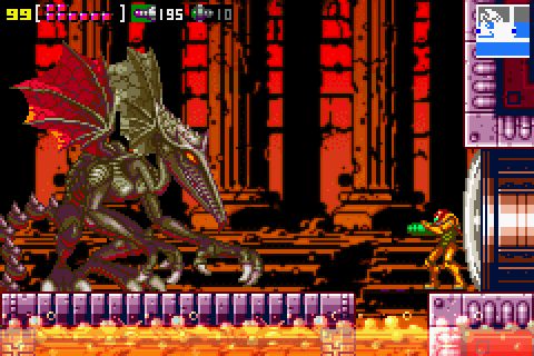
Had alittle discussion on reddit about Ridleys designs, might aswell copy it here:
The thing about the Brawl design is, it looks great, but only (AND ONLY) if looked at from a very specific angle and if he is posed in a very, very specific way (basically his boss pose). Otherwise, one will quickly notice that the proportions are all off and his head is just basically a total mess.
But my main problem with his Brawl design is... it makes Ridley look dim witted:
http://img3.wikia.nocookie.net/__cb20080812163552/metroid/de/images/a/ab/Ridley2.jpg
The eyes and the tounge, aswell as the comical teeth just make him look brainless. It doesnt represent his character well at all. For me, Ridley´s zero mission design is the perfect example of what Ridley is supposed to be:
http://images1.wikia.nocookie.net/_...on.jpg/619px-Raidley_Metroid_Zero_Mission.jpg
Look at those eyes. That slight smirk he seems to have. There is something happening there. Yes, Ridley is a beast, but he isnt mindless. Its canon that he is a very very intelligent beeing. I think your model captures this aspect of him reasonably well
(the model in question:
http://i.imgur.com/rFoJLki.jpg)
Besides, alot of people say his Brawl design is his Super Metroid design but.. that isnt really true, is it? It looks pretty close to Super Metroids promotional art design, but his ingame sprite looked nothing like that:
http://img4.wikia.nocookie.net/__cb20070823194955/metroid/images/6/63/Metroid_ridley.jpg
Again, Super Metroids ingame sprite is actually alot closer to what Zero Mission did later on.
its just a panel near the end when Sammy gets back to her ship

BaganSmashBros for this gif.


