kingdomofthehearts_snucas
Smash Lord
definately.

Welcome to Smashboards, the world's largest Super Smash Brothers community! Over 250,000 Smash Bros. fans from around the world have come to discuss these great games in over 19 million posts!
You are currently viewing our boards as a visitor. Click here to sign up right now and start on your path in the Smash community!
Request for: Fezzy
Renders: Couldn't find it. Looking for the Melee version of Marth in white. Planetrenders only has like 3 pictures of Marth, none of them are white and all of them are from Brawl.
But there is one white Marth you could use from Brawl if you're having trouble finding a Melee one:
http://i2.photobucket.com/albums/y28/feardragon64/ee5f02656e893a55.jpg
In this thread feardragon64 posted a decent amount of Marth pictures in white, none are from Melee but you could use them if you want.
Colors: White and Yellow (if the colors can't make a good theme, switch them according to your discretion. It's only white and yellow due to the fact that I play white Marth in the player three slot--yellow shield ;p).
Text/Font: "Bard" is the text I want, wherever you can fit it and in the font Palatino Linotype. The font looks like this: Bard
Design: Perhaps a Baroque or medieval theme to fit with my name. But use your judgment.
Size: Whatever the normal size is for a sig, I really don't know. The size of my currrent one would be fine--just use your judgment.
Border: My preference is no, unless when you're doing it you think that a border would fit it much better.
Additional Comments: Just use your creative vibe. I want as much of this as possible to come from you--it's your artwork after all.
Alright, no problem. I'll be on it tomorrow, since tonights a school night
if I could vote, I would say inthanks for the support.
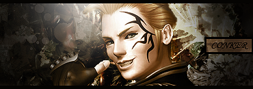
") I know that you have a job and everything... but still.
I know that you have a job and everything... but still. Holy sh** conker that´s your best by far! Alot of wasted potential, however. The mark on his face would totally do for a nice effect base. Displace it, cut it off, smudge it, tadaah, I nice fitting effect you can play around with. Text is bad, but lighting is aight, as is the mood. Imo you should´ve used some adjustment layers- nice choice of focal, too. Nice an HQ. Props Conker, your improvement is getting faster and faster every day.new sigy up!!!
cnc would be good
I vote him in too.thanks for the support.
What number did you pick for the sharpening? Like 30? Keep it at 10-20, sharpen is just to accentuate the tag, not to create an effect of it´s own like for example Topaz (over-topazing **** is even worse though).tahnk you flare
tuts have improoved me this far
and yea..i forgot about the adjustment layers :/
also i faded the sharpen a bit but looks like it wasnt enough
Effect c4ds are the one with the black BG, they´re supposed to have it. To accentuate the c4d´s themselves and darken the mood for better focus on the c4ds when put on lets say overlay or something. Sorry for the double post but I had to quote.Or you could just use the fuzzy select tool and click the black...
You don't know how to render from a single color background?
yea i think i used over 30What number did you pick for the sharpening? Like 30? Keep it at 10-20, sharpen is just to accentuate the tag, not to create an effect of it´s own like for example Topaz (over-topazing **** is even worse though).
snucas is in, cuz he iz awesomewhat do you vote dinko?

im not doing any sig at the moment...
well hmm
i might remember the people
which persons sig are u doing atm?
and why is there a waiting list on ure rules
u could of posted their names and then just pmed them
thank u. =DDinkoman, two of your requests are back on page 163. (Mine was fulfilled by L__.)
Np, but can you believe it? 43 pages in 4 days???thank u. =D
I can ^_____^Np, but can you believe it? 43 pages in 4 days???
thats nothin in the first week we got 30 pages in 2 days and in 4 days we got 100 pages lawlNp, but can you believe it? 43 pages in 4 days???