
-
Welcome to Smashboards, the world's largest Super Smash Brothers community! Over 250,000 Smash Bros. fans from around the world have come to discuss these great games in over 19 million posts!
You are currently viewing our boards as a visitor. Click here to sign up right now and start on your path in the Smash community!
It appears that you are using ad block :'(
Hey, we get it. However this website is run by and for the community... and it needs ads in order to keep running.
Please disable your adblock on Smashboards, or go premium to hide all advertisements and this notice.
Alternatively, this ad may have just failed to load. Woops!
Please disable your adblock on Smashboards, or go premium to hide all advertisements and this notice.
Alternatively, this ad may have just failed to load. Woops!
The All Stars House o' Sigs (OFFICIALLY CLOSED)
- Thread starter Roller
- Start date
- Status
- Not open for further replies.
kingdomofthehearts_snucas
Smash Lord
im not, im just saying that i can make it in a shop too, even though people think i suck at making sigs....
don't go and be pisshy about it ok
jeez
im not coming back....
don't go and be pisshy about it ok
jeez
im not coming back....
Conker315
Smash Lord

any little thing people say to u snucas u take it so seriously
learn how not to..
Iron-Snickers
Smash Rookie
Hi, Dinkoman! My friend Roymyboy284 said you could make a sig for me. Here's my request.
Middle: http://www.smashbros.com/en_us/characters/images/hidden07/hidden07.jpg
Far Left: http://www.wikicheats.com/images/0/0b/Super_Smash_Bros_Brawl_Luigi_01.jpg
Near Right: http://images4.wikia.nocookie.net/ssb/images/thumb/b/b7/Jigglypuff_in_Brawl.JPG/256px-Jigglypuff_in_Brawl.JPG
Near Left: http://www.videogamesblogger.com/wp-content/uploads/2007/10/kingdedede-super-smash-bros-brawl-character-art-screenshot.jpg
Far Right: http://www.wikicheats.com/images/5/58/Super_Smash_Bros_Brawl_Wario_01.jpg
I would also like my name to be in a sort of solid, purple font, and I'd like the background to be electric. Please get done ASAP. Thanks!
Roller
Smash Legend
Sorry for my leave of absence guys. I was over a friends.
I've got a LOT of reading to do here...
I've got a LOT of reading to do here...
Grandeza
Smash Master
Anyone here got any good sprite tuts? I have a feeling sotw3 will be on sprites.
Ekoix.exe
Smash Ace
Guess who's back.
Grandeza
Smash Master
Black Waltz?
Ekoix.exe
Smash Ace
. Oh my god. I think i just died a little on the inside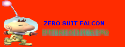
were any of you guys around before i changed my name to grandeza?
My first sig.
Grandeza
Smash Master
lol i hope you weren't trying to insult me. I know that that is ****.
Conker315
Smash Lord
ekoix just dont start arguements and filling up pages with ure rudeness
Grandeza
Smash Master
double post sowwy
Grandeza
Smash Master
Funny to think i went from this-
all the way to this-

all the way to this-
Conker315
Smash Lord
double poster :O!!!!
lol
lol
Grandeza
Smash Master
wtf i didnt press submit twice. -________________________-
AlmightyJeebus
Smash Lord
- Joined
- Jun 12, 2008
- Messages
- 1,325
Someone kill me please, ekoix is back :'(. Meh, he'll just wind up banned again.
Grandeza
Smash Master
If he trys any shi- i'll just report him.
Conker315
Smash Lord
grandeza know any good tutorials i can possibly try ?
?Grandeza
Smash Master
Hold on, I'll search up a few. Slow down though, you're going to surpass me and leave me in the dust lol.]
http://www.gimptalk.com/forum/curlyʹs-splatter-vector-sig-tutorialǃ-t8728s0.html
give that a shot
http://www.gimptalk.com/forum/curlyʹs-splatter-vector-sig-tutorialǃ-t8728s0.html
give that a shot
Conker315
Smash Lord
no grandeza
we are equals
and who cares if we surpass each other
u may do a better and simpler one that all these sigs with like 50 layers
we are equals
and who cares if we surpass each other
u may do a better and simpler one that all these sigs with like 50 layers
Conker315
Smash Lord
grandeza can u try and find a ps one
i dont use gimp
only time i use it is for animations
i dont use gimp
only time i use it is for animations
Grandeza
Smash Master
Ohhh. Awesome. I like being the best gimper only second to marthmaster. A_man was better too but he switched to photoshop. Yay now to surpass Marth master....... I'll look for some tuts for ya conka
Conker315
Smash Lord
ok grandeza thank you
Grandeza
Smash Master
lately all he uses is photoshop. And if he does part of the sig in ps and part in GIMP that doesn't qualify in my eyes. I respect A_Man and love his work, but to be a full fledged GIMPer you have to only use gimp. No back and forth stuff lol.Hey grandeza, A man still uses gimp. It is about 2/3 PS and 1/3 GIMP. CnC guys CnC
conka- try this. i obviously cant try it but the result looks hot
http://www.guildinn.com/forum/intermediate/24498-hope-signature-tutorial.html
AvoiD
Smash Lord
I'm not to sure if were allowed to request from two different shops, but these sigs are amazing.
@ AzSvFeZ: I saw the avatar you made HabiT, it looks tight haha. I was wondering if you could possibly make me a relevant avatar with Falco, but in the Black Alt. costume. I couldn't find any good pictures, sorry :\.
Colors, maybe a Dark Blue/ Black. I can't picture it in my head how it'd look, but if you want, you can actually mix around what you think might go good and all.
As for Text, could you put "Kuro" somewhere around the edge. Font, not to sure, whatever you think is good haha. If anything, maybe a little relevant to HaBiT's. Not trying to steal it or copy anything, but I like the way it turned out. Just different colors other then his. Thanks if you can. ;]
For size, what is the usual? 100 x 100?
@ The Dinkoman: Your the second person who I'd like to ask, but for a signature this time. The Metaknight one is sick. Could you possibly find a Black Alt. costume for Falco to use in the sig? Like I said above, couldn't really find any good pics. As for the background, maybe relevant to the Metaknight one as well? You could mix it up a bit so it won't be to similar. But your choice on what you want to do.
If you do Text, could you add "Kuro" and "The Ghettoest Brawler" with the Trademark (TM) sign next to it? Somehow like the one in my current sig. If you can, thanks as well.
Falco (MOP)
Smash Journeyman
I have a request for ANY sig maker who is willing to take the request
I want my signature to just have the following. Make it as large as possible (To fit everything nicely)
Color Scheme: Up to you
Theme Text: "Mach 4 " -- If you could be creative with a kind of Techno theme with images and effects and such
I would like the signature to say the following: Mach 4, and three hyperlinks for the following links.
http://www.mediafire.com/?o2xrzwlm0r5 - Hyperlink should say the following: DOWNLOAD: - Music made by yours truly - The MOP
http://www.myspace.com/mach4band - Hyperlink should say the following: STREAM - Music on the go or for Download
http://smashboards.com/showthread.php?t=184659 - Hyperlink should say the following: THREAD - Check out my SWF Music Thread!
Make it pretty
Anyone can do this, I have faith in you all. Thank you so much and I CANNOT WAIT to see it!!!!
--The MOP
Grandeza
Smash Master
Somone take his request. I would but I'm goin on vaca for a few days startin tomorrow.
AlmightyJeebus
Smash Lord
- Joined
- Jun 12, 2008
- Messages
- 1,325
Ay kurozero, it wasn't AzSvFez that made habit's avatar, that was me. And I can make your avatar for you, and I do have that alt costume. K? Cause AzSvFeZ referred habit to me, and he asked in a pm. If you want' me to do it, just say so.
Also, dinkoman said he didn't want do do your request on aim, so i'll take it
this is all at kurozero btw
Also, dinkoman said he didn't want do do your request on aim, so i'll take it
this is all at kurozero btw
AvoiD
Smash Lord
Oh, sure :D.
Thanks lol.
Thanks lol.
pikapwr980
Smash Journeyman
hey guys back
AlmightyJeebus
Smash Lord
- Joined
- Jun 12, 2008
- Messages
- 1,325
FINISHED KURO
I couldn't get the trademark symbol to come out right, but overall, I think you'll like it
Sig:

Avi:

if there's anythign you don't like, say something
I couldn't get the trademark symbol to come out right, but overall, I think you'll like it
Sig:
Avi:
if there's anythign you don't like, say something
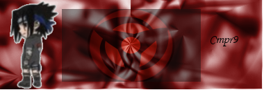
Grandeza
Smash Master
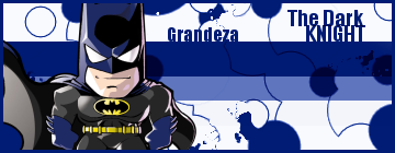
new vector siggy
AvoiD
Smash Lord
AlmightyJeebus, it's amazing! I love it haha, could you change the color of the text to make it stand out more though? If fades in with the background. So I couldn't see it all to well. But very tight, none the less.
:D
EDIT: Actually, I think I like it like that. Once again, thanks lol. Much appreciated, but could you also add a frame around the Signature? And maybe make the text a bit bigger, so it'd cover up some of the room. And mind making the same avatar, but 100 x 100? Unless it'd stretch, nevermind.
Sorry lol, it is good. I'm just picky sometimes :\.
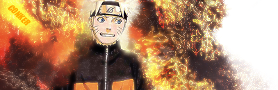
Conker315
Smash Lord
can i get sum cnc on this 1?
its a sprite sig
my first sprite sig also btw so yea
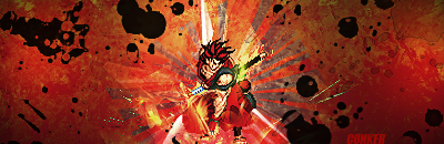
and nobody cnc this one yesterday so ill post again
please cnc
its a sprite sig
my first sprite sig also btw so yea
and nobody cnc this one yesterday so ill post again
please cnc
Grandeza
Smash Master
Ok the sprite tag-not bad for a first sprite sig(god i suck at working with sprites). Normally I think of sprite tags as more bright and vibrant. I don't like the text placement. Not feelin the splatters either. Not mcuh flow. Keep practicin with sprites or look up a sprite tut.
Onto you naruto one. The text is to close to a corner. I like how it's brighter around the text, BUT that distracts from the focal. It would be better if there was more flow. Also crop the sig. IMO the blankness on the right doesn't look good.
I got paged -_-
Onto you naruto one. The text is to close to a corner. I like how it's brighter around the text, BUT that distracts from the focal. It would be better if there was more flow. Also crop the sig. IMO the blankness on the right doesn't look good.
I got paged -_-
*Erhem* Shall we have a friendly battle?Ohhh. Awesome. I like being the best gimper only second to marthmaster. A_man was better too but he switched to photoshop. Yay now to surpass Marth master....... I'll look for some tuts for ya conka
Conker315
Smash Lord
lmao gflare!
i say you 2 compete and whoever comes out with the best sig
using gimp of course...and see whos better
i say you 2 compete and whoever comes out with the best sig
using gimp of course...and see whos better
- Status
- Not open for further replies.