• Welcome to Smashboards, the world's largest Super Smash Brothers community! Over 250,000 Smash Bros. fans from around the world have come to discuss these great games in over 19 million posts!

    You are currently viewing our boards as a visitor. Click here to sign up right now and start on your path in the Smash community!

SWF Member Tutorials

Super King

Smash Rookie
Joined
May 18, 2006
Messages
14
Amazing guys! These are some of the best graphics tuts I've ever seen, I plan on trying them all, haha.

TM: Guys, it's great that you like these tuts the others are sticking up for ya, but please read the rules AND DON"T POST UNLESS YOU HAVE A TUTORIAL TO PUT UP. It keeps the topic clear of clutter. Thank you.
 

ExMachina

Smash Journeyman
Joined
Feb 29, 2004
Messages
282
Location
Northern Virginia / UVA
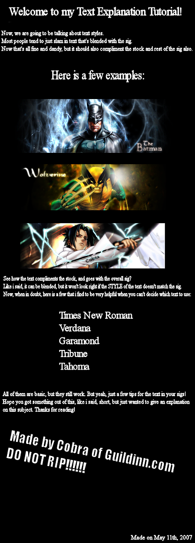
Tag Basics - Composition, Text, Using Filters Correctly, etc.

Introduction

Not really a tutorial with clear steps, more like a bunch of guidelines. Here's the stock if you want to use it:

http://www.people.virginia.edu/~aov2x/basicstut/stock.jpg

And the .psd of the tag made for reference:

http://www.people.virginia.edu/~aov2x/basicstut/uzumakitag.psd


Terms

Some terms explained for easier reading:

Filter - Photoshop's built-in tools for creating generated effects / manipulations, all found under the Filter menu option

Stock - the image of a person or character that you place in the tag

Render - an abstract image created in a 3d program like Cinema4D or Bryce, usually used as filler

Brush - downloaded "stamps" that you can use in Photoshop

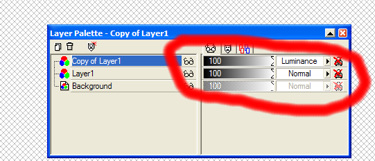
Adjustment Layer - select the yin/yang looking icon at the bottom of the Layers window, creates a layer that adjusts the look of all the layers underneath

Blending Mode - on the top-left of the layers window there is a drop-menu where you can select how the layer interacts with other layers (default mode is "Normal")


The Tutorial Itself

1. Stock Placement / Composition

So, you've cut out your stock... but where do you place it? In general, when coming up with a composition for anything, you should try the rule of thirds first.

http://en.wikipedia.org/wiki/Rule_of_thirds

Since tags are usually much wider than they are high, let's just apply the rule of thirds to the horizontal positioning of the stock. Here, I've drawn in 2 lines that divide the canvas into thirds horizontally. You should place the stock on one of these 2 lines.

Another thing to note when placing your stock... Do not center it vertically and try to fit the whole character's head in there. This is what people dub "floating head syndrome." Move the stock so that you get at least the neck/shoulders in the canvas.
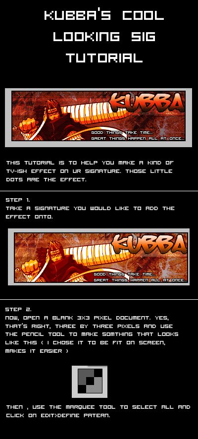


2. Backgrounds

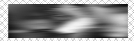
When just starting to use Photoshop, people tend to use a layer of filtered stuff as their base. Here's the tag with a simple Filter > Render > Clouds layer as the background, doesn't look very exciting, right? I'd stay away from this and use a gradient layer as a base instead, as it has more focus/depth than a flat layer of filter muck (Gradient Tool, which is in the same place as the Paint Bucket, I usually go with a radial gradient).

Filtered stuff is good for texturing, however... so try putting filtered stuff on top of the gradient and changing its blending mode and/or opacity.

Here, I've put the cloud filter layer on top of the gradient and set its blending mode to Vivid Light.


More filtered stuff... I made a new layer, filled it with black, then used Filter > Render > Lens Flare. I set its blending mode to Screen, which means that none of the black background will show up and only the lens flare itself will be visible, and then move it closer/behind the stock.


3. Stock/BG Interaction, Blending

One way to get the colors of your stock and background to fit together is to put a Color Balance adjustment layer on top of both the background and the stock. Move the sliders towards Blue, Green, and Cyan if you want a "cooler" feel to your colors, or move them towards Red, Magenta, and Yellow if you want warmer tones. Since I used blue as the main color in the background gradient, I bring up the Blue, Cyan, and Green values.


Another way is to create a new layer, fill it with one color (here, a blue midtone) and then change its blending mode / opacity. It's recommended that you don't use the Hue or Color blending modes, as that changes everything to monotone, or single color, which is really boring.


I'm pretty partial to the way the layer looks on Lighten, so that's what I'll stick with for the remainder of the tutorial.


4. Filler / Flow

So, we've got nice colors and good stock placement, but it still feels empty... This is where filler elements come in. I made this section separate from the background portion because some elements may even overlap the stock. Also, flow is an important thing to keep in mind when you're adding this filler... Keep in mind your focus (the stock) and try and make all elements "flow" towards it... In general, don't go sticking random stuff in the corner where it doesn't relate to the stock image at all.

Let's use some shapes to fill up that empty space... Go to Custom Shape Tool, click the little arrow in a circle on the right, and select All. Then select a color, and then pick a shape (I use the star thing), and then left click, drag, and let go to make one in your canvas. I then move it underneath the stock and then place it close/below it.

Create a couple more shapes of different colors, and don't be afraid to mess around with blending modes / opacities. Try overlapping some on top of the stock as well.

If you want to erase a part of a shape, simply right click on it and select Rasterize Layer, then you'll be able to use the eraser tool on it.


Filtered stuff as filler... it can be done, but again, the key is not to overdo it. Here's some filtered garbage I made really quickly, but it will make a wispy, smokey effect that we can use.

http://www.people.virginia.edu/~aov2x/basicstut/filter.jpg

Simply copy and paste it into your tag, then set its blending mode to Lighten, Screen, Color Dodge, or Linear Dodge. Here, I just use Screen and then erase all of the extra bits that overlap the stock in weird places and extraneous stuff I don't want. I paste in the stuff again and find another portion of it to use and again, set to Screen and erase what I don't want.


Same principle as using renders or downloaded brushes: erase all the extraneous bits that do not "flow" with the tag or look awkward. Just use the portions that look best in the tag.


5. Typography

Don't use that elaborate, fancy font unless it fits with the theme of the image... since we have some energetic anime guy in here, I think something else is in order. Some nice-looking sans serif fonts that can work in almost any piece are Century Gothic, Arial, Verdana, Eurostile, etc. Simple fonts are likely to not stick out horribly, so if in doubt, just go with one of those.

Also, another tip for not having ugly typography: avoid putting extra effects (bevel, emboss, drop shadow, etc.), as it just makes the stuff stick out and not fit in with your overall tag. Newcomers tend to over abuse layer effects on text... Also, try to pick a color using the eyedropper tool so that it isn't some color that sticks out too much because it's too dark, a weird color, etc.

And again, keep flow in mind... don't just shove your text into a corner for no apparent reason, have it closer to the stock and pointing towards it, if possible.


6. Finishing Touches

Tweaking quality... if you want to sharpen the whole thing to make it pop a little more, simply make a new layer on top of *everything* and select Image > Apply Image. This will make a layer that's a copy of the whole tag so far. Then go to Filter > Sharpen > Sharpen and adjust the opacity of the layer till you get the level of sharpness you want.

You can also mess around with the image's overall brightness/contrast with a Levels or Brightness/Contrast adjustment layer.

So, borders... as with typo, make sure that whatever border (or not) you put on your tag fits with the overall piece. In general, fancy tech borders don't work with every kind of image, so keeping it simple is your best bet. Simple = no border or a simple black or white 1-2 pixel border.


EDIT:

7. Post Script

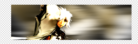
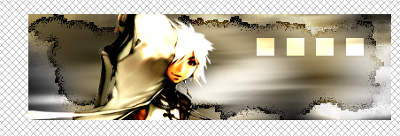
With a little more work (I deliberately tried to keep stuff simple for the tutorial, but all the added effects here are still all defaults), this is what I'd consider a final product. Still no renders, downloaded brushes, or smudging... just default brushes, text, and filter muck.


Doggalina

Smash Lord
Joined
Jul 25, 2005
Messages
1,958
Location
Chicagoland (NW Indiana)/Purdue West Lafayette
Text Background for Sigs.

Earlier darkshadows posted a pretty cool site that converts an image into text. I thought that his converted file of BM's sig looked kinda strange, so I tried it out myself, and I got this:


It looked cool, so I tried something different. I just text-ified the background and put a non-text stock on it. I tried that today while doing Ex's tutorial on making a sig with just Photoshop filters. I realized that Elements 3.0 lacked color balance and layer masks, and I decided to mess around with www.text-image.com. Well, here's how to make a cool text-y background.

1. Make a sig. I made this one with Ex's tutorial (well, up until the Color Balance part), but I didn't bother using text. Make sure you leave it as a psd!


2. Duplicate the image. (File>Duplicate)

3. Get rid of the stock in the duplicated image. (right click on it's layer and select "Delete Layer") (in this sig, I would get rid of Meta Knight). When I got rid of my stock, my image looked like this:


It's now just the background.

4. Save the background for web (as a jpg or png).

5. Go to www.text-image.com/convert.

6. Select browse. When browsing, select your background.

7. Mess with the settings. For this tutorial, I used the following:


You can change the "image width" to your liking. 85 had the height that I wanted.

8. Press "Convert". You should get a nifty image from text.

9. Hit "Print Screen"

10. Create a new file in Photoshop. Paste. An image of your screen should show up.

11. Crop the text. My image from text looked like this:


12. Put your stock (and all layers that modify it) on the new text background.

13. Add a border (Select All. Then Edit>Stroke [Outline] Selection...)

14. Add text if you like (I'm too lazy to do that)

The Final Product:


Pretty cool, eh? I really like the look of that background.
 

ExMachina

Smash Journeyman
Joined
Feb 29, 2004
Messages
282
Location
Northern Virginia / UVA
Smudging + Squiggles

Kickin' it old-school with this one. All defaults.

1) Cut out your stock and place it into the canvas. Remember the rule of thirds and avoid "floating head syndrome."

2) Put down a linear or radial gradient as your background. In example 1, I used a linear gradient comprised of 2 shades of green because it contrasts with the pink / skintone in the stock. In example 2, I used a radial gradient comprised of yellow and red taken from the stock via eyedropper tool. In both cases, the gradients originate from the left because that's where lighting will be.


3) Grab your soft-edged circular brush (set to around 60-80% opacity) and pick a light, saturated color. For 1, I picked a slightly lighter, more colored green. For 2, it was a more saturated orange. Create a new layer between the stock and the background gradient and brush so that it starts from the lighting's origin and so it spills out a little past the stock.


4) Now, to integrate the stock a little into the background... eyedropper tool the color of the BG closest to the stock's edge. Then, make a new layer on top of the stock and use your soft-edged brush to put some of it overlapping the stock. In both examples, I decided to blend the edges furthest from the center (in 1, that's the stock's right, in 2, the stock's left).


5) Lens flare! Create a new layer, fill it with black. Then go to Render > Lens Flare and pick whatever you like best. Make sure it originates from wherever the lighting is. Set this layer's blending mode to Screen and then erase the cheesy looking bits (most of the rays should be gone because that's a tell-tale sign of filter use... and we want to hide that =P). In 1, the lens flare is underneath the stock because the light area is underneath it. In 2, the flare is above because the light area overlaps it.


6) Awesome, now let's get some texture in there. Select the Smudge tool and pick either the Chalk or Spatter brushes. Set Strength anywhere from 60-100%. Around 60, you'll likely keep blurry edges. At 100%, you're going to get the texture of whatever brush you're using to smudge and some hard edges. Now, just go and smudge those layers of soft-brushing you made earlier. Feel free to add more layer of soft-brushing and smudge them for more texture. And don't forget that you can sharpen a smudged layer to bring out those edges a little more.


7) Alright, you've got the big strokes down and some good texture / overlapping. Now for some smaller elements to really focus in your effects. Grab your hard-edged circular brush, size 3-6, set its opacity to 100%. Create a new layer and select a standout color from your background or stock and start drawing squiggly lines. Don't be afraid of getting messy or drawing over your stock, you can always move them and erase parts later. As always, make sure their direction goes with the "flow" of the tag...

8) Now, arrange the squiggles so that they focus in on the stock. You may have to resize them to get them to "fit" properly. Sharpen each squiggle once to make the edges more defined. Then take a soft-edged brush and erase certain areas (especially the ends) so that they "blend" into the background.


9) Keep adding more...


10) Nice. Now, for a little extra blending to integrate the stocks more... Eyedrop tool the background color closest to the stock's left edge. Soft brush some over the very left edge of the stock and set the blending mode to Soft or Hard Light. Muck around with the opacity settings so it doesn't stick out too much. Repeat with the right edge. Voila. It's subtle, but it helps.


11) Here's where it gets cool. Create a new layer on top of everything else. Then select Image > Apply Image. This will create a layer that is a duplicate of the whole sig. Grab the Rectangular Marquee tool and select long areas of the duplicate and copy and paste them as new layers. Do this a couple times... You should end up with 4 or 5 strips of your tag. Then, rotate them all so they fit with the tag's flow and arrange them so that they overlap the stock here and there. Erase the parts you don't want and then you'll get something like this:


12) Add text accordingly and you're done.


Not half-bad, eh? Remember, it's not the number or flashiness of your effects, it's how you use them. A few not so fancy effects that flow with your tag do a lot more than random flashy stuff that isn't relevant to your stock at all.
 

KidZero

Smash Cadet
Joined
Apr 15, 2006
Messages
42
If you need any help on anything, feel free to PM me & I will do my best to help you out. Enjoy!


Epsilon52

Smash Champion
Joined
Aug 8, 2006
Messages
2,215
Location
South East Denver
great tutorial...i dont see much masking around here ( i dont do it enuff either) i think eveyrone would beneift form this great tutorial to entry lvl masking. sure to make ur sig skills much better

It sounds easy, doesn't it? Duplicate one layer's layer mask on another layer. It is easy but only if you know the technique. A layer mask is a channel that determines the visibility of the content of that particular layer. If multiple layers require the same areas of transparency, you can create a single layer mask and copy it to the other layers. We'll start with a look at creating layer masks. A layer mask enables you to create areas of transparency on a layer without erasing the layer content. Since the layer's entire content is still available (although partially hidden), you can later edit the layer mask to change the visibility. NOTE: Keep in mind that a layer named "Background" (in italics) cannot have areas of transparency. Simply double-click the layer name in the Layers palette and rename the layer. That converts the layer to a regular layer, enabling you to show/hide areas selectively with a layer mask.

Creating Layer Masks
A basic layer mask can be created by making a selection of the area of the layer that you want visible and then clicking the Add Layer Mask button at the bottom of the Layers palette. In this example, the Horizontal Type Mask tool was used to create a selection in the "shape" of a zip code.

You can also use the painting tools to create a mask. Click the button the add an empty layer mask, make sure the layer mask thumbnail is active in the Layers palette, then paint with black and gray to hide areas of the layer. Where a layer mask is black, the layer is hidden. Where the mask is white, the layer is visible. Shades of gray produce partial transparency.

Keep in mind, too, that you can refine the mask using the Image> Adjustment commands. Levels and Curves, for example, can be used to adjust areas of partial visibility by changing the gray values in the mask.

Filters can also be applied to layer masks. Blurring the mask a bit can slightly soften the edges of the visible areas of the layer. Other filters can be applied to masks for special effects, such as the Glass filter (shown here).

NOTE: Remember that, after creating or editing a layer mask, you must click on the left thumbnail in the Layers palette to edit the layer content.

Duplicating a Layer Mask
1. In the Layers palette, Command-click (Mac) or Control-click (Windows) on the thumbnail of the existing layer mask to make a selection of the content of the layer mask.

2. In the Layers palette, click on the layer to which you want to add the layer mask.
3. Click the Add Layer Mask button at the bottom of the Layers palette.

If you need to reposition the layer mask on the new layer, click on the layer mask channel in the Channels palette and use the Move tool (or the Edit> Transform commands) as necessary.

TIP: Click on the layer mask channel to make it the active channel, then click in the left column (the "eyeball" column) next to the RGB (or CMYK) channel to make the image visible. When finished, remember to click on the RGB channel to make it active again.

You can also reposition a layer mask without moving the layer content by first clicking on the link icon between the thumbnails in the Layers palette. This unlinks the mask from the layer itself. You can use the Move tool to reposition either the mask (without moving the layer content) or the layer content (without moving the mask). Which will be dragged with the Move tool depends on which thumbnail is active in the Layers palette. (Remember to re-link the mask and layer afterward by clicking again between the thumbnails.)

And don't forget.
Any layers style applied to a layer with a mask conforms to the visibility of the layer. Each effect will follow the outline of the layer mask. .

* Digg Digg This!
* Del.icio.us Del.icio.us
* Technorati Technorati
* Furl Furl It
* Blinklist Blinklist
* Ma.gnolia Ma.gnolia
* Yahoo! My Web Yahoo! MyWeb

Photoshop Seminars Tour
Headers
Austin, TX
Jan 24th
Photoshop CS2 Creativity Tour
Tampa, FL
Jan 26th
Photoshop CS2 Creativity Tour
Houston, TX
Jan 29th
Photoshop CS2 Power Tour
Arlington, TX
Jan 30th
Adobe InDesign Seminar Tour
San Antonio, TX
Feb 26th
Photoshop for Photographers Tour
© 2006 KW Media Group. All Rights Reserved. Privacy Policy - Terms of Use

orirginal link------- http://www.planetphotoshop.com/creating-and-duplicating-a-layer-mask.html
 

BuryYourDead

Smash Rookie
Joined
Dec 21, 2006
Messages
14
tut. made it for F&YL

this is my firt tutorial so sorry if you get confused at all.

heres the final look. I kind of rushed it but it's not half bad.

I found a tutorial that showed this way of making sigs but i can't find it so I made this one. I don't want to take 100% credit for this. +rep me if you like it! :laugh:
 

Marthmaster92

Smash Champion
Joined
Jun 29, 2006
Messages
2,564
Location
Stuck between a parallel dimension of code and you
This is my first tutorial so bear with me. For all you new guys out there wanting to get into sig and banner-making, this is for you.

Basic Sig-making tutorial.

NOTE: there might be some edges around some of the images, that's just from where i cropped the picture to show you the stuff. that won't be on your banner.

This is made using Paint Shop Pro 7.

Step 1: Make a 410X120 image. Width=410 Height=120 Background color is black.

Step 2: Pick your picture. (I already have a rendered one of this samurai here.)


Step 3: Make a new image, transparent background, or 800X600 pixels. paste your samurai in there.

Step 4: Now, under "image", go to "rotate". set it to rotate right at 90 degrees.

Step 5: Copy and paste your rotated samurai into your original 410X120 image.

NOTE: Close out your 800X600 image now. don't save it, you don't need it.

Step 6: go to "colors" and click "colorize". Hue should be 30 and Saturation should be 80.
also apply a motion blur. i usually use maximum strength, and if that's too much, use about 75% to 50% strength.
Step 7: change layer blend mode to "luminance". blend modes are in your layer pallete, in the right box.

you should now have something like this:

(this is with the original layer1 visibility off. just click the glasses in the layer palette to toggle that layer on and off. if it has a red "X" on the glasses, you can't see that layer right now. if they don't have an "x", that means you can see the layer. hope this isn't confusing.)

It doesn't have to be exact, just something along that line.

Step 8: Now on "Layer 1" let's apply a gaussian blur. (effects>blur>gaussian blur) your settings should be 11.89 for that.)

Step 9: Add a new raster layer. (layers>new raster layer) left click the new layer and drag it up to the top of the layer palette. it should be called layer 3 by default.

Step 10: paste your samurai pic in there. (the one from step 2) put him in the left side of the sig.

Step 11: you'll now be controlling "layer 4". go to the following: colors>adjust>brightness/contrast. your settings should be the following:

brightness: 0 contrast: 45

your samurai should have a bit of a change. you should now have the following:


Step 12: Now, go to the picture tubes. go to the "clouds", and set the scale to 30. put them around the edges. Now, apply mosaic glass. (effects>texture effects>mosaic_glass.) your settings should be the following:


Step 13: Now erode the edges twice. (effects>edge>erode)

Step 14: go to your paintbrush tool. your settings should be the following:


then put in 4 squares. you should now have something like this:


Step 15: Now to add some text. Colors are just plain white, text type should be Gothic 57. Size should be 18. Make sure the create as vector box is checked, and the Antilias box is checked. the text will suck horribly if these aren't checked. Position it right underneath the blocks you made with your paintbrush. Now set the layer blend mode that the text is on to "luminance".

Step 16: Create a last new raster layer and bring it to the top of the layer palette. Now, change your foreground and background color to black.


Step 17: Now, for the final touch. next do this:

Effects>3D effects>buttonize.

your settings should be the following:

Height=3 Width=3 Opacity=75 and make sure the "transparent edge" is checked.

You should have something along the following:


Congratulations! You have now successfully made your first sig. I also find these sites very helpful for designing effects and just learning some of the ins and outs of paintshop:

http://www.pinoy7.com/psptutorials/webgraphics.shtml

http://graphicssoft.about.com/od/pa...sential_Tutorials_for_Jasc_Paint_Shop_Pro.htm
 

Dr_Twist

Smash Lord
Joined
Oct 6, 2006
Messages
1,110
Location
Iowa-gimme some brawl challengers yo!
ok guys i found out on my own how to make a gun shot effect. (NOTICE: this is also a full sig tut, I guess I felt like it.)
Its very easy.
(before u start pick 2 colors that go with your picture)
first: make new document pick a size, for this tutorial I did 400x115
second: find a pic with a gun (pointing left or right) and copy it onto a new document (I used this pic if u want to use it 2 http://xs511.xs.to/xs511/07045/BioFalcoSig.jpg )
third: color around your background and use filter to create your OWN background.
VVVVVVVVVVVVVVV my bg

fourth: normally if you pick a good picture then u can press the magic wand tool and click the white part of the background right click where the white is. Go down and click select inverse it is now covering just the picture. (if there is something left in your background I.E. text just erase it) Click the move tool and move your "render" to the sig with the background u created.
fifth: blend picture (right click the layer 1 at the bottom right of the page, and select blending options)
sixth: click Type Tool/Text Tool and type in your OWN text. Doesnt matter what it says. I did this on a request so I used the name of the person that requested it. P.S. you can have more than one text box it does not need to be just one
seventh: blend the text (like I said before right click the layer that has your text name on it and click blending options.)
eigth: slant your text by ctrl-t and right clicking the box and select rotation. Then rotate it so its slanting like VVVVVVVV below.

9th: duplicate the layer with your text; move it down so u can see it. If your guy if pointing left with his gun, erase all letters except the LAST letter.(if u have a guy pointing right with his gun; u need to erase all letters but the FIRST letter)
VVVVVVVVVV like this
Line it back up with the original text so u CANT see it. (make sure you're still on your text layer copy) Go to filter at the very top, go down to stylize>Wind>Wind>From right or from Left (depending on where your render is facing) Go to filter and at the top click wind again about 2-3 times. ( I did three) Now it looks like your whole text is shot. (LOL)
VVVVVVVVVVVVVVVVVVV like this

tenth: Duplicate the layer 1 (or whatever the render layer is, should be layer 1) Erase the whole copy except the tip of the gun, put it back on the render where it belongs, then go to filter at the very top, go down to stylize>Wind>Wind>From right or from Left (depending on where your render is facing) Go to filter and at the top click wind again about 2-3 times. ( I did three) Now it looks like the tip of your gun is shooting the text (LOL)
VVVVVVVVVVVVVVVV like this

eleven: Go back to your text layer. (not the copy!!!!!!!!!) Like I said before right click that layer that has your text name on it and click blending options. Click inner shadow and outer glow. Press OK.
VVVVVVVVVVVVVVVVVVVVVVVVVVVV like this

12th: Then to add a border, click your very top layer by the very bottome right. Go to layer>new>layer>OK. Go to the very top, go to select>all. Then select again>modify>border, pick one pixel. Click your paintbrush tool, select a color that goes with your BG. Run across the lines with the left mouse button, once your done, click the magic wand tool and click inside your banner twice. You are done, now save it and be proud!!! LOL
Here Is My Result:

This is my first tutorial, tell me what you think, I dont expect you 2 try this, But go ahead!!! Thanks for reading this!!!! P.S. This is for photoshop 6.0, but u could probably do it on any photoshop!!!!! (or GIMP)
:D :D :D :D :D :D
 

Leoneri

Smash Ace
Joined
Mar 1, 2007
Messages
580
This tutorial will show you how to make bevelled outlines.

Note: Start this on a new layer, not the background layer.

My image size is 410x120, but you can choose what fits your needs.

Step 1: Use the Polygonnal Lasso and make a shape, here I made something of a border.


Step 2:Make sure the shape is still selected, if not Ctrl Click on the layer thumbnail (Cmd Click for Mac Users)

Step 3: At the top of the screen with the menu that has File, Edit, etc. click on Select, scroll down to Modify, and choose Contract. It should be contracted by 10 pixels

Go back to Select-Modify but this time choose Border, and make it 5 pixels.

The image should now appear to have two selections.


Step 4: Make sure you still have the 'double selection' shown in the picture above, and...wait for it... press delete! Yep thats all for this step.


Step 5:
Now we are going to add the bevel, first, make sure that you still have that selection from where you cut out the border, then you can either access the Bevel and Emboss feature by double clicking the layer thumnail, or on the layer palette, click the little f and choose Bevel and Emboss.

Make sure you have these settings


If you want to, you can check the Drop Shadow box, which is what I am going to do.

Step 6: You're done! This is what your finished product should look like.


But wait, you can do some other things to it if you want.


You can cut shapes and text out of it.

When I cut out the squares its just simply use the rectangular marquee tool inside of it and hit delete.

For the text type in what you wish, but make sure you reselect the layer with the Bevelled Outline before you hit delete.

You can add Drop Shadows and other effects to the text if you want.

I am currently trying to figure out how to add stock on to these without it looking weird, if you figure it out, please PM me.
 

tappy

Smash Ace
Joined
Oct 14, 2006
Messages
860
Easy background Tut for photoshop 7

Make a new picture file> 350x110
Filter> render> clouds
Filter> render> difference clouds
Press ctrl F a few times to get what u want
Filter> brushstrokes> accented edges with these settings:
Edge width: 1
Edge brightness: 50
Smoothness: 1

You should have something like this


Next, go to filter> sharpen> sharpen
Then, u will duplicate the layer (ctrl J)
Select the top layer and go to filter> sketch> bas relief with these settings:
Detail: 13
Smoothness: 3
Light direction: bottom
And set that layer to soft light

You should have something like this


Press ctrl E to merge layers

Now press ctrl U to get the hue/saturation box and pick out what color u want
Here’s mine


this was my first tutorial, hope u guys like it!:)
 

E123Omega

Smash Lord
Joined
Sep 16, 2006
Messages
1,880
Location
ニューヨーク
E123Omega's Shiny Sig Tutorial!

E123Omega's Shiny Sig Tutorial

We are going to learn how to make a shiny sig much like this one:


WARNING: TRY TO AVOID USING BRIGHT PICTURES IN THESE KINDS OF SIGS BECAUSE IF THE PICS ARE TOO BRIGHT THAN THE BACKGROUND WILL NOT LOOK GOOD AND WILL BE TOO LIGHT! IF YOU HAVE NEVER USED PHOTOSHOP OR GIMP BEFORE THEN DON'T BOTHER TRYING THIS TUTORIAL!!!!!
This tutorial requires basic knowledge of Photoshop or Gimp.
This tutorial is compatible with both Photoshop and Gimp.
NOTE: This tutorial was originally meant for Photoshop but was discovered to also be for Gimp.
Shall we begin?
This is the pic I am using to make this tutorial:


It is best to use a render(pic) that has at least 2 or more different colors such as the pic shown above.

You also need to download Metal-CX's Photoshop brushes which are located here.
Metal CX's Gimp brushes are located here.
You can use ANY kind of sparky brushes though for this tutorial.


Step 1: Open a new document with a size of 450x130 and fill it with black.


Step 2: Cut(Ctrl+X) and paste(Ctrl+V) your picture. Position it in a place that you find best. I prefer pasting the pic right in the middle of the sig. But that's just me.


Step 3: This is optional. We are going to enhance the picture. Duplicate the layer with your pic in it and go to Filter>Sharpen>Sharpen and lower the opacity of the duplicated layer to 30% and then merge the layers(Ctrl+E). Then duplicate again and go to Filter>Blur>Gaussian Blur and set the radius to 3.5 and then set the duplicated layer's mode to lighten and merge the layers(Ctrl+E).


Step 4: Duplicate the layer again and go to Filter>Blur>Motion Blur and set the angle to 0 degrees and the distance to 130. Duplicate the motion blurred layer 5 times(Ctrl+F 5 times). And move the duplicated layers all around the sig to cover the sig up but try to avoid moving the duplicated layers up or down. NOTE: I duplicated the layers more than 5 times. Your sig should look like something like this:


Step 5: Set all the motion blurred layers to overlay and move the non blurred layer(the one that has your picture in it) to the top.


Step 6: Change the foreground color to white and then select the layer that you filled with black and starting brushing it with the brushes I provided you with until you get something you like. This is what I got:


Step 7: Nice isn't it? Well let's just add some text and we are done!


Hope you like this tutorial!!
Tell me what you think of this tutorial.
Please do not RIP.
Let me see your results.
Also be sure to save your result as a .png file.


Outcomes:


Xanskarr of Smash World Forums (Smashboards):


Devid of Video Game Lan Forums:


Pokemaster252 of Video Game Lan Forums:


Sonic-san of Video Game Lan Forums:


Leoneri of Smash World Forums (Smashboards):


O D I N of Smash World Forums (Smashboards):


Lean of Smash World Forums (Smashboards):
 

Dr_Twist

Smash Lord
Joined
Oct 6, 2006
Messages
1,110
Location
Iowa-gimme some brawl challengers yo!
hey new tut i made up! Its called...................

Black and white framed picture

THIS TUT IS FOR PHOTOSHOP!

start out by making a new picture file and use the size 375x630
make sure the b.g. is gray (i used this color #9B9A99)

then find a big!!!! picture like this

(put the opacity on your pic to 80)


then go to layer>new>layer>ok
then go to gradient tool and make the colors go from white to gray
^^^(i used these #ffffff and #959595) make sure white is at the bottom when you scrape across like this.


set it to saturation(if you don't know what i mean its at the top right of the layers box)


then make another new layer!
then go to select>all>ok. then select>modify>border>10 pixels.
file it with this #CCCACA
then add these blending options by right clicking the layer or dbbl clicking it.
drop shadow(don't change anything)
bevel & emboss= DEPTH 31 SIZE 7 & SOFTEN 0!


then make a new layer again
then used the rectanguler marquee tool and put it on the edges of the first border!
then go to select>modify>border>5 pixels.
fill it with #E5E1E1!
then go to blending options and add drop shadow (opacity 65)
then drag the layer behind the first broder layer^^


you can stop at this or go on


and if you want to add a black an white b.g.
go to google and find a good b.g. that goes with a your pic. like a playground our something.
then make a new layer behind the pic the bring it there! then move it around till it looks good

like this


and there you go! you have your black and white framed picture! you can even use your own picture from your camera
 

Leoneri

Smash Ace
Joined
Mar 1, 2007
Messages
580
I know im not supposed to comment but you really have to cut off ALOT of that extra space
 

Leoneri

Smash Ace
Joined
Mar 1, 2007
Messages
580
Dr. Twist you're not supposed to comment here, but if you pay attention to this please cut off the half pages worth of extra space on your tutorial, it is really irritating to scroll through.
 

Dr_Twist

Smash Lord
Joined
Oct 6, 2006
Messages
1,110
Location
Iowa-gimme some brawl challengers yo!
booya!!!!!!!!!!!!!!!!!!!!!!


heres my first one that i posted! please post outcomes


outcome


link: http://img155.imageshack.us/img155/3894/tutcopyfw3.png


please post your outcome forVVVVV2(tut)


my new second tut ever!!!
warn you this tut is very very long!!!!
if you like the end of part two better then part three then just stop at part two and go to part three text.(at the end).(except chang text to normal at 100%)
please tell me if you like the end of part two or part three better.

outcome

(new^^^)

part1: http://img209.imageshack.us/img209/9074/2ndtutroxcopyon3.jpg

part2: http://img209.imageshack.us/img209/3746/2n...art2copyff8.jpg

part3: http://img407.imageshack.us/img407/1681/2n...art3copyhr8.jpg


long!!! tut but please i worked hard on this tut i want to see some outcomes

more is coming!

ok new tut!

outcome(s)


tut:
1: http://img177.imageshack.us/img177/6006/sp...1111copyxu9.jpg

2: http://img245.imageshack.us/img245/6614/spritetutcopyom3.jpg
 
Top Bottom