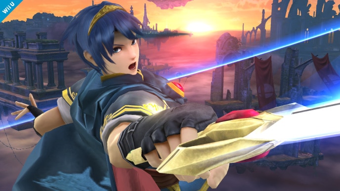
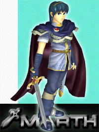
People may complain about the step back in terms of finer details, but the one thing that clearly is being given more detail are the character faces. Good night, look at the difference in expressions between both pictures! And it's not just him: Toon Link, Mario, Luigi, Peach, Pit, Sonic, Pikachu, everyone; and when Kirby, of all characters, manages to look better, that's quite an impressive feat. The brighter color scheme is really making this game visually pop more than Brawl ever did. Very impressed.
Although, the only thing that continues to bug me is Megaman's icon. Literally, that is the one gripe I have that bugs me to no end. I really hope that is one of those details that change over time. E-tank, Megaman helmet, screw; something that is actually indicative of the game.


")

