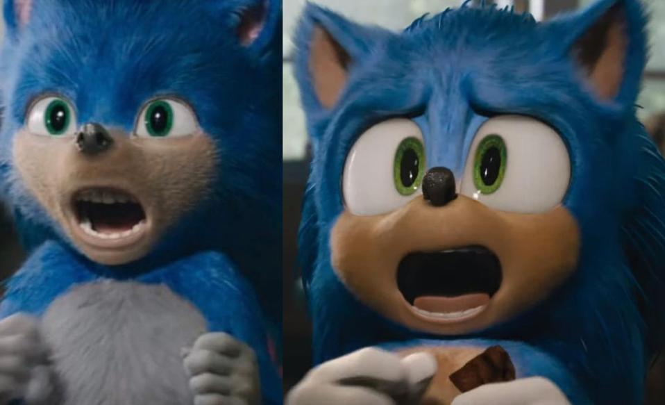
Someone here asked me what it'd be like to see the old Sonic "meow" scene but with the new Sonic design. And I said yes, it would absolutely look better. And while it didn't play it entirely, it still played the majority of it.
And surprise, surprise, I was right. This new Sonic design is far better than the older design, and it makes scenes with Sonic less cringey and more fun to watch.
Big props to the film studio. Well done.
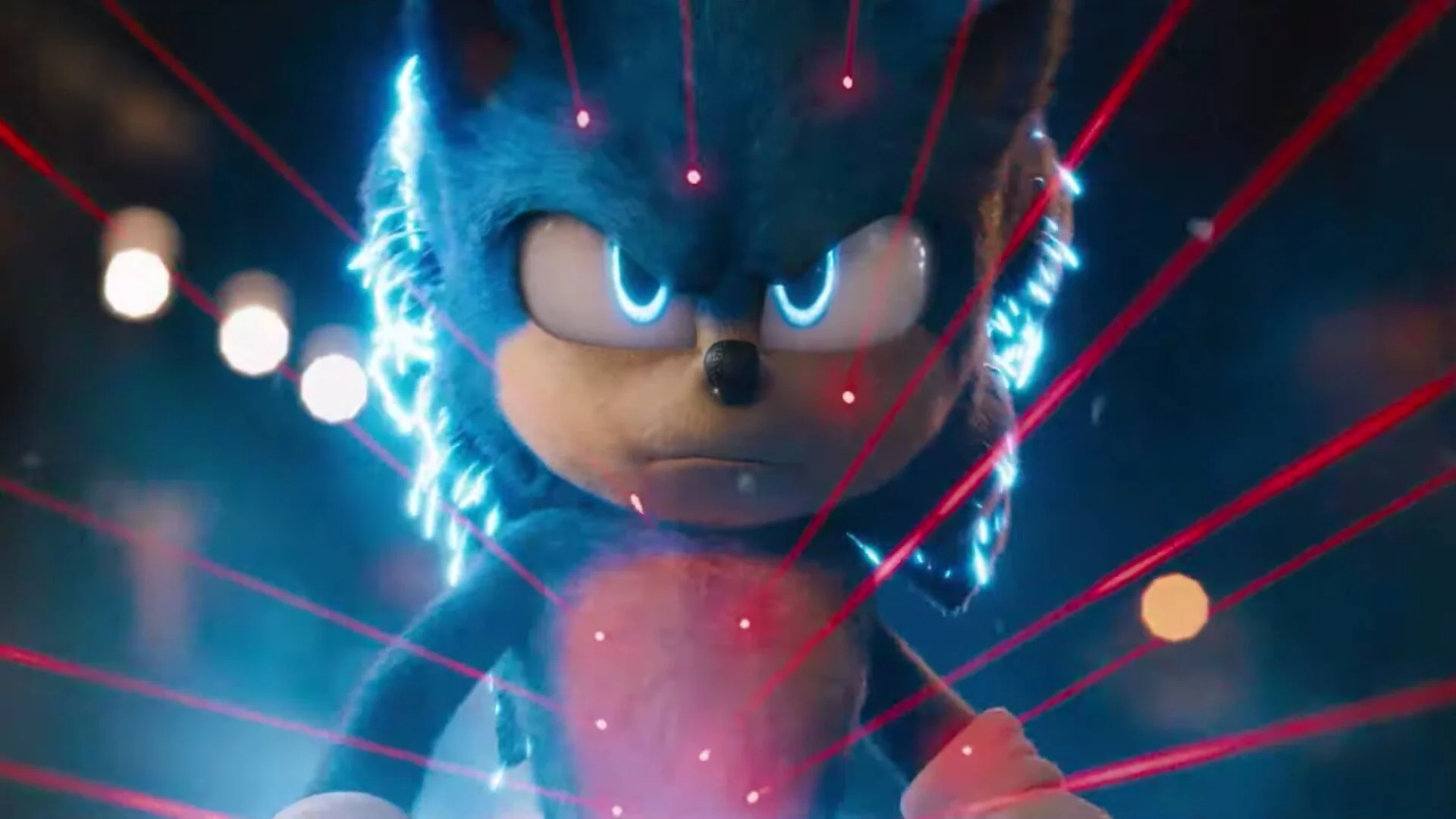
Edit: This image alone changes everything I felt was wrong about the movie.
He's bubbly! Hes got personality! HE HAS GLOVES!
That was my biggest nitpick about the old design, was that he had WHITE HANDS. Not white gloves, WHITE. HANDS. That was a level of outrage I never felt before about any design in my life. Like, he can wear shoes, but gloves are unacceptable?
It's like Mickey having white hands but yellow shoes. That don't work, and no excuse in the WORLD could dismiss that change.
But its fixed now, and Sonic looks very good. Not the best, I will admit, but this design is realistically the best that we could of gotten.


