• Welcome to Smashboards, the world's largest Super Smash Brothers community! Over 250,000 Smash Bros. fans from around the world have come to discuss these great games in over 19 million posts!

    You are currently viewing our boards as a visitor. Click here to sign up right now and start on your path in the Smash community!

Reality 64: A Smash 64 Mod For Brawl [Not Quite The End | Page 26]

Zarx1554

Smash Journeyman
Joined
Jun 22, 2014
Messages
402
Location
California
NNID
Zarx1554
Well, now that it's out... but then we'd be restricted to making a clone of Lucario and Marth, that would have to be named Mewtwo and Roy, at least in the games files. Unless a Ex-PMDT member released their tools. Anyways, that's far from now. You guys are a tad-bit too speculatory for a mod that's been canceled once before its first release. I hope the Ex-PMDT releases the Alt Engine though (pls). Yeah, and we'd have to make them from scratch. I'd like to add characters in, but not until we have the first 35 in. If we were though, I think we should stick to characters either planned for Smash 64, or created in the N64 Era. Also, they have to be in the game already because of legal stuff.
 

Kamineigh

Smash Apprentice
Joined
Jan 29, 2015
Messages
76
That's why I suggested Mewtwo be a costume. Since I'm redesigning all of the characters that weren't in Smash 64 into the Smash 64 art style, I figured that when I try to make Lucario match Gen II's aesthetic, I could increase the size of the tail to a halfway point between Mewtwo and Lucario.

After all, it'd be a far simpler solution than outright cloning Lucario. Most of the animations would be Lucario's, with a few changed to accommodate Mewtwo, since Lucario's animations would be 64ified anyways.

So it'd be more like Bowser Jr. and the Koopalings in Smash 4. Roy is nearly the size of Smash Bowser and Iggy is puny, but both had their sizes changed to match Junior.


Anyways, I've been making progress on 64ifying Ganondorf.


I'm using Captain Falcon's art as a reference for proportions. The rest of him is being amalgamated from Ganondorf's various appearances.

His face is based on OoT Ganondorf and Oracle Ganondorf, with the beard OoT Ganondorf grew in Wind Waker and Twilight Princess.

His shoulder pads/chest plate are a halfway between OoT and Twilight Princess. This is so that his cape animations don't look weird). The images of the Triforces of Wisdom and Courage are on his chest, since he already has the Triforce of Power in his left hand.

On the back of the cape, is going to be the image of Majora's Mask. I figure a plain sheet of red would be boring.

His gloves are going to be the ones he wore in OoT, with the gold plate on the back of his hand. His pants and shoes are based on the traditional poofy pants of the Gerudo, and the curled shoes that Oracle Ganondorf wears. I figure he should look like a desert warrior, since that it was he is. (I also hate how his Twilight Princess pants make him look like his knees are up on his thighs.)

Overall, his clothes will be black and red, with bits of gold and white.

I'm also going to include a design for a sword based on the trident Ganon uses in Four Swords.

I've also got some moveset input, for moves that could use the sword, But I'll save that until after I've posted the finished concept art.
 
Last edited:

Kamineigh

Smash Apprentice
Joined
Jan 29, 2015
Messages
76
I know double-posting is a no-no, but it's been ten hours since my previous post.

I've finished the lineart for the Ganondorf concept. I would've flipped the canvas to ensure it looks nicer, but Art Academy doesn't have that option for some reason.


I'm exhausted and need sleep, but when I wake up, I'll be coloring this six times, to fill up Ganondorf's six costume slots.

The default will be black and red, since the main design influence was the unused Oracle Ganondorf, who wore those colors.

The blue costume will be primarily blue, with gold armor, to invoke the appearance of Pig Ganon.

The green costume will be based on Aghanim's overworld sprite in A Link to the Past.

The final three recolors are just covering the bases. The brown one will be there to provide the option of an OoT-style Ganondorf, a purple color to match the color of his magic, and the white-haired 'Old Manondorf' costume.

Nighty night, ya'll. Instead of doing Bowser next, I think I'll draw someone simple, like Marth.
 
Last edited:

Saxophoneoftime

Smash Lord
Joined
Nov 18, 2012
Messages
1,454
Location
MI
That's why I suggested Mewtwo be a costume. Since I'm redesigning all of the characters that weren't in Smash 64 into the Smash 64 art style, I figured that when I try to make Lucario match Gen II's aesthetic, I could increase the size of the tail to a halfway point between Mewtwo and Lucario.

After all, it'd be a far simpler solution than outright cloning Lucario. Most of the animations would be Lucario's, with a few changed to accommodate Mewtwo, since Lucario's animations would be 64ified anyways.

So it'd be more like Bowser Jr. and the Koopalings in Smash 4. Roy is nearly the size of Smash Bowser and Iggy is puny, but both had their sizes changed to match Junior.


Anyways, I've been making progress on 64ifying Ganondorf.


I'm using Captain Falcon's art as a reference for proportions. The rest of him is being amalgamated from Ganondorf's various appearances.

His face is based on OoT Ganondorf and Oracle Ganondorf, with the beard OoT Ganondorf grew in Wind Waker and Twilight Princess.

His shoulder pads/chest plate are a halfway between OoT and Twilight Princess. This is so that his cape animations don't look weird). The images of the Triforces of Wisdom and Courage are on his chest, since he already has the Triforce of Power in his left hand.

On the back of the cape, is going to be the image of Majora's Mask. I figure a plain sheet of red would be boring.

His gloves are going to be the ones he wore in OoT, with the gold plate on the back of his hand. His pants and shoes are based on the traditional poofy pants of the Gerudo, and the curled shoes that Oracle Ganondorf wears. I figure he should look like a desert warrior, since that it was he is. (I also hate how his Twilight Princess pants make him look like his knees are up on his thighs.)

Overall, his clothes will be black and red, with bits of gold and white.

I'm also going to include a design for a sword based on the trident Ganon uses in Four Swords.

I've also got some moveset input, for moves that could use the sword, But I'll save that until after I've posted the finished concept art.
This looks great. My only criticism is why add the Majora's Mask on the back? It doesn't appear on any other design on Ganon, isn't a symbol connected to him (or is even in a game he's in), and would be a bit distracting from his design. Not every feature of him has to be a reference to something, or have to be really cool. In fact, there should be a fine balance of cool design and well, everything else, to avoid feeling claustrophobic. Ganon's cape wouldn't be plain red, either. It has a golden design on it:


Also, making Mewtwo a costume for Lucario doesn't make much sense. Their proportions don't match up completely well, and their movesets in the series are completely different; Mewtwo is mainly focused around his tail and psychic powers, where Lucario is mainly melee-based with his hands and feet. There's no real reason to do this, especially not at the expense of changing attributes of Lucario's design like the length of his tail. Not to mention that it'd be a disservice to Mewtwo's character.

I hope I haven't been coming across as a negative Nancy. I'm just really excited for this project and want it to be as professional as possible to garner it respect and to surpass being just another mod.
 
Last edited:

Zarx1554

Smash Journeyman
Joined
Jun 22, 2014
Messages
402
Location
California
NNID
Zarx1554
I'll work on a Lucario Gen 1 Style Redesign. Will post if I have a ready model. Just don't expect it any time soon, I still have to work on a new-alt
 
Last edited:

The Pizza Guy

Smash Apprentice
Joined
Aug 12, 2014
Messages
162
I'm back!

You guys were talking about falco earlier so I thought I'd throw in my 2 cents.

Now let's see, Falco in 64 style? I like the idea of keeping the melee shine, and since 64 Fox has Falco lasers than the obvious choice would be to give 64 Falco Fox's lasers. Maybe Fire Bird can't travel as far as Fox's, but can be used twice per airtime? But remember, he can't just be made different from Fox by giving him different specials, we could also give him the brawl/melee Fsmash and his Brawl air moves, and maybe give the Down air spike a little bit of lag, so comboing into it from a shine wouldn't be so ridiculously easy. Something like that perhaps?

But if we want Falco to keep the stunning lasers then maybe instead of deciding between stun and no stun we can find some other way to make them different. Maybe give them little/no stun but more stun than fox's as it travels on? Falco would be slower right so he wouldn't be able to just rush up to someone he hit from the other side of the stage and start a huge combo off of that much stun so I guess it wouldn't be super unbalanced. What do you think of that idea?

Can't wait for more info!
 
Last edited:

Kamineigh

Smash Apprentice
Joined
Jan 29, 2015
Messages
76
This looks great. My only criticism is why add the Majora's Mask on the back? It doesn't appear on any other design on Ganon, isn't a symbol connected to him (or is even in a game he's in), and would be a bit distracting from his design. Not every feature of him has to be a reference to something, or have to be really cool. In fact, there should be a fine balance of cool design and well, everything else, to avoid feeling claustrophobic. Ganon's cape wouldn't be plain red, either. It has a golden design on it:
Well the image of Majora's Mask has been used in the Fused Shadow, and it appears in Link Between Worlds. I suggested the mask design as a neat little detail, rather than having some generic lines on the bottom of the cape.

Saxophoneoftime said:
Also, making Mewtwo a costume for Lucario doesn't make much sense. Their proportions don't match up completely well, and their movesets in the series are completely different; Mewtwo is mainly focused around his tail and psychic powers, where Lucario is mainly melee-based with his hands and feet. There's no real reason to do this, especially not at the expense of changing attributes of Lucario's design like the length of his tail. Not to mention that it'd be a disservice to Mewtwo's character.
Mewtwo only uses its tail in Smash because Sakurai is unimaginative: See Ganondorf.

I figure I could design a middle-ground that would do both of them justice, since I occasionally doodle Pokémon fusions.

EDIT: So I just looked at the two side-by-side in Smash 4.


Aaaaaaand now I see what you mean. Lucario is a head shorter than Mewtwo, and that's with Mewtwo slouching. So yeah, now I can see why we'd need a clone engine to portray the world's strongest Pokémon, and succeed.

I'll work on a Lucario Gen 1 Style Redesign. Will post if I have a ready model. Just don't expect it any time soon, I still have to work on a new-alt
Ah, well I had been planning on pushing Marth off on someone else, and doing Lucario next. Today's Smash Broadcast has left me with an undying hatred for everything Fire Emblem-related, except for Ike.

EDIT: So I was looking at some Gen I and Gen II Pokémon. It seems that Lucario doesn't really need a redesign. It has about as much detail as Scizor or Ampharos.

I'm thinking the only major change to Lucario would be a larger head - so it looks 'cuter', similar to how Smash 64 Link has a proportionally large head.

Still salty about Fire Emblem though.
 
Last edited:

Zarx1554

Smash Journeyman
Joined
Jun 22, 2014
Messages
402
Location
California
NNID
Zarx1554
Yeah, there's not much to change with Lucario, I'm going to just get rid of the spikes and give him a more dog-like head.
 

Kamineigh

Smash Apprentice
Joined
Jan 29, 2015
Messages
76
Yeah, there's not much to change with Lucario, I'm going to just get rid of the spikes and give him a more dog-like head.
I think the spikes can stay, just with a little rearagning. it is a Steel-type after all, and those spikes are the only metal on its body.
If you're looking to make the head look more 'classic' then I'd recommend using Ninetales' head as a base.

For the spikes, I'd say that the chest spike could be moved to Lucario's back.
 

Zarx1554

Smash Journeyman
Joined
Jun 22, 2014
Messages
402
Location
California
NNID
Zarx1554
Why change Lucario's aesthetics at all? There's no reason to.
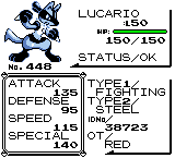
Gen 1 Pokémon look a lot different in terms of design than Gen 4. They're so much more simplified in Gen 1. It's for his 64 styled alt
Here's an example of the design switch
 
Last edited:

Kamineigh

Smash Apprentice
Joined
Jan 29, 2015
Messages
76
Well if I wasn't intimately familiar with Pokémon, and you showed me Lucario, you'd probably be able to convince me that it was from Gen II.

So I take it that Lucario is going to have 'regular Lucario' as a main costume, and then a less detailed 'Red/Green battle sprite' styled costume as an alt? Makes sense, since the Red/Green sprites were known for being hilariously inaccurate.


Lucario's got five costume slots, so I figure he could have other costumes based on other Steel-type Pokémon.

Default/Blue Team - Regular colors.
Yellow - Shiny colors.
Red Team - The colors of Scizor.
Green Team - The colors of Machamp.
Retro - Monochromatic inaccuratic Gameboy-styleatic costume.

I'm gonna be honest though, that 'Gen IV style' Charizard would make for an awesome costume. Like, holy **** that's cool.
 

Zarx1554

Smash Journeyman
Joined
Jun 22, 2014
Messages
402
Location
California
NNID
Zarx1554
So I've completely reworked Link. Revamped his tunic texture, hair, and recolored his face a bit and made his shield match the art style (On the back). Same pose as you saw last week, but now you get to see on the detail.
Also, for Lucario, I'm still going to take the spikes out, mostly because Gen 1 had no Steel-Type. Now that Christmas Break is almost here, (1 day left for me), I'm going to be able to do so much more.
 

Kamineigh

Smash Apprentice
Joined
Jan 29, 2015
Messages
76
Gen I also lacked special attack, special defense, Fighting-type attacks that used the special stat, Ghost didn't do anything to Psychic...

Gen I really wasn't very good, technically speaking. It was memorable and fun, and it sparked a great franchise, but it's still such a glitchy, unbalanced mess that I'm surprised Nintendo published Red and Green, let alone let Game Freak follow it up with Blue and Yellow.


If we must be completely accurate to the time period: There's also no such thing as 'Thunder Jolt' in the Pokémon games(Gen I or otherwise), Adult Link can't use a Boomerang(He had the Bow and Arrow), Samus should be able to run while using her Neutral B, Ness couldn't learn PK Thunder or PSI Magnet, and Captain Falcon would have to fight while inside his F-Zero machine.

I don't think absolutele 100% N64-era accuracy is the best way to go. Otherwise we've have to drop everything that didn't exist until after Smash 64 released - like Olimar, Ike, Lucas, the majority of the Pokéball Pokémon, and a ton of assist trophies.

Sounds pretty silly, right?

I think we should approach this with a retro-style mindset, and not a 'retro-only' mindset.

Sure the Steel and Dark types didn't exist in Gen I, but neither did Lucario, the concept of aura, or a few of Lucario's attacks.


Rather than looking at Lucario and going 'What can we strip away to make it match the time period of Smash 64?', we should look at it and go 'What can we do to make Lucario match Smash 64's simpler design philosophy?'
 
Last edited:

Kamineigh

Smash Apprentice
Joined
Jan 29, 2015
Messages
76
We'd also have to remove Green Mario. I mean come on, keep your OCs to yourselves guys!
 
D

Deleted member

Guest
Well if I wasn't intimately familiar with Pokémon, and you showed me Lucario, you'd probably be able to convince me that it was from Gen II.

So I take it that Lucario is going to have 'regular Lucario' as a main costume, and then a less detailed 'Red/Green battle sprite' styled costume as an alt? Makes sense, since the Red/Green sprites were known for being hilariously inaccurate.


Lucario's got five costume slots, so I figure he could have other costumes based on other Steel-type Pokémon.

Default/Blue Team - Regular colors.
Yellow - Shiny colors.
Red Team - The colors of Scizor.
Green Team - The colors of Machamp.
Retro - Monochromatic inaccuratic Gameboy-styleatic costume.

I'm gonna be honest though, that 'Gen IV style' Charizard would make for an awesome costume. Like, holy **** that's cool.
Every Generation of Pokemon has different design philosophies. In fact, you can honestly look at each Gen, 1, 2, 3, 4, 5, 6 and notice how different the designs are and how they are centered around a certain theme. The closest the generations got to using a similar style is 5 and 6. Lucario's design doesn't suit even Gen 2, it's far too humanoid and modern by comparison. I like the sprite, but yeah, that's definitely not how he would've looked in Gen 1 it's more of putting a Gen IV design in a specific art style. Even then, it doesn't match the style of Red and Green, neither Blue. Of course, I don't really care either way how he is represented in this game, but more or less explaining the reasoning behind what Zarx said.

As far as opinions about Gen's balance or technical aspects, that's honestly an entirely different debate compared to aesthetics and really everyone has their own opinions on what they like over the other. Right now Zarx is trying to emulate a style.
 

Kamineigh

Smash Apprentice
Joined
Jan 29, 2015
Messages
76
Every Generation of Pokemon has different design philosophies. In fact, you can honestly look at each Gen, 1, 2, 3, 4, 5, 6 and notice how different the designs are and how they are centered around a certain theme. The closest the generations got to using a similar style is 5 and 6. Lucario's design doesn't suit even Gen 2, it's far too humanoid and modern by comparison. I like the sprite, but yeah, that's definitely not how he would've looked in Gen 1 it's more of putting a Gen IV design in a specific art style. Even then, it doesn't match the style of Red and Green, neither Blue. Of course, I don't really care either way how he is represented in this game, but more or less explaining the reasoning behind what Zarx said.
Save for the fact that they designed hundreds of Pokémon before Gen I and they're still reusing and pulling out old designs. Tyranitar and Larvitar show up in the Capsule Monsters concept book, and a weird blue sea turtle looks too similar to Gen V's Tirtouga for it to be coincidental. I'll bet there are still pre-Gen I concepts that Game Freak is sitting on.

I don't really buy there being a theme that all Pokémon in a Generation will follow. Scizor looks like it could have been a Gen IV Pokémon introduced in the same vein as Piloswine or Gallade. Swaddloon looks like it coulda been Gen II.

I'm pretty sure more focus is put on inter-Pokémon relations than it is on a Generational theme. Theme generally only applies to the region's legendaries and specific Pokémon created for that region - like Honedge or Vanillite.

In the case of art direction, then Gen I-ifying Lucario doesn't make sense, since Smash 64's artistic style was intended to make the characters look like toys, be they dolls, figurines, or action figures.

A Smash 64 Lucario would probably have a slightly bigger head and larger eyes. His spikes wouldn't be pointy, but slightly rounded at the tips(Like on a Lucario figurine), and his paws would be larger - as figurines tend to have larger feet in order to stand up properly.

Which is actually something that's gonna make my job much easier. I just have to approach designing the character art from the perspective of a toy-maker.
 
D

Deleted member

Guest
Save for the fact that they designed hundreds of Pokémon before Gen I and they're still reusing and pulling out old designs. Tyranitar and Larvitar show up in the Capsule Monsters concept book, and a weird blue sea turtle looks too similar to Gen V's Tirtouga for it to be coincidental. I'll bet there are still pre-Gen I concepts that Game Freak is sitting on.

I don't really buy there being a theme that all Pokémon in a Generation will follow. Scizor looks like it could have been a Gen IV Pokémon introduced in the same vein as Piloswine or Gallade. Swaddloon looks like it coulda been Gen II.

I'm pretty sure more focus is put on inter-Pokémon relations than it is on a Generational theme. Theme generally only applies to the region's legendaries and specific Pokémon created for that region - like Honedge or Vanillite.

In the case of art direction, then Gen I-ifying Lucario doesn't make sense, since Smash 64's artistic style was intended to make the characters look like toys, be they dolls, figurines, or action figures.

A Smash 64 Lucario would probably have a slightly bigger head and larger eyes. His spikes wouldn't be pointy, but slightly rounded at the tips(Like on a Lucario figurine), and his paws would be larger - as figurines tend to have larger feet in order to stand up properly.

Which is actually something that's gonna make my job much easier. I just have to approach designing the character art from the perspective of a toy-maker.
Although some Pokemon were designed a while back before being released, however, most of those aren't how they ended up looking like and drastically change depending on the theme of that generation and also how Sugimori started changing his art style as time went on. Tirtouga as you mentioned's concept artwork is actually incredibly different compared to how he looked in Gen V.


The only thing that ended up staying the same is that he is a blue skinned tortoise, but the shell shape, shell color, stature, mask, feet, and even eyes are different to how Sugimori drew him initially in concept. As for Scizor, I even disagree there as the shapes used (Although with Generation III artwork a lot of Gen I and Gen II Pokemon got redesigned in some ways) on Scizor are lot different to the shapes used on even Gallade. Gallade has rounder features and a more humanoid type design whereas Scizor is a bit more bulky and more animal like despite it being a drastic change over Scyther. Also, Gallade's head color having that teal part in the center is something Gen II wouldn't have done. The designs were generally more uniform than how Gen IV did with adding out of the typical mesh symbols on the designs. Gardevoir doesn't even have something like that on her head and she's Gen III. Gallade's belly/waist is also something that wouldn't have been done back then either with it's honestly quite random placement.

Swadloon actually doesn't either fit Gen I or II due to the intricate leaf design on top, it's modernized eyes, as well as the darker green part of him near his lower body in the back and it's artistically shaped opening for his eyes to peep out. Gen I and Gen II had a much more uniform approach to designs compared to Gen IV. The artistic detail was more of not in making various parts of the body shaped like art, but shaped like it'd actually exist on an animal in the Pokemon world. I've noticed that since Gen IV the designs started to get more complex on a lot of the Pokemon and delve into this kind of territory, whereas Gen V is where they went full force with it and dropped the uniform approach the previous Gens had.

But yeah, it honestly doesn't matter to me either way what gets in this mod or not, def interested in playing it, though.
 
Last edited by a moderator:

Sluigi123

R64/Brawl- Dev; AI Coder; Balancer
Joined
Jan 18, 2011
Messages
365
Location
Bowling Green, Ohio, USA
NNID
Sluigi123
Save for the fact that they designed hundreds of Pokémon before Gen I and they're still reusing and pulling out old designs. Tyranitar and Larvitar show up in the Capsule Monsters concept book, and a weird blue sea turtle looks too similar to Gen V's Tirtouga for it to be coincidental. I'll bet there are still pre-Gen I concepts that Game Freak is sitting on.

I don't really buy there being a theme that all Pokémon in a Generation will follow. Scizor looks like it could have been a Gen IV Pokémon introduced in the same vein as Piloswine or Gallade. Swaddloon looks like it coulda been Gen II.

I'm pretty sure more focus is put on inter-Pokémon relations than it is on a Generational theme. Theme generally only applies to the region's legendaries and specific Pokémon created for that region - like Honedge or Vanillite.

In the case of art direction, then Gen I-ifying Lucario doesn't make sense, since Smash 64's artistic style was intended to make the characters look like toys, be they dolls, figurines, or action figures.

A Smash 64 Lucario would probably have a slightly bigger head and larger eyes. His spikes wouldn't be pointy, but slightly rounded at the tips(Like on a Lucario figurine), and his paws would be larger - as figurines tend to have larger feet in order to stand up properly.

Which is actually something that's gonna make my job much easier. I just have to approach designing the character art from the perspective of a toy-maker.
He's right about that, since the person who made the artwork of all the Pokemon is by the same person, my best guess was that Lucario would have looked more like he'd be on all fours than anything else, and would be a simple Steel-Type OR Fighting-Type Pokemon, than Steel/Fighting-Type, IMO.
 
Last edited:

PlateProp

Smash Master
Joined
Mar 15, 2014
Messages
4,149
Location
San Antonio
NNID
Genericality
3DS FC
3823-8710-2486
I was wondering how you guys are going to make 12 characters & only 12 characters playable. I am developing my own mod Called, "Clap For 64". I just wanted to make this mod for people that are waiting for this.
We're just starting with them for the first release
 

Zarx1554

Smash Journeyman
Joined
Jun 22, 2014
Messages
402
Location
California
NNID
Zarx1554
I was wondering how you guys are going to make 12 characters & only 12 characters playable. I am developing my own mod Called, "Clap For 64". I just wanted to make this mod for people that are waiting for this.
Change the CSS so that only the first 12 appear. I have the code in the build, but it doesn't seem to work. Maybe it's because there's no random slot. It doesn't crash the game, it just doesn't load.
 

Kamineigh

Smash Apprentice
Joined
Jan 29, 2015
Messages
76
Hmm. Perhaps load the whole thing, but make it so the other characters can't be chosen? Perhaps with an 'X' over their faces?

It'd probably be wise to look for some help from people who made the Project M CSS for the versions that had an incomplete roster.
 

NhgrtPlayer

Smash Cadet
Joined
Nov 4, 2014
Messages
47
Try to remove temporarely your common5.pac file, it should work (If you use CSS Organizer for changing the CSS, it only changes the selcharacter.pac file)
 

Kamineigh

Smash Apprentice
Joined
Jan 29, 2015
Messages
76
I'd say when the original 12 have their models and animations finished.
 
Last edited:

Zarx1554

Smash Journeyman
Joined
Jun 22, 2014
Messages
402
Location
California
NNID
Zarx1554
This project sounds very interesting and cool, is there anytime frame for a demo to be released?
I'd say maybe late Spring, but no clear date. I don't think we're going to have all 12 with Alts just yet. I'm still thinking about how we're going to do Yoshi and Jigglypuff. The basic engine is complete. Obviously we'll be adding over time, but for character changes, all we have to do is change the movesets and speed. We pretty much have the stages ready. We'll be recycling PM's 64 stages. Using the originals would just clash art styles and they generally look better. We're trying to take as little as possible from PM, but in this case it's unavoidable, if we want to make this look good. I'm completely re-rendering them and we have plans for our own stages, but those will have to wait.
 
Top Bottom