• Welcome to Smashboards, the world's largest Super Smash Brothers community! Over 250,000 Smash Bros. fans from around the world have come to discuss these great games in over 19 million posts!

    You are currently viewing our boards as a visitor. Click here to sign up right now and start on your path in the Smash community!

Rate That Render! (Now Rating: #49 Little Mac)

VexTheHex

Smash Ace
Joined
Mar 30, 2018
Messages
567
:roymelee: - 4/10 - Kind of a off look on his face and overall not that interesting.
:4feroy: - 7/10 - Call back to Melee has nostalgic reasons to help excuse it, overall a massive improvement in overall quality and facial work than Melee's.
:ultroy: - 8/10 - I feel there is a bit much going on in this one but it's good overall. It has a little personality with gaping mouth compared to other FE renders.
 

NintendoKnight

Smash Lord
Joined
Oct 26, 2013
Messages
1,735
Location
Climbing the mountain I made from a molehill
NNID
Nin-Knight
The denizen of Flat Zone, the master of two dimensions, the ringer of the bell: #26 Mr. Game & Watch

Melee: :gawmelee:

Image Link

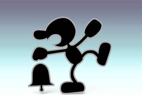
Here we are. Mr. Game & Watch is probably the character who should the easiest renders to rate, hands down... sort of... It's complicated. However, to compensate for his renders being so absolutely clear, they had to sacrifice any and all depth each render could have. Crappy puns aside, this is where most of us became acquainted with G&W, and not only that, but he's the most blankest of slates and thus has no real personality. What personality he does have is rather flat. But as far as we know, he rings bells. He'd love Notre Dame. With one foot in the air, his mouth is open, and a bell hanging from his left no right hand. Normally, I'd give higher marks for having a great silhouette but uh... he's... all silhouette...and uh... You know what, screw it.
4.5/10

Character Select Screen Portrait: CSSP

Image Link

I like his shadow on the backdrop and that he's doing this lean thing. That's pretty much it. (BTW, this marks the last CSSP we'll ever rate again.)
4.5/10

Brawl: :gw:

Image Link

Yes, this is legitimately his Brawl render... Oh, good Heavens what have I got myself into with this thread? It's exactly the same as his Melee render, and I mean EXACTLY. The model didn't even change! It didn't get better in any way... but it certainly didn't get any worse. But you know what? I'm deducting points for reusing the pose. This is lame.
4/10

Wii U/3DS: :4gaw:

Image Link

With Smash for Wii U and 3Ds comes a G&W with an updated design. I much prefer the new design. The old design could get run over by a bus for all I care. Not that the bus could flatten him anymore than he already is. Right out of the gate this pose is slightly more interesting. The overall shape of his design works much better as a silhouette.
6/10

Ultimate: :ultgnw:

HD Image Link

Let's be honest here: it might be impossible for Mr. Game & Watch to have any actual interesting renders, if not really rough form the get go. He breaks mediocre at best. But the number one flag? That's fun. I like the posing of the Wii U/3DS render better, but the flag barely evens it out.
6/10

Greatest to Least: :ultgnw: = :4gaw: > :gawmelee: = CSSP > :gw:

Goodness gracious we made it past Mr. Game & Watch through all the Melee characters! We're starting on the Brawl ones next!
 

Idon

Smash Legend
Joined
May 24, 2018
Messages
17,725
Location
Waxing Moon Ritual
NNID
Miyamoto Iori
Switch FC
SW-4826-9581-3305
... I don't even know where to start.

Literally all of them are 10/10 perfection. Praise be to Sakurai, the absolute genius.
 

TheTrueBrawler

Smash Demon
Joined
Jul 16, 2018
Messages
816
Location
Mystery
Mr Game and Watch's renders in order from best to worst:

Smash Ultimate
Smash Melee and Brawl
Smash 4

I grouped Smash Melee and Smash Brawl together because they're just too similar.
 

NintenRob

Rising YouTuber
Writing Team
Joined
Feb 8, 2014
Messages
5,517
Location
Australia
NNID
trpdm.wilton
I would personally rank brawl over Melee for having a more defined outline

And I refer having the bell and that pose, so I guess

Brawl > Melee > Ultimate > Wii U
 

Mogisthelioma

Smash Master
Joined
Aug 24, 2018
Messages
3,596
Location
Ravnica
Uhh.
:gawmelee:: 4/10: Nothing to interesting here.
:gw:: 5/10: Literally just the Melee one with a better outline.
:4gaw:: 7/10: He looks happy!
:ultgnw:: 8/10: The outline is less intrusive and he's holding the flag, which is also nice.

Also I think we skipped Chrom, unless we're doing all of the newcomers last, in that case never mind.
 

Sari

Editing Staff
Writing Team
Joined
Aug 3, 2014
Messages
4,439
Location
New Jersey
NNID
Villager49
Switch FC
SW-2215-0173-2152
Not really much to say about each specific one so I guess I'll just rank them by the order I like:

Ultimate > Brawl > Melee > SSB4 > Melee CSSP
 

VexTheHex

Smash Ace
Joined
Mar 30, 2018
Messages
567
This is a pretty boring one.

:gawmelee: - 5.5/10 - Simple though effective.
:gw: - 6.5/10 - Improved former one.
:4gaw: - 3/10 - Very boring and one note.
:ultgnw: - 6.5/10 - He put on some weight and has a flag now.
 

Kairyu24

Smash Cadet
Joined
Feb 7, 2016
Messages
46
:gawmelee: - 7 the pose is ''iconic'' for him, and it gets boosted because it isn't possible to be better.
:gw: - 7.1 yeah, slighty improved I guess?
:4gaw: - 5/10 - somewhat on the simple side
:ultgnw: - 6/10 I don't know guys, I think the bell is a more important item then the vlag for G&W. Okay the pose is nice, but we're so starved for content it pretty much depends on what them make him hold for me.
 

Alternis

Ignore the user in front of you
Joined
May 28, 2018
Messages
1,304
Location
Tartarus
NNID
GeneralO
Switch FC
SW-1137-6792-9994
:gawmelee:: 6/10 - It's decent. There's not a lot you can do with Mr. Game & Watch's posing, so this works.
:gw:: 4/10 - However, points will still be deducted for recycling the same pose. Come on guys.
:4gaw:: 8/10 - I like this one. He's not holding anything, but this one just looks good.
:ultgnw:: 6/10 - This one is weird, since he's holding a flag, like his u-tilt... except his u-tilt has been completely altered in this game. Now it's oddly out of place, so while I like the pose, it loses points for inconsistency.
 
Last edited:

Quetzal77

Smash Journeyman
Joined
Sep 6, 2014
Messages
300
NNID
yomugo
3DS FC
1349-4940-0147
:gawmelee:: the bell is great
:ultgnw:: the flag is great
:gw:: see above, but why copy/paste?
:4gaw:: no props?
 

NintendoKnight

Smash Lord
Joined
Oct 26, 2013
Messages
1,735
Location
Climbing the mountain I made from a molehill
NNID
Nin-Knight
He's the masked swordsman of dreamland, the most powerful warrior in the galaxy, and perhaps the shadow of Kirby's future: #27 Meta Knight

Brawl: :metaknight:

HQ Image Link

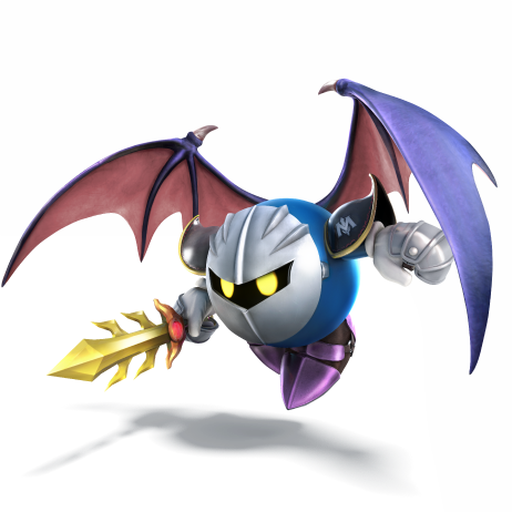
We've finally made it to Brawl! Here we have the first character added by the third entry in the series. This is actually a pretty decent pose for Meta Knight, right out of the gate. He looks battle ready, he's staring dead into the camera, and he even has an air of mystique about him. It's a strong first showing.
7.8/10

Wii U/3DS: :4metaknight:

Image Link

In Sm4sh, Meta Knight decided to let loose his wings for his render. As you can see by the shadow, he isn't even touching the floor. It is still a decent pose, but I definitely think there was still room for improvement. Also, is it just me, or is his sword smaller than the previous render?
7.4/10

Ultimate: :ultmetaknight:

Image Link

And finally, we have Ultimate! And I have to say, I love this render! Among all the renders for Ultimate, I definitely noticed that this one stood out when compared to previous renders. It's *so* good. It's like Meta Knight is saying (with his cheesy 4kids Spanish accent), "I'm going to cut you into a thousand pieces" and the fact that he can actually follow up said claim really shows the feel of this render. It's menacing, he looks very dangerous, and I love the sideways glance through the visor. Also, the little reflective glows on the ridge of his mask underneath his eyes is a SUPERB detail. The cape folds are also immaculate, and his sword is noticeably longer now!
9.6/10

Greatest to least: :ultmetaknight: > :metaknight: > :4metaknight:

Meta Knight has had some decent-pretty good renders as far as I'm concerned. What do you all think of the renders of this Meta Knightmare?
 
Last edited:

Vic Viper [FR]

Smash Rookie
Joined
Jan 13, 2019
Messages
13
:metaknight:7.5/10: Outside of the fact that he's wearing... boxing gloves? Cooking gloves? Well anyway outside of him not wearing gauntlets, it's a fine render with a nice cape flowing. Him looking ahead though feels less like he's looking at you than UltimateMK does, but that also could be because... there's not much to read already on his "face".
:4metaknight: 4.5/10: The 3D model itself is fine, and less angular than Brawl's, but the pose is so... whatever. It's already hard to show much personality without movement and with a mask on, and that render just doesn't do anything to make it better. It's really plain and boring, good thing Meta Knight has a striking design, however I much prefer him when he's not using his wings.
:ultmetaknight: 9/10: All the perks of the Brawl render with a more "intimidating" pose, more dramatic cape flowing, actual gauntlets, and him more explicitly looking directly at you as if he'd dare you to fight him.
 
Last edited:

Sari

Editing Staff
Writing Team
Joined
Aug 3, 2014
Messages
4,439
Location
New Jersey
NNID
Villager49
Switch FC
SW-2215-0173-2152
:metaknight:: 8.5/10 I always liked how intimidating this pose was.
:4metaknight:: 6/10 I like the changes to his model but I have no idea what he's trying to do in this pose.
:ultmetaknight:: 9/10 A fierce looking stance and the latest updated model make this the best MK render. The flowing cape is also great.

:ultmetaknight:>:metaknight:>:4metaknight:
 

Mogisthelioma

Smash Master
Joined
Aug 24, 2018
Messages
3,596
Location
Ravnica
:metaknight:: 8/10: Not much too it but it looks intense. I like the feel of it.
:4metaknight:: 7/10: It wasn't bad, but I like seeing MK focus on the viewer more.
:ultmetaknight:: 12/10: Amazing and super serious look, also bonus points for having great Galacta and Dark MK renders.
 

VexTheHex

Smash Ace
Joined
Mar 30, 2018
Messages
567
Oh, one of the most annoying characters to ever exist from his broken state in Brawl to his annoying sounds. At least his design isn't awful.

:metaknight: - 6.5/10 - Serious and straight forward.
:4metaknight: - 6/10 - The flying doesn't add as much as I'd expect or want, looks too graceful and less scary.
:ultmetaknight: - 9.5/10 - Pretty good direction to take him and fairly successful. Now if only they improved his sounds to be less obnoxious.
 

NintenRob

Rising YouTuber
Writing Team
Joined
Feb 8, 2014
Messages
5,517
Location
Australia
NNID
trpdm.wilton
I really like the flow and pose of the Brawl one. Ultimate is very dynamic but the position of the cape just seems weird.


Wii U is obviously the worst one
 

NintendoKnight

Smash Lord
Joined
Oct 26, 2013
Messages
1,735
Location
Climbing the mountain I made from a molehill
NNID
Nin-Knight
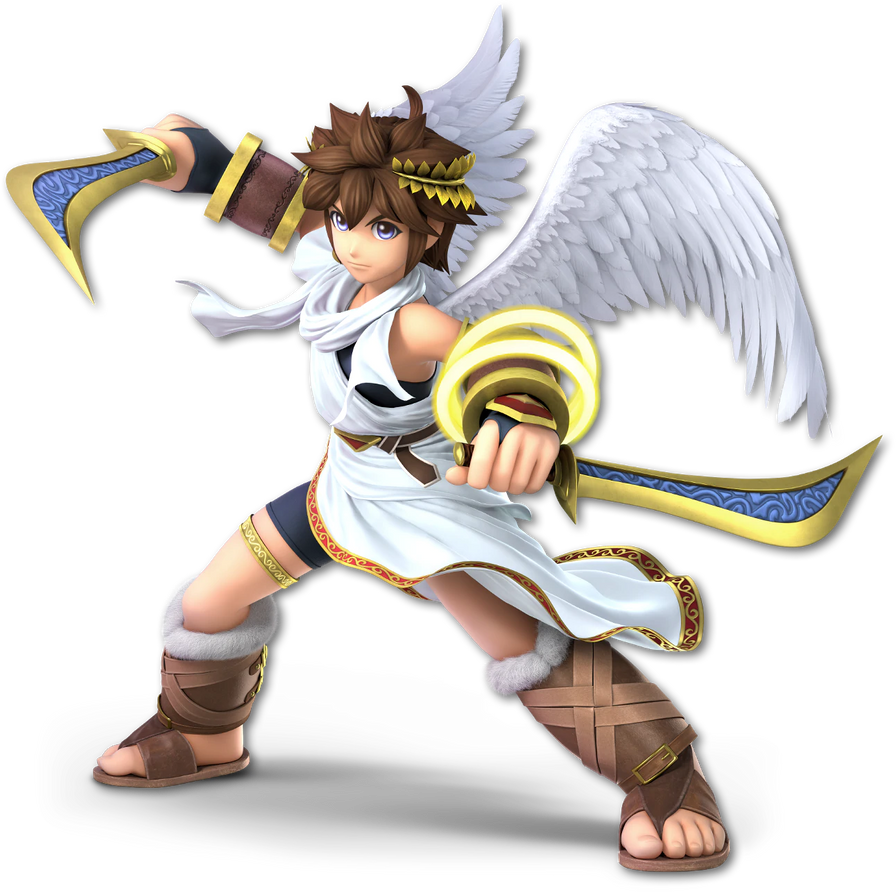
He's the captain of Palutena's guard, the flightless angel of Skyworld, the messenger of the light: #28 Pit

Brawl: :pit:

HQ Image Link

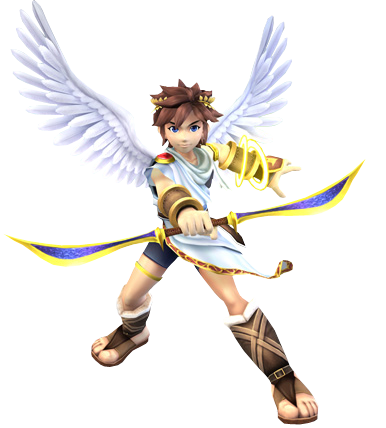
And now we finally have Pit! While I don't think his model is the greatest ever, I do think the silhouette is pretty phenomenal. All the negative space around his wings and feathers is super interesting. Also, the positioning of the bow in contrast to his wings is also neat. Though, his right foot (our left) looks a tad janky... He's standing on the ridge of the sandal.
8.3/10

Wii U/3DS: :4pit:

HQ Image Link

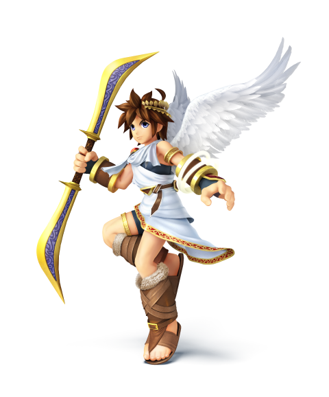
Now, though this particular render is less dynamic than the Brawl render, I like the flow of this pose better. He looks like he's floating gracefully down to the battlefield. I do wish that the rings of light on his wrist were a bit more yellow like in the Brawl render as they blend in to his wings a bit too much here. The wings looks absolutely fantastic here! Sure that's entirely on the part of the model, but it works really well render-wise.
8.7/10

Ultimate: :ultpit:

Image Link

Now, I will say that while I do like the Sm4sh render slightly more, I feel this one fits Pit a whole lot better than both his previous renders. He's finally split the bow up into the dual blades that make the bow interesting. It's like the entire gimmick of the weapon and it's finally being shown off here. You know how in Bloodborne and the RWBY series, each weapon has a "trick"-side to it where it has an alternate function/gun mode? Yeah, Pit's bow invented that crap. And it's about time they showed it off in his render. Also, his wrist rings are super glow and yellow again, yay!
9.2/10

Greatest to Least: :ultpit: > :4pit: > :pit:

Overall, Pit's renders have been pretty good. He's suffering from NA Kirby syndrome, but that's fine. Most characters aren't smiling in their renders, anyway.
 

Admiral Pit

Smash Hero
Joined
Feb 20, 2008
Messages
8,722
Location
Skyworld
NNID
GoldAngelPit
3DS FC
0903-2895-3694
*crashes in* Pit-kun! *cough* um, let me begin now.

Brawl :pit: 8.5/10

So here begins Pit. Honestly, it's been so long that I didn't even notice that this Pit seems like he has a bit of lip, at least compared to the others, or maybe it's just me. For the good things, I do like his pose, he looks happy and ready to fight. Them glowing rings are also awesome. As Nintendo Knight said above, Pit's right foot seemed a bit messed up in a way, as in he's not standing properly because of that. Come to think of it, I noticed his right hand, the one holding the bow, doesn't have the black glove-like thing on his hand like they do on the other Pit renders, which is strange and might bother me a bit. Regardless, this is a good entry to Pit's debut.


Smash 4 :4pit: 8.8/10

As Nintendo Knight said once again, I do like how graceful his pose looks here, although the rings look weaker from not glowing like they did in Brawl. However, other positives to this are the better details, including the fur-like details on his sandals, the red/gold part of his tunic and his leg ring has a more detailed design, the bow near the base is a tad thicker (also the patterns on the blue parts of the bow), and no explanation needed on the improved rains. Overall, the pose is pretty good and shows off his graceful and angelic side more.
My rating could've been higher if his arm rings were glowing better and had better colors though.


Ultimate: :ultpit: 10/10

Now here Pit definitely means business! Although I sometimes miss the "archer" side of Pit, but him having his bow into dual blade mode really is showing us that he's been adapting in combat well. Pretty all of his details have improved. The wings and the white part of his sandals look even fluffier than before, the rings on his arm are yellow again (although they don't have that glowing effect reflecting off his arm guard like Brawl's), the design on his leg ring is much clearer, the bow's gold and blue tone look better and more clean in this, and more! Even the little white part (I dont know what it's called) that's out and below Pit's right hand... the way it's position makes it seems like it's moving around, as if Pit literally was swinging his blade around so it'd look like that. There's also the red/gold pattern on his tunic that looks darker on the lower half likely due to his shadow or something. If this was the intention, then I like that little detail.

I did consider giving this a 9.5/10 rating due to the rings not showing some glow on his arm guard like they used to in Brawl, but his overall amazing details all over, his pose, and the fact that he's showing off his bow in dual blade form (and my Pit bias) essentially override that one downside. As I said before, this Pit means business.

So overall? :ultpit: > :4pit: > :pit:

I suppose my Pit bias is showing, but he just looks awesome in all those renders. So if I had to describe each of em, Brawl Pit would be the happy one with a tough pose (not counting that right leg problem), S4 Pit would definitely be the graceful one with his pose. and Ultimate Pit for well, seriousness and showing off that he is not just a mere archer with them dual blades out. All of em are amazing in their own right, but I definitely have to favor Ultimate Pit for the sheer amazing details all over him, and once again, them dual blades showing everyone that he means business.
:ultpit:
 

VexTheHex

Smash Ace
Joined
Mar 30, 2018
Messages
567
:pit: - 6/10 - Seeing as the guy hadn't shown up in ages, this was a nice showing and revival for him. The pose shows off his weapon and wings but the weapon aspect feels a bit forced like he is showing it off to a friend. But the biggest knock I have to give him is for his legs. That is one tiny knee. His feet are also pretty blocky/oddly shaped.

:4pit: - 9.5/10 - I actually really like this one. I feel the angelic float down for with his feet barely off the ground vibe is very nice and fitting for the angel. His limbs are still small but not nearly as jarring as his Brawl render and look quite a bit better. I can see and understand the complaint on his arm rings lacking color as they do end up blending more into the his overall white coloring on his clothes and wings. Still a very strong showing here.

:ultpit: - 10/10 - Interesting how dramatically improved the renders got with his limbs, hands, and feet. Seriously compare Brawl's feet to Ultimate's! Massive improvement on body shapes. He actually has shaped toes instead of a block with some shading to look like there is different shapes. Overall he also got a overall on his textures from the leather to the fluff on his attire. Lots of improvements all around. The pose is more aggressive, but it's good. I could take a more angelic pose, but I won't deduct for that as this one works well.
 
Last edited:

ssbashworld

AKA nirvanafan
Premium
Joined
Oct 14, 2016
Messages
2,758
Catch up time

:gawmelee:: 5/10
:gawmelee: cssp: 3/10
:gw:: 6/10
:4gaw:: 10/10
:ultgnw:: 8/10

:metaknight:: 6/10
:4metaknight:: 10/10
:ultmetaknight:: 9/10

:pit:: 5/10
:4pit:: 8/10
:ultpit:: 10/10
 

Mogisthelioma

Smash Master
Joined
Aug 24, 2018
Messages
3,596
Location
Ravnica
:pit:: 5/10: He looks dumb. Period.
:4pit:: 5/10: He still looks boring.
:ultpit:: 5/10: Why does he still have this expressionless face.
 

NintendoKnight

Smash Lord
Joined
Oct 26, 2013
Messages
1,735
Location
Climbing the mountain I made from a molehill
NNID
Nin-Knight
IT"S TIME FOR THE FINAL ECHO FIGHTER BONUS ROUND! (There's only two echo fighters we'll ever go over in this thread and this is the second)
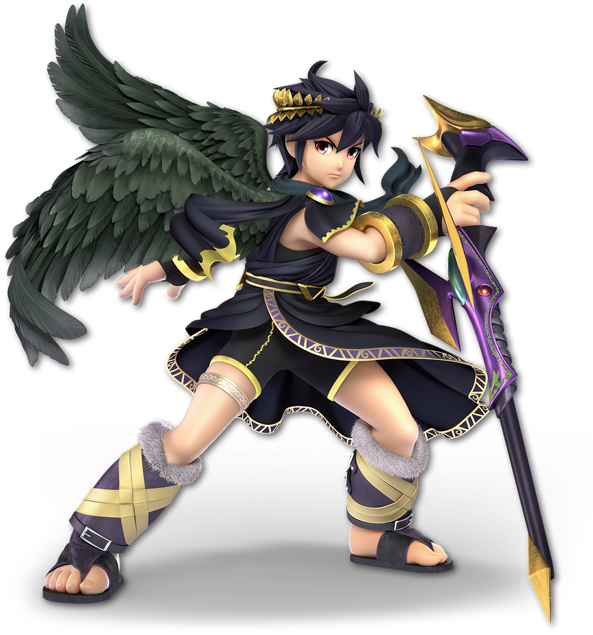
He's Pit's Dark dopplegangar, the independent spirit of a loyal angelic servant, and really not all that bad when you get to know him: 28ε Dark Pit

Wii U/3DS: :4darkpit:

Image Link

Unfortunately, with all the ire this character earned when it was revealed that he would be taking a spot on the roster—it reignited the Clone Wars that Lucina had just barely managed to avoid causing—Dark Pit brought a not-so-great render for him to be represented by. He's just standing there... not menacingly... With his staff extended out and that edgy-boy attitude look on his face, it's really nothing special.
4.5/10

Ultimate: :ultdarkpit:

Image Link

Now that's a good looking render, and even better it looks pretty good when contrasted with Pit's render. It really goes with the two sides of the same coin sort of aspect to the character. We got a stronger pose, he's actually doing something, he's holding the staff in a really cool way, and he doesn't look so edgy as opposed to just looking battle-ready. Overall, it's pretty great.
8.8/10

One over the other: :ultdarkpit: > :4darkpit:

What do you guys think of Pittoo's renders? Are you glad we won't be going over any Echo Fighters anymore?
 
Last edited:

Sari

Editing Staff
Writing Team
Joined
Aug 3, 2014
Messages
4,439
Location
New Jersey
NNID
Villager49
Switch FC
SW-2215-0173-2152
:4darkpit:: 5/10 Stiff pose that looks really edgy. Also his right fist looks really out of place for some reason.
:ultdarkpit:: 8.5/10 Definitely a more expressive pose that suits Dark Pit more.
 

osby

Smash Obsessed
Joined
Apr 25, 2018
Messages
24,013
:4darkpit:: 7/10. It fills its purpose for what it is. Could be better, could be worse.
:ultdarkpit:: 9/10. Dark Pit is a wild card and it really shows in this render. Asymmetric pose, wings in motion, wind effect, his staff in reverse grip... I can gush about this render a lot, it's one of my favorites.
 

Mogisthelioma

Smash Master
Joined
Aug 24, 2018
Messages
3,596
Location
Ravnica
:4darkpit:: 6/10: Looks a lot like Pit's but at least he has the cool staff
:ultdarkpit:: 6/10: It looks like Pit's current one but he's facing the other direction. At least it's more intense.
 

slamallama

Smash Journeyman
Joined
Oct 3, 2018
Messages
268
Location
the cold void of space
Automatic -0.5 for teasing his signature staff when he can only actually use it during his Final Smash.

:4darkpit: 2.5/10: Very basic. He doesn't look dangerous or menacing or even moody, just sort of angry. And for someone who looks so angry, he's not doing much with his body. Feels robotic.

:ultdarkpit: 6/10: Much better! I feel like kind of having his back to us rather than staring head-on is more his style- and look at the flowiness on his tunic and wings! But... what's going on here? He's holding the staff like a walking stick but posing like he's ready for battle.
 
Last edited:

NintendoKnight

Smash Lord
Joined
Oct 26, 2013
Messages
1,735
Location
Climbing the mountain I made from a molehill
NNID
Nin-Knight
She's the warrior within, the heiress to the Chozo, and intergalactic bounty hunter supreme WITHOUT her armor: #29 Zero Suit Samus

Brawl: :zerosuitsamus:

Image Link
Bonus HQ Image Link (Early Announcement Art) (Could've done this with Mario, Link, Meta Knight, or Pit—and Pit's is the most notably different from the original—but the image quality was really good that tI had to post it... Why were images for Brawl ZSS really easy to find? Also, remember when we thought her whip was a lightsaber? Good times...)

As the second character to the Metroid series in Smash, Zero Suit Samus joins us in her first pose. Now, right off the bat, it's clear she's not standing on anything. She's sort of doing this floating thing... which perfectly matches all of Power-suitless Samus' poses from her home series. Really nice silhouette here... she's really curvy... She also has this whimsical smile that betrays much of the head canon of Samus and really shows off her true personality: loaded with confidence.
7.5/10

Wii U/3DS: :4zss:

Image Link

I have to comment on the sheer difference in quality between ZSS' character models between Brawl and Sm4sh, because holy cow does she look SO MUCH BETTER IN SM4SH. *Ahem* but that's beside the point; we're judging her pose, not the quality of the model. She has a somewhat similar, although slightly adjusted and varied, version of the Brawl render now that I look at it. She's still doing the raised knee thing she did in Brawl, but this time she looks more concerned. The smile is gone, and her eyes are off to the side scanning for potential danger. He left arm is now raised defensively while the right arm has lowered for versatility in switching stances. She looks much more battle focused. Not as curvy as the last one... sorta. Her hips and below but above the shins are NOT STRAIGHT LINES, I TELL YA HWAT.
7.5/10

Ultimate: :ultzss:

Image Link

Right off the bat, I love this pose. She actually looks like she's gonna shoot a fool. It's not whimsical like Brawl's, and it's not cautious like Sm4sh's: it's ready to pull the trigger at the drop of a hat. Love the flow in her hair, the look of confidence in her face (though not quite a smile, it doesn't look concerned at least), and I love the feel that she saw something odd in the corner of her eye and just whipped around (pun not intended) and pointed the Paralyzer at the target. Now, for points of definition: the muscles in her legs, goodness gracious great balls of fire! I also like the glow of her jet boots. It looks fantastic.
9.2/10

Greatest to least: :ultzss: > :4zss: = :zerosuitsamus:

What do you guys think of Zero Suit Samus' renders over the years?
 
Top Bottom