i like it, too much empty space, and the text/white line bug me
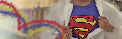
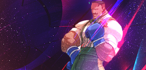
wow, been a while lol, this i something i found while looking through older stuff, did a little touching up
still a work in progress though
I'm gonna have to agree with Neon Ness, here. While it seems like you did a lot, there could be a lot done with it. The lighting source could be improved; that bright ball of white on the left side feels real forced and the goal of the game is to make it feel natural. It is also on the wrong side of superman. While I don't agree with Neon Ness about needing to burn to create the focal (I can see some blurring around the arms), burning might be fun to play with if you want to keep your current light source. Otherwise, remove it and place it on the top right corner.
I notice a real awkward C4D on the right side of Superman. It just seems like it's floating and, since it really doesn't add much to the signature besides filling negative space, I'd suggest taking it off.
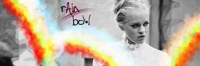
You might want to sharpen bits around the signature; outside of the Superman logo, everything seems way too bury for comfort. I know that bluing is used to create a focal, fine, but the goal of the game is to make the blurring seem natural and, by sharpening, you'll make it seem a little less forced. Another personal tactic of mine would be to copy render, place it on top, and play with opacity and blending till you get something that keeps the effect, but makes the render stand out a bit from the blurry smudging.
The brushes, while a cool idea, might be better done with pentooling. It takes much less room than the brushing and it just seems a bit less haphazard. You also might try moving it to the logo as seeing those really blurry lines come in contact with a real sharp image just doesn't flow in my mind. Heck, if you want to take Neon's advice and make the lines a rainbow, maybe making the edges of the logo glow with some brushing on soft light would look cool and give some meaning to those lines besides flow.
Other than this, you might just wanna play with gradient maps and such. Good start, but it seems incomplete.


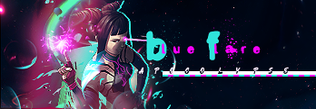


 It looks better to me without that distracting word in the dead center.