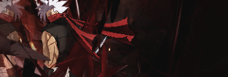
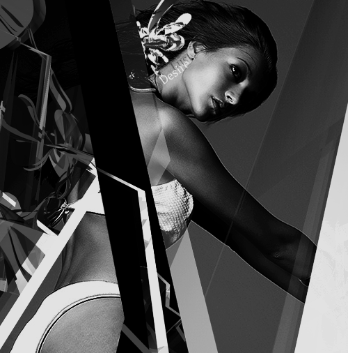
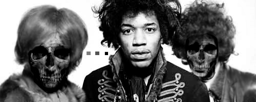
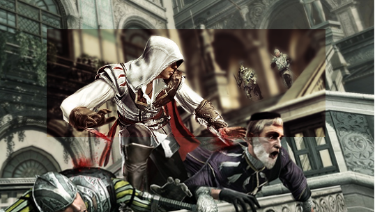
Well I like it, the skulls seems a little out of place to me though, like it's not blended in well. I can see the outlines of where they are cut off.
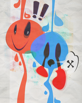
Yeah, I agree with this. Because the skulls are sharp and in focus while the people they were superimposed onto are blurry, it sort of breaks the illusion factor. If it's possible to sharpen the people on the side it'd look great. The third square bothers me, though. Why is it a different size than the others?
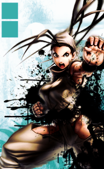
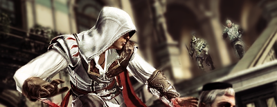
The lighting is great throughout, and makes for interesting contrast. There's some odd depth, though. The leftmost person is blurry and slightly shorter than the middle person, which makes them look farther away, yet looking at the shoulders they're somehow in front of him? That's the only real big issue there with the composition... I'd also like the background to have something other than just plain white.
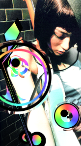
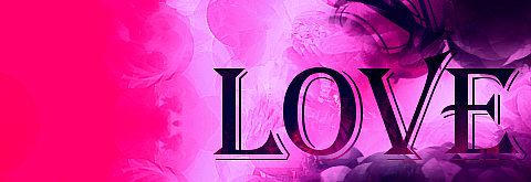
@ Onyx Vulpine: It's not bad. That font is sort of blah. I don't particularly care for serif fonts in sigs generally, most of the time simpler typefaces work better. The letters are also really thick and bold, but I'm not sure if it fits so well. I wish the blue curve wasn't cut off at the bottom; I'd also like to see a few more of them. The smudging looks random, but it's good you were at least trying things out with it. Smudge tool's hard to get right. @__@
The border looks unnecessary. I think it's fine without it. There basically just needs to be more designs to make us want to look at it.
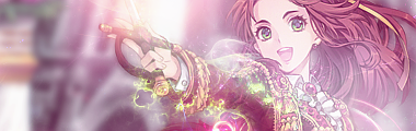
@ Hentai: I don't see much wrong with the depth. Only thing is, to have "Hentai King" and also "Welcome to the world of hentai" seems... redundant, I guess. The designs and lighting are pretty incredible.

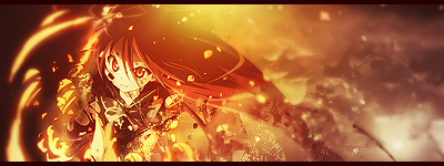


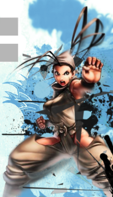
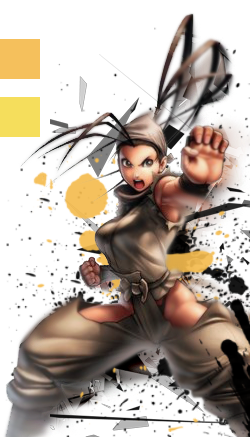
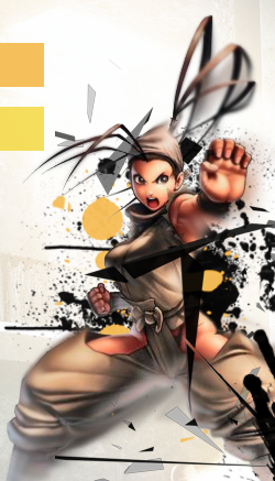
 It's not as easy as it sounds to make a monotoned piece work well, but it has just enough variation (yellow/sandy colors) to make it interesting. I don't think it needs other colors, personally. The depth is very well done, and the negative space really works.
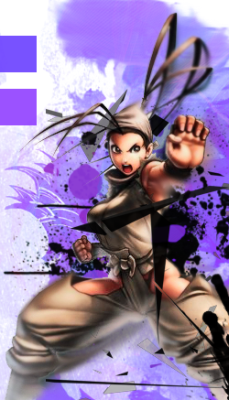
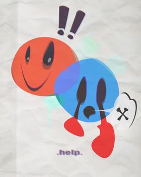


")