• Welcome to Smashboards, the world's largest Super Smash Brothers community! Over 250,000 Smash Bros. fans from around the world have come to discuss these great games in over 19 million posts!

    You are currently viewing our boards as a visitor. Click here to sign up right now and start on your path in the Smash community!

Sugarpoultry's Homeroom /[Graphics School]\

sugarpoultry

BRoomer
BRoomer
Joined
Jul 10, 2007
Messages
3,369
Location
West Jordan, Utah


This is going to be a school of graphic design, mostly signature making. I decided since my shop is busy and signatures are so high in demand, why not teach people how to make their own high quality signatures.


_____
The number one rule:
[No spamming, graphic students only.]
Alrighty, to get started I would like to know what type of experience you have, so I'm going to have you answer a few questions.
[ Send your questions to me with your request to be my student in a PM. ]

+
What version of Photoshop do you have?


+ How long have you been using Photoshop?

+ How familiar are you with all the different menus and tools there are? Which ones do you use most often?
_____
+ Colenstien
+ Duker
+ Evelgest
+ BHLMRO+ Ice_Dragon
+ Crescendolls
+ SgtWikez
+ IceEmblem
+ skyler123456789
+ Teh Uber Parachuter
+ PinkPwnageFrenzy
+ Omega Nintendo Dude
+ hugglebunny
+ SpeedySonicToonLucarioTrainer
+ burntsocks
+ Maraphy
+ tag yeah

No Spots Left
_______


||Resources||
To better help my beloved students... I will provide a list of resources that will help you with photoshop/GIMP.

SWF Tutorial/Resource Archive, there are GIMP tuts in here as well.
http://smashboards.com/showthread.php?t=47714

HUGE HUGE TUTORIAL RESOURCE** I highly recommend you download some of these. It has pretty much everything you can cover for PS graphics.

Permission from Marthmaster92, Basic C4D use instructions.
Basic C4D Usage Tutorial by ~CobraGFX on deviantART

This is also my own personal tutorials I suggest you use.
http://img231.imageshack.us/img231/1381/pirateanimetutorialcopyvy6.png
http://fc04.deviantart.com/fs30/f/2008/079/b/f/Venom_Grunge_Tutorial_by_sugarpoultry.png
http://img147.imageshack.us/img147/8053/sigtutbysugarpoultrycoptq7.png

Check out Guild Inn, it has everything you need as well.

Image Hosting: Go to www.imageshack.org. Its free and you don't have to sign up. ^_^ It's what I use.

C4Ds - For those who are clueless. ;)
http://browse.deviantart.com/resources/applications/cinema4d/?order=9&alltime=yes
http://planetrenders.net/renders/thumbnails.php?album=1

PS Brushes
http://browse.deviantart.com/resources/applications/psbrushes/?order=9&alltime=yes
Just a bit of everything tutorial. Clipping masks, C4D's, etc.
_____

A s s i g n m e n t # 1:
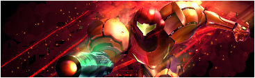
Create a 367 x 113 Signature with a 1 pixel border, and use this render. No text please.

Make sure to note all of your steps, because when you post your signature you are going to post the steps along with it. Also, save your image as a .PSD when you are finished, so that you may edit the changes that I suggest when I critique your piece. Have fun! Be creative!

And don't worry, I'll be doing assignments right along side you guys. ^_^

A s s i g n m e n t # 2:
Alrighty, round 2! This time I want you guys to get used to working with tutorials. I'll list a few that you can choose from, they are pretty easy, step by step, for both Photoshop and GIMP users. Feel free to PM me questions. Pick 1 tutorial and stick with it.

Photoshop:
GIMP:
When you choose your tutorial, please tell me which one you did.

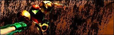
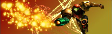
Here are the renders I would like you to use. Make sure you pick one that will work well with the tutorial you choose.
1, 2, 3, 4

A s s i g n m e n t # 3:
I want you to visit these sites:
stock.xchngCobra's Resource PhotobucketGFXsource.com stocks/photosTeam-Huggles-Stocks' PhotobucketcP-AnG3L's Photobucket
Look around, collect many things into your sig library, make a folder or something. Then I want you to choose 3 times from each and put them in your sig for your assignment.

You have to have a stock and a C4D. (Note: A stock is different then a render. Renders are cut out, stocks have backgrounds with them.)

You have to use both of these in your assignment, make it 400 x 150. You have complete freedom on this assignment, use any combination of C4D and stock you would like. You can even add simple effects such as clipping masks, gradients, soft brush lighting, etc.

You don't have to use a tutorial for the whole sig, but many of you don't know how to use a C4D at all, so this tutorial will show you (courtesy of Marthmaster92).
 

Grandeza

Smash Master
Joined
Nov 11, 2007
Messages
4,035
Location
Brooklyn,New York
Assignment 1-


step 1- Gradient background
step2-Filter>render>nature>flame(toyed with brightness and contrast)
step3- cut out render
step 4- spark brush
step 5-used pencil tool to do a black one pixel border.
*gimp doesnt allow saving as a psd so i saved as png*

edit-**** i forgot 1 pixel border, sorry disregard please....


redo-
 

Duker

Smash Journeyman
Joined
Dec 10, 2006
Messages
226
Location
The Cold north
Heh, don't think I need schooling, but there's always room for improvement =).

It's getting late now, but I'll send you my resumé tomorrow.

Just one question, how detailed do you want the notes to be? I've just begun and I'm already to point 10, and it could've easily been twice that.

Guess I could've asked that in the PM, but it should be of interest for others too.
 

Lucas_User

Smash Journeyman
Joined
Jan 13, 2008
Messages
471
Wow, this seems interesting! [:
Too bad I dont know how to make sigs. :[
 

Duker

Smash Journeyman
Joined
Dec 10, 2006
Messages
226
Location
The Cold north
My application haven't been processed yet, but I hope it's ok to go ahead and post anyway.


The changes is always done on a new layer unless noted.

I also save the .PSD very frequently, but it's unnecesseary to add to the list I hope :p.

'Added' will be used frequenty, please deal with it :p .

R&P=Resize and Position

1. Made the frame.
2. Added the render, R&P.
3. Made a basic gradient as background.
4. Added some brushes.
5. Added a soft inner and outer glow on the render. The inner is softer.
6. Added a C4D, R&P, recoloured and lowered opacity.
7. Duplicated C4D layer and repositioned.
8. Render -> Clouds (was lucky, got good clouds on second try), and Sumi-e to that. Put mode to Soft Light and put the layer just below the frame.
9. Added Gradient Map and set to to 20-ish %.
10. Dublicated render, put copy to overlay and lowered the opacity a tad.
11. Added more brushes
12. Duplicated render again, put it ontop of the other duplicates. Gaussian blurred, lowered opacity and put mode to the option below Linear Light (Don't know the english name for it).
13. Added one more C4D, R&P and recolour.
14. Duplicated Sumi-e layer, set to overlay and lowered opacity.
15. Added a Gradient Overlay, set it to Overlay and lowered opacity.
16. Added a Colour Balance layer.
17. New layer -> Apply Image. Gaussianblurred and set to Screen (I think, called "raster" in my ver).
18. Added Layer Mask to the applied image and used a soft 40-45% brush to hide some at shadowed areas of the render.
19. Couldn't think of any anything more to add and saved as .png .


I've just got to ask, why such weird dimensions?
 

sugarpoultry

BRoomer
BRoomer
Joined
Jul 10, 2007
Messages
3,369
Location
West Jordan, Utah
@Jem.: Huh what? DL? Not even sure what that is.

I'll start on your assignments too. All those who PMed me will be added to the list of students, you can start working on your assignments right away.

And people, please don't comment or ask questions in this thread, this is only for actual students and me. Any questions and comments PLEASE PM me.

Assignment 1-


step 1- Gradient background
step2-Filter>render>nature>flame(toyed with brightness and contrast)
step3- cut out render
step 4- spark brush
step 5-used pencil tool to do a black one pixel border.
*gimp doesnt allow saving as a psd so i saved as png*

edit-**** i forgot 1 pixel border, sorry disregard please....


redo-
Alrighty, well, first off I'll say its very good. But you have 2 types of effects going on in different places. Both look good alone, but when put together it doesn't quite match ya know? There is a lot of flow and focus coming from the lights that she seems to be shooting out, and thats great, but the effects behind her don't match that flow.

I might suggest putting the effects closer to the render one on each side of Samus, and then blending them in. The white dots coming from the the gun are good, but there might be too many. I would also put more light coming from the gun, so it looks more like she's actually shooting them out. Keep them closer to the gun too.

Background is a bit plain, and if you notice you have the lighter section of the gradient on the bottom, when light is hitting Samus from the top. Always make sure your source of light stays consistent in your sig. Light is shining on top of Samus, so I'd move the gradient to the top or add more light shining down on top of her.

Also, you can save it as a GIMP file to open later, it has a different extension, not sure what it is, but just so you can go back and edit it.

My application haven't been processed yet, but I hope it's ok to go ahead and post anyway.


The changes is always done on a new layer unless noted.

I also save the .PSD very frequently, but it's unnecesseary to add to the list I hope :p.

'Added' will be used frequenty, please deal with it :p .

R&P=Resize and Position

1. Made the frame.
2. Added the render, R&P.
3. Made a basic gradient as background.
4. Added some brushes.
5. Added a soft inner and outer glow on the render. The inner is softer.
6. Added a C4D, R&P, recoloured and lowered opacity.
7. Duplicated C4D layer and repositioned.
8. Render -> Clouds (was lucky, got good clouds on second try), and Sumi-e to that. Put mode to Soft Light and put the layer just below the frame.
9. Added Gradient Map and set to to 20-ish %.
10. Dublicated render, put copy to overlay and lowered the opacity a tad.
11. Added more brushes
12. Duplicated render again, put it ontop of the other duplicates. Gaussian blurred, lowered opacity and put mode to the option below Linear Light (Don't know the english name for it).
13. Added one more C4D, R&P and recolour.
14. Duplicated Sumi-e layer, set to overlay and lowered opacity.
15. Added a Gradient Overlay, set it to Overlay and lowered opacity.
16. Added a Colour Balance layer.
17. New layer -> Apply Image. Gaussianblurred and set to Screen (I think, called "raster" in my ver).
18. Added Layer Mask to the applied image and used a soft 40-45% brush to hide some at shadowed areas of the render.
19. Couldn't think of any anything more to add and saved as .png .


I've just got to ask, why such weird dimensions?
Wow, that is a lot of steps for a relativity easy looking sig, but it worked out very nicely. To answer your question about the size, I just wanted it smaller, its weird dimensions but I played around with a size I wanted and those just happened to be the numbers. :p

I'm glad you make a good use of layers. Layers are KEY my students. Always, when it doubt, make a new layer...

The C4D looks nice, the flow is great, the lighting is a bit much. Like I told Grandeza, the light his hitting her from the top, which means that is where your light source needs to be. You already have some on top, but too much on the bottom. I know you are trying to get the effect that light is coming from behind her, but the render says otherwise, unless you change the renders lighting by using your dodge tool. Same with the darkening tool (name slips my mind, but I'm sure you know what I'm talking about.) Just make sure it looks good. :)

The colors match the render well, done very nicely. Nice use of gradient maps as well.


Good job to both of you. You can now take my advice and tweak your sigs. If its too much of a hastle, work with what you can and repost your images. I look forward to seeing more assignments from the newly added students. ^_^


EDIT: Grandeza, they are basically special effects renders. You can google or search on planetrenders or deviantart to find a bunch. :)
 

sugarpoultry

BRoomer
BRoomer
Joined
Jul 10, 2007
Messages
3,369
Location
West Jordan, Utah
Just use a blending tool and blend the effects into or over Samus, that way she seems more involved with them. Just don't do it too much.
 

Colenstien

Smash Ace
Joined
Aug 23, 2007
Messages
838
Location
:noitacoL
#1:

I like this one! I used some brushes that I found after about three hours of searching.

Steps:
1) I used a black and white gradient to make a lighting effect.
2) Placed render (duh :p)
3) Placed the the back-fore ground by using a wing effect brush.
4) Used 3 different brushes to create the liney things.
5) Placed border.
6) Enjoy with martinis by the beach.
 

sugarpoultry

BRoomer
BRoomer
Joined
Jul 10, 2007
Messages
3,369
Location
West Jordan, Utah
#1:

I like this one! I used some brushes that I found after about three hours of searching.

Steps:
1) I used a black and white gradient to make a lighting effect.
2) Placed render (duh :p)
3) Placed the the back-fore ground by using a wing effect brush.
4) Used 3 different brushes to create the liney things.
5) Placed border.
6) Enjoy with martinis by the beach.
The lighting problem is still there, your light source is coming from the left when the light on Samus is coming more from the top. The brushes look good but they are very random. Maybe if they were smaller and closer to the render.

FLOW... There is a certain flow you need to find in ever sig. How do you find it? Where is she facing? What direction is her gun pointing? Most effects should point in that direction. Each character has a flow, you need to find it and go with it. ;) ** Especially when you use effects**

I also highly recommend using C4D's for effects instead of brushes, but thats just me.

The background color doesn't match the sig at all, I'd try to match the colors as best as possible, and then add newer colors last to spice it up. Thats when you can use some brushes.

Anyways, I promised I would show my work along with you guys, so here is mine.

Basically, all the steps I had was to follow this tut:
http://img218.imageshack.us/img218/1425/ironmantutsc2iw2.jpg
BTW, clew. The next assignment is going to be working with tutorials... ^_^ They need to be learned. :D
 

Duker

Smash Journeyman
Joined
Dec 10, 2006
Messages
226
Location
The Cold north
.. do you WANT to pay Kenta? I mean, no problem with going to a graphical school, but looking for one specifically to pay for it seems a bit weird to me... :p
[/off-topic]

Anyway, tried to better the lightning a bit, and add text:

A grand total of 21 layers.

Beh, it feels like I'm getting better in general, but worse and worse with text.
 

sugarpoultry

BRoomer
BRoomer
Joined
Jul 10, 2007
Messages
3,369
Location
West Jordan, Utah


I see.... no difference whatsoever. All I see is added text (which I asked for none.)

Most of these changes needs to be drastic. Sometimes you might even need to do the sig over, its all part of learning. Not to say your sig was horrible and you fail this assignment, its just I want to each you basic principles you need to remember when you make a sig, and right now, you have everything down but lighting.

Hmmm.... I'd say try again. Remove the light completely from behind her and try focusing the light coming from behind her upper body.
 

Duker

Smash Journeyman
Joined
Dec 10, 2006
Messages
226
Location
The Cold north
Firstly, there's a difference...

Can you see it now? It's not "drastic", but it's there. It looked like a pretty big difference when I switched between with and without change, guess I was wrong.

Secondly, I thought of the assignment as finished and that I therefore could alter it however I wanted, in this case adding text to try to cover some of the dead space <.<" .
Thirdly... I had no third thing


Back to the drawingboard... got some lightning issues to fix.


Edit: It did look ALOT better when most of the lightning at her feet was removed... great tip Sensei-san.
 

Evelgest

Smash Apprentice
Joined
Feb 5, 2008
Messages
196
Sorry, I've been busy these last few days. Thankfully it's Spring Break next week.

Here's my assignment.

Note: I might have missed some things in my description of how this was made. I had it on Notepad, and my computer froze on me, and I had to reboot, so I lost it. I had to write it again off of my psd, so I'm afraid it's not very detailed.

Could use some work, but here it is.


Opened New Document.
Filled it black.
Added render, resized, adjusted angle.
Duplicated render layer 4 times.
Hide all but 1, begin smudging.
Added Sharpen Filter to make clearer.
New layer, brushed a little behind Samus in the direction of the light.
Set to linear dodge.
Smudged next render layer with different brush size.
Added Curves Adjustment Layer with Strong Contrast.
New layer, apply image.
Added Wave Filter - Square. Smudged from top right to bottom left.
Erased some parts that I didn't like.
Added Color Adjustment Layer, set mid-tones, highlights.
New Layer - Brushed around Samus, erased some parts covering Samus.
Added Motion Blur, moved it a bit, erased parts on focal.
Added 1px border.

Now that I have free time, hit me with another assignment, sugarpoultry!

Oh, is there a certain number of posts I have to reach so that my sig shows? Sometimes I see it, sometimes I don't. I find it odd.
 

sugarpoultry

BRoomer
BRoomer
Joined
Jul 10, 2007
Messages
3,369
Location
West Jordan, Utah
Sorry, I've been busy these last few days. Thankfully it's Spring Break next week.

Here's my assignment.

Note: I might have missed some things in my description of how this was made. I had it on Notepad, and my computer froze on me, and I had to reboot, so I lost it. I had to write it again off of my psd, so I'm afraid it's not very detailed.

Could use some work, but here it is.


Opened New Document.
Filled it black.
Added render, resized, adjusted angle.
Duplicated render layer 4 times.
Hide all but 1, begin smudging.
Added Sharpen Filter to make clearer.
New layer, brushed a little behind Samus in the direction of the light.
Set to linear dodge.
Smudged next render layer with different brush size.
Added Curves Adjustment Layer with Strong Contrast.
New layer, apply image.
Added Wave Filter - Square. Smudged from top right to bottom left.
Erased some parts that I didn't like.
Added Color Adjustment Layer, set mid-tones, highlights.
New Layer - Brushed around Samus, erased some parts covering Samus.
Added Motion Blur, moved it a bit, erased parts on focal.
Added 1px border.

Now that I have free time, hit me with another assignment, sugarpoultry!

Oh, is there a certain number of posts I have to reach so that my sig shows? Sometimes I see it, sometimes I don't. I find it odd.
Wow, very nicely done! The lighting is excellent and the colors match very well. I love the steps you took, tutorial or just experimenting?

The effects in the background are nice, the angle is good. C4D correct? Try blurring the background a bit (mostly behind her) to add more debth, like Samus is sticking out more as well as the lines and effects.

I would change the border to black rather than the white. You don't have to, I'm just not a fan of white borders unless the entire signature is light to begin with.

I would suggest maybe a soft yellow light coming and shining on top of her, but not too much, just so the light spots on her armor have reason for being there.

Very nice job! Try those suggestions and post your work again. Hopefully it works out for ya!

I'd start the next assignment, as soon as ThePUNK submits his assignment. I want to keep everyone in the class on the same page. If he takes too long I'll assign the next one. Colenstien also needs to resubmit his work and add the changes I suggested.

I'll PM ThePUNK today.
 

Evelgest

Smash Apprentice
Joined
Feb 5, 2008
Messages
196
Wow, very nicely done! The lighting is excellent and the colors match very well. I love the steps you took, tutorial or just experimenting?

The effects in the background are nice, the angle is good. C4D correct? Try blurring the background a bit (mostly behind her) to add more debth, like Samus is sticking out more as well as the lines and effects.

I would change the border to black rather than the white. You don't have to, I'm just not a fan of white borders unless the entire signature is light to begin with.

I would suggest maybe a soft yellow light coming and shining on top of her, but not too much, just so the light spots on her armor have reason for being there.

Very nice job! Try those suggestions and post your work again. Hopefully it works out for ya!

I'd start the next assignment, as soon as ThePUNK submits his assignment. I want to keep everyone in the class on the same page. If he takes too long I'll assign the next one. Colenstien also needs to resubmit his work and add the changes I suggested.

I'll PM ThePUNK today.
Yeah, tutorial.. :p let me know if you want to see it, I can find it again.

I'll try to add your suggestions. Thanks a bunch.
 

Colenstien

Smash Ace
Joined
Aug 23, 2007
Messages
838
Location
:noitacoL
*Trys to bribe Sugar with apple*

I redid it.

#1 Darkend and contrasted the render.
#2 Added the orange and black
#3 Created the cannon effect.
 

sugarpoultry

BRoomer
BRoomer
Joined
Jul 10, 2007
Messages
3,369
Location
West Jordan, Utah
Wing-Zero, you can join, just follow the instructions from the first post, PM me, and I'll see if I can help ya. :)

Colenstien, I hope this isn't very discouraging, but I like the first one better. Its very choppy, the background is anyways. The lighting behind the black stuff is ok. Try blending it or blurring the background some more. Just use the blur/blend tools and play around and see what you can do. :)

Ok, all is left is ThePUNK, and then the next assignment will be posted. :)
 

Colenstien

Smash Ace
Joined
Aug 23, 2007
Messages
838
Location
:noitacoL
Colenstien, I hope this isn't very discouraging, but I like the first one better. Its very choppy, the background is anyways. The lighting behind the black stuff is ok. Try blending it or blurring the background some more. Just use the blur/blend tools and play around and see what you can do. :)
Don't worry about discouraging me. I'm here to learn :). Besides, you can't be any worse than the gym teachers at my school. Yelling at me for not climbing that dammed rope. Rope burn hurts! :(

Okay. I tried one more time. Sorry to take up som much space. :ohwell:


Blurred background and buffed out Samus' edges.
 

sugarpoultry

BRoomer
BRoomer
Joined
Jul 10, 2007
Messages
3,369
Location
West Jordan, Utah
Don't worry about discouraging me. I'm here to learn :). Besides, you can't be any worse than the gym teachers at my school. Yelling at me for not climbing that dammed rope. Rope burn hurts! :(

Okay. I tried one more time. Sorry to take up som much space. :ohwell:


Blurred background and buffed out Samus' edges.
That looks much better. Great improvement. :) Notice its not as choppy of a background. I'd experiments with some C4D's and some brush effects, you don't have to post it of course, but just go crazy with experimenting. :) That is how I learned the most.


Alrighty class, I'm not sure about ThePUNK, and I've already talked to BHLMRO, so hopefully tomorrow I can put up the next assignment. I suppose some people will just have to be behind. ;)
 

Mechageo

Smash Ace
Joined
Apr 11, 2005
Messages
626
Location
Utah
I got the go-ahead via PM to start on assignment one, so here it is!


Here's what I did, I missed some things though, I got too into it and realized I'd forgotten to log what I was doing a few times.

Gradiant background
layer style- outer glow (screen)
Render Fibers
Difuse Glow
Smart Blur
Brush tool
Crystalize
Change layer to Overlay
Render Clouds
Brush tool
Motion blur
Smudge
Cut and edit of original image
 
Top Bottom