O D I N
Smash Hero
- Joined
- Mar 13, 2005
- Messages
- 7,408
- 3DS FC
- 4098-3123-8629
nair to ground attacks works wonders. Nair to ftilt, nair to jabs, nair to fsmash, u smash, etc. It's too good.

Welcome to Smashboards, the world's largest Super Smash Brothers community! Over 250,000 Smash Bros. fans from around the world have come to discuss these great games in over 19 million posts!
You are currently viewing our boards as a visitor. Click here to sign up right now and start on your path in the Smash community!
This is why I came here. I really want to do that, just I can't figure it out with Smudging and Clipping masks. I say some assistance in anyway.Have you tried smudging? So far, it looks really good. I like your C4d usage. Easy backgrounds can be attained through copying your render, and doing some different smudging. Same with clipping masks and certain splatter brushes.


 The flow is nice, as are the colors, and nice lighting. :D I like it when people experiment with the tuts.
 ") I'd suggest that the render be brought out more, take out the text or bring it out more. Pick a different font though. You can find all of those resources there. Also, check the first post.... recourses are all listed.
I'd suggest that the render be brought out more, take out the text or bring it out more. Pick a different font though. You can find all of those resources there. Also, check the first post.... recourses are all listed. 
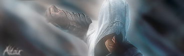
I don't know if I stretched the render. I did resize it and flip it so he faced a different direction, and it's possible I might have stretched it slightly without noticing. The font was just a throw away, really. I was going to just put the assassin's creed logo thing. My original was a tad darker (which made the render stand out a bit more), but I think photobucket made it look lighter than I intended. Darn internet hosting. Thanks for the critiqueCrescendolls: It's not bad, but I wouldn't stretch the render to look different, ya know? He's skinnier.
Just a tip.1 word for you: Cobra. XDThis is why I came here. I really want to do that, just I can't figure it out with Smudging and Clipping masks. I say some assistance in anyway.
Needed:
Good Brushes for GIMP for Smudging/Splattering
Clipping Mask Lessons
Smudging Lessons
C4D Lessons for Sigs.
Stock Backgrounds and good ones lessons
[I do use Gimp. Who told you I use PS? I know how to use Gimp just some Techs for Graphics is missing.]
 ) Also, in the transition of files, some annoying dots popped up =/
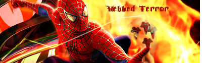
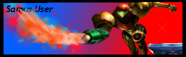
The light is still laying on Samus. The light needs to be shining ON her, not coming from her ya know? But the background redu and everything is great! Very nice! :DHere's the updated version of lesson 1(not sure if i was supposed to post it or not, but w/e
Well I think you understood and followed the tutorial good, just the C4D and effects on either side of Spiderman don't match in any way shape or form. Choose one or the other, I'd choose the C4D's personally. Maybe move it over so it shows up on the right side as well.And here is lesson 2:I followed this tutorial(well, sorta):http://yaaat.com/jakool/tuts/mario.png SOme of it was render specific, so i did some other stuff, added a c4d, and put a clipping mask(which is my favorite effect ever now) instead of a different effect (seemed to work better in my case). If u think i should do it again following the tutorial more precisely, then i will.
Edit: I probably will do it over, since it seems like the point of this lesson was to learn to follow tutorials well. Would u be able to assist me in a GIMP tutorial if i need help, or is there someone else (marthmaster?)?


 .
. 

Good I'm so glad! Teaching yourself is very important, I'm glad you worked on improving. I can't wait to see them. :D :Dsp i will complete assignments 2 and 3 tomorow if i get the chance and i will try to fix assignment one. I got over 100 new brushes and my sigs are really starting to turn out nice now. I also looked at a few tutorials.

VERY nice. Text is mucho better. Nice job! ^_^Fixed the pentooling, changed text to something "Bourne"ish.
ThanksVERY nice. Text is mucho better. Nice job! ^_^
.

*grumbles* Sorry, that was a typo, just ignore that.I know what a stock and a C4D is, it is just I was confused because you said "Take three times from each site" <_<
And thank you STG
Wow, that is extremely hot. The effects are beautiful and it adds to the flow. The colors are soft, and fit so well with the render. I think there might be a little bit too much white in there, maybe use more colors from the render.Oh, I edited my post, sorry. (I didn't think anyone posted but there's an 11th page now xD)
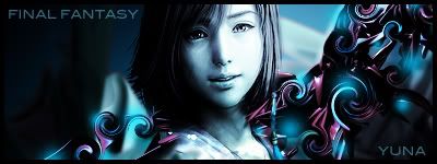
Random FF image I found because I didn't like anything else. Did I put in the C4D right?
Quite bright but it still owns.I know what a stock and a C4D is, it is just I was confused because you said "Take three times from each site" <_<
And thank you STG
Edit: Is this good?
I picked some Final Fantasy stock from the photobucket resource... I have no idea what it is but it was the only thing I liked. Did I use the C4D right?
Yeah, I had trouble finding one I liked too... my advice would be to not worry about a certain character or series you like (You won't find one) and just browse and pick something that catches your eye. ;DYuck... I greatly dislike real-life stocks in all ways possible.
Is it ok that I skip this assignment?
Edit: I see now that there are some VG ones too, but none I like...
Using stocks is a very useful technique that everyone should learn. Just try it.Yuck... I greatly dislike real-life stocks in all ways possible.
Is it ok that I skip this assignment?
Edit: I see now that there are some VG ones too, but none I like...
I admit its not my favorite style either, but its good to learn.