Ice_Dragon
Smash Cadet
- Joined
- Jan 21, 2007
- Messages
- 30
Guess who's here, Chugar. 
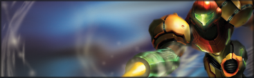
1. Pasted a stock and smudged it a bit.
2. Paster the render
3. Duplicated the render and did some smudging.
4. Placed the untouched Render on top.
5. Created a new layer, Applied the Image, then used the Liquefy tool to create flow. Layer on lighten.
6. Pasted a c4d, set the layer to Linear Dodge, and erased parts I didn't like.
7. Another C4D. This time on Screen.
8. Duplicated Samus, and placed her on top.
9. Lighting.
10. Applied the image. Did some smudging.
11. More C4D. Screen again.
12. More smudging. Some scatter brushing at add to flow.
13. More Smudging. Layer set to lighten.
14. Two Splatter Clipping Masks.
15. Black -> White Gradient map. Soft Light, 40% opacity.
16. Applied the Image. Used the Angled Brush Strokes filter to make even more flow.
17. Orange -> White Gradient Map. Overlay, 15% Opacity, 57% Fill.
18. Orange -> Yellow Gradient Map. Soft Light, 70% Opacity, 23 % Fill.
19. Black and White Gradient. Set the layer to soft light, 50%, 36%.
20. Blue -> White Grading Map. Soft Light 64%, 73%.
21. Curves layer.
22. Cooling Filter. Colour, 75% Opacity.
And here is a result:


")