• Welcome to Smashboards, the world's largest Super Smash Brothers community! Over 250,000 Smash Bros. fans from around the world have come to discuss these great games in over 19 million posts!

    You are currently viewing our boards as a visitor. Click here to sign up right now and start on your path in the Smash community!
SSB4 vs Brawl graphics comparison

greenluigiman2

Smash Ace
Joined
Nov 21, 2007
Messages
809
I'm probably in the minority in that I prefer Mario to have a less grungy look because its more true to the source design, so I like his Smash 4 look over Brawl.
I don't know whether or not we're in the minority. I think most people like this Mario.
 

Admiral Pit

Smash Hero
Joined
Feb 20, 2008
Messages
8,722
Location
Skyworld
NNID
GoldAngelPit
3DS FC
0903-2895-3694
That Pit <3 Though Bowser's eyes do look smaller. Of course, this is only the early stages of the development too. Just wait til they're done, and then we will have some fun.
 

max.

Smash Rookie
Joined
Mar 20, 2013
Messages
13
Location
CLE
Just makes you remember how insanely detailed the Brawl models were for their time and hardware

That being said, I'm amazed that they managed to make Kirby look better
Agreed. It's hard to expect Kirby would look much different.

Really glad they got rid of the texturing on Mario's overalls. Looked so awkward last time. Now his model looks so smooth and clean. I love it.
 

Ray Robo

Smash Ace
Joined
Mar 5, 2010
Messages
545
Location
CT
NNID
RayRobo
Graphics keep getting better and better. I'm pretty happy with the improvements and I'm sure the game will be better as well.
 

Kapus

Smash Ace
Joined
May 22, 2013
Messages
734
Location
Under your bed
NNID
Kaplus4
3DS FC
3626-0411-0921
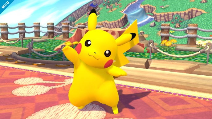
Wow, I hadn't noticed just how much better Pickachu looks now. Nice picture.
 

Artsy Omni

Smashified Creator
Joined
Aug 5, 2011
Messages
1,368
NNID
artsyomni
I'm trying to remember... does DK ever show teeth in any of the Smash games?
 

PrincessAzula

Smash Apprentice
Joined
Jun 14, 2013
Messages
78
Location
Dallas, TX
As some posters have mentioned before, seeing these screenshots of the graphics/artworks just makes me ecstatic to see Zelda's character design in SSB4.

In all honestly, everything about this game (graphics wise) seems more simple and clean than Brawl. The only character that really didn't have much difference was Fox, but that's because I feel like the darker colors from Brawl suit him a little bit better.
 

Prince Longstrok

Taker of lives, defiler of daughters.
Joined
Jun 16, 2013
Messages
648
Location
Toledo, OH
I didnt like the more puristic art style at first, but its growing on me. I kinda appreciate the whole "focusing more on pure hues this time around" part. :3
 

FalKoopa

Rainbow Waifu
BRoomer
Joined
Dec 16, 2012
Messages
32,231
Location
India/भारत
3DS FC
1650-3685-3998
Switch FC
SW-5545-7990-4793
What I like from the screenshots is that the the folds on Mario's clothes look more real, as if they really are made of cloth.
 

Kamiko

Smash Ace
Joined
Jun 13, 2013
Messages
976
Location
Wandering the Gerudo wastes
I don't know why people keep saying Mario doesn't show texture anymore, because his overalls look more real than ever. I guess this could be seen as a good thing, having the details so fine some people can't even see them.
 

Mr. OC

Smash Journeyman
Joined
Jun 3, 2013
Messages
328
Location
egypt land
Pit looked so much less like a woman when he was just a trophy.

I'm not sold until I see C. Falcon's new duds.
 

Venus of the Desert Bloom

Cosmic God
Super Moderator
Premium
BRoomer
Writing Team
Joined
Jul 30, 2007
Messages
15,494
NNID
VenusBloom
3DS FC
0318-9184-0547
Brawl models appear to be desaturated or were painted with a desaturated palette. I agree that Smash 4 appears brighter, simpler, cleaner, and HD in mind. I loved Brawl's but I'm quickly starting to like Smash 4. Easily, my favorite model is either Mario or DK. I'm really looking forward to Zelda, Ganondorf, Peach, King Dedede, and Diddy in HD.
 

Fares612

Smash Apprentice
Joined
Jun 16, 2013
Messages
80
Looks really nice, but you can tell there's still a little work that needs to be done. Can't wait to see how it looks when it's all said and done.

Looking forward to seeing how ZSS looks.

*crosses fingers*
 
Joined
Jun 4, 2006
Messages
8,377
Location
Long Beach,California
Game looks great. Glad Mario decided t get some new overalls though. The detailing in them was great, ad he clearly washed them properly with castile soap.

Looks like Mario is on his way to break in a new pair of Nuddies. Or maybe they're A.P.C.
 

Swamp Sensei

Today is always the most enjoyable day!
BRoomer
Joined
Jan 4, 2013
Messages
38,909
Location
Um....Lost?
NNID
Swampasaur
3DS FC
4141-2776-0914
Switch FC
SW-6476-1588-8392
All these people drooling over what ZSS could look like disturbs me...
 

Artsy Omni

Smashified Creator
Joined
Aug 5, 2011
Messages
1,368
NNID
artsyomni
Looking at this image I'm surprised almost every character looks better in the smash games than in their actual series
It shouldn't surprise you... most of the characters haven't had a Wii U game.
 

Lugubrious

Smash Journeyman
Joined
Feb 11, 2013
Messages
236
NNID
Lugubrious
Everything, primarily the colors, seems more vivid. More good details have been added while old, worse ones have been removed; take Mario's overalls and DK's fur. I like it.
 

Tacblack

Smash Apprentice
Joined
Jun 13, 2013
Messages
91
More detailed and colorful so I prefer SSB4's. I will say that I prefer Samus's suit in Brawl (the design not the graphics). Though I guess upgrading her suit to look like the one from Other M makes sense I guess.
 

Artsy Omni

Smashified Creator
Joined
Aug 5, 2011
Messages
1,368
NNID
artsyomni
As much as I love the retro stages... I think if they include stages from past games, they should give them a visual overhaul.

More detailed and colorful so I prefer SSB4's. I will say that I prefer Samus's suit in Brawl (the design not the graphics). Though I guess upgrading her suit to look like the one from Other M makes sense I guess.

Y'know.... I don't mind the Other M suit itself. It's not bad. But the Other M Morph ball looks ridiculous...
 

Mario & Sonic Guy

Old rivalries live on!
Joined
Sep 18, 2007
Messages
22,425
Location
Mushroom Kingdom
NNID
TPitch5
3DS FC
5327-1637-5096
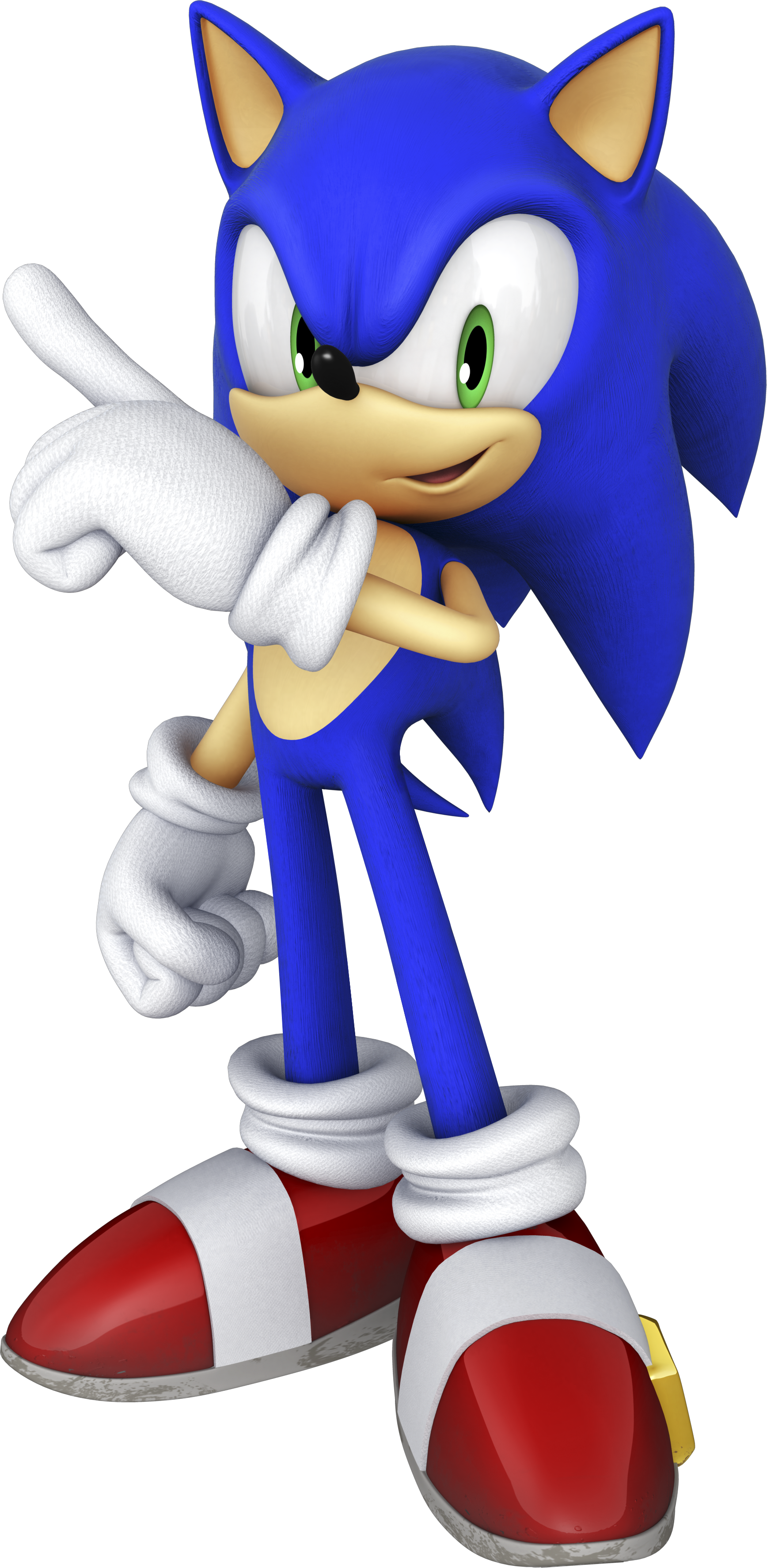
I do kind of wonder how Sonic would look if he manages to return. I'm probably guessing that he'll be like his artwork from Sonic & All-Stars Racing Transformed.


Artsy Omni

Smashified Creator
Joined
Aug 5, 2011
Messages
1,368
NNID
artsyomni
I do kind of wonder how Sonic would look if he manages to return. I'm probably guessing that he'll be like his artwork from Sonic & All-Stars Racing Transformed.


Sonic's look has been fairly constant since Sonic Unleashed. I imagine they'll use an equivalent model.
 

grizby2

Smash Lord
Joined
Feb 14, 2012
Messages
1,166
Location
Upland California
They really should base DK's look and voice off DK64. They use the DK Rap afterall.


Samus looks... awful in this game.
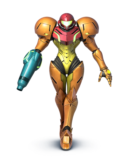
She looks like she's a princess walking to a freaking ball! And Other:M! Do I really need to be reminded of that game constantly?!

Give us badass Samus again! Literally any other version of the Varia suit would have been better.
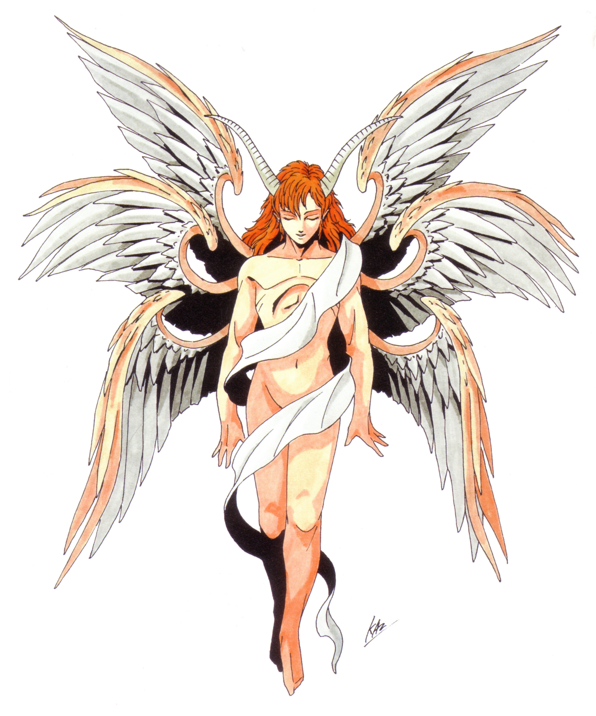
just look at Lucifer from the Shin megami tensei series. :]


im looking forward to seeing how shiney ness is going to be~
 

Mr. OC

Smash Journeyman
Joined
Jun 3, 2013
Messages
328
Location
egypt land
I never saw the point in people getting angry about Samus, just because they used her armor from Other M.
I thought the game was an absolute piece of **** too, but honestly, it's the same character, just with a revamped look.

It's about as pointless as those dumb rapid sonic fans that complained about something as small as his eyes being green.
 

Jellyfishn

Smash Journeyman
Joined
Feb 5, 2008
Messages
387
Location
Utah
I am way pumped to see the final version of this game. I love how much time and detail they put into these characters. Everyone looks at least a little bit better (some FAAAR better). However, PLEASE Fox, get rid of those clown shoes. Only real thing that I still have a little bit of a problem with.
 
Top Bottom