• Welcome to Smashboards, the world's largest Super Smash Brothers community! Over 250,000 Smash Bros. fans from around the world have come to discuss these great games in over 19 million posts!

    You are currently viewing our boards as a visitor. Click here to sign up right now and start on your path in the Smash community!

Rate That Render! (Now Rating: #49 Little Mac)

OnyanRings

Smash Ace
Joined
Mar 11, 2019
Messages
711
Location
The Cale-Zone
Switch FC
SW-4662-0014-5533
:olimar: : 6/10
Bland but dynamic enough.

:4olimar: : 4/10
Bland, he's just sorta running :/

:ultolimar: : 5/10
fune hehe.

I never really cared for Olimar in the first place so i don't have much to say about him :T
I would give Olimar a gun or two and some cool sunglasses.
 

SUfan

Smash Rookie
Joined
Dec 22, 2018
Messages
20
:dedede:: 7 (Actually looks good)
:4dedede:: 6 (Eh)
:ultkingdedede:: 7 (Same as Brawl)
:olimar:: 4 (Herrrrreeeeees Olimar!)
:4olimar:: 4 (Bleh)
:ultolimar:: 6 (Looks the best, but not by much)

Top 5:
5. :ultganondorf:
4. :ultsonic:
3. :4kirby:
2. :ganondorfmelee:
1. :sonic:

Bottom 5:
5. :4olimar:
4. :fox64:
3. :squirtle:
2. :dk64:
1. :4ganondorf:
 

Cyberfire

Smash Journeyman
Joined
Dec 20, 2013
Messages
300
Location
London
:olimar: 8/10 - I like the scene here, it sums up Olimar’s playstyle nicely. The blue and yellow Pikmin have a cute dynamic.

:4olimar: 4/10 - I much prefer his Smash 4/Ultimate model over the Brawl design, however the pose in this render isn’t that great.

:ultolimar: 6/10 - This ones better, but I feel sorry for that poor red Pikmin. Would have liked to see the blue and yellow Pikmin in a more comedic pose.

Olimar has poor renders overall, the poor guy.
 
Last edited:

NintendoKnight

Smash Lord
Joined
Oct 26, 2013
Messages
1,735
Location
Climbing the mountain I made from a molehill
NNID
Nin-Knight
He's the Aura Pokemon, the first to use Mega Evolution, and grows stronger when he's near death (like a Saiyan): #41 Lucario

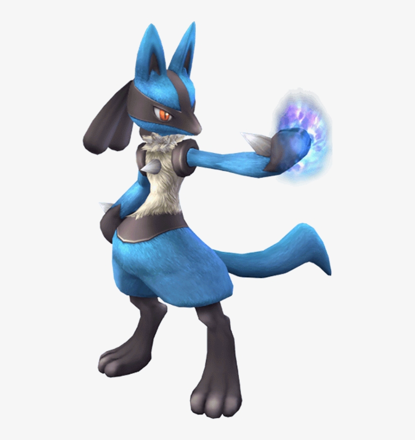
Brawl: :lucario:

image link

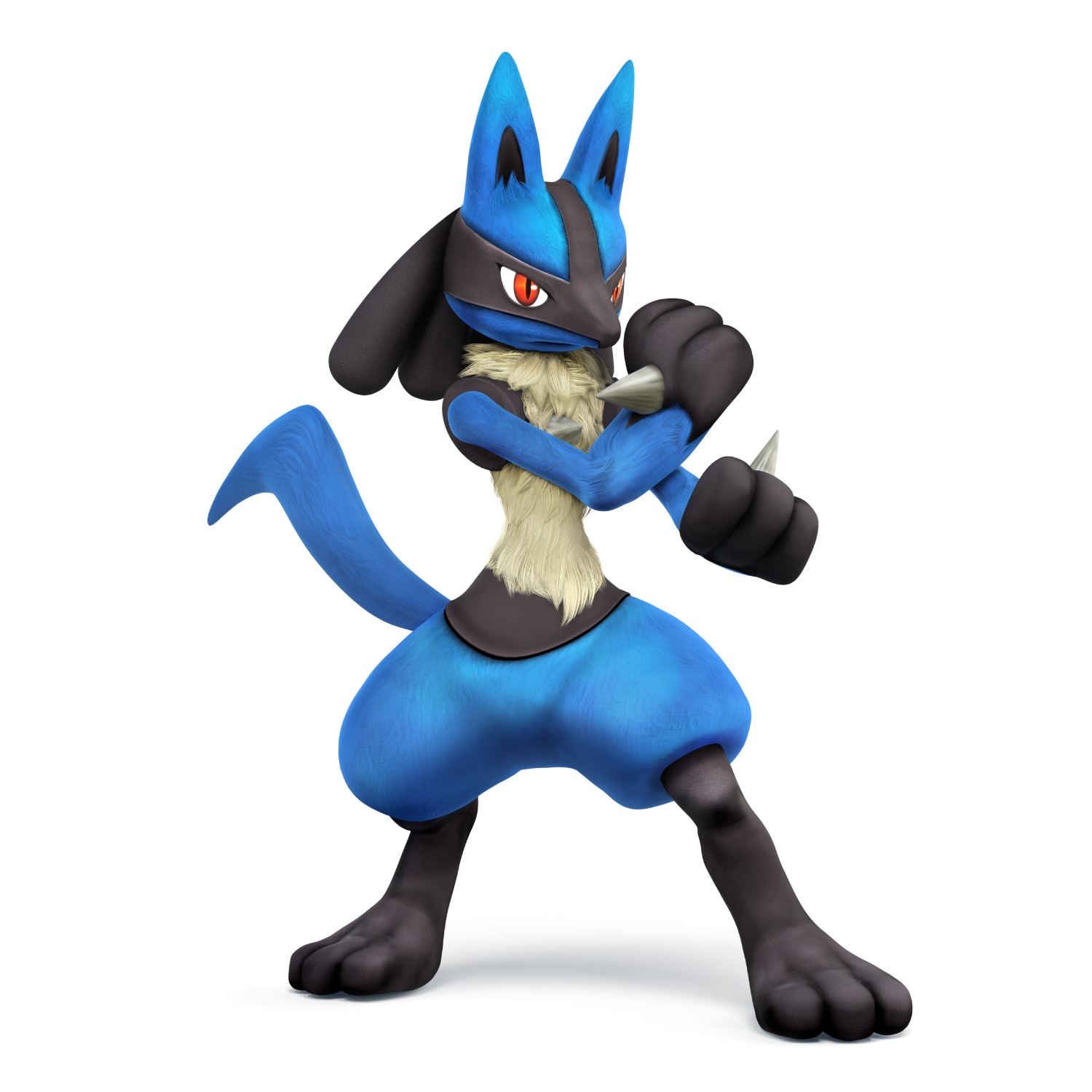
Starting off with Brawl's render for Lucario, he's doing a very basic pose. It's decent as an introductory pose, but I don't believe it fully encompasses what Lucario is all about. He's just standing there with one arm out and with Aura flickering from his paw. I will say the Aura is a nice touch, but the effect itself hasn't aged very well. It's decent, but the render isn't that incredible.
5.5/10

Wii U/3DS: :4lucario:

image link

This render is still pretty basic and a bit static as well, but I like the feel of more than the previous one. It gives off more of a fighter vibe than the previous one since he's in a fighting stance... which makes more sense for Lucario considering it is a Fighting Type. I think this render is a better fit.
7/10

Ultimate: :ultlucario:

image link

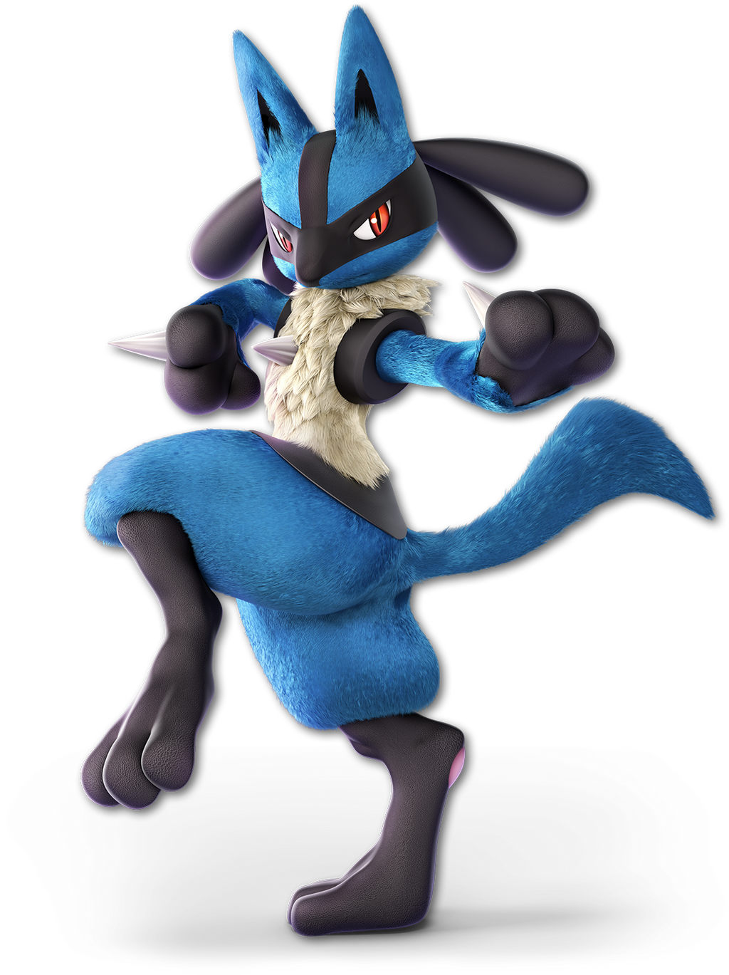
This render from Ultimate has taken the full dive into Martial Arts style fighting stances. Honestly, it makes Lucario look like the only martial practitioner until you remember that Snake, Ryu, Ken, Little Mac, and Incinaroar all practice martial arts as well. (This only solidifies that Lucario is the Goku of Smash) Regardless, I like this pose as it makes Lucario look skilled, capable, and even threatening.
8.4/10

Greatest to Least: :ultlucario: > :4lucario: > :lucario:

What are your thoughts on Lucario's Renders?
 

OnyanRings

Smash Ace
Joined
Mar 11, 2019
Messages
711
Location
The Cale-Zone
Switch FC
SW-4662-0014-5533
:lucario: : 5/10
Pretty decent, a bit bland but menacing.

:4lucario: : 6/10
Uh oh, he's ready to get started now.

:ultlucario: : 9/10
Now that's a fighting stance ! Looks like he's about to unleash some sick martial art moves !

Lucario's renders are great ! Although i wouldn't call Lucario the Goku of smash since he's not nearly as goofy as him but i can't definitely see why people would link him to our favorite gi-wearing saiyan.
 

CallMeKnux

Smash Ace
Joined
Oct 24, 2018
Messages
933
Location
20,000 feet under the sea
Switch FC
SW-0424-3957-0991
:lucario:: 7/10, pretty alright. He’s standing there menacingly with his hand emanating aura. Nothing too interesting tho.
:4lucario:: 6/10, it’s not bad, but it reminds me a lot of Sheik’s Sm4sh render in that it just looks like “i know karate bich”. Unlike that, tho, it at least looks a bit serious and badass so it gets points.
:ultlucario:: 8.5/10, pretty cool martial artist pose. I was worried I’d have trouble saying why I like this one but not the Sm4sh one but the difference is this one has a unique shot and is actually cool.

I do wish the latter two renders showed off his aura more properly, though. That’s just what the Ultimate one is missing.
 
Last edited:

soyperson

Smash Apprentice
Joined
Dec 30, 2018
Messages
102
Location
east tennessee
Switch FC
SW-6207-2383-9806
Ultimate is definitely its best. Sick fighting stance, good details in the different body parts (detailed fur and skin textures).
Ultimate > 4 > Brawl
 

MarioMeteor

Smash Hero
Joined
Nov 27, 2014
Messages
8,340
Location
New Orleans
NNID
BGenius23
3DS FC
0662-2900-1492
:lucario: 6.5/10 - A bit basic, but I do like the aura (pun not intended) of menace that I get from it.

:4lucario: 5/10 - Just as basic, but less menacing.

:4lucario: 6/10 - I like how this one shows off the martial arts influence in Lucario’s moves, but it still doesn’t hit me hard enough. The last two renders don’t even show off any Aura, which is literally the most important thing about Lucario.
 

NintendoKnight

Smash Lord
Joined
Oct 26, 2013
Messages
1,735
Location
Climbing the mountain I made from a molehill
NNID
Nin-Knight
He's the Robotic Operating Buddy, he stacks gyros, and is the last of his kind: #42 R.O.B.

Brawl: :rob:

image link

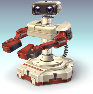
And here we have the most bonkers Smash character revealed up to this point in the cast. Of course, due to ROB's physical structure, it's actually quite difficult for him to be posed into interesting positions. Thus, he's just sitting standing existing there not doing much. He looks cute, though. (Also, all his render images in this post will use the Famicom coloration for consistency)
5/10

Wii U/3DS: :4rob:

HD image link

Again, we're seeing relatively the same thing for Sm4sh... just angled a slightly different way. Overall, it's not that impressive of a change. I like the light reflecting off his lenses though, that's a nice touch.
5.1/10

Ultimate: :ultrob:

image link

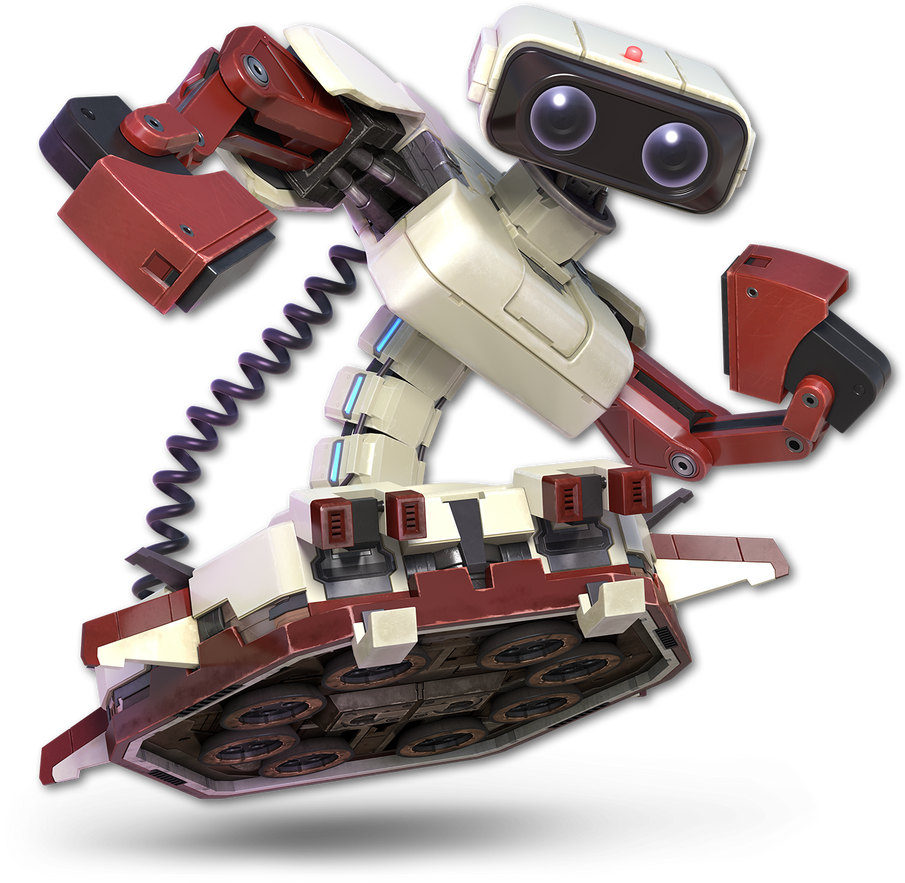
Haha, now that's a funny render. It's goofy, it makes no sense, but it's better than the last two in my opinion. It's also not out of character for ROB since... he has no real character. So, I think it gets points for humor, and doesn't lose any for being OOC.
7/10

Greatest to least: :ultrob: > :4rob: > :rob:

What do you guys think of our little Robot's renders?
 

CallMeKnux

Smash Ace
Joined
Oct 24, 2018
Messages
933
Location
20,000 feet under the sea
Switch FC
SW-0424-3957-0991
:rob:: 5/10 he’s just standing there
:4rob:: 6/10 i like his wall-e stare, but altogether this isnt much better than before
:ultrob:: 8.5/10 it’s fun, funny, and he’s actually doing something
 

soyperson

Smash Apprentice
Joined
Dec 30, 2018
Messages
102
Location
east tennessee
Switch FC
SW-6207-2383-9806
:4rob:>:ultrob:>:rob:

:rob: - 5/10. reflections are a little weird and inconsistent. is he plastic or metal?
:4rob: - 8.5/10. huggable and friendly
:ultrob: - 7.5/10. he's doing a funky little dance
 

Gyrom8

Smash Champion
Joined
Sep 21, 2018
Messages
2,795
Location
over dere
Switch FC
SW-4844-4242-3130
:rob: Bit boring but I guess the most accurate to the real ROB 5/10
:4rob: Has a bit more of an 'action' pose going on ... even if he isn't actually doing anything 6/10
:ultrob: Glorious 11/10
 

NintendoKnight

Smash Lord
Joined
Oct 26, 2013
Messages
1,735
Location
Climbing the mountain I made from a molehill
NNID
Nin-Knight
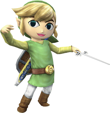
He's the Waker of the Winds, the sailor of the Great Sea, the boy with the crawfish pajamas: #43 Toon Link

Brawl: :toonlink:

(image link)

Okay, I love this render a whole bunch. This is a render borrowed from a pose performed by the character in his own game, while that can pull away from the quality of the render, I don't believe it does here. That image is translated beautifully into 3D even though it lacks the wind effect on his clothes and hair. He's also very expressive and has a great smile on his face.
9/10

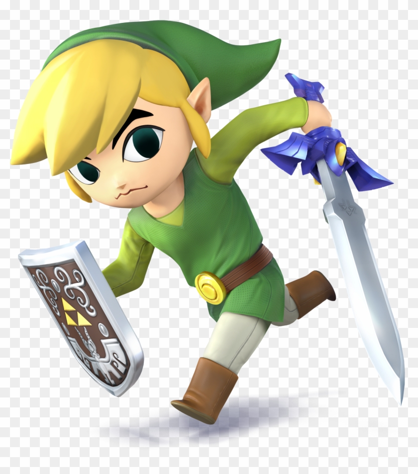
Wii U/3DS: :4tlink:

(image link)

While the overall quality of the render is higher, the pose itself is so far less interesting than the prior render. His face is blank and expressionless, which misses the point of this Link's design. Like, dude, you're in the middle of combat! At least Link serious or focused! The pose is less static and more dynamic yes, but it's really boring in comparison. Wait, where the heck is the sheath?
6/10

Ultimate: :ulttoonlink:

(image link)

While I think this one has less charm than the Brawl render, I still really do like this one a lot. The fierce expression on his face sells the pose honestly. I also love the shape and indentation of his belt buckle. Also, his sheath has returned! Though, it's somewhat painfully awkward now seeing it displayed so clearly without a strap wrapped around the little fella's torso (like how is it attached to his tunic? I know it's always been like this, but this render REALLY exposes it). Also, Toon Link is just really adorable. (Always has been, but his in-game model for Sm4sh was less than ideal to me. His Ultimate model looks GREAT).
9/10

Greatest to least: :ulttoonlink: & :toonlink: > :4tlink:

What are your opinions on Toon Link's renders? Which is your favorite?
 
D

Deleted member

Guest
I took a look at my Smash 4 Toon Link amiibo, and sure enough, the sheath is there but just so happens to be magically hidden due to the pose he's in, so it's just a coincidence you can't see it. :p
 

Sari

Editing Staff
Writing Team
Joined
Aug 3, 2014
Messages
4,439
Location
New Jersey
NNID
Villager49
Switch FC
SW-2215-0173-2152
:toonlink:>:ulttoonlink:>:4tlink:

I love the Brawl one since it's a great pose and a reference to one of the official Wind Waker artworks. Ultimate's is good too though the SSB4 one is just really bland.
 

Gyrom8

Smash Champion
Joined
Sep 21, 2018
Messages
2,795
Location
over dere
Switch FC
SW-4844-4242-3130
:toonlink: Brawl's more realistic aesthetic suited some characters better than others. Weird uncanny valley between cartoon-like and realistic 6/10
:4tlink:... At least Brawl's render actually emoted (kind of the point of the character) and was a pose that reflected his origin game. What's he even meant to be doing here? Going to the shops? 4/10
:ulttoonlink: Addresses the other renders' issues, being both toon-looking and having a dynamic pose. 8/10
 

Roguewolf

Smash Lord
Joined
Jul 23, 2018
Messages
1,473
Location
Where the caribou roam
Rating them I think the brawl one is hands down my favorite he's so happy10/10

while I really love the ultimate one it loses some of the personality that brawl had8/10

Don't have much to say about 4 because its not really saying much with that render meh/10
 
Last edited:

Curious Villager

Puzzles...
Joined
Jun 24, 2012
Messages
11,770
Location
London
Toon Link seemed to have caught some of the Mario syndrome.
He was cheerful looking in his first appearance in Brawl. Still looked fairly like his usual self in his second appearance in Smash 4. Then in his third Smash appearance he looks very grumpy in Ultimate.

It's kinda weird.
Render wise though, I'd probably go with :ulttoonlink:>:4tlink:>:toonlink: in that order
 
Last edited:

soyperson

Smash Apprentice
Joined
Dec 30, 2018
Messages
102
Location
east tennessee
Switch FC
SW-6207-2383-9806
:toonlink:>:ulttoonlink:>:4tlink:

:toonlink: - Happy, musical boy. I love him. 9/10
:4tlink: - He's just kinda running but I still love him. 6/10
:ulttoonlink: - Angry little man. I love him. 8/10
 

SUfan

Smash Rookie
Joined
Dec 22, 2018
Messages
20
:lucario:: 6 (Okay)
:4lucario:: 6 (Slight Improvement)
:ultlucario:: 8 (Now we have improved)
:rob:: 7 (Gets the Robot part perfectly)
:4rob:: 6 (He somehow feels soulless)
:ultrob:: 7 (Looks Good)
:toonlink:: 7 (Looks weird but has a charm)
:4tlink:: 1 (STARES DEEP INTO YOUR SOUL)
:ulttoonlink:: 8 (daw he is so adorable)

Top 5:
5. :ultganondorf:
4. :ultsonic:
3. :4kirby:
2. :ganondorfmelee:
1. :sonic:

Bottom 5:
5. :fox64:
4. :squirtle:
3. :dk64:
2. :4tlink:
1. :4ganondorf:
 

NintendoKnight

Smash Lord
Joined
Oct 26, 2013
Messages
1,735
Location
Climbing the mountain I made from a molehill
NNID
Nin-Knight
He's the Leader of Star Wolf, the rival to Fox McCloud, and will be the one to take you down: #44 Wolf

Brawl: :wolf:

(image link)

Hey look, it's Wolf! One of the most fun characters in Brawl I'd say has a pretty decent render. I do wish his left arm was a bit more distinct from the rest of his body for a stronger silhouette, but it's fine I suppose. I'd say the only thing he's lacking in this render is that he doesn't look as fierce as he probably should. Bowser and Ganondorf had somewhat menacing renders, you'd think that this villain-type character would match them somewhat. Missed potential.
6.7/10

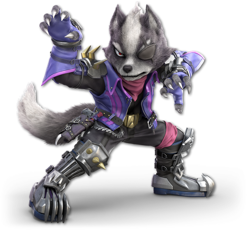
Ultimate: :ultwolf:

(image link)

And then, there's Ultimate Wolf. His stance is almost a 1-to-1 reference to his Brawl stance, but he's facing his good side, where his eyepatch is given a strong showing. He looks FIERCE! This is the menace that Brawl was missing. This the stance and demeanor of someone who's going to kill you. His silhouette is strong, really strong. A much more prominent tail, and it's now very clear that it wasn't his gloves that had the claws like Brawl showed: those are his actual claws. It's pretty good.
9/10

One over the other: :ultwolf: > :wolf:

What do you guys think of Wolf's renders? From this point onward, save for a few notable exceptions, every character will only have two renders to rate.
 

MarioMeteor

Smash Hero
Joined
Nov 27, 2014
Messages
8,340
Location
New Orleans
NNID
BGenius23
3DS FC
0662-2900-1492
:wolf: - In terms of the pose, the render is okay, perfectly acceptable. The design, however, is what impresses me. This is what I picture in my head when I think Wolf O’Donnell. Blue looks a lot more natural on him than purple. If he were turned more towards the screen, it’d be perfect. 8/10

:ultwolf: - I find this redesign to generally be inferior to his Brawl look, but this render gets points for the pose, which does a great job of showing all of Wolf. 7/10
 

OnyanRings

Smash Ace
Joined
Mar 11, 2019
Messages
711
Location
The Cale-Zone
Switch FC
SW-4662-0014-5533
:wolf: : 7/10
Menacing but doesn't convey a lot of emotions to me, he looks prety cool though.

:ultwolf: : TEN OUTTA TEN
The pose, the expression, the new design... One of the best renders of Ultimate in my opinion.

I actually like Wolf's new design better, i'm a sucker for that purple.
Though i wish you could choose beteween the two
 

TheTrueBrawler

Smash Demon
Joined
Jul 16, 2018
Messages
816
Location
Mystery
Wolf's renders in order from best to worst:

Smash Ultimate
Smash Brawl

Also, with every Smash 4 newcomer, I find that their Smash Ultimate render is better than their Smash 4 render, so I won't be posting for each one.

The only thing I will say is that for Robin and Corrin, I think the Smash 4 Female renders are better than the Smash 4 Male renders, and that the Smash Ultimate Male renders are better than the Smash Ultimate Female renders,
 

Nutty Sponge

Smash Apprentice
Joined
Jan 26, 2019
Messages
106
Location
Napoli, Italia
:ultwolf: - absolutely incredible, love this render. In fact it's one of my favorites! 10/10

:wolf: - really underwhelming, lame pose and I just don't like the design as much 4.5/10
 

Roguewolf

Smash Lord
Joined
Jul 23, 2018
Messages
1,473
Location
Where the caribou roam
Hey its my boy

Brawl wolf is very cool looking and has a nice stance but I feel somethings missing 8/10

Ultimate wolf is my favorite design ever the purple(favorite color) the sleekness everything about it fits and that pose is the perfect mix of animal indimadation and fierce cunning 10/10
 
Last edited:
Top Bottom