• Welcome to Smashboards, the world's largest Super Smash Brothers community! Over 250,000 Smash Bros. fans from around the world have come to discuss these great games in over 19 million posts!

    You are currently viewing our boards as a visitor. Click here to sign up right now and start on your path in the Smash community!

Rate That Render! (Now Rating: #49 Little Mac)

CallMeKnux

Smash Ace
Joined
Oct 24, 2018
Messages
933
Location
20,000 feet under the sea
Switch FC
SW-0424-3957-0991
:wolf:: 6/10. Decent, but very flawed. His design is grotesquely over detailed, with big spiky shoulder blades and a jacket that looks more like metal than an actual jacket. No one besides an old school Power Rangers villain would wear this garbage, especially not someone like Wolf. And yeah I know it’s based on Assault, but even that looked more regular than this. Also, bland pose.
:ultwolf:: 9/10, he looks like Wolf!! An actual good jacket!! Details that actually add to his design!! It’s the anti-Brawl! I still feel like the odd could be more menacing, tho.
 

NuzTheMonkey

Smash Apprentice
Joined
Apr 10, 2017
Messages
147
:wolf:8/10 Beautiful pose. Screams angsts Wolf boy.

:ultwolf:8.5/10 I.... dislike this pose a bit in comparison. But.... purple.. compels me......
 

NintendoKnight

Smash Lord
Joined
Oct 26, 2013
Messages
1,735
Location
Climbing the mountain I made from a molehill
NNID
Nin-Knight
He's the payer of mortgages, the pocketer of useless trinkets, the mayor of Smashville: #45 Villager

Wii U/3DS: :4villager:

(image link)

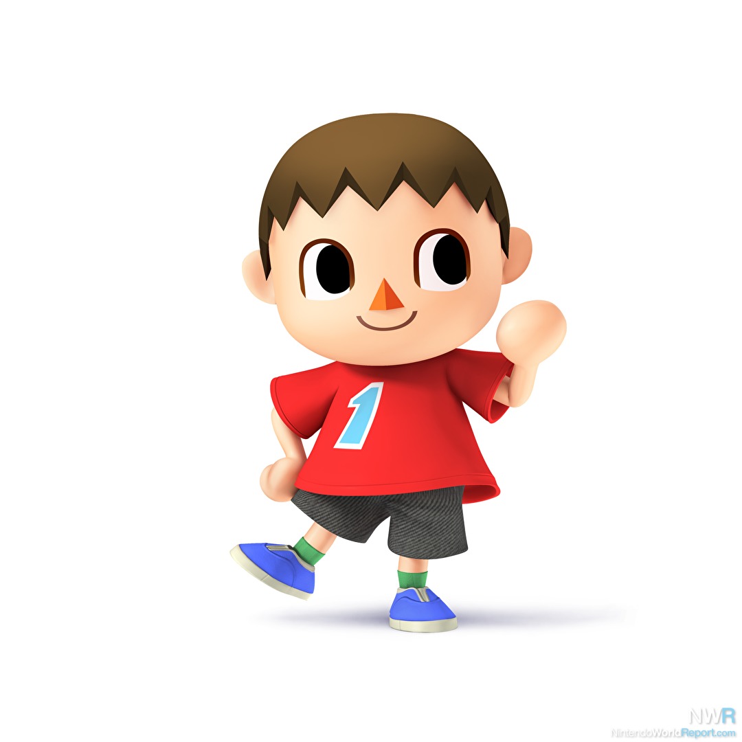
Now, while there isn't much to the Villager's pose, take note that there really isn't much to the Villager, himself. A simple person who lives a simple life... thrown into a hectic Brawl. Just your standard pose, but not that there's anything wrong with that.
6.5/10

Ultimate: :ultvillager:

(image link)

Ah, here we have Villager using one of his many tools, the net. Good for catching bugs... and whacking neighbors on the head... No, he's not sorry. (Neither was I, honestly. That crap is too funny.) He's also raised his foot further than it was previous. It's not much, but I like it.
7/10

One over the other: :ultvillager: > :4villager:

Which do you prefer?
 

OnyanRings

Smash Ace
Joined
Mar 11, 2019
Messages
711
Location
The Cale-Zone
Switch FC
SW-4662-0014-5533
:4villager:: 7/10
Look at this precious boy, i give him a 7 just for his cuteness alone.

:ultvillager: : 8.5/10
This render is a straight upgrade, we get villager's cuteness and a neat pose.

I like how they made the net his signature tool, using it in his render, reveal trailer and in the "everyone is here" banner.
 
Last edited:
D

Deleted member

Guest
:4villager:Decent, stands next to Ultimate. Doing a pocket or somethin'.
:ultvillager:Nice pose, but I feel it would fit better with the axe.
 

felicialee

Smash Rookie
Joined
Jun 6, 2019
Messages
4
:lucas:: 6
:4lucas:: 8
:ultlucas:: 8.5

Lucas's Ultimate render is very odd with the use of the rope snake indeed but i love that lil' bugger so it doesn't bother me.

Brawl's though... Man, a lot of them looked rough :T

image link
 

LoZ00

Smash Journeyman
Joined
Dec 11, 2015
Messages
361
Location
Italy
Let's move on, last time I reviewed renders until King Dedede's (long may he reign).

Olimar
:olimar: 6.5/10: this is a pretty basic render. It somehow makes pretty clear how Pikmin work in the original games, but still, it's kinda boring. Also, the spacesuit is way too detailed and the colors are not vivid enough.
:4olimar:/:4alph: 6/10: even though this render makes for a great amiibo, it's pretty bland in game. It somehow manages to be even more boring than the first one. However, I must admit, they got the colors and details right.
:ultolimar:/:ultalph: 7/10: not a great render per se, but it's more fun than the other ones. I mean, did you see how the Red Pikmin is being plucked up?
Overall: :4olimar:<:olimar:<:ultolimar: (I wish Alph got unique renders, but I'm thankful he's playable in the first place).


Lucario
:lucario:
7.5/10: a pretty basic render, but it shows Lucario's most important attribute (at least in Smash, I wish they implemented a similar ability in Pokémon): Aura. Lucario doesn't appear as a Pokémon, rather it's more of an ascetic warrior that learned how to channel Aura. So this render nails it pretty well.
:4lucario: 5/10: soooo booooring... It's Lucario, doing some kind of martial arts. I really don't like this render, even though Lucario is my second favorite Pokémon, right after the lovely Piplup.
:ultlucario: 6.5/10: slightly better than his Smash 4 incarnation. The best part of this render is the fact that it stands on just one foot as he did in Brawl when we were first introduced to Lucario in the Subspace Emissary.
Overall: :4lucario:<:ultlucario:<:lucario:

R.O.B.
:rob: 6/10: R.O.B. is (unpopular opinion incoming) a pretty boring character, at least to me. Its renders seem to agree with me, starting with the first one. It's just here, standing. I like this version of R.O.B. the least because the way its body is portrayed seems to be too metallic. I like a more plastic-like appearance for this Buddy.
:4rob: 6.5/10: ooooh, I see what's happening here! You're face to face with greatness and it's strange. They turned R.O.B.'s head slightly! It somehow looks slightly better than Brawl's render. I like R.O.B.'s overall body slightly more as I was saying before.
:ultrob: 7/10: a slightly better take on R.O.B. They made it way more dynamic, but no pose really belong to R.O.B. because (unpopular opinion intensifies) it isn't a character. It's a peripheral! What if they added Joy-Con as fighters?
Overall: :rob:<:4rob:<:ultrob:


Toon Link
:toonlink: 9.5/10: finally a great render! Toon Link's render in Brawl is great: it directly portrays one of his most iconic poses and does it greatly and in Smash's style! I wish more renders were done like this! They sometimes try to create weird and unique poses when they could easily use some simplicity!
:4tlink: 8/10: I hate to admit it, but maybe I'm biased. I love this render too! It gives me the vibes of the beginning of a great adventure, which is what the Zelda series is all about. The previous render had Toon Link smiling while this one has him in a more neutral expression, however, this one completely nails the colors, although this was more Brawl's fault rather than the render's.
:ulttoonlink: 9/10: as you can see, I love Toon Link. This one takes everything from the previous one and cranks it up to eleven! The best part of this render is easily Toon Link's mouth. It's just a line, you may say, but to me, best represents the "Toon" series of Zelda. This render has Toon Link pretty angry. Wait, when I think about it, it almost seems like that Toon Link is getting angrier and angrier. Is everything ok, buddy?
Overall: :4tlink:<:ulttoonlink:<:toonlink:


Wolf
:wolf: 7/10: this is a solid render. It has nothing that makes it stand out, but it hasn't anything inherently bad. Except for the hands. I don't like how they're depicted. I hope the next render would not feature this posture...
:ultwolf: 7.5/10: what? A very similar pose with the exact same hands? What's wrong? The angle is much better, however, as he looks towards the camera. I like Wolf's design a lot more: not only the eyepatch is great, but the jacket is fantastic, with this combination of purple-heliotrope-pink. I like it a lot, but sadly the pose isn't that great.
Overall: :wolf:<:ultwolf:


Villager
:4villager: 7.5/10: we finally reached Smash 4! Villager, as the first Smash 4 veteran, has a pretty solid render: nothing really stands too out, but I like the expression that seems to look nowhere. He almost seems to wave at the player, which would fit his polite character.
:ultvillager: 8/10: I think I like this render a bit more than Smash 4. It features an item of his, in this case, the net. I like the jumping pose Villager has: it's dynamic but without exceeding. I wished Villager used the axe or even the shovel instead of the net, but it's fine otherwise.
Overall: :4villager:<:ultvillager:
 

SUfan

Smash Rookie
Joined
Dec 22, 2018
Messages
20
:wolf:: 6 (It's-a Wolf)
:ultwolf:: 8 (Much more Wolf-y)
:4villager:: 7 (You have a point there)
:ultvillager:: 8 (But this is still better)

I'll stop with the lists but I will put Best and Worst
Best: :sonic:
Worst: :4ganondorf:
 
D

Deleted member

Guest
Best renders of all::nessmelee:,:ganondorf:,:4mario:,:ultbayonetta:
Worst renders of all::falcomelee:,:jigglypuff:,:4miibrawl:,:ultzss:
 
Last edited by a moderator:

slamallama

Smash Journeyman
Joined
Oct 3, 2018
Messages
268
Location
the cold void of space
:4villager: 9/10: I feel like less is more with villager. I like how subtle and simple the pose is.
:ultvillager: 7.8/10: Still good, but I feel like he's doing a bit too much. I know holding a net isn't really "doing much," but Animal Crossing is idyllic and peaceful, and he looks a bit too active for me to give it as high a score as Sm4sh's render.
 

NintendoKnight

Smash Lord
Joined
Oct 26, 2013
Messages
1,735
Location
Climbing the mountain I made from a molehill
NNID
Nin-Knight
He's the Blue Bomber, the destroyer of Wily's machines, the super fighting robot with a human face: #46 Mega Man

Wii U/3DS: :4megaman:

large image link

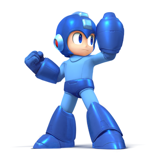
As happy as I was to see Mega Man join the series, I have to say that I outright disliked his render. The only way I really know how to describe this render is lame. There are so many poses they could have used as inspiration, yet we ended up with this? He looks like a plastic toy. I'm disappointed. Ironically, it's this render and Luigi's renders that stood out to me in Sm4sh the most as renders that are on the lower end of the ladder.
3.6/10

Ultimate: :ultmegaman:

image link

Now THAT is a character render! This is so far beyond the other one it saddens me that it took a second game to get this one made. This does Mega Man so much justice that this render alone was worth bringing him into the game for. Sure, it's another case of "Ultimate comes in to save the day" but I don't care because it looks amazing.
9.9/10

One over the other: :ultmegaman: > :4megaman:

What do you guys think of Mega Man's renders?
 
D

Deleted member

Guest
Ooh, I so some 3D animation. Just gonna hop in if that’s ok.
 

Cyberfire

Smash Journeyman
Joined
Dec 20, 2013
Messages
304
Location
London
Both solid renders in my opinion.
:4megaman: 8/10 - I like this one despite its 'blandness', it remind me of statue of a legendary hero (ironically it wad the basis of 2 amiibo so maybe that clouded my judgement).
:ultmegaman: 9/10 - Badass pose, if he showed some emotion on his face this would be a 10.
 

NintendoKnight

Smash Lord
Joined
Oct 26, 2013
Messages
1,735
Location
Climbing the mountain I made from a molehill
NNID
Nin-Knight
Your personal yoga instructor, the mascot of Wii Fit, and the the second health professional in the roster: #47 Wii Fit Trainer

Wii U/3DS: :4wiifit:

image link

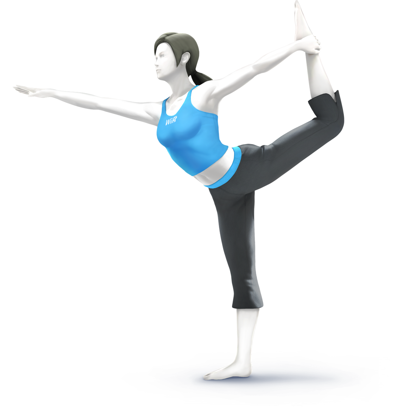
I still remember the reveal for this wacky character. Of course, this yoga pose is perfect for the render. The colors are great and the lighting is very interesting. And the silhouette is simply unmistakeable.
7.5/10

Ultimate: :ultwiifittrainer:

image link

Now, this render is much less bombastic and the lighting and colors are a lot softer than the previous. However, and I mean HOWEVER, HER FACE. Her face is beautiful now. It's... actually kinda hard to look at the old render's face after seeing this one. Everything about the character looks much more natural as she no longer looks like a freaking department store manaki; it probably helps that her pale white skin is no longer shiny. I do prefer this one over the other one.
8/10

One over the other: :ultwiifittrainer: > :4wiifit:

What did you guys think of Wii Fit Trainer's renders?
 

SUfan

Smash Rookie
Joined
Dec 22, 2018
Messages
20
:4wiifit:: 7 (I mean, what else could it really be)
:ultwiifittrainer:: 7 (Slightly better)

Best Render: :sonic:
Worst Render: :4ganondorf:
 

Laniv

Smash Champion
Joined
Apr 20, 2014
Messages
2,286
:4wiifit:: 8/10. A nice silhouette. Easily recognizable.

:ultwiifittrainer:: 8/10 (again). It's not a yoga pose, but the model is higher quality. Love that face.
 
D

Deleted member

Guest
Ultimate is so goddamn stupid. They gave her a face to perv out over. But I never cared for her and would happily kick her out the next Smash Bros, if we get one.
 
Last edited by a moderator:

NintendoKnight

Smash Lord
Joined
Oct 26, 2013
Messages
1,735
Location
Climbing the mountain I made from a molehill
NNID
Nin-Knight
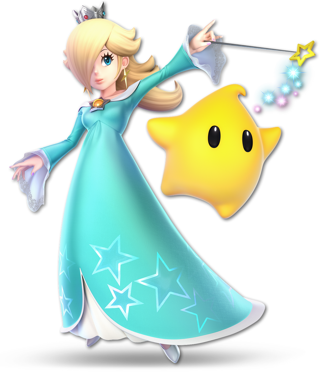
The cosmic travelers, the denizens of the Cosmic Observatory, the spectators of countless galaxies: #48 Rosalina & Luma

Wii U: :rosalina:

large image link

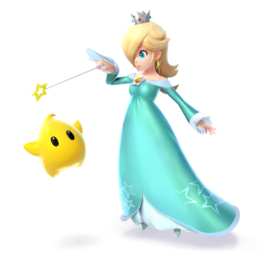
With our space duo, I was pleasantly surprised to see them join. Hate fighting them, and also don't like playing as them, I'm still glad they're in the game. As far as I'm concerned, this render isn't bad. It's not spectacular, but it isn't bad. Wish they couldn't been using in a more team-oriented fashion similar to the climbers, but this is what we get.
6/10

Ultimate: :ultrosalina:

Image Link

Honestly, this is just a better version of the first one. She's looking more towards the viewer, Luma occupies more of the negative space closer to Rosalina, and it has wand sparkles. WAND SPARKLES. Though points are deducted because there are too many similarities between this render and the first tone. It's a tragic lack of real originality. It still finds plenty in line with her general renders from the Mario series though, so...
7.4/10

One over the other: :ultrosalina: > :rosalina:

What do you guys think?
 
Last edited:

Tino

Smash Hero
Joined
Jul 31, 2014
Messages
7,211
Location
Spartanburg, South Carolina
NNID
FaustinoRojo10
3DS FC
5284-1678-8857
Switch FC
SW-6232-2426-8037
Her Ultimate design is way more elegant than her Wii U one, though she still looks great.
 

Sari

Editing Staff
Writing Team
Joined
Aug 3, 2014
Messages
4,439
Location
New Jersey
NNID
Villager49
Switch FC
SW-2215-0173-2152
:rosalina:: 7/10 Good render though it looks like she isn't even paying attention.
:ultrosalina:: 9/10 The Luma doing a similar gesture as Rosalina's left arm is a really nice touch. Great render overall.
 

NintendoKnight

Smash Lord
Joined
Oct 26, 2013
Messages
1,735
Location
Climbing the mountain I made from a molehill
NNID
Nin-Knight
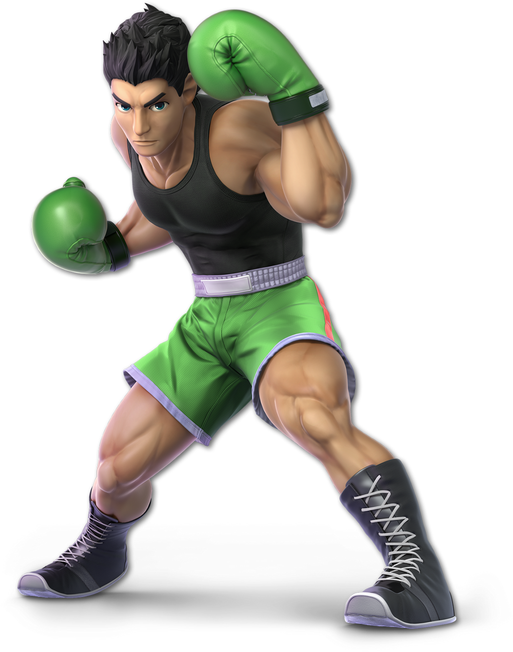
Standing at 5'7", weighing in at 107 lbs., he's the bruiser from the Bronx: #49 Little Mac

Wii U/3DS: :4littlemac:

image link

Striking a pose for the camera as if the photo would be used to hype up his next match, Little Mac poses for the viewers and shows off his huge right arm. This boi swole! While a bit strange, the pose itself isn't that bad. It's somewhat awkward, yes, but not bad.
6/10

Ultimate: :ultlittlemac:

image link

And now we have Mac striking his Slip Counter anticipation pose. Interesting to see if from the front. He seriously looks ready to deck the camera. I do wish a little more of his arms were shown. But now we got a better view of his torso. This boi still swole! Overall, it looks good and not as awkward as the previous one!
8.2/10

One over the other: :ultlittlemac: > :4littlemac:

What do you guys think of the under the height limit underdog?
 

SUfan

Smash Rookie
Joined
Dec 22, 2018
Messages
20
:rosalina:: 5 (Kinda Flat)
:ultrosalina:: 7 (Probably the best you can do but luma is kinda flat)
:4littlemac:: 8 (I just love the pose)
:ultlittlemac:: 10 (L O O K A T T H E S H O R T S)

Best: :sonic:
Worst: :4ganondorf:
 
Last edited:
D

Deleted member

Guest
I prefer Wii U over Ultimate. Idk, just better represents him.
 

Porygon2

Smash Journeyman
Joined
Sep 2, 2014
Messages
225
:4littlemac: Little Mac doesn’t strike me as the kind of character that would deliver a punch with real weight for the "camera", so to speak – so, weirdly, this mild pose is accurate. That doesn’t stop it being boring however. 6/10
:ultlittlemac: Love how practical this is. Leg muscles are larger-looking, ready to pivot and add force to that right-hand blow. Eyes straight ahead, serious. Wouldn’t mind a more expressive look in the face. 8/10
 
Top Bottom