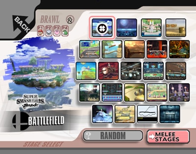
In lieu of studying/reading here is some comparison of the two stage select screens, one from PM, one from Melee. Thanks, CBO0tz!!!
In PM, the stage layout is more traditional, and has the nice option of excluding illegal stages. While hacked Melee of versions have this option too, the vanilla version doesn't. In the PM SSS the background is pretty simple, but also bears resemblance to Melee's background. Melee's background is more busy, with little gray objects and flecks flying around here and there. Also note the borders in Melee's SSS and how they home in on the text/name of the stage highlighted. (interestingly, almost forming a smash emblem) Furthermore, note the location of stage/origin of the stage above the actual stage name. As the obnoxious pink text in the second picture points out, there is actually a basic blue model of the stage selected in the background, which shifts between the model and logo/emblem of what character that stage is from (ex. in this picture, it would shift to the starfox emblem). PM also has these logos, as well as smaller icons indiciating the type of match to be played. Also note the random stage button in Melee, which is a bland gray screen with RANDOM on it, versus the bland smaller button with a weird looking question mark (who the hell has a question mark like that? See how this one is normal? ? ?). Also while the Melee SSS has small pictures of the stages, the PM screen has these in addition to a larger preview. The Melee screen is also only one page whereas the PM screen is in two pages. It might be nicer if everything was all on one page, but it might start to look cluttered.
It'd be kind of cool to incorporate some ideas from the Melee SSS. The 64 SSS is quite plain, as is Brawl's. If one wanted to make nods to these, it could be possible to have the grey background floating objects form the cracks seen in Smash 64's SSS background, and instead of the neat larger preview of the stage PM has, make it slightly more messy/scratched away like Brawl's was. I've included pictures of those SSS screens as well for more reference.
Interestingly, in all the smash games, when a stage is selected the border around it is red, except maybe Smash 4. Here's a history lesson that no one needed but hopefully sparks some discussion. Let me know anything I missed, like what the background stuff in Melee actually says


