• Welcome to Smashboards, the world's largest Super Smash Brothers community! Over 250,000 Smash Bros. fans from around the world have come to discuss these great games in over 19 million posts!

    You are currently viewing our boards as a visitor. Click here to sign up right now and start on your path in the Smash community!

PM Arts and Alts Thread

Thank you PMDT!

  • :)

    Votes: 6 31.6%
  • :')

    Votes: 10 52.6%
  • ;-;

    Votes: 9 47.4%

  • Total voters
    19
Status
Not open for further replies.

Nefnoj

Smash Lord
Joined
Sep 2, 2014
Messages
1,911
Location
Spiral Mountain
Heck no. One, that sounds ugly as heck. Two, it'd arguably water down the intended reference to enemy unit colors in FE. Three, I will cut you.
You sound hostile! Haha, I wasn't really analyzing it when I was typing it, I really shouldn't mess with Fire Emblem characters whom I know nothing about, haha. Though it really isn't as red as the blue one is blue and the green is green, and could be easily confused with black. I'm done talking now, before I get stabbed, haha.
Also disagree with changing Toon Link's shield color (I'd actually like them to change Link's Twilight Princess red, blue, and possibly white outfits to use the traditional Hylian shield coloration), and I like Sheik's blue alt as is. The red scarf provides a nice contrasting touch and helps to differentiate it from the default color scheme.
Personally, I love vast palette swap changes. I changed the classic Toon Link colours to use Link to the Past's shield, and replaced the Triforce on Dark Toon Link's shield with Majora's Mask. Though one problem with changing all of Toon Link's shields is inconsistency with the Four Swords, I didn't really think about that at the time.
Want me to change Twilight Princess' shield for you? I have magic. MAGIC.
The red scarf is indeed a contrast, and definitely helps differentiate. But it's so... Well, as you said, a huge contrast, sticks out like a sore thumb on someone who had all his fingers cut off. Which is a lot. Maybe the whole swap should be improved overall but I dunno I ain't no fashion designer.
I think Wario's White overalls costume should have yellow overalls, to make it a Fire Flower costume like the Mario Bros' white outfits.
Did you know that it's a reference to the first Warioland? I only half agree with you... I love the connectivity, but Wario never really had a fire outfit, did he? He's also a bit different visually from Mario and Luigi... He's not as "realistic" as the Mario Brothers, they all have different visual styles.
I made some changes to the red and black that you guys might like:

Compare or I'll cook your throat and eat it:

Also, maybe Ness's red costume should be replaced with one resembling Loid or Teddy from Mother 1, and Lucas should get the red costume based off Fuel, since he's in Mother 3.
Do you mean the red/white/yellow swap, used as a red team colour? If so, you're a genius... And that's coming from someone who LOVES the red/white/yellow swap. And the Lucas idea is even better.
Heck, I might go ahead and do that...
 
Last edited:

CBO0tz

Smash Lord
Joined
Jun 2, 2014
Messages
1,055
Location
Yoshi's Island
You sound hostile! Haha, I wasn't really analyzing it when I was typing it, I really shouldn't mess with Fire Emblem characters whom I know nothing about, haha. Though it really isn't as red as the blue one is blue and the green is green, and could be easily confused with black. I'm done talking now, before I get stabbed, haha.
Personally, I love vast palette swap changes. I changed the classic Toon Link colours to use Link to the Past's shield, and replaced the Triforce on Dark Toon Link's shield with Majora's Mask. Though one problem with changing all of Toon Link's shields is inconsistency with the Four Swords, I didn't really think about that at the time.
Want me to change Twilight Princess' shield for you? I have magic. MAGIC.
The red scarf is indeed a contrast, and definitely helps differentiate. But it's so... Well, as you said, a huge contrast, sticks out like a sore thumb on someone who had all his fingers cut off. Which is a lot. Maybe the whole swap should be improved overall but I dunno I ain't no fashion designer.

Did you know that it's a reference to the first Warioland? I only half agree with you... I love the connectivity, but Wario never really had a fire outfit, did he? He's also a bit different visually from Mario and Luigi... He's not as "realistic" as the Mario Brothers, they all have different visual styles.
I made some changes to the red and black that you guys might like:

Compare or I'll cook your throat and eat it:


Do you mean the red/white/yellow swap, used as a red team colour? If so, you're a genius... And that's coming from someone who LOVES the red/white/yellow swap. And the Lucas idea is even better.
Heck, I might go ahead and do that...
I don't see how it is a Wario Land reference.. Is it because white is the closest to resembling Gameboy coloring?
And yeah, he never did have a Fire flower costume.. But I wish he did..
also, I did the comparing, your Wario recolors are way better than the originals imo
 

Shin F.

Smash Master
Joined
Oct 10, 2013
Messages
3,314
Location
The internet, obviously.
I don't see how it is a Wario Land reference.. Is it because white is the closest to resembling Gameboy coloring?
And yeah, he never did have a Fire flower costume.. But I wish he did..
also, I did the comparing, your Wario recolors are way better than the originals imo
It's based on this. Wario Land 2 or 3, I think.
 

InfinityCollision

Smash Lord
Joined
Jul 9, 2014
Messages
1,245
You sound hostile!
Passionate maybe, definitely don't take it too seriously. That particular alt has been my color of choice for Marth since... late 2002 I think? Use it in Brawl as well.

But yes, you should be careful about such things.

Want me to change Twilight Princess' shield for you? I have magic. MAGIC.
I'd take you up on that (assuming it doesn't already exist, which wouldn't surprise me), but I don't play Link much of late + I usually use his default colors, so it's not a huge concern.
 
Last edited:

Nefnoj

Smash Lord
Joined
Sep 2, 2014
Messages
1,911
Location
Spiral Mountain
Passionate maybe, definitely don't take it too seriously. That particular alt has been my color of choice for Marth since... late 2002 I think? Use it in Brawl as well.
Haha, I know, I didn't think you were mad, haha. I've never understood being "passionate" though, haha.
But yes, you should be careful about such things.
Careful?! Now hold on son, I may be surrounded by people who are competitive and analyze every small detail, and use such information to win hundreds, if not, thousands of dollars, and thus, deserve, or believe to deserve high levels of respect, but I still reserve my right to be a blissful idiot! Hahahahaha!
I'd take you up on that (assuming it doesn't already exist, which wouldn't surprise me), but I don't play Link much of late + I usually use his default colors, so it's not a huge concern.
A default user?! Woah.

I specialize in palette swaps for characters I never use, it makes me more eager to use 'em, haha. It's as easy as butts, I'll get 'em done soon!
 
Last edited:

CBO0tz

Smash Lord
Joined
Jun 2, 2014
Messages
1,055
Location
Yoshi's Island
Oh, also I think the Pink Samus recolor is a reference to one of her old sprites in the NES Metroid.

Also, I think the Red, Blue, and Purple Tink costumes should have their Master Swords replaced with the Four Sword, for further reference.
 
Last edited:

Nefnoj

Smash Lord
Joined
Sep 2, 2014
Messages
1,911
Location
Spiral Mountain
Oh, also I think the Pink Samus recolor is a reference to one of her old sprites in the NES Metroid.

Also, I think the Red, Blue, and Purple Tink costumes should have their Master Swords replaced with the Four Sword, for further reference.
Agreed, I have that in my build, but the texture isn't nearly as pretty nor accurate, and I had to set metal myself. Still good though.
Yeah, Pinky's a reference to the Fully Powered Suit. Though it's on the red team... And I wish they could do SOMETHING to make it more red. No clue what though.
 
Last edited:

InfinityCollision

Smash Lord
Joined
Jul 9, 2014
Messages
1,245
I've never understood being "passionate" though, haha.
Not really the word I was looking for, but I couldn't think of a better one.

Alts are associative, in the sense that a player who consistently uses a particular color tends to become associated with that color. In particularly iconic cases, the color may in turn become associated with the player. In the same sense, they can be expressive: your color choice is part of your identity within the game. For some players, that expressive connection (of character and playstyle combined) is a major focus of their play experience (they've got a bit of "Johnny" in them). Mess with these elements and you potentially mess with that relationship.

Also orange is ugly :smash:

A default user?! Woah.
Right? Though thinking about it, that's one of the only default colors I use with any regularity. The variety of alts we can choose from is really quite good.
 
Last edited:

CBO0tz

Smash Lord
Joined
Jun 2, 2014
Messages
1,055
Location
Yoshi's Island
Donkey Kong doesn't do a thumbs up in his Victory animation like he does in DKC, it would be so much cooler if he did..

OH
ALSO
I just watched my friend's girlfriend fight Bowser in the Fire Sea, and I had a brilliant idea;
What if Bowser's roll animation was like Super Mario 64, where he just dissapears and reappears behind you?
 
Last edited:

Nefnoj

Smash Lord
Joined
Sep 2, 2014
Messages
1,911
Location
Spiral Mountain
Donkey Kong doesn't do a thumbs up in his Victory animation like he does in DKC, it would be so much cooler if he did..
I think it's small, and subtle, but would be awesome. Could make a good idle animation. They could move the shimmy-shimmy shake to the idle animation too. His Golden Banana dance would be awesome for a taunt to replace it, and a victory animation. Diddy would need one to match.
OH
ALSO
I just watched my friend's girlfriend fight Bowser in the Fire Sea, and I had a brilliant idea;
What if Bowser's roll animation was like Super Mario 64, where he just dissapears and reappears behind you?
That's a great idea, but Bowser isn't a magic user in Smash, I think for it to fit, he'd need less physical attacks, and more magic attacks... Which wouldn't go well for his fans, I think.
I wish I had a girlfriend.

Not really the word I was looking for, but I couldn't think of a better one.

Alts are associative, in the sense that a player who consistently uses a particular color tends to become associated with that color.
Also orange is ugly
Oh, yawp, totally, like how on online matches, players know who's who just because he's a yellow yoshi each round. I actually used red Marth too, before red Sigurd took over, haha.

Right? Though thinking about it, that's one of the only default colors I use with any regularity. The variety of alts we can choose from is really quite good.
The only default one I use is Wario's, haha.
 
Last edited:

CBO0tz

Smash Lord
Joined
Jun 2, 2014
Messages
1,055
Location
Yoshi's Island
I still think it would be cool/nostalgic to see him slowly fade away and then seeing his shadow move to where he'd roll and then he'd fade back into existence.
 

TimeSmash

Smash Champion
Joined
Aug 23, 2006
Messages
2,669
Location
Inside a cheesecake
NNID
nintend64
Not exactly art-related, but that Bowser song from Super Mario 64 would be pretty epic on a stage (think about the music that plays before you go to face him where you keep climbing up crap and eventually get to a Warp Pipe). A Bowser Castle stage would also be great <3
 

The Stoopid Unikorn

Spiciest of Guacamoles
Joined
Sep 8, 2014
Messages
77,788
Location
somewhere in Canada
Switch FC
SW-4202-4979-0504
Not exactly art-related, but that Bowser song from Super Mario 64 would be pretty epic on a stage (think about the music that plays before you go to face him where you keep climbing up crap and eventually get to a Warp Pipe). A Bowser Castle stage would also be great <3
I know right?

PMDT, give us Bowser's Castle!!!!!
 

Shin F.

Smash Master
Joined
Oct 10, 2013
Messages
3,314
Location
The internet, obviously.
Not exactly art-related, but that Bowser song from Super Mario 64 would be pretty epic on a stage (think about the music that plays before you go to face him where you keep climbing up crap and eventually get to a Warp Pipe). A Bowser Castle stage would also be great <3
You mean Bowser's Road, right?
Yeah, probably my favorite Bowser theme. If we get a Bowser's Castle, it'd be a great theme for it.
 

TimeSmash

Smash Champion
Joined
Aug 23, 2006
Messages
2,669
Location
Inside a cheesecake
NNID
nintend64
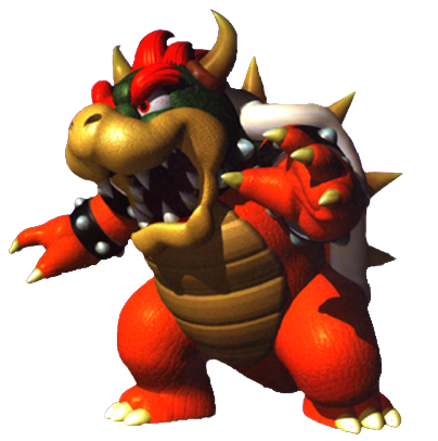
We could have a 64 Bowser alt, but depending on which art they refer to, some people might hate the design haha.


Vs.


Though I really did like Rainbow Bowser's design. It was a totally random element but made the battle feel more intense.
 

Nefnoj

Smash Lord
Joined
Sep 2, 2014
Messages
1,911
Location
Spiral Mountain
I sorta like Bowser with reddish-orange skin, but I don't think its enough to warrant a new alt.
Has anyone seen AlGeorgeRomo's classic skins? I bit undetailed, but it has essentially that.

I want an "HD" version of Mewtwo2000's Bowser Fight to make it in, that stage is deh awesome. Though could do with a few platforms.
 
Last edited:

TimeSmash

Smash Champion
Joined
Aug 23, 2006
Messages
2,669
Location
Inside a cheesecake
NNID
nintend64
I sorta like Bowser with reddish-orange skin, but I don't think its enough to warrant a new alt.
I would argue that the SM64 alt is more than just skin color. There are subtle differences in eye shape, spike and shell textures, and even hair to a degree. Moreover the colors of the SM64 Bowser seem to be way more saturated than the current model as well. I do agree with you though if it's just a skin texture alteration, that wouldn't be enough
 

ArtfulHobbes

Smash Journeyman
Joined
Apr 8, 2014
Messages
236
Location
Edmonton Alberta
NNID
ArtfulHobbes2.0
3DS FC
4339-2578-0811
Not really a costume suggestion, but I'm wondering if the PMDT has any plans on changing Bowser's run animation?

While it is comical I think it doesn't suit him at all. I mean he's just vibrating on the ground to move... not very Bowser esc. Perhaps we could get Bowser running on 4 legs? It would bring out his more beast like nature in the smash games while still having his hunched over posture.
 

GFooChombey

Smash Ace
Joined
Jun 20, 2013
Messages
595
NNID
GFooChombey
Not really a costume suggestion, but I'm wondering if the PMDT has any plans on changing Bowser's run animation?

While it is comical I think it doesn't suit him at all. I mean he's just vibrating on the ground to move... not very Bowser esc. Perhaps we could get Bowser running on 4 legs? It would bring out his more beast like nature in the smash games while still having his hunched over posture.
You can't stop the Bowser train.
 

Nefnoj

Smash Lord
Joined
Sep 2, 2014
Messages
1,911
Location
Spiral Mountain
Not really a costume suggestion, but I'm wondering if the PMDT has any plans on changing Bowser's run animation?

While it is comical I think it doesn't suit him at all. I mean he's just vibrating on the ground to move... not very Bowser esc. Perhaps we could get Bowser running on 4 legs? It would bring out his more beast like nature in the smash games while still having his hunched over posture.
Yeah, WHAT IS THAT, ANYWAY?!! HOW DOES IT PHYSICALLY WORK?!!
I love Melee's and Brawl's Bowser much better than Smash Four's... Smash Four's seems disproportionate to Bowser for some reason to me. Or something. I don't know.
 

Mushguy

Smash Cadet
Joined
Aug 9, 2014
Messages
63
Yeah, WHAT IS THAT, ANYWAY?!! HOW DOES IT PHYSICALLY WORK?!!
I love Melee's and Brawl's Bowser much better than Smash Four's... Smash Four's seems disproportionate to Bowser for some reason to me. Or something. I don't know.
I'd rather have the cartoonier Bowser from the current games than the Smash version: He does know how to run, and his shell doesn't bend, but that's just me.
 

Nefnoj

Smash Lord
Joined
Sep 2, 2014
Messages
1,911
Location
Spiral Mountain
Okay, so I have an idea... But they'd have to make a lot of animation changes. What if they made the grapple beam utilize Prime's beam? It's not Spoiler Big is it?

It makes more sense, given she's using it to grab the enemy, and one cannot grab something with a cannon. I know her Brawl design is based off of Super Metroid... But still. It'd be cooler and more logical. Maybe.
I'd rather have the cartoonier Bowser from the current games than the Smash version: He does know how to run, and his shell doesn't bend, but that's just me.
Yeah, and I guess that makes sense... Maybe I don't like him because he's TOO upright, though I'm not sure.
 
Last edited:

ConDeeCas

Smash Journeyman
Joined
Sep 11, 2014
Messages
246
NNID
ConDeeCas
I always thought that Bowser's run was like a glitch or something, mainly because it MAKES NO FRICKIN SENSE! I would personally love 2 SIMPLE F*CKING THINGS FOR BOWSER: 1. MEOWSER. MAEK IT HAPPEN. 2. BETTER RUN. NOW.
plz dont be mad at my capital letters im trying to look cool. plz pmdt do these things ;3
 

InfinityCollision

Smash Lord
Joined
Jul 9, 2014
Messages
1,245
I can't possibly be the only person here who understands that Bowser slides along on the underside of his shell for his run animation. It's fine.
 

Nefnoj

Smash Lord
Joined
Sep 2, 2014
Messages
1,911
Location
Spiral Mountain
I can't possibly be the only person here who understands that Bowser slides along on the underside of his shell for his run animation. It's fine.
Errr...
I think you are.

So I decided to open Bowser up in Brawlbox, just to see what the heck he does. I took the time
He bends down, front claws facing forward, and then he... Scoots forward with his feet. Sort of a shimmy. It's the weirdest goshdarn thing I've ever seen.
https://www.youtube.com/watch?v=fzHOfzkkacc
WHAT DOES HE DO.
 

Shin F.

Smash Master
Joined
Oct 10, 2013
Messages
3,314
Location
The internet, obviously.
Errr...
I think you are.

So I decided to open Bowser up in Brawlbox, just to see what the heck he does. I took the time
He bends down, front claws facing forward, and then he... Scoots forward with his feet. Sort of a shimmy. It's the weirdest goshdarn thing I've ever seen.
https://www.youtube.com/watch?v=fzHOfzkkacc
WHAT DOES HE DO.
Clearly he has an engine hidden in his shell.
 

Nefnoj

Smash Lord
Joined
Sep 2, 2014
Messages
1,911
Location
Spiral Mountain
Hey guys... What would Olimar look like if Pikminified? We've seen his head... But what would his suit look like?
Clearly he has an engine hidden in his shell.
He's not the only one...

:4dedede::4wario:
Get it? 'Cause Wario has a bike and King Dedede has the jet hammer thing...
 
Last edited:

Nanobuds

Smash Ace
Joined
May 17, 2013
Messages
896
Okay, so I have an idea... But they'd have to make a lot of animation changes. What if they made the grapple beam utilize Prime's beam? It's not Spoiler Big is it?

It makes more sense, given she's using it to grab the enemy, and one cannot grab something with a cannon. I know her Brawl design is based off of Super Metroid... But still. It'd be cooler and more logical. Maybe.

Yeah, and I guess that makes sense... Maybe I don't like him because he's TOO upright, though I'm not sure.
I like this.
 
Last edited:

CBO0tz

Smash Lord
Joined
Jun 2, 2014
Messages
1,055
Location
Yoshi's Island
Okay, so I have an idea... But they'd have to make a lot of animation changes. What if they made the grapple beam utilize Prime's beam? It's not Spoiler Big is it?

It makes more sense, given she's using it to grab the enemy, and one cannot grab something with a cannon. I know her Brawl design is based off of Super Metroid... But still. It'd be cooler and more logical. Maybe.

Yeah, and I guess that makes sense... Maybe I don't like him because he's TOO upright, though I'm not sure.
I bet it would be super easy to do this by just mirroring the current grab/zair animation so the left arm is extending out.
 

Nefnoj

Smash Lord
Joined
Sep 2, 2014
Messages
1,911
Location
Spiral Mountain
I bet it would be super easy to do this by just mirroring the current grab/zair animation so the left arm is extending out.
Yeah, but I don't know if there's a command to mirror animations... It'd look better if they did it from scratch since her footing and her upper body movement would be different.
 

CBO0tz

Smash Lord
Joined
Jun 2, 2014
Messages
1,055
Location
Yoshi's Island
I played Smash 64 last night, and I realised there was a few more things that I really would like to see in PM.

I sorta feel like we need more victory poses for the original 12, but idunno. Some of them are a little weird, but others(like Link's, Luigi's, and C. Falcon's) are pretty damn cool.

All Victory Poses (SSB64): http://youtu.be/6xsgHRQ0TEY

Also, I think Dr. Mario's Victory animation could look cool for regular Mario if you replace the pill with flames.
 

Nefnoj

Smash Lord
Joined
Sep 2, 2014
Messages
1,911
Location
Spiral Mountain
Also, I think Dr. Mario's Victory animation could look cool for regular Mario if you replace the pill with flames.
I'm not quite sure what you mean here.
:4mario::4drmario:
I played Smash 64 last night, and I realized there were a few more things that I really would like to see in PM.

I sorta feel like we need more victory poses for the original 12, but I dunno. Some of them are a little weird, but others, like Link's, Luigi's, and C. Falcon's, are pretty [censored] cool.
I like Samus' when she shoots into the air. That's a really good idea. I would love to see more Smash 64 representation. When I heard the menu theme of Smash 64 in Smash 4, I wanted to cry tears of joy.
 
Last edited:

Narpas_sword

Moderator
Moderator
Joined
Dec 11, 2013
Messages
3,859
Location
Wellington, New Zealand
I like this.
Excellent.

Your PED suit can have the Lasso =p


and while you're making art, convince the team that samus' current grapple animation is silly.

It's an energy weapon, the propulsion comes from the device, not from samus flinging her arm out like shes tossing out one of these
 
Last edited:

Nefnoj

Smash Lord
Joined
Sep 2, 2014
Messages
1,911
Location
Spiral Mountain
Excellent.

Your PED suit can have the Lasso =p

And the best part about the PED is that the starting point of the energy isn't too far from where the cannony thingy of the beam is.


and while you're making art, convince the team that samus' current grapple animation is silly.
It's an energy weapon, the propulsion comes from the device, not from samus flinging her arm out like shes tossing out one of these
Are you saying she shouldn't throw any force in the beam? I'm kind of undecided if that's a good idea. One one hand, you have a good point, it's an energy weapon, and all her force should be in the pull.
But on the other hand, I like those hand-slappy-sticky things.
 
Last edited:

Narpas_sword

Moderator
Moderator
Joined
Dec 11, 2013
Messages
3,859
Location
Wellington, New Zealand
And the best part about the PED is that the starting point of the energy isn't too far from where the cannony thingy of the beam is.


Are you saying she shouldn't throw any force in the beam? I'm kind of undecided if that's a good idea. One one hand, you have a good point, it's an energy weapon, and all her force should be in the pull.
But on the other hand, I like those hand-slappy-sticky things.

it should look like this

https://gfycat.com/DescriptiveFortunateFerret
 
Last edited:
Status
Not open for further replies.
Top Bottom