• Welcome to Smashboards, the world's largest Super Smash Brothers community! Over 250,000 Smash Bros. fans from around the world have come to discuss these great games in over 19 million posts!

    You are currently viewing our boards as a visitor. Click here to sign up right now and start on your path in the Smash community!

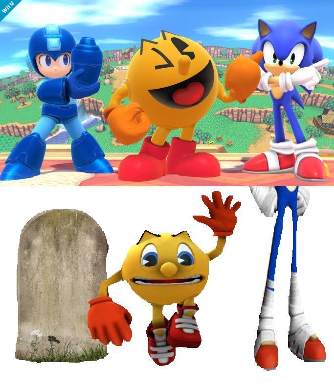
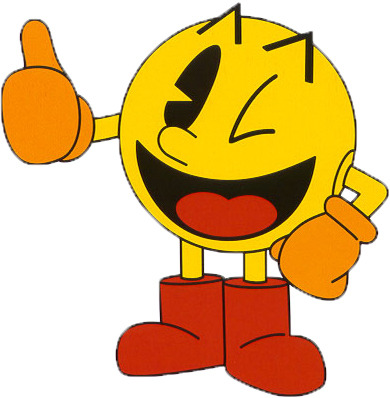
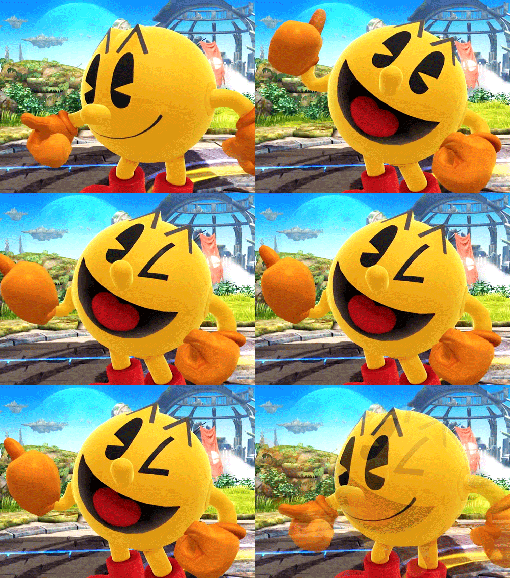
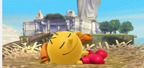
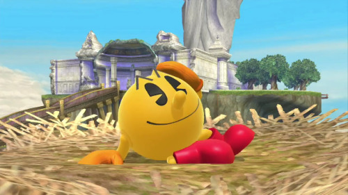
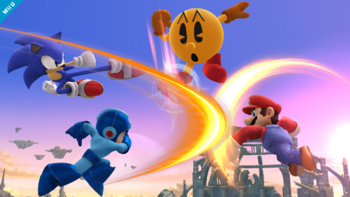
Pac Man's Character Design, is it the right one?

Mega Bidoof

Smash Hero
Joined
Aug 14, 2013
Messages
8,463
Location
The Drought
NNID
Link46
3DS FC
1160-9840-1542

This Pac may be "baaaa-aaaaaack,'


But this Pac never left. He was always with us, in out hearts.
 

Ginger Hail

Smash Apprentice
Joined
Jun 8, 2014
Messages
100
Location
New Jersey
I was pleasantly surprised when it was old school Pac, especially with the push the new design's been getting. Definitely fits in with Sakurai's decision to base Mega Man off of his classic appearances.
 

Pazzo.

「Livin' On A Prayer」
Joined
Oct 3, 2012
Messages
9,187
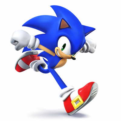
Considering that Sakurai used Classic Mega Man, is it a surprise that he used Classic Pac-Man? :laugh:
 
Last edited:

Reila

the true enemy of humanity is anime
Joined
Feb 8, 2014
Messages
9,240
Location
Alma
Annnnnndddd???? This isn't a classic Sonic rep. This is modern Sonic, and is more popular.
More popular? lol Yeah, sure.

"Aaaaand" the fact Sakurai used Modern Sonic instead of Classic means it wasn't obvious which design Pac-Man would get.

Tip: Classic and Modern Sonic are the same character.
 

Pazzo.

「Livin' On A Prayer」
Joined
Oct 3, 2012
Messages
9,187
More popular? lol Yeah, sure.

"Aaaaand" the fact Sakurai used Modern Sonic instead of Classic means it wasn't obvious which design Pac-Man would get.

Tip: Classic and Modern Sonic are the same character.
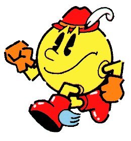
I know classic and modern Sonic are the same character... no need to be condescending.

Looking back at it, It wasn't obvious that Classic Pac-Man would appear, but at the same time, Sonic was introduced in Brawl, and Megs in SSB4.
 

Mega Bidoof

Smash Hero
Joined
Aug 14, 2013
Messages
8,463
Location
The Drought
NNID
Link46
3DS FC
1160-9840-1542
Seeing a Modern Sonic over Classic Sonic actually makes a lot of sense.

Classic Sonic rivaled Nintendo, and he was sworn enemies with Mario.
But Modern Sonic has a bunch of games on Nintendo consoles, has been to the Olympics with Mario, and has really strong ties to Nintendo.
So Modern Sonic was chosen because it is the more "Nintendo" Sonic.

Modern Mega Man is on non-Nintendo consoles more now (when he actually has a game that is).
But Classic Mega Man is more iconic and known for being on Nintendo.
 
Last edited:

SureNsync

Smash Journeyman
Joined
May 5, 2013
Messages
290
Its perfect. One thing I have to admire about Sakurai is he usually manages to choose the right design for the characters.
 

Arcadenik

Smash Legend
Joined
Jun 26, 2009
Messages
14,152
NNID
Arcadenik
What I really like is how they picked the yellow-orange tone for Pac-Man... it looks very similar to the color Pac-Man had in the NES version of Pac-Man... at least that's how it looks like to me... and his Final Smash where he turns into a giant 2D Pac-Man... the yellow tone looks very similar to the original arcade version.
 

Camalange

Moderator
BRoomer
Joined
May 12, 2008
Messages
9,420
Location
Seattle
NNID
Camalange
3DS FC
1160-9836-5007
Switch FC
SW-4197-1438-9208
As a Sonic main, I've always actually really liked the modern Sonic design. I grew up with both the Genesis games and the 3D games, and Sonic the Hedgehog 3 & Knuckles is still my all-time favorite game ever made. I would beat it all the time as a kid, but I also loved the Adventure series. Primarily Sonic Adventure 2 Battle. I guess I had that luxury of being able to experience both worlds without having the generational gap in preference.

For the reasons Mega Bidoof said, I think Modern Sonic has a different relation to Nintendo than Classic. Modern Sonic is the style of Sonic that kids are growing up with now to be the guy that hangs out with Mario on weekends to snowboard. Plus, Generations is really the last Sonic game to have had the Classic look... And that game was only for PS3 and 360. Not Nintendo. Even Sonic the Hedgehog 4 favors the more modern image.

Considering Nintendo's recent partnership with Sega, and Sonic still being a prevalent mascot, it makes total sense why they went with Modern Sonic. Also, for some reason, it's easier for me to imagine the talking, taller version of Sonic beating on people than the stubby round one.

As awesome as Megaman Legends is, I think Megaman's prime legacy amongst general audiences was his NES and SNES days. With Capcom canceling any new Megaman titles (including a Legends game) it made sense that Sakurai went with the Megaman we all grew up with playing on the first Nintendo consoles. We still see a ton of Sonic games being made today, and most recently, they're Nintendo exclusive. Megaman has essentially been shunned by Capcom in the modern times, and I think giving us that classic Megaman look, reminding us of better days where he was jumpin' and shootin' on our Nintendo is the right decision.

Same thing goes for Pac-Man. Granted he did just undergo a reboot, the majority of audiences still don't connect with that "Modern Pac-Man" as they do "Modern Sonic". I think going with his oldschool look and warping it with the 2D pizza look was the perfect way to really bring home Pac-Man to their audiences.

:093:
 
Last edited:

shadowjosh

Smash Apprentice
Joined
Jan 24, 2014
Messages
199
Location
Chicago
Modern Sonic has been around longer than Classic Sonic at this point, though. "Modern" Pac-Man is basically a couple years old. I really don't think this comparison makes sense, either way. They're using each character's iconic look in terms of their association with Nintendo.

This is about 'Pac, not Sonic. And I'm a huge Sonic fan...
 
D

Deleted member

Guest
The design is 100% perfect. Sakurai could not have picked a better one. One of the hardest parts of being a Pac fan was always trying to accept the awkward new designs, this was a huge relief. The new designs have their place in cartoons and party games but this is the iconic design everyone knows and loves the most.
 

ptrk83

PRiDE
Joined
Apr 6, 2014
Messages
256
Location
NJ
NNID
X-ptrk83-X
Definitely. The retro touches are perfect for him! He kinda is like a game and watch type with a quirky move-set.
 

D3monicWolv3s

Smash Ace
Joined
Nov 11, 2006
Messages
648
Ugh. I wanted the design with the bow and eyeshadow! He just looks so basic.
Its perfect. So glad we got this design.

I can only speak for myself, but I am bit bummed by SEGA's stupidity. If people like Classic Sonic, they should give Classic Sonic to people. That said, Modern Sonic isn't as bad as some extremists claim him to be and I can live with this design being the one present in Smash. Lets just be glad they didn't change his design to that abomination with giant legs from Sonic Boom.
I really don't like modern sonic. I was really disappointed they didn't go with Classic, but I knew from the start to not get my hopes up for the classic design being used. I'm curious what the majority would have wanted.
 

BirthNote

Smash Master
Joined
Jul 9, 2009
Messages
3,003
Location
A warrior's grave...
NNID
GeneticDestiny
IDK people...Pac Man World 2 is my favorite game of the series, and my 10 year old self would be in hysterics if he had a way to time travel and see this reveal, but I honestly like the new Pac Man's sneakers. They remind me of Crash Bandicoot's and I wish he had THOSE sneakers but the PMW2 look. Everything else is fine
 

VictoryIsMudkipz

Smash Journeyman
Joined
Jul 8, 2012
Messages
407
Location
Disney World
Just like Megaman's classic design, Sakurai hit it home with using this design for Pac-Man, I doubt people would really have made a BIG deal if they used his new design because its not that bad, and if you've played Pac-Man for as long as I have, you would have known that Pac-Man over the years has had many designs, with the one Sakurai is using, being the most well regarded
 

Mysteltainn

Smash Ace
Joined
May 4, 2008
Messages
888
Location
Canada
I'm quite happy they chose his Pac-Man World 2 look. Perhaps I'm biased in that since I enjoyed that game, but I just found he was overall more of a modest character back then. I feel as if they completely ruined him when they made him talk, made him cocky and gave him those weird looking runners.

I guess now I know why Link and Mario don't say much, it's a good way to keep a character modest and no chance of messing up, lol.

I'm sure the new Pac-Man does have fans though, so I'm sure there will be a palette swap for it.
 
Last edited:

Ragna22

Smash Ace
Joined
Apr 9, 2014
Messages
904
I'm gonna be hones, I've never even heard of Pac-Land until Pac-Man's reveal for Smash 4, my experience begins with one day on an arcade cabinet at a Cici's Pizza, went to Pac-Man World 2 and ends with Championship Edition which I still play the hell out of.

That said I do have a more nostalgic connection with the design in Smash 4 because it's Pac-Man World, granted I saw no butt bounce or rolling attack in sight but this is absolutely fine. Now this doesn't mean I despise the Ghostly Adventures design like most people, I don't watch the show myself but I do understand what they were going for with that design...I just prefer the one I played as in Pac-Man World 2 on my Gamecube.
 

Halfhead

Smash Journeyman
Joined
Jul 16, 2013
Messages
361
I think the reason Sonic is modern while Mega Man and Pac-Man are retro is because those are the time periods in which those characters were biggest on Nintendo platforms. Capcom brought Mega Man more towards Playstation near the end of its life and Pac-Man isn't big anywhere at the moment. Retro Sonic is very non-Nintendo, though. It was Nintendo's biggest competitor.
 

~ Valkyrie ~

Holy Maiden Warrior
Premium
Joined
Jun 18, 2011
Messages
8,991
Location
Marvel Land ~ Eternally Slumbering
NNID
IndyGo98
3DS FC
2793-0906-0731
Switch FC
SW-7670-7999-3483
How to put this.

To me, this design for Pac Man, along with all the retro touches, makes me see him having this timeless, old-school charm reminischent of Mickey Mouse from his cartoons around 30s.


It's also something I found really approving and neat throwback in the "Mickey Mouse Shorts" made by Disney I think around last year, which sported designs inspired by the cartoons of that time as well:


Now what strucks me most in these cartoons and their characters is their simplistic, yet charming movement, emotions and actions they do, all Pac Man does this all down to a tee, even if his eyes are just little gag of their own to his iconic look.


Considering how Pac's most beloved and remembered as the historically important, timeless videogame icon and had his most best prime in the arcades back in those days, I think this design, along with his portrayal ala Namco Arcade Hits-styled moveset, I truly believe we have a character that is basically the Old-School Mickey Mouse of the SSB4-cast, right down to how revolutionary and integrated to development of videogames Pac was.

His taunts and animations are just full off charm which feels so retro, so simplistic, yet all the way charming.


I tell you, I'm beyond content with how Pac's been put there: serving what I think is the Mickey Mouse of the whole SSB4-cast. Or Felix the Cat. Whichever. You know what I mean though - a monumental, timeless old-school character who's simple, yet very full of charm from the time he's from, and had his prime in.
 
Last edited:

Wonks

Smash Journeyman
Joined
Aug 12, 2012
Messages
374
Yes, yes, for the love of all things good--yes. This combines the best of both worlds: arguably the most recognizable limbed Pac-Man design and the move-specific original pizza-pie design. Fantastic decision by Sakurai. (Although I would have been okay with the Pac-Man Party design, as well.)
 

TaichiYaegashi

Smash Ace
Joined
Apr 11, 2013
Messages
962
Location
KY
As someone who doesn't really favor Pac-Man's modern designs in any way and absolutely hates his new voice....yes. Yes a thousand times. When it comes to Pac-Man, his old(er) designs beat all. Waka waka ftw.
 
Last edited:

SmashShadow

Smash Champion
Joined
Jul 9, 2012
Messages
2,660
3DS FC
0104-0598-9588
I still say that this is the best design overall but for the sake of being iconic the other one works more.
 
Top Bottom