• Welcome to Smashboards, the world's largest Super Smash Brothers community! Over 250,000 Smash Bros. fans from around the world have come to discuss these great games in over 19 million posts!

    You are currently viewing our boards as a visitor. Click here to sign up right now and start on your path in the Smash community!

Pac Man's Character Design, is it the right one?

ChillerDuu

Smash Cadet
Joined
May 22, 2014
Messages
49
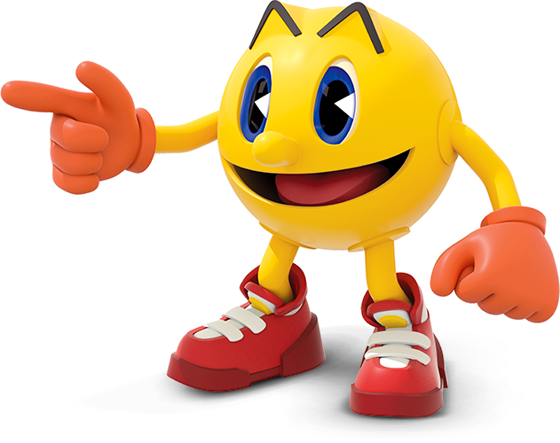
I was never too keen on Pac-Man to begin with thinking they'd go with the newer design with eye balls and teeth. Eugh! Seemed too uncanny and strange for me to like. I think it's the look they decided to go with that really sold people on his inclusion in the game, me included. The classic look just fits better with the other characters.

As an added bonus, no voice, just classic sounds. They played it safe and old school making him all the more timeless and charming. I love him now.
 
Last edited:

Azureyoshi

Smash Rookie
Joined
Jun 1, 2014
Messages
21
This was a great choice for him. I think this design is a great compromise for people who either preferred the "8-Bit arcade style Pac-Man" or the "Pac-Land - Pac-Man World Pac-Man". It blends the best of both worlds into one character (Kinda similar to Mega Man). And for people who like the Pac-Man Party & Ghostly Adventures Pac-Man design (Like myself), they might add that as an alternate costume (Won't be upset if they don't). We'll see in due time. As for now though, I'm very happy with this design choice for Pac-Man! :4pacman:
 

κomıc

Highly Offensive
Joined
Jun 22, 2012
Messages
1,854
Location
Wh✪relando
NNID
komicturtle
I like this design more. But I do like his new design. I think it's more vibrant. I hope it is an alt.
 

smashbro29

Smash Champion
Joined
Oct 9, 2007
Messages
2,470
Location
Brooklyn,NY,USA
NNID
Smashbro29
3DS FC
2724-0750-5127
They have no problem going with classic Pac Man.
Yet they use modern Sonic.
All my rage.
There's a massive difference there.

New Sonic isn't a reboot or some other asinine ****. It's the same character slightly taller with colored eyes. I would have been fine with classic Sonic but the new one retains what made the old one special in what is a rare case of a good video game mascot redesign.
 

BlitznBurst

Smash Ace
Joined
Jun 25, 2013
Messages
723
They have no problem going with classic Pac Man.
Yet they use modern Sonic.
All my rage.
Because Sonic's modern design has been around far longer than his classic one. Classic Sonic was around from 1991-1999, while Modern Sonic has been around since 1999. For all intents and purposes modern Sonic is his most iconic design.

Meanwhile Pac-Man's newest design is from a show that nobody likes and a cheap tie-in game that nobody played, and is pretty much universally hated. Maybe if they had used the Sonic Boom designs you would have a point.
 

TheMagicalKuja

Smash Champion
Joined
Jul 25, 2001
Messages
2,079
Location
I'm not telling you psychos
3DS FC
2020-0988-7919
I'm still baffled by all the hate Sonic's Unleashed->current design gets. It's every way better than what we've seen in the early days. People's nostalgia boners have pretty much screwed over Sonic just as much as any of Sega's bad decisions regarding him.
 

Bauske

Pac-Maniac
Joined
Feb 13, 2014
Messages
1,175
Location
Pac-Maze
NNID
Bauske
3DS FC
2878-9584-0314
I'm still baffled by all the hate Sonic's Unleashed->current design gets. It's every way better than what we've seen in the early days. People's nostalgia boners have pretty much screwed over Sonic just as much as any of Sega's bad decisions regarding him.
Dude, I feel ya, but on the Pac-Man side. Everyone hates on the Ghostly Adventures, saying it's so bad, but I don't see it. It's definitely different, but I think he's just as adorable, fun, and lively in the new persona. It's just personal preference, but to me as a Pac-Man fan, I love anything Pac-Man regardless, but I actually do enjoy Ghostly Adventures.

I'm sure Sonic Boom will receive much the same gripes, but people will still enjoy it.
 

Dreamking

Smash Journeyman
Joined
Nov 18, 2007
Messages
409
Location
The Infinite Beyond
NNID
DreamWanderer92
3DS FC
0817-5074-8674
Switch FC
6827-7951-1977
I'm satisfied with Pac's look in this game and I do hope his Pac Land costume gets in as an alt especially considering that Pac Land is to be Pac Man's Wii U stage.
 

silvR1995

Smash Journeyman
Joined
Mar 20, 2011
Messages
230
Location
California
NNID
silvRboLt1995
3DS FC
0834-0571-4339
I'm satisfied with Pac's look in this game and I do hope his Pac Land costume gets in as an alt especially considering that Pac Land is to be Pac Man's Wii U stage.
IIRC, Isn't Pac's 'Land' costume simply him with a hat? That's what I've seen.
 

SegaNintendoUbisoft

The Amateur Artist
Joined
Jan 26, 2014
Messages
7,301
Location
This thread
NNID
S.N.U0203
3DS FC
4725-8740-7336
Dude, I feel ya, but on the Pac-Man side. Everyone hates on the Ghostly Adventures, saying it's so bad, but I don't see it. It's definitely different, but I think he's just as adorable, fun, and lively in the new persona. It's just personal preference, but to me as a Pac-Man fan, I love anything Pac-Man regardless, but I actually do enjoy Ghostly Adventures.

I'm sure Sonic Boom will receive much the same gripes, but people will still enjoy it.
I think the difference is that Ghostly Adventures is a reboot, while Sonic Boom is just a separate branch of the franchise that won't replace the current Sonic. People were a bit more positive towards Boom when they found out it wasn't a reboot.
 

Ryu Myuutsu

Smash Champion
Joined
Mar 24, 2013
Messages
2,438
Location
Niigata, Japan
NNID
BahamurShin
3DS FC
3668-9945-1996
What is Pacman's current design? I'm afraid I'm not much into the games lately.
Either way, this design choice was perfect. It was obvious that his four-limbed design would take prevalence over the old-school one since it fits more in a fighting game, but been able to transform into it's original form is awesome.
 

Pacack

Super Pac-Fan
Joined
Jun 7, 2013
Messages
8,066
Location
US (Mountain Time, -7 Hours)
NNID
Pacack
3DS FC
0688-5284-6845
What is Pacman's current design? I'm afraid I'm not much into the games lately.
Either way, this design choice was perfect. It was obvious that his four-limbed design would take prevalence over the old-school one since it fits more in a fighting game, but been able to transform into it's original form is awesome.


That's his current design.
 

Pacack

Super Pac-Fan
Joined
Jun 7, 2013
Messages
8,066
Location
US (Mountain Time, -7 Hours)
NNID
Pacack
3DS FC
0688-5284-6845
Only issue I have with the design is that Pac-Man looks *really* strange with teeth.
The reason a lot of people dislike the design so much is because of this picture:


Not the best. The previous pictures are much better and show off the better parts of the design.

Though I do agree that Pac-Man with teeth is odd.
 

Crendog

Smash Cadet
Joined
Jun 9, 2014
Messages
59
3DS FC
0318-7435-8104
His design could definitely be better but from looking at the reveal video it looks like they are implementing some retro pac man moves into the game
 

Mr Lange

Smash Apprentice
Joined
Jul 2, 2012
Messages
193
There's a massive difference there.

New Sonic isn't a reboot or some other asinine ****. It's the same character slightly taller with colored eyes. I would have been fine with classic Sonic but the new one retains what made the old one special in what is a rare case of a good video game mascot redesign.
Sonic's modern design is considerably more different than just "taller with colored eyes", and by all accounts is uglier and shallower than his original design. I've never liked the redesign nor the embarrassingly bad personality they gave to it. The design has only gotten worse over time as well. I can tell the Smash Bros devs tweaked his appearance to be a little more ambiguous with his legacy design though, so props to them for that.
 

SomewhatMystia

Smash Lord
Joined
Nov 29, 2013
Messages
1,194
Location
Columbus, Ohio
NNID
SomewhatMystia
3DS FC
2750-1555-1721
The reason a lot of people dislike the design so much is because of this picture:

Ghostly Adventures Pac

Not the best. The previous pictures are much better and show off the better parts of the design.

Though I do agree that Pac-Man with teeth is odd.
Yeah, that's definitely not the best. He looks all... weirdly stiff and posed (like someone posing an action figure) in it, unlike the earlier/toothy one.
 

BridgesWithTurtles

Smash Champion
Joined
Apr 18, 2013
Messages
2,175
Location
The long road to nowhere
3DS FC
3523-2059-7939
Ghostly Adventures Pac looks plastic/robotic. Like he's hard and inflexible. I really don't like it. Plus teeth.

Also, Adventure-era Sonic's design > Classic > Unleashed onward.
 

D-idara

Banned via Administration
Joined
Jul 8, 2012
Messages
3,240
Location
Venezuela
NNID
D-idara
3DS FC
4511-0670-4622
They have no problem going with classic Pac Man.
Yet they use modern Sonic.
All my rage.
Because modern Sonic looks awesome and he looks better than Classic Sonic? (And I love Classic Sonic, mind you). He overall much more memorable and has a much more defined personality, choosing Classic Sonic wouldn't make any sense.
Ghostly Adventures Pac looks plastic/robotic. Like he's hard and inflexible. I really don't like it. Plus teeth.

Also, Adventure-era Sonic's design > Classic > Unleashed onward.
Unleashed Sonic = Best Sonic design.
 
Last edited:

TheDarkKnightNoivern

Smash Master
Joined
Jun 24, 2014
Messages
3,641
Location
Croft Manor
Funny how Sonic is the only 3rd party contender to use his modern look, while Mega Man and Pac-Man stick to their more classic looks.
Well now Modern Sonic is just as if not more recognisable than classic, this is what we've had since Sonic Adventure in 1998 while classic mega man and this pac-man have had recent games (9 and 10, World series). Also this sonic is much easier to make a moveset for
 

ptrk83

PRiDE
Joined
Apr 6, 2014
Messages
256
Location
NJ
NNID
X-ptrk83-X
I too love his design.. very retro very nostalgic.. I also love how he is always smiling.. enjoys everything he does lol
 

Cyberguy64

Smash Journeyman
Joined
Apr 25, 2014
Messages
439
Location
Denial


That's his current design.
My problem with modern Pacman is that he's trying too hard to be "The cool, but unpopular kid." It's such an overdone character type, and I've yet to see one pulled off that wasn't incredibly annoying.

Classic Pac-man has a timeless, ageless, "devil-may-care" attitude about him. Like classic Mickey Mouse, he faces adversity with a look of shock, and then an unconcerned grin. He's got this, man. He's been around since the early 80s, after all.

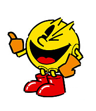
That said, I still hope that some of this Pac-Man design gets some representation at some point:
 

andalsoandy

Smash Lord
Joined
Oct 24, 2013
Messages
1,278
Location
heck
My problem with modern Pacman is that he's trying too hard to be "The cool, but unpopular kid." It's such an overdone character type, and I've yet to see one pulled off that wasn't incredibly annoying.

Classic Pac-man has a timeless, ageless, "devil-may-care" attitude about him. Like classic Mickey Mouse, he faces adversity with a look of shock, and then an unconcerned grin. He's got this, man. He's been around since the early 80s, after all.

That said, I still hope that some of this Pac-Man design gets some representation at some point:
That design was confirmed as an alt. costume in Famitsu I believe.

Personally I want his Pac-Land design the most, and if they added the American version as well (where he has regular looking eyes with whites and all) that would be fantastic.
 

Dropkick JD

Unexpected Smash God
Joined
Feb 10, 2014
Messages
173
Location
York City, Pennslyvania
You know, if they would have went with Pac-Man's modern design? I wouldn't use him.

Reason I immediately decided to main Pac-Man is because I have such fond memories of the one big arcade we have around here, and the tokens and posters showed Pac-Man. I always loved trying to win Pac-Man related prizes and playing the one classic machine. So many fond memories.

I have no fond memories of the over-done new design. I think it's ugly. Too much detail on something that never needed that much. Just like Chuck E Cheese's new design. No love for it.

Maybe it is just nostalgia. I don't give a single damn. I'm beyond glad they went with his classic design.
 

Luigi580

Smash Apprentice
Joined
Aug 23, 2014
Messages
119
Well, the primary gaming community is definitely more likely to like the original/world version of Pac-Man since that's the version that everyone in the gaming universe will recognize and be happy with. Sure, The Ghostly Adventures Pac-Man has shown up in a game every now and then, but that version of him is more well known for the TV show.
 

Placebo Effect

Smash Apprentice
Joined
Aug 17, 2010
Messages
156
Location
The Arena Eternal
Well seeing as this is a variation of his original artwork, yes.


Either way it's much better than that horrendous-looking/sounding Ghostly Adventures remake, and (imo) has much more character than just his arcade form.
 

Knight Dude

Keeping it going.
Joined
Mar 10, 2013
Messages
21,365
Location
The States
NNID
Kaine-Rodgers
3DS FC
0232-7749-6030
Yes. This is the absolute best Pac-Man design that they could have chosen. I know Sakurai wanted just the floating head Pac-Man. But Namco convincing him to use the Pac-Man World look was a very smart move.

I mean, when I think of Pac-Man, that's what I see. So I'm happy with the design.
 

Paint_B

Smash Cadet
Joined
Sep 7, 2014
Messages
35
I'm just happy they didn't have him use the voice from Ghostly Adventures... that would be annoying.
 

D-idara

Banned via Administration
Joined
Jul 8, 2012
Messages
3,240
Location
Venezuela
NNID
D-idara
3DS FC
4511-0670-4622
Great. Exaggerations
Doesn't help that fans still hate The Blur's current, pre-Boom design.
The number of people who hate Modern Sonic's Unleashed design have been decreasing rapidly since Unleashed and Colors. He really looks like the best Sonic because Unleashed grabbed the 06' design and added some small things from the Classic design to make Sonic seem more friendly.

They obviously chose all the best designs possible for the third parties, Sonic looks expressive and his mouth's on the side like it should always be, like on Unleashed, Colors and Generations. Megaman looks and feels like his highest point, and Pac-Man's design feels classic.

For me, the Pac-Man Party design looks good, but the Ghostly Adventures design rubs me the wrong way...still, this was the best design they could use, the most recognizable, memorable and cartoony Pac-Man, like @Young Horsetail mentioned. Although I still think Sonic should get his classic counterpart as an alt. costume (And don't get any ideas, Sakurai, don't go making him 'Young Sonic' or 'Toon Sonic').
 

Aflay

Smash Rookie
Joined
Oct 8, 2014
Messages
4
Location
Laredo, Texas
I couldn't picture a better Pac-Man. I love his Galaga moves, especially. I used to play Pac-Man and Galaga side by side at a Cici's pizza awhile back. I hated the pizza, but loved the games.
 

AGES

Smash Apprentice
Joined
Dec 14, 2013
Messages
143
Location
Chicago, IL
NNID
Snicks
I couldn't picture a better Pac-Man. I love his Galaga moves, especially. I used to play Pac-Man and Galaga side by side at a Cici's pizza awhile back. I hated the pizza, but loved the games.
Man, thats pretty similar to how arcades would go for me too lmao. Me and my brother would sorta trick my parents into thinking we loved this one local bowling alley, so for our birthday parties sometimes we would have them at the alley where we would bowl for not too long and head straight to the arcade where our quarters went to die. In the retro corner(I'm still a fairly young one) alongside Donkey Kong, Space Invaders, etc. There sat Pac Man, Galaga, and Dig Dug, which those 3 were pretty easily my favorites out of the whole arcade, save for this one pinball game(I cant remember what brand for the life of me) as I was a pretty huge pinball kid, and still kinda am actually.

As for Pac Man's design I'm extremely happy with how he turned out, I definitely prefer this design even if it be because of nostalgia. Granted, I wouldn't have quite minded the new design but it is supposed to be extremely cartoony and embody a character that speaks a lot, it just wouldn't fit quite as nice without proper voice acting which would be preeeeetty annoying imo
 
Top Bottom