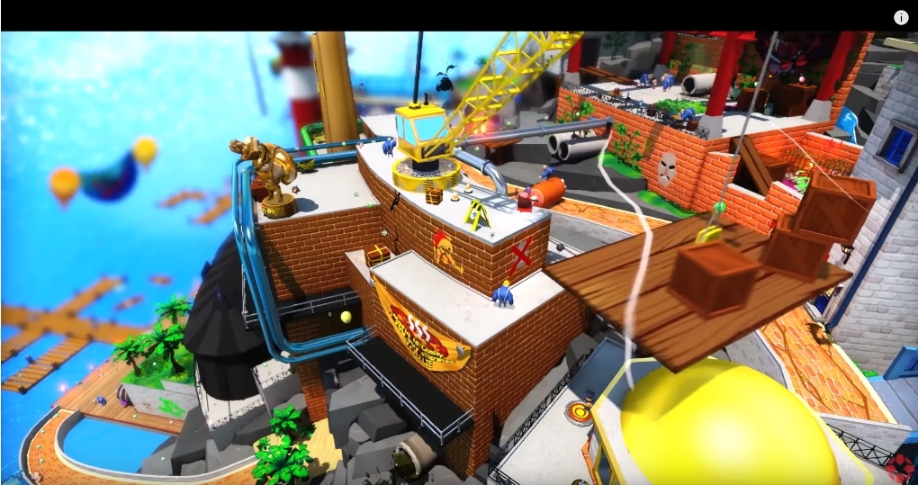
"The shading and colors are all WW-like"
lol
-no understanding of theme to level
-no primary color
-no secondary color
-everything clashes (why is there a gold statue? its not a big golden statue, so it doesn't feel like an important centerpiece, and its in a location you can hardly see, why is it in a port? is this a town? graffiti necessary? again, You cant even see them thanks to the clashing color) so messy
-models look like they came from a watered down ps2 game
its such a simple philosophy for these kinds of games, have basic overarching colours so its easy to navigate. You dont just throw stuff together when making a level.
Now lets look at WW:
- very nice and clear color scheme, nothing clashes
- I can understand simply what setting im in
- 3D cellshaded model that looks 2D thanks to fantastic visuals
I can go on with Sunshine as well if you want.
Just know that the creator of Hat in Time, has a very infamous past in a old Mario fangame community (MFGG).


