• Welcome to Smashboards, the world's largest Super Smash Brothers community! Over 250,000 Smash Bros. fans from around the world have come to discuss these great games in over 19 million posts!

    You are currently viewing our boards as a visitor. Click here to sign up right now and start on your path in the Smash community!

Giving Brawl+ a unique look: Modifying the CSS and other menus

Slashy

Smash Lord
Joined
Aug 15, 2007
Messages
1,402
Location
Palm Beach
We have begun work already on modifying the CSS http://filebin.ca/yanuqd/common5.pac . (place that in /private/wii/app/RSBE/pf/system [credit goes to SakurabaNeku]), to swap out the HANDICAP icon to BUFFER.

If we can do that, maybe we can further texture other menu files to give Brawl+ a unique look and make it a more seamless experience. In this topic we will share files we want to edit, files we edited, and files that need to be tested, in order to compile a Brawl+ theme for Brawl.
 

SymphonicSage12

Smash Master
Joined
Feb 6, 2009
Messages
3,299
There's already a cool CSS that someone gave me.... it has pictures of all of the characters from various games and such...

if you guys could post pictures of these than it would be great
 

SymphonicSage12

Smash Master
Joined
Feb 6, 2009
Messages
3,299
no like, the actual pictures of the characters on the CSS. not the csp's.


like the pictures that you put the cursor on
 

Slashy

Smash Lord
Joined
Aug 15, 2007
Messages
1,402
Location
Palm Beach
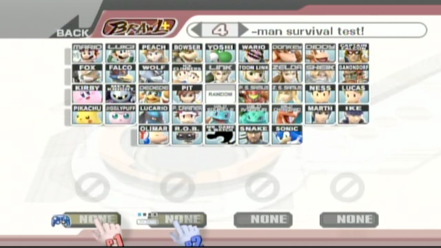
Ah okay, I was going to edit that with a new font and background for the names. I want to make the names more stylish, inform that there are "wild" Pokemon on the roster, and fix ZSS' name.
 

timothyung

Smash Ace
Joined
Feb 3, 2008
Messages
948
Location
Hong Kong
cookiemonster said in another thread that he want everything in Brawl "plussified".
Yeah so we should discuss what we can do.

Buffer - done
Mark neutral, cp, and banned stages with a green, yellow and red border respectively?
title screen
anymore suggestions?
Actually CSPs for the official texture package would be <3
That would be cool and all, but you'd have to wait for an offical stage list. Also, different regions would have different stage lists.
I'd love the marking of the stages.
You can make the title screen say B+ but that's a nice bonus.
A few of my suggestions:
- title screen to Brawl+
- Change the text in rules from "Handicap" to "Buffer"
- Change any instances of Brawl to Brawl+
- Include just one menu song replacement? I would suggest just this one or something like that because it's still the Brawl theme, yet the different style is enough to tell you "Hey, Brawl+ means business" Yeah, music is really a personal thing, but I don't think changing one theme would be a big deal, plus users can always switch it out. *shrug* I just think the idea of Brawl+ having its own theme would be cool. :laugh: If this suggestion is ignored, I'll just continue using my own of course.
- I saw a Brawl+ strap loader image awhile back, would be cool if that was polished up a bit more, had the Brawlplus site URL on it, explain what Buffer is, the version number of the codes, etc.
So long as the title screen doesn't say "Screw that, I want fun speed activate!" I'd love to see a brawl+ title screen. ^_^ Speaking of which, who came up with that lousy(no offence) phrase anyway?
I was thinking of holding a contest for the artist to draw and color each individual 39 characters for the three screen warnings. Just replace those with the characters everyone has drawn.

Have the community vote on the best characters that are well drawn.
you mean you're gonna put the characters on the warning screens? like the wrist strap ones and stuff?
Yeah, replace that with the characters and have a different phrases like for example: "Brawl+ is a faster, more competitive game to its predecessor vBrawl." etc, etc.

It won't really have that line but it's just an example...
It should be a random character each time!
that would be cool. Kinda like the "press start" screen on mario kart that randomly shows peach, mario, luigi, or bowser. :D


Unfortunately it seems these altogether increase the filesize beyond the original file size and thus File Patch gets screwed up.

Using SmashBox's Size Resizer doesn't seem to work. =/

Although I bet you can replace it drectly onto the ISO and it'll work lol.

Btw, replace the Donkey Kong Jungle Beat icon with the Super Smash Bros. Brawl one. <.<
My pac also with the Buffer icon:
http://www.mediafire.com/download.php?nrzowdynmm2

And I need the JP version of common5...
 

SymphonicSage12

Smash Master
Joined
Feb 6, 2009
Messages
3,299
post pictures people D:


and I dont' know the person my custom CSS is from.....but I think a lot of the pictures are from the Subspace Emissary...
 

Sakuraba Neku

Smash Cadet
Joined
Jun 10, 2008
Messages
47
We have begun work already on modifying the CSS http://filebin.ca/yanuqd/common5.pac . (place that in /private/wii/app/RSBE/pf/system [credit goes to SakurabaNeku]),
For the record, I didn't make the buffer thing(I think timothyung did) I just discovered the you could put it in the common5.pac and it would work with the SD loader(Slashy was telling me it didn't until I tried it)
 

Lucina Clash

Smash Apprentice
Joined
May 9, 2007
Messages
162
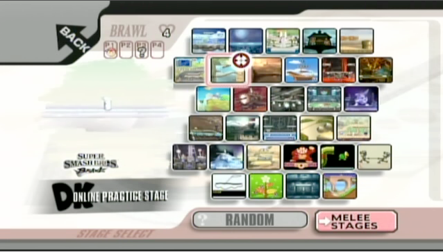
Seems like the "Online Practice Stage" icon needs a new palette in order to function. Anyone know how to do this?
 

Lucina Clash

Smash Apprentice
Joined
May 9, 2007
Messages
162
Okay, so I got the pictures of the Online Practice Stage to at least show up, but when the cursor is on top of Rumble Falls, the game freezes. All I need is to figure out WHY it froze. I have a picture to prove it worked slightly. We're getting close!

Any thoughts as to why it froze the game? I can't think of any, because the picture requires no palette and the text also does not require one. (No, the icon needs a palette, so that did NOT work.) I shall post the picture of the Online Stage in a few minutes or so!

Thanks to VietGeek for creating those lovely Online Practice Stage graphics for us! They look official, and will look good if we can get them to function correctly!!

Edit with pic:


Viquey

Smash Journeyman
Joined
Jun 15, 2009
Messages
335
Location
Under a Rock
Aah yesss I'd love this. Can you change the appearance of the menus themselves? Maybe change the button shapes or locations, or at least the buttons' and bg's colors? I dunno how much of that is customizable.

Maybe a B+ themed opening movie? And a B+ how-to-play tut?

Oh and as for the colored borders marking stages, since, as someone timothyung quoted up there said, different regions/etc. would have different legal and banned stages and changes are still being made overall, etc. So have say blue for neutral, blue-green/green for starter/counter, yellow for counter, orange for counter/banned, red for banned. So it retains the ones that could go either way. And as for the changes that could be made, well just change what stages are marked what alongside the builds.

aaand what else...

messing with the defaults some more if possible? The banned stages could be turned off by default, cpus are a different level by default maybe...

Perhaps using the special brawl mode for something? like switching between builds or something... and maybe changing/adding b+ specific options to the settings menu...?

Yeah just throwing ideas out there. I know most of this probably isn't possible. :laugh:
 

Lucina Clash

Smash Apprentice
Joined
May 9, 2007
Messages
162
If only we could skip the intro movie loader. It makes me very impatient, and it's pointless considering everyone just skips over that. Maybe we can make it skip?? :)
 

VietGeek

Smash Hero
Joined
Mar 19, 2008
Messages
8,133
well that's also the time it loads the common# files and info files (music track names), as well as some other universal game elements. I remember somewhat vaguely that someone replaced the movie with a smaller one (probably a random SSE clip) and the load time was relatively unchanged.

btw good luck trying to get the my images to work on a standard common5 Fortenium. =3
 

Lucina Clash

Smash Apprentice
Joined
May 9, 2007
Messages
162
btw good luck trying to get the my images to work on a standard common5 Fortenium. =3
Give me a little credit: I made at least a little progress.

Again, thanks for making them. Eventually we will find a way to get them to work. They look official, so that's partially why I'm pumped about this. What do you mean by standard file??

Also thanks for the info about the common.pac thing. :)
 

Plaid02

Smash Apprentice
Joined
Feb 28, 2009
Messages
110
My problem is that if I download your common5.pac, I would have to replace mine which has all my portraits. What do I do about that?
 

[TSON]

Hella.
Joined
May 7, 2008
Messages
3,422
Location
Macomb, MI
NNID
oTSONo
Wait so for the Wifi room icon it needs some pallette compression? I could do that easily for you.. If you need it.
 

Lucina Clash

Smash Apprentice
Joined
May 9, 2007
Messages
162
Don't forget Kryal, who made SmashBox.
Yes, also Kryal. I would've never even known how to do this had it not been for Kryal.

@TheSilenceOfNoOne If you could get it to work, that would be fantastic! Also, do you know how to change the "DK" logo with the "Super Smash Brothers" logo without replacing the graphics? If I replace the "DK" logo, then it will affect Donkey Kong characters! xD

@Slashy I will try out the new CSS and take a picture if I can get it to work! ^^

Edit with pic:


He has changed the font on some. I need to ask you something, Slashy: why did you change Donkey Kong and Diddy Kong to Donkey and Diddy? Is this supposed to be on the Japanese game?? Overall a good idea and a good start, though! This is really differentiating + from every other hack!!!
 

WheelOfFish

Smash Journeyman
Joined
Jul 8, 2009
Messages
387
DK Online Practice Stage XD

But it looks good!

And a B+ how-to-play tut?
I'm still pushing for a Melee-esque how-to-play video, and when it says intercept, and Mario is about to f-air spike Bowser, Captain Falcon flies out of no where and pawnches them.
 

Lucina Clash

Smash Apprentice
Joined
May 9, 2007
Messages
162
I say we add a DK themed texture and name it something DK-ish so the logo fits.
Or we could add in the "MENU" spot in the Melee Stages, and replace that with the stuff. That would make it easier and keep the stage. I also doubt it would harm anything....
 

dabridge

Smash Journeyman
Joined
May 21, 2008
Messages
234
Location
El Paso, Texas
I'm not a big fan of the new font. To be honest, I really don't like it. :/
Why are you even changing it? We just need something that shows the difference between Brawl+ and Brawl, not a complete overhaul.
 

thanyou

Smash Journeyman
Joined
Mar 8, 2009
Messages
371
Location
CA
C'mon you guys, lets see some pics, I'd hate to replace my custom Common5 with all my portraits on it just so I can see handicap switched to buffer =p
 

Lucina Clash

Smash Apprentice
Joined
May 9, 2007
Messages
162
I just made some sort of discovery for our "Online Practice Stage" predicament: there are two versions of every icon, one for stages, one for characters. Maybe we won't change the Donkey Kong characters after all.

I would still stick with my original idea of changing the SSS to have "MENU" on it.

Also, Slashy, I hate to say it, but I agree with Dabridge: I dislike this new font
 

Alphatron

Smash Champion
Joined
Aug 5, 2008
Messages
2,269
Lol. That sounds like it would be a pain...

Hopefully, Youko will put it in the next update.
Use smashbox to add the buffer texture to your common5.pac. Takes about two minutes.
 

Slashy

Smash Lord
Joined
Aug 15, 2007
Messages
1,402
Location
Palm Beach

timothyung

Smash Ace
Joined
Feb 3, 2008
Messages
948
Location
Hong Kong
slashy, you should upload all the image used, and make a list of what is replaced by what so people can give suggestions more easily.
 

ThatGuyYouMightKnow

Smash Champion
Joined
May 12, 2008
Messages
2,373
Location
Baltimore, MD
Here's my contribution.


Doesn't go towards B+, just something nice. >:3 This took HOURS to do due to editing the pictures.

I don't think the intro is able to be edited yet. When it is I'll have one waiting.

Picture requests could take a while. Certain pictures have to be edited or else they come out...bad.
 
Top Bottom