Mota
"The snake, knowing itself, strikes swiftly"
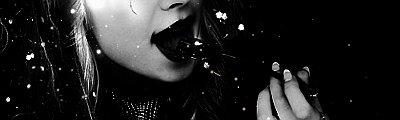
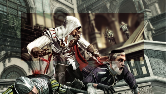
Whoa Player that looks awesome, love the black splashes.

Welcome to Smashboards, the world's largest Super Smash Brothers community! Over 250,000 Smash Bros. fans from around the world have come to discuss these great games in over 19 million posts!
You are currently viewing our boards as a visitor. Click here to sign up right now and start on your path in the Smash community!
This post says nothing meaningful.lulz I already talked to Player4 about his Ibuki siggy.
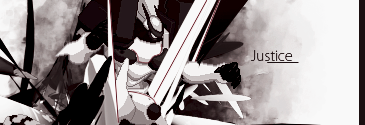
@Doro.........Wtf happened?
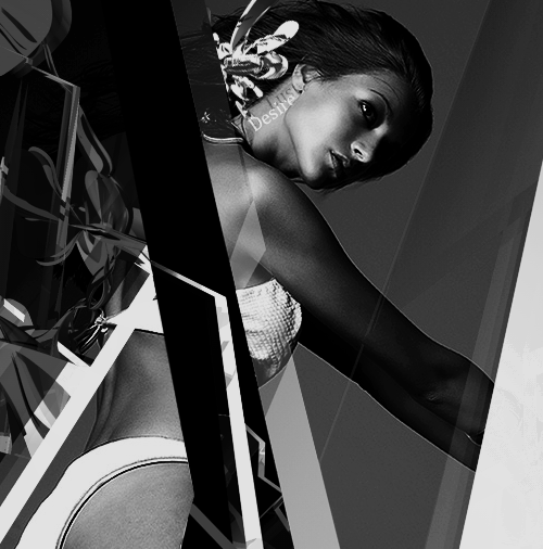
Flow []
Lighting []
Depth []
Comp []
Wtf happened?

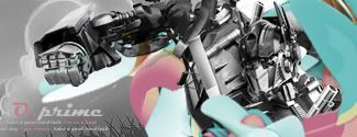

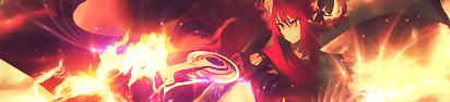
Much improved from the previous versions. Optimus seems just a little too grayscale. Needs a smidge more color. Maybe a photofilter or gradient map on very low opacity.
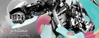
Any better?
Not feeling this one. Too empty and boring. Text is pixely, try a bolder font to match your hard contrast.
It's really nice. I think it was said before but Optimus is a bit too gray scale. Besides that, good job
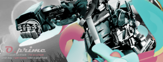
Any better?
Lol I'm surprised you noticed. I ALWAYS save my stuff in .png but for some reason my Photoshop decided it wanted to be an *** hole and not save in .png so I just saved it in .jpg this one time.Much improved from the previous versions. Optimus seems just a little too grayscale. Needs a smidge more color. Maybe a photofilter or gradient map on very low opacity.
And also, I noticed that you saved your file as a .jpg. Don't use .jpg. Use .png.

Random brush spam, no real thought to the overall composition of the artwork.Doro we should talk on AIM and talk more about our GFX
(Edit)
My final version
Text needs A LOT of work. Great art has great typography, great typography has great artwork. Remember that. Also, randomly placing C4D's doesn't really cut it these days. Also, don't oversharpen your C4D's.Chiisu, I like the compo. Nice colors bro, but I feel as in v1 there is something missing, and the text is too much, and on v2, there is too much going on for me.
I'm doing terribly with making tags lately. I might go back to this one.
Text is pretty cool, flow is great. C4D placement is alright. Probably one of the better tags I've seen on SWF. The only thing I'd have to say is work on better font usage.@Doro: wtf is going on? o.o I really don't know what to look for =\

CnC
Im sure theres a things i need to work on still T_T
E1: Just noticed..depth needs work
~Diddyknight~
Left and right people are SOOOOOOO low quality. Too basic, work on effects. Boxes are kinda random imo.I don't think anything really special about yours, hentai. The text could be improved a bit. Decent compo, and simple bg. Nothin much I care about, it's something I don't mind looking at though (not in that way).
Random smudging is bad, border doesn't work. Random brush lines don't work, use a better choice of fonts. Too basic, work on effects.Hmm I guess I'm doing Doromac's huh?
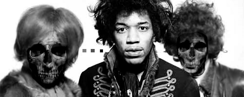
Well I like it, the skulls seems a little out of place to me though, like it's not blended in well. I can see the outlines of where they are cut off. Though that isn't the focus it would be nice since it's like you bothered to put them in there so people will see it, make it nicer. I've never been able to pull off any of those squares and shapes put in places, seems to work there to me but I can't say anything about them if they can be improved.
Ok I haven't been here in a long time and I haven't photoshopped anything in a long time as well. Starting to go on forums again so I thought I'd try again.

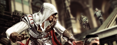
First one would've been cool if you didn't leave the two guards in the background in focus, messes up the atmosphere.Player - I think you need to work more on giving the tag a foreground, and then maybe give more vectors or c4ds in the background instead of the white.
New tag:
And for those who want to say "You didn't do anything to the original stock", here you go:
Cornered text is ew. Render/Stock doesn't match the whole overall theme you're going for here. Textless is better. I'd say try to expand your canvas size (width) to make it a bit more appealing.
Help :3
Random smudging is bad. Too monochromatic, too much random stuff going on, not real thought. Text is random as hell and I don't know why you added that line since it really doesn't do much except distract.
this isn't allowed on this site I bet...
...critique away for me anyway
Why did you CnC my old versions? Waste of time.Cornered text is ew. Render/Stock doesn't match the whole overall theme you're going for here. Textless is better. I'd say try to expand your canvas size (width) to make it a bit more appealing.
Which is your new? It says "this is my final version."Why did you CnC my old versions? Waste of time.
Read again, the one you quoted said "help :3"Which is your new? It says "this is my final version."
Lol I'm surprised you noticed. I ALWAYS save my stuff in .png but for some reason my Photoshop decided it wanted to be an *** hole and not save in .png so I just saved it in .jpg this one time.
edit:
OK I took what you guys told me to do and tried to apply it. My final 2:
Supposed to CnC someone else first... :lHere are two pieces. They look the exact same but have different text. It's kind of a mess but I haven't been active a while and I'm looking to get back into graphics. Be Nice
http://img59.imageshack.us/img59/178/soldiersig.jpg
http://img221.imageshack.us/img221/4235/soldiersig.png

The "sprinkles" are supposed to be blood and dirt flying everywhere but I see where you are coming from. Also, could you further explain this vectoring idea?Supposed to CnC someone else first... :l
The transparent flag looks good actually, but the marks everywhere I don't like. Mainly because they look like sprinkles, and I sort of see it as a serious piece. I think this would look good as a vector, with the marks being a darker color and having a limited scheme of 2-3 colors.
First A_man and Yoon, and now cmpr... all of the old regulars are returning for some reason.
Yoon, I like the colors but I think its kind of chaotic. There is flow to what I think is the render but there is also flow away from it. There are some hard edges that I think you should take care of and I don't really see a definitive light source.
Flow =/= Linear Direction. And yeah, I agree with the lightsources.I got skipped ^^^^^
Yoon, I like the colors but I think its kind of chaotic. There is flow to what I think is the render but there is also flow away from it. There are some hard edges that I think you should take care of and I don't really see a definitive light source.

My eyes are not being drawn very well to what I assume is the focal. That's all I'm saying.Flow =/= Linear Direction. And yeah, I agree with the lightsources.
The composition could be a bit better. The splatters look interesting and for text, I'd suggest using a Japanese character or something that replaces on of the thick black lines maybe? idk text can ruin sigs beware. The bottom right has some weird lines those need to go IMO.@cmpr
First off, it's really nice. I like how it flows and the monochrome is interesting. There's a couple spots here and there that could be touched up though. On the bottom left there's just two weird blobs... They aren't that noticeable but they kinda bother me. Also, the glare effect on the lamp post looks kinda out of place. All of the other lighting is different so it looks out of place.
Also, the really sharp lines are A little disorienting. maybe soften some of them, right now it looks like the entire sig is in the foreground...
Thanks a lot, the lighting effect on the light you're talking about was from the original stock actually.
How's this?
I wanted to throw in some text but I just couldn't find a way to...
Looks too basic for me `-`@cmpr
First off, it's really nice. I like how it flows and the monochrome is interesting. There's a couple spots here and there that could be touched up though. On the bottom left there's just two weird blobs... They aren't that noticeable but they kinda bother me. Also, the glare effect on the lamp post looks kinda out of place. All of the other lighting is different so it looks out of place.
@yoon
There's a LOT going on here. I like where it's going but I just can't seems to follow it. The super bright thing on the right throws me off... Is it behind the person or in front? If it's in front the lighting needed to be changed on your render. If it's behind, there needs to be a definite way to tell.
Also, the really sharp lines are A little disorienting. maybe soften some of them, right now it looks like the entire sig is in the foreground...
How's this?
I wanted to throw in some text but I just couldn't find a way to...
Yeah, that's called visual hierarchy, not flow. Just sayin' ;pMy eyes are not being drawn very well to what I assume is the focal. That's all I'm saying.