• Welcome to Smashboards, the world's largest Super Smash Brothers community! Over 250,000 Smash Bros. fans from around the world have come to discuss these great games in over 19 million posts!

    You are currently viewing our boards as a visitor. Click here to sign up right now and start on your path in the Smash community!

The new Final Destination looks... bad..?

lucasla

Smash Journeyman
Joined
Jul 24, 2018
Messages
481
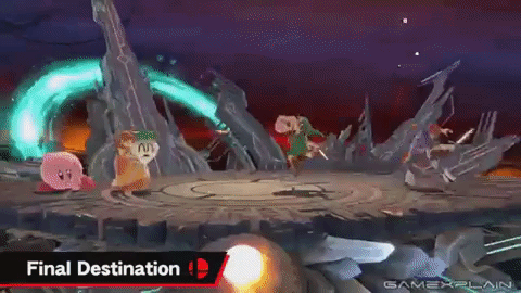
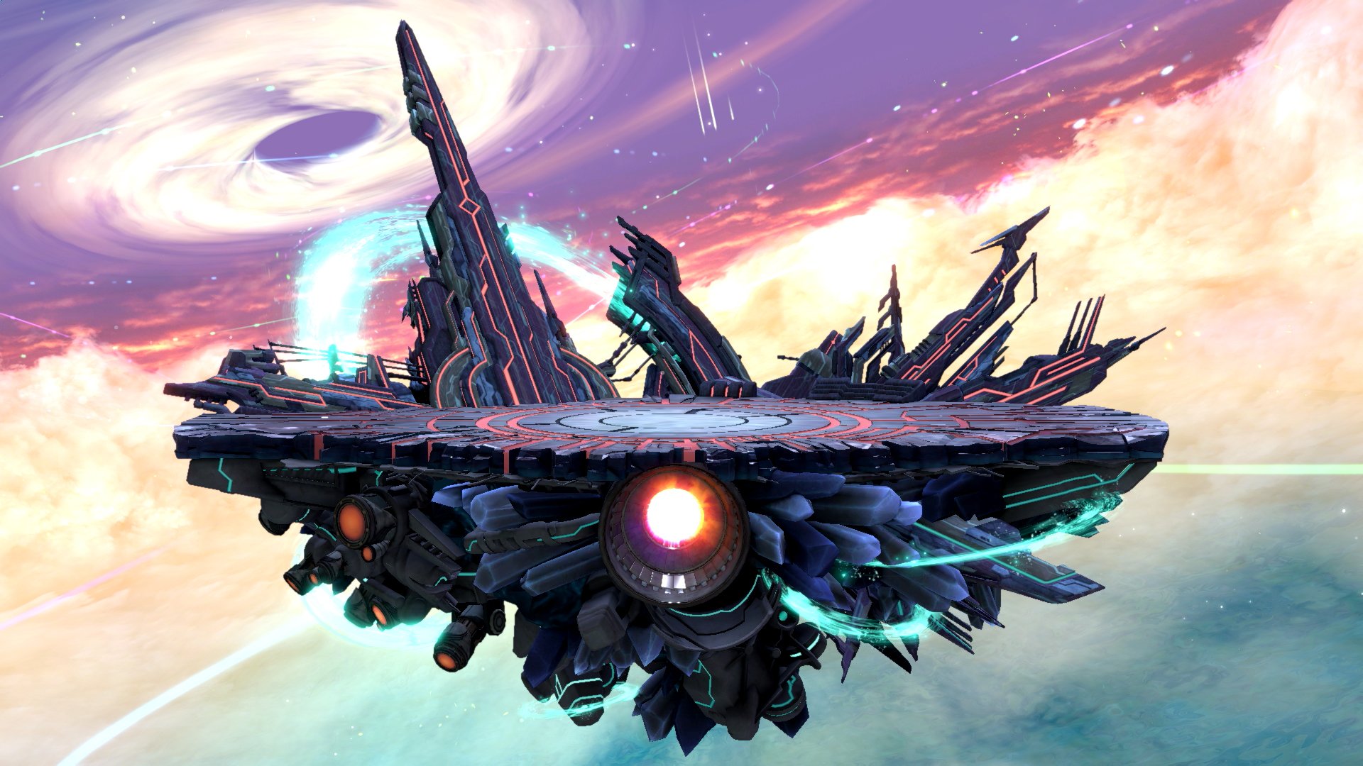
Is just me, or anyone else thinks that the new Final Destionation looks worse than the WiiU version?

I think it's mostly because the colors and ilumination and some level of shader that is not present for the plataform to react to the light properly... everything looks bland, clear, washed out, or even unfinished...

Even on the section of the FD of the WiiU game where there's more light (the section with the clouds and sun at the distance) the colors and reflections feels right on the plataform.

But I think there's something wrong on this new FD Ultimate... Looks like some level of shaders were not included on the plataform of the stage, and everything looks bland..

Final Destination WiiU:
https://vignette.wikia.nocookie.net...ision/latest?cb=20141105202809&path-prefix=en

Final Destination Ultimate:
https://i.redd.it/f9tmd9y8vve11.jpg
 
Last edited:

Primid

Smash Apprentice
Joined
Aug 6, 2011
Messages
157
Location
A Distant Planet
Yeah, I'm not really a fan of the new design either. Though honestly the only design of FD that I actually liked was the Melee version.
 

Yuya-Noboru

Smash Journeyman
Joined
Jul 8, 2018
Messages
210
I don't find the new design bad. I'd say that it's more unique than the Wii U's version which doesn't feel that original (though the design is beautiful). We haven't seen the full transformation of the stage yet, so it might be too soon to compare those two versions.

The real disappointment for me is the Battlefield design since Brawl. Melee's Battlefield was great and then we got a bland stage. It doesn't looks bad, but it's just bland...
 

lucasla

Smash Journeyman
Joined
Jul 24, 2018
Messages
481
I dont think the problem is the design, but the shaders of the plataform. It looks like the rocks aren't affected by the lighting of the stage. If they fix that, I think it will be ok. Maybe it's just a wrong impression, and it actually looks good playing, but I don't know...
 
Last edited:

BonafideFella

Smash Journeyman
Joined
Jul 17, 2018
Messages
372
Location
Over there! (Note: Not a 100% guarantee)
I found there's a lack of theming in the new destination.
Like. it has the futuristic space-themed platform but with energy-flowing waterfalls but in a sky-high cloudy environment but then it goes into space after?
 
Last edited:

SmashShadow

Smash Champion
Joined
Jul 9, 2012
Messages
2,660
3DS FC
0104-0598-9588
I like it better than the Wii U one which just felt a little too distracting in design for me. This one is more plain and uniform.
 
Last edited:

ryanator008

Smash Cadet
Joined
Aug 2, 2014
Messages
25
Given that we have Ω forms now, Final Destination doesn't really have much of a reason to exist. Besides, I think it looks better in this picture.
 

Admiral Pit

Smash Hero
Joined
Feb 20, 2008
Messages
8,722
Location
Skyworld
NNID
GoldAngelPit
3DS FC
0903-2895-3694
Well the game's still in WiP, so details will increase come the final product. Sure the design may be different and strange, but another thing to remember is that because of the first reason and the fact that it was only shown through a few clips, we still haven't seen the beautiful background transactions that could be awesome, or even the music for it. Let's just give it time and see if it grows on us.
 

soviet prince

I am the terror that flaps in the night
Premium
Joined
Nov 10, 2007
Messages
3,142
Location
Kentucky
NNID
7066-9708-9591
I don't think FD looked all that great in any game, flat stages are boring to me
 

Diddy Kong

Smash Obsessed
Joined
Dec 8, 2004
Messages
25,968
Switch FC
SW-1597-979602774
I hope we can get Melee's Final Destination as well. All other Final Destination stages felt off ever since.

Ironically, I think Battlefield only improved since Melee.
 

Yuya-Noboru

Smash Journeyman
Joined
Jul 8, 2018
Messages
210
The Omega form of Final Destination on Wii U was pointless, they should replace the omega version with an alternative skin of Final Destination like the Melee, Brawl or WiiU version.
 

infomon

Smash Scientist
Joined
Mar 11, 2008
Messages
5,559
Location
Toronto, Canada
That'd be dope.

I love the new FD though. Something about its colour scheme is great I think, it will let the characters stand out. But there's just something super ominous about it.
 

BridgesWithTurtles

Smash Champion
Joined
Apr 18, 2013
Messages
2,174
Location
The long road to nowhere
3DS FC
3523-2059-7939
I like how it looks more assymetrical. Makes it feel more like a random chunk of rock and metal floating in a void between dimensions, which gives a sort of dynamic feel to it. By contrast, I never liked Brawl's Final Destination because everything about it was so flat, straight, and uniform. I think there's a little too much visual noise going on with the bottom of the platform here, but overall, I like it. Probably my second favorite FD after Melee's.
 
D

Deleted member

Guest
Really? I think it looks great!?! But Melee has the best FD hands down.
 

aarchak

Smash Ace
Joined
Jul 29, 2018
Messages
501
Location
The blast zone
It's honestly my favorite one. It isn't distracting like Smash 4's one, with its 2 differently colored sides and busy background, but it's still memorable unlike Melee's or Brawl's (seriously, I can't even remember what they looked like while I can remember Battlefield just fine).
 

Amiibo Doctor

Smash Ace
Writing Team
Joined
May 30, 2014
Messages
756
Location
U.S.A.
NNID
AmiiboMD
Melee's FD is the best, clearly.
But I'm fine with this design. It does seem a little bit off, maybe it's just a little bit too wide. Either way, I'm good with it
I love Melee, but Melee's Battlefield was lackluster. It's the best stage for play, but it's an eyesore. Brawl's was the best Battlefield: simple, colorful and elegant. Good use of pastels.
 

link2702

Smash Champion
Joined
May 10, 2008
Messages
2,778
I liked fd better when it’s background used to appear as if the characters were traveling through the virtual world into the real one.

So yeah melees.
 

Drawcia

Smash Apprentice
Joined
Mar 15, 2018
Messages
94
I like how it looks more assymetrical. Makes it feel more like a random chunk of rock and metal floating in a void between dimensions, which gives a sort of dynamic feel to it. By contrast, I never liked Brawl's Final Destination because everything about it was so flat, straight, and uniform. I think there's a little too much visual noise going on with the bottom of the platform here, but overall, I like it. Probably my second favorite FD after Melee's.
I think one reason why it's off-putting is it's very unsymmetrical.
Now that I see it pointed out, I think the reason it feels so off to me is because it’s asymmetrical, and stuff like that tends to make me anxious.
I hope it grows on me though.
 

SmashShadow

Smash Champion
Joined
Jul 9, 2012
Messages
2,660
3DS FC
0104-0598-9588
Melee's FD is the best, clearly.
But I'm fine with this design. It does seem a little bit off, maybe it's just a little bit too wide. Either way, I'm good with it
I love Melee, but Melee's Battlefield was lackluster. It's the best stage for play, but it's an eyesore. Brawl's was the best Battlefield: simple, colorful and elegant. Good use of pastels.
I agree with both of these statements.
 

staindgrey

I have a YouTube channel.
Writing Team
Joined
Jan 30, 2008
Messages
11,489
Location
The 90's
NNID
staindgrey
3DS FC
0130-1865-3216
Switch FC
SW 1248 1677 4696
I think it's the random metallic formations jutting out in the background and obscuring the backdrop that kills it. It looks small.

Melee's FD wasn't just a flat surface with good music, it made the stage push into the fore- and background to add a sense of size. As did 64's. Brawl and Smash4 removed that aesthetic, for some reason, and essentially made a Battlefield stage without the platforms.

Honestly, my perfect FD would be a visually updated Melee version with Brawl's music. Brawl had such good music.
 

Pit93

Smash Apprentice
Joined
Sep 7, 2014
Messages
78
I really like the new FD in Ultimate. The one in Sm4sh I actually disliked. The background was too distracting to me and I often lost track of my own character.

Of course, I haven't seen the entire background animation yet and maybe it's gonna be different when I actually play on it myself, but for now it looks like it could become my new favorite FD. ^^
 

BronzeGreekGod

Smash Lord
Joined
May 26, 2012
Messages
1,638
I duno about u guys, but I felt the backfround of the wiiu final dest was very distracting. I'm hoping this new one has a simpler background and good lighting so the characters are the focal point
 

TMNTSSB4

Smash Obsessed
Joined
Jun 15, 2014
Messages
29,426
Location
John Cena
NNID
No More
3DS FC
3368-4469-9312
Switch FC
SW-6414-0526-7609
The stage itself is better than the Wii U/3DS version, but barely...the background however is not as good as 4
 

TheTrueBrawler

Smash Demon
Joined
Jul 16, 2018
Messages
817
Location
Mystery
The platform itself looks like the apocalyptic side of Smash 4's Final Destination was expanded to the entire stage and redone completely. I personally liked the other half and would rather have had them expand from that, but Brawl already was that. We haven't seen the entire background yet. It looks bland from what we have seen, but there's nothing too distracting so far.

People seem to be giving their opinions on Final Destinations from previous titles, so I'll give mine.
Melee felt way too technical for parts of the animation. It felt as if the fighters are in a simulation with in the game during the first half, but it's actually nice to look at once that segment is done with. Also, while the platform looks pretty good, the black hole at the bottom makes no sense.

Brawl did a lot of transitions by light tunnels which got repetitive after a while. The backgrounds between were okay, but the sun over the ocean segment was one of the best things of all the Final Destinations in my opinion. It also did a good job in the sense that the background loop time was close to matching the main music itself. The platform had a weird shape, but it looked nice. I would love to see an HD version of this one to be honest. It would be my preferred Final Destination, but we can only ask for so much.

People don't seem to understand by the way that Smash 3DS and Smash Wii U actually had Final Destinations with different backgrounds. Wii U was the worst. The platform was split which I didn't like, and the background was insufferably bad. The beginning of animation is a bland space with a tiny blue star, the middle segment with the colliding stars is way too distracting, and I legitimately can't tell what's happening in the final part. It's a mess much worse than the menus of that game.

3DS is better than Wii U. It unfortunately still has the less than favorable platform. The first part is much less bland than it's counterpart, and I liked it. The distracting segment is notably less distracting and lingers for less time. I really enjoyed the part where the sun set over what I think is an ocean.
 

TMNTSSB4

Smash Obsessed
Joined
Jun 15, 2014
Messages
29,426
Location
John Cena
NNID
No More
3DS FC
3368-4469-9312
Switch FC
SW-6414-0526-7609
The background being simpler is a good thing. Complex backgrounds make it hard to see wtf is going on
Especially when everything gets super bright just out of nowhere (I did love the sun and earth being together though)
 
D

Deleted member

Guest
I like it, I think it could be improved by making it a circular platform instead of a rectangular one, but it's still pretty cool looking.
That said, it's pretty obvious that the main draw of FD has always been how the background and bottom have been implemented. As of now, those aspects seem pretty rad to me.
 
Top Bottom