
-
Welcome to Smashboards, the world's largest Super Smash Brothers community! Over 250,000 Smash Bros. fans from around the world have come to discuss these great games in over 19 million posts!
You are currently viewing our boards as a visitor. Click here to sign up right now and start on your path in the Smash community!
It appears that you are using ad block :'(
Hey, we get it. However this website is run by and for the community... and it needs ads in order to keep running.
Please disable your adblock on Smashboards, or go premium to hide all advertisements and this notice.
Alternatively, this ad may have just failed to load. Woops!
Please disable your adblock on Smashboards, or go premium to hide all advertisements and this notice.
Alternatively, this ad may have just failed to load. Woops!
The 1st Annual SWF Spriting Tournament! (Who Will Win? Round Two!))
- Thread starter M.K
- Start date

Zook
Perpetual Lazy Bum
Time for my entry.
Although the Pokemon series seems as though it is growing annualy, that is no excuse for us to not go back a generation or two and remember the the games of the past that many of us grew up with. Face it, if you go here, you've known the series for a while. I hope to achieve some degree of nostalgia with this sprite, G/S/C Giratina.

Did you purposely mess up some of the pixels? Cool nonetheless.
Circa
Smash Champion
If you ever go back to look at the old 2nd gen sprites, you may notice that a great number of them have occasional pixel errors around the borders (Togetic is a good example of this. Look at its wings). So if I had to guess, that would be a yes.Did you purposely mess up some of the pixels? Cool nonetheless.
")
Bowser King
Have It Your Way

I tried to make the head pop out. Anyway, my entry.
-
 Bowser King
That would be correct, all of the old sprites have lighter colours on the edges that look absolutely horrid on dark backgrounds. That's why those games had white backgrounds, I believe.
Anyway, all of these are really cool. It's neat seeing what people come up with for recolours. Good stuff.
Anyway, all of these are really cool. It's neat seeing what people come up with for recolours. Good stuff.
CT Chia
Smash Obsessed
im so sorry i didnt get to send in my submission. i planned on doing it today (after some preliminary work earlier in the week), but my plans changes and i was out most of the day. il work on something in a few mins incase it can still be put in
edit:
heres my submission

edit:
heres my submission
M.K
Level 55
Thank you everyone for entering, the judges will now decide who will be going home this week.
Judges, check your PM box.
Judges, check your PM box.
Zook
Perpetual Lazy Bum
C'mon guys, I wanna know how I did!

This is the best one for round 1 IMO. It just looks awesome.Now presenting Cherry/Vanillatina.

I Googled a picture of vanilla icecream with a cherry on top, and applied the colors to Giratina.
But I have no say in this so I'm just a spectator.
karthik_king
Smash Ace
Zook always wins
M.K
Level 55
Chill yourselves!
The judges are working extra hard to have detailed judgings for each sprite!
The judges are working extra hard to have detailed judgings for each sprite!
M.K
Level 55
FirusTheHedgehog:
Mr Snucas -- 43
Mewter -- 66
NakeDeDeDe -- 68.5
SkylerOcon -- 49
Streetracr77 -- 49
Zook -- 74
zrky -- 55.5
bowser king -- 64.5
ChiboSempai -- 54.5
The best of Week 1, Giratina Recolor is....ZOOK!!!
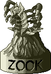
Spire has your prize.
The person eliminated this round is....Mr. Snucas.
Mr. Snucas, here is a participation ribbon in honor of competiting in our first spriting contest.

ROUND TWO WILL BEGIN TOMORROW!
Spire IIIFirustheHedgehog said:Mr. Snucas
CREATIVITY: 5
BASIC SPRITING MECHANICS AND TECNICAL DETAILS: 5
DIFFICULTY OF SPRITE: 5
TOTAL POINTS: 15
Additional Notes: Part of background colored; some specks of gray left. Simple recolor.
Mewter
CREATIVITY: 7
BASIC SPRITING MECHANICS AND TECNICAL DETAILS: 8.5
DIFFICULTY OF SPRITE: 9.5
TOTAL POINTS: 25
Additional Notes: Interesting concept; atypical recolor. One color wasn't recolored (pale yellow on the neck armor and spike)
NAKEDeDeDe
CREATIVITY: 10
BASIC SPRITING MECHANICS AND TECNICAL DETAILS: 6.5
DIFFICULTY OF SPRITE: 10
TOTAL POINTS: 26.5
Additional Notes: VERY creative sprite; some points off for being a little more than just a recolor. Missed pale yellow on neck armor and spike.
SkylerOcon
CREATIVITY: 6
BASIC SPRITING MECHANICS AND TECNICAL DETAILS: 8.5
DIFFICULTY OF SPRITE: 5.5
TOTAL POINTS: 20
Additional Notes: Fairly simple sprite; nice "crystal" effect on the armor. Missed a little bit of recoloring on the wings.
streetracr77
CREATIVITY: 5
BASIC SPRITING MECHANICS AND TECNICAL DETAILS: 9
DIFFICULTY OF SPRITE: 5
TOTAL POINTS: 19
Additional Notes: Simple; background not consistent (part is white while another part is transparent). Colors clash a little.
Zook
CREATIVITY: 7.5
BASIC SPRITING MECHANICS AND TECNICAL DETAILS: 8
DIFFICULTY OF SPRITE: 5.5
TOTAL POINTS: 21
Additional Notes: Interesting theme; gold colors weren't recolored on neck armor and mask.
Zrky
CREATIVITY: 5
BASIC SPRITING MECHANICS AND TECNICAL DETAILS: 8.5
DIFFICULTY OF SPRITE: 5
TOTAL POINTS: 18.5
Additional Notes: Simple sprite; missed a little gold on the mask, yellow speck around wings. Colors clash.
Bowser King
CREATIVITY: 7
BASIC SPRITING MECHANICS AND TECNICAL DETAILS: 10
DIFFICULTY OF SPRITE: 6.5
TOTAL POINTS: 23.5
Additional Notes: Clean recolor; good concept with making the head "pop".
ChiboSempai
CREATIVITY: 5
BASIC SPRITING MECHANICS AND TECNICAL DETAILS: 9.5
DIFFICULTY OF SPRITE: 5
TOTAL POINTS: 19.5
Additional Notes: Simple sprite; clean recolor; colors clash a little bit.
Meta-KirbySpire III said:Snucus
CREATIVITY: 5
TECHNIQUE: 4
DIFFICULTY: 7
TOTAL POINTS: 16
Additional Notes: I awarded you points for your risk with the neon oranges, as they particularly stand out as strong parts. I detracted points from your technique, however, because there were easily avoidable flaws in the sprite, such as filling the gaps between the tentacles with dark purple. However, having worked with this sprite before myself, I understand the difficulty of it, so I awarded you the most points in that category.
__________________________________________________
Mewter
CREATIVITY: 7
TECHNIQUE: 7
DIFFICULTY: 8
TOTAL POINTS: 22
Additional Notes: You showed evidence understanding composition, as you colored the foremost spikes on both the “legs” and the tentacles a light blue, helping to balance the sprite out. The fact that the abdomen stripes differed from their flanking spikes added to the eclectic nature of the sprite, and worked particularly well because they did have matching spikes. You changed the Giratina sprite immensely, and I reward you for that.
__________________________________________________
NAKEDeDeDe
CREATIVITY: 9
TECHNIQUE: 6
DIFFICULTY: 5
TOTAL POINTS: 20
Additional Notes: I greatly appreciate you “devamping” the Giratina sprite to match that of the 2nd Generation sprites. It works greatly because of the parallel nature of both the 2nd and 4th Generation, and I would easily believe it to be a Pokemon from Gold and Silver. The difficulty of the creation of the sprite, despite your concept behind it, did not strike me, but creatively, you soar.
__________________________________________________
SkylerOcon
CREATIVITY: 6
TECHNIQUE: 7
DIFFICULTY: 5
TOTAL POINTS: 18
Additional Notes: This looks like a legitimate shiny version for Giratina. It feels like it could be a real Pokemon (well technically, it is), but isn’t farfetch’d (hawhaw) enough to warrant a flying creativity score. Technically, this sprite works well. It’s very, very well balanced, with just enough blue and purple to hold it together, spaced out accordingly. The purple, however, should have stood out brighter, as it would have complimented the “glowing” blue hues, and induced a crazier, spacier, David Bowier menace of an anti-dimensional worm.
__________________________________________________
streetracr77
CREATIVITY: 6
TECHNIQUE: 3
DIFFICULTY: 4
TOTAL POINTS: 13
Additional Notes: The sprite is overdone. I scored you highest in the creativity field, as you obviously had something abstract in mind, but the color choices are far from appealing. It’s difficult to look at the sprite as the bright blues, pinks, and greens do not compliment one another at all. I would suggest working with duller colors next time, limiting your vibrants to a minimum.
__________________________________________________
Zook
CREATIVITY: 10
TECHNIQUE: 8
DIFFICULTY: 7
TOTAL POINTS: 25
Additional Notes: This is beautiful. The concept behind it is humorous, yet powerful. Finding such a commodity as “cherry-topped vanilla ice cream” for a specific color scheme, simply for the sake of coloring Giratina is awesome. The crimson is just oh-so-sharp. I want to eat it.
__________________________________________________
zrky
CREATIVITY: 8
TECHNIQUE: 8
DIFFICULTY: 7
TOTAL POINTS: 23
Additional Notes: This is by far the most unique Giratina. It feels like an entirely different creature, despite retaining the Giratina form. The color scheme is great, and all that I would suggest improving upon is your understanding of highlights and midtones. This is a great sprite, nevertheless.
__________________________________________________
bowser king
CREATIVITY: 7
TECHNIQUE: 6
DIFFICULTY: 6
TOTAL POINTS: 19
Additional Notes: This is the most ghostly of the Giratina entries. It feels illusory, yet ectoplasmic. If it weren’t for the blue, it would easily skyrocket to the top. The greys and Saturn-greens work beautifully together, comprising a radioactive, spooky skin for this beast. I do compliment you trying to pick up the blue in the greys with the blue plates, but they were just far too vibrant.
__________________________________________________
ChiboSempai
CREATIVITY: 6
TECHNIQUE: 5
DIFFICULTY: 7
TOTAL POINTS: 18
Additional Notes: This sprite suffers from the blue parts. Purple naturally picks up on any present blue, and while that’s not the problem, the blue is just far too dark and “thick”, for its own good. The overall prismatic composition works relatively well, reminding me strongly of Spiritomb. Small changes could have greatly improved the sprite, and when it all boils down, it’s all in the color choices.
TOTAL POINTSMeta-Kirby said:Snucus
CREATIVITY: 4
TECHNIQUE: 3
DIFFICULTY: 5
TOTAL POINTS: 12
Additional Notes: Don't put a border around your next sprite. I like the colors, but you missed alot of transperencies, and added a funky blue color in the hole made by Giratina's colors.
__________________________________________________
Mewter
CREATIVITY: 8
TECHNIQUE: 6
DIFFICULTY: 5
TOTAL POINTS: 19
Additional Notes: It was an interesting concept and above average execution, however, I feel like you could have done alot more with it. The parts you did do, however, were VERY good.
__________________________________________________
NAKEDeDeDe
CREATIVITY: 9
TECHNIQUE: 7
DIFFICULTY: 6
TOTAL POINTS: 22
Additional Notes: It was the most creative of all the entries, and I really like the execution. The "messed-up" pixels sort of ruin it for me, though. I looked back at the Gold/Silver/Crystal sprites like you asked and there aren't as MANY messed-up pixels as you included in your sprite, and the inclusion of "too many" pixels detracts from the overall value.
__________________________________________________
SkylerOcon
CREATIVITY: 3
TECHNIQUE: 3
DIFFICULTY: 5
TOTAL POINTS: 11
Additional Notes: It looks very messy. The colors blend together way too much. You used a lighter outline for the blue "mask" part and it looks messy because of that. You should have chosen more distinct colors and recolored the outlines a darker color to avoid making it look too blotchy.
__________________________________________________
streetracr77
CREATIVITY: 6
TECHNIQUE: 5
DIFFICULTY: 6
TOTAL POINTS: 17
Additional Notes: You had the correct concept, executed it well, but the colors are a bit mis-matched. Try working with color combinations that work well together, such as red-orange-yellow, blue-brown-green, or something like that.
__________________________________________________
Zook
CREATIVITY: 10
TECHNIQUE: 10
DIFFICULTY: 8
TOTAL POINTS: 28
Additional Notes: I love it. THIS is what spriting is. You are inspired by every day things and incorporate them into your spriting. I love this Zook, amazing job! The colors are perfect.
__________________________________________________
zrky
CREATIVITY: 6
TECHNIQUE: 3
DIFFICULTY: 5
TOTAL POINTS: 14
Additional Notes: I don't like the colors in the same way that I didn't like the colors in streetracr's sprite, however, there are alot of places where you forgot to apply the transperency. If you choose to WBG your image, try to go all the way with it.
__________________________________________________
bowser king
CREATIVITY: 7
TECHNIQUE: 8
DIFFICULTY: 7
TOTAL POINTS: 22
Additional Notes: Amazing choice of colors, man. I really enjoy the sprite and it has a great combination of contrast and lighting. This sprite has the best "wing" color out of any of them. Great job.
__________________________________________________
ChiboSempai
CREATIVITY: 6
TECHNIQUE: 6
DIFFICULTY: 7
TOTAL POINTS: 17
Additional Notes: The blues are nice and vivid, but the other colors should have been something more subtle so that the blue really "pops" out. I like the overall appearance, though.
Best-Of-Week: ZOOK!
Mr Snucas -- 43
Mewter -- 66
NakeDeDeDe -- 68.5
SkylerOcon -- 49
Streetracr77 -- 49
Zook -- 74
zrky -- 55.5
bowser king -- 64.5
ChiboSempai -- 54.5
The best of Week 1, Giratina Recolor is....ZOOK!!!
Spire has your prize.
The person eliminated this round is....Mr. Snucas.
Mr. Snucas, here is a participation ribbon in honor of competiting in our first spriting contest.
ROUND TWO WILL BEGIN TOMORROW!
karthik_king
Smash Ace
I knew it I told u Zook always wins

Zook
Perpetual Lazy Bum
Ha, thanks guys. I can't wait for next week.
CT Chia
Smash Obsessed
for the end, do the points from all the rounds add up?
or is it round by ruond basis
either way, im glad i made it. im sort of meh about my conflicting colors whch i knewthey sorta were, but the color i originally wanted to use to compliment the blue made it look really similar to someone elses submission which i wanted to avoid. either way, lets get this next round goin. im psyched
Congratulations Zook, your recolour was great. Same goes with all the other participants, I really like a lot of them.
I must say that trophy is amazing...
As for me, I'm content with second place and look forward to tomorrow's challenge. Good luck everyone!
I must say that trophy is amazing...
As for me, I'm content with second place and look forward to tomorrow's challenge. Good luck everyone!
Since he hasn't posted it yet, I'll go ahead and start...
For this round, you guys must fuse a Rock and an Electric Pokemon. They can be either primary or secondary (primary usually yields more representative Pokemon of their type, so choose carefully). Have fun, and good luck!
ROUND II
For this round, you guys must fuse a Rock and an Electric Pokemon. They can be either primary or secondary (primary usually yields more representative Pokemon of their type, so choose carefully). Have fun, and good luck!
CT Chia
Smash Obsessed
spire, u said have to be primary type, but in the pm metakirby sent he said secondary types are also good.
clarification?
clarification?
I guess MK changed it. Secondary is good to go!spire, u said have to be primary type, but in the pm metakirby sent he said secondary types are also good.
clarification?
M.K
Level 55
Yeah, as long as the Pokemon has a Rock or Electric Type, it's allowed to be fused.spire, u said have to be primary type, but in the pm metakirby sent he said secondary types are also good.
clarification?
CT Chia
Smash Obsessed
I got to work early this time, here is my submission
Lunatrode!

Lunatrode!
Mewter
Smash Master
- Joined
- Apr 22, 2008
- Messages
- 3,609
Awesome work, Chibo!I got to work early this time, here is my submission
Lunatrode!
KoolKatKarl
Smash Apprentice
My brother isnt happy he got eliminated. But he said "Oh well, I havent sprited in forever."
Who, Snucus? Anyone would be unhappy if they got eliminated. What matters most is that he gave his time to create and submit a sprite for others to see and enjoy.My brother isnt happy he got eliminated. But he said "Oh well, I havent sprited in forever."
Zook
Perpetual Lazy Bum
Meta-Kirby, update the title.

Here's my entry. Bastiodon and Raikou.
Here's my entry. Bastiodon and Raikou.
Bowser King
Have It Your Way
O_OMeta-Kirby, update the title.
Here's my entry. Bastiodon and Raikou.
That is really good.
Great job Zook.
-
Bowser KingMeta-Kirby, update the title.
Here's my entry. Bastiodon and Raikou.
Here's your trophy Zook. Bastiokou is that good.
Mewter
Smash Master
- Joined
- Apr 22, 2008
- Messages
- 3,609
Niiice, Zook. That's really original(no sarcasm)Meta-Kirby, update the title.
Here's my entry. Bastiodon and Raikou.
Edit: When are these due?
CT Chia
Smash Obsessed
Bastiokou is pretty ballin'
I wonder who would win in a match, that or Lunatrode
I wasn't sure of some of the rules of splicing though since I'm not normally a spriter. Do you just have to combine the sprites as is with maybe slipping some parts horizontally or vertically and recoloring, or can you do anything else? I wasn't sure if you could rotate (free rotate, not by 90 degree increments) or resize any parts. i tried but it never came out looking right, so i stuck with keeping them original.
You can do whatever you want with just two sprites. You could make a Missingno. out of them by moving pixels around if you wanted, but, you can only use what the two sprites have to offer.Bastiokou is pretty ballin'
I wonder who would win in a match, that or Lunatrode
I wasn't sure of some of the rules of splicing though since I'm not normally a spriter. Do you just have to combine the sprites as is with maybe slipping some parts horizontally or vertically and recoloring, or can you do anything else? I wasn't sure if you could rotate (free rotate, not by 90 degree increments) or resize any parts. i tried but it never came out looking right, so i stuck with keeping them original.
M.K
Level 55
They are due this Friday.Niiice, Zook. That's really original(no sarcasm)
Edit: When are these due?
Zook
Perpetual Lazy Bum
Come on, people. Don't forget about this thing!
CT Chia
Smash Obsessed
there already was an extension, this round goin till friday is 8 days and the first post says each round is 5
what if no one else enters? is either me or zook gonna be eliminated? seems kind of lame. we should just both be fast tracked to the finals lol
what if no one else enters? is either me or zook gonna be eliminated? seems kind of lame. we should just both be fast tracked to the finals lol