D
Deleted member
Guest
I won't even get the food this year; I'm working until 8.Im just here for the food
Welcome to Smashboards, the world's largest Super Smash Brothers community! Over 250,000 Smash Bros. fans from around the world have come to discuss these great games in over 19 million posts!
You are currently viewing our boards as a visitor. Click here to sign up right now and start on your path in the Smash community!
I won't even get the food this year; I'm working until 8.Im just here for the food
You really don't know that. And he sure wasn't popular on the wii u. I also heard more praise about the steam version of Generations. Especially since you can mod it.Sonic was far more popular on consoles than he'd ever be on PC. It wouldn't make sense. He's finished.
That looks like a recolor more than anything. Is that from the Sonic comics?Speaking of Boom Knux, am I the only one who thinks that he was based on Thrash the Tasmanian Devil? The similarities between both characters do look pretty uncanny (large upper body, long hair, big gloves, ect.) and this guy was even one of Knuckles enemies in the Sonic comics. Hell, the character himself was created for the sake of giving Canon!Knuckles a run for his money given his grudge against the Echidna Race.


Maybe because everyone was having high expectationsWhy is everyone soo pissed off on Mr. G&W?
Because he isn't Shadow, Cloud or Vegeta probably.Why is everyone soo pissed off on Mr. G&W?
I'm not familiar with Sonic's comics, mostly since I'm just not interested in Sonic these days. And the original characters seemed weird. (as opposed to the Mega Man comics, which only introduced a few new humans and a female robot so far, but that's likely just personal preference.) But you have a point there. The only character I really liked that much was Knuckles, which was one of the first examples of a "jarring" redesign.Speaking of Boom Knux, am I the only one who thinks that he was based on Thrash the Tasmanian Devil? The similarities between both characters do look pretty uncanny (large upper body, long hair, big gloves, ect.) and this guy was even one of Knuckles enemies in the Sonic comics. Hell, the character himself was created for the sake of giving Canon!Knuckles a run for his money given his grudge against the Echidna Race.


That much is true. Link Samus and Pit are a bit more closely tied to their original designs, despite being somewhat realistic. That might have to do with said designs not being 100% grounded in reality. But I still see Mega Man X's redesign to be leagues above Bomberman's, though it might not be saying much.Thing is, Samus and Link still keep a Japanese feel to them.
That X and Bomberman redesigns hardly retain anything that makes them iconic and the characters that they are.
Compare Link, Samus and Pit (1986 vs. Smash Bros. 4):
[collapse="1986 art work"]
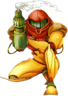
[/collapse]
[collapse="Smash Bros. 3DS/Wii U"]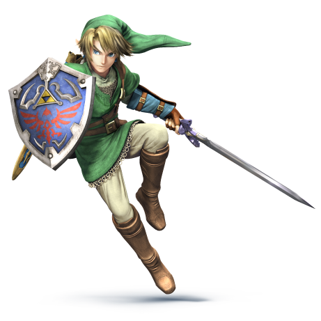
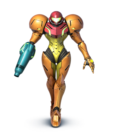
[/collapse]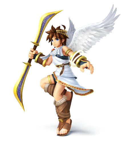
Yes, the later look more detailed and more modern, but keep their most identifiable traits despite the artistic evolution.
The modern ones are still in-line with Japanese character design: more similar to modern anime like how the original designs were more similar to anime from back then.
You see there's a more natural evolution, without being forced. Sure, Pit was actually forced but it is a what-if design that managed to do the job well in emulating the same art evolution as the likes of Link and Samus.
Y'know, I must say, after watching some of the SSF2 stream, and seeing the game for the first time in years, I must say that it doesn't look all that bad.
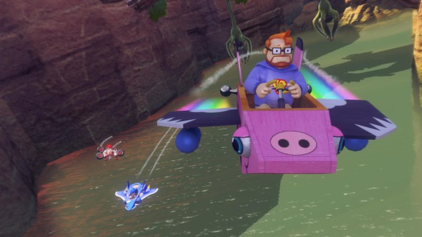
I am totally excited to play as this guy:ALSO the steam version of All star racing transformed has way more characters.
That sums up speculationMaybe because everyone was having high expectations
Add Luffy and Luigi to that listBecause he isn't Shadow, Cloud or Vegeta probably.

Cloud? More likeBecause he isn't Shadow, Cloud or Vegeta probably.

But it doesn't have VillagerI am totally excited to play as this guy:


I think the major fault in that X redesign is how the helmet covers the entire face. It makes the character unrecognizable.That much is true. Link Samus and Pit are a bit more closely tied to their original designs, despite being somewhat realistic. That might have to do with said designs not being 100% grounded in reality. But I still see Mega Man X's redesign to be leagues above Bomberman's, though it might not be saying much.
While it's true that the latter two have more western designs, that, to me, isn't the inherently bad part. I'd say that sits more in how well any alternate design can remain recognizable alongside the original. Which is why I think Mega Man X's kind of works, though not as well as Pit or Samus. He's got enough similarities to still be seen as X. Similar color scheme, similar helmet, red lights, arm cannon. Still far from perfect(he could use some saturation and bulkier legs), but at least they tried. With Bomberman, they actively ****ed up, they just had to.
It's an interesting topic to me. Can't help but wonder if any other characters got such major changes, prototypes or not. Simon Belmont comes to mind. But he's far less consistent than the likes of Link, Samus and the even various Mega Men.
Well I'll be damned, his reboot look actually had meaning to it. The 80's and 90's were the dark ages when plenty of games had misleading or terrible video game box art in the West. Here's a perfect example which is Super Bust-a-Move on the Sega Saturn:Actually edgerman was inspired in a bad box art too:


Now I understand why Acclaim ceased to exist.Well I'll be damned, his reboot look actually had meaning to it. The 80's and 90's were the dark ages when plenty of games had misleading or terrible video game box art in the West. Here's a perfect example which is Super Bust-a-Move on the Sega Saturn:

What the hell does a man holding his eyes open with matches has to do with cute dragons solving puzzles? In fact, I REALLY do not want to know.

I realized that trend only stopped when anime and manga started to become more popular outside of Japan.Well I'll be damned, his reboot look actually had meaning to it. The 80's and 90's were the dark ages when plenty of games had misleading or terrible video game box art in the West. Here's a perfect example which is Super Bust-a-Move on the Sega Saturn:

What the hell does a man holding his eyes open with matches has to do with cute dragons solving puzzles? In fact, I REALLY do not want to know.
'cos it's so addicting, you never know want to look away for a second. You never want to sleep if it means to stop playing. And it's an old man because you will play this game for decades.Well I'll be damned, his reboot look actually had meaning to it. The 80's and 90's were the dark ages when plenty of games had misleading or terrible video game box art in the West. Here's a perfect example which is Super Bust-a-Move on the Sega Saturn:

What the hell does a man holding his eyes open with matches has to do with cute dragons solving puzzles? In fact, I REALLY do not want to know.
Pfft what a villager is compared to:But it doesn't have Villager

Yeah, I've had that happen to me before.On an unrelated note, does anyone know why Nintendo eShop only accepts Mastercard and Visa cards? It feels redundant that I have to pay for a £10 eShop voucher at minimum if I only want to buy a £3-5 game.
Football Manager's pose is the reaction of all PC Sega fans that wanted more exclusive games in the future. That sly son of a ***** couldn't be any more of a troll.Pfft what a villager is compared to:
Random manager guy :
View attachment 37583
Character from controversial war game:
View attachment 37584
Protagonist from a game that doomed an entire company:
View attachment 37585
And one third of the classes of a hat simulator:


Pretty much. I've seen some fan designs that meet a better compromise between realism and mirroring the original. But again, if you ask me, nothing will be as bad as that Bomberman.I think the major fault in that X redesign is how the helmet covers the entire face. It makes the character unrecognizable.
I've seen more realistic designs of Link, Samus and Pit that keep the iconic traits about them. The art style is one thing, another is the characterization of the characters, which is what is at fault with the Bomberman and that X redesign. You can change the former without changing the latter.

My point exactly. In that artwork, you get a definitively Western feel reminiscent of Marvel and DC comics.Pretty much. I've seen some fan designs that meet a better compromise between realism and mirroring the original. But again, if you ask me, nothing will be as bad as that Bomberman.


Yeh, and that's Optimus Prime towering in the ba- wait a min.My point exactly. In that artwork, you get a definitively Western feel reminiscent of Marvel and DC comics.
Yet, you can immediately identify the characters. You can see those are Mega Man, Proto Man, Bass and Dr. Light at the first glance.
Pfft what a villager is compared to:
Random manager guy :
View attachment 37583
Character from controversial war game:
View attachment 37584
Protagonist from a game that doomed an entire company:
View attachment 37585
And one third of the classes of a hat simulator:


I downlaodd it, I need to remake my town soon XDSpeaking of villager, I recently got into playing with him. He's very fun! Love all his little tricks he has up his sleeve and all the mix ups you can do. His gyroid and aerials are amazing! <3
I'm also going to try to get back into New leaf since my interest in Animal crossing came back. I do wish I bought the digital version a while back. >.>

Nice to see the bowser jr. amiibo coming along nicely.Coolest amiibo ever.


2pm EST today.>SSF2
>Game and Watch
lol when did they confirm him.
It amazes me when a company seems to do all the wrong things for a certain product.Oh no.
Well this looks really nice. Bowser Jr. amiibo coming soon™.Coolest amiibo ever.

