• Welcome to Smashboards, the world's largest Super Smash Brothers community! Over 250,000 Smash Bros. fans from around the world have come to discuss these great games in over 19 million posts!

    You are currently viewing our boards as a visitor. Click here to sign up right now and start on your path in the Smash community!

Smash 4 VS. Brawl: Graphics Comparisons

BigHairyFart

Salty Supreme
Joined
Jan 10, 2013
Messages
866
Location
Kansas City, MO
NNID
JackAzzMcTittles
Wow, thanks sonicbrawler, these are great. If I didn't know better, I'd think you were trying to hijack my thread...
Anyways, as much as I want to add these to the OP right now, I've had a LONG ass day, and I'm about ready to fall over and die. I'll put the new pics in the OP in the morning.
 
Last edited:

ptrk83

PRiDE
Joined
Apr 6, 2014
Messages
256
Location
NJ
NNID
X-ptrk83-X
Great post.. Peach looks amazing this time around!
 

Katy Parry

The Only Zelda in Indiana
Joined
May 20, 2007
Messages
3,328
Location
Indianapolis, IN
NNID
justysuxx
Yeah the Peach ones are WAY more spot on than the Zelda ones...

and there's like TRIPLE the Zelda ones :(

I DEMAND A REDO
<3
 

~ Valkyrie ~

Holy Maiden Warrior
Premium
Joined
Jun 18, 2011
Messages
8,992
Location
Marvel Land ~ Eternally Slumbering
NNID
IndyGo98
3DS FC
2793-0906-0731
Switch FC
SW-7670-7999-3483
Some notes I saw:

  • The characters seem to have less agitated, more of surprised expressions when getting hit and so on than in Brawl, which makes this title not feel as "serious" than the last installment (understandable as Brawl was going more for realism-like direction with it's characters). Look at Mario and Toon Link for example.It might thus let us go back to the even between Melee's epic and 64's toony style, which IMO fits Smash the best.


  • The hitboxes now match the attack animations themselves more than in Brawl, which seemingly had many of 'em looking disjointed and/or visible spaces when taking shots. (Snake's Up Tilt and it's hitboxes in Brawl were the worst offender of this.)


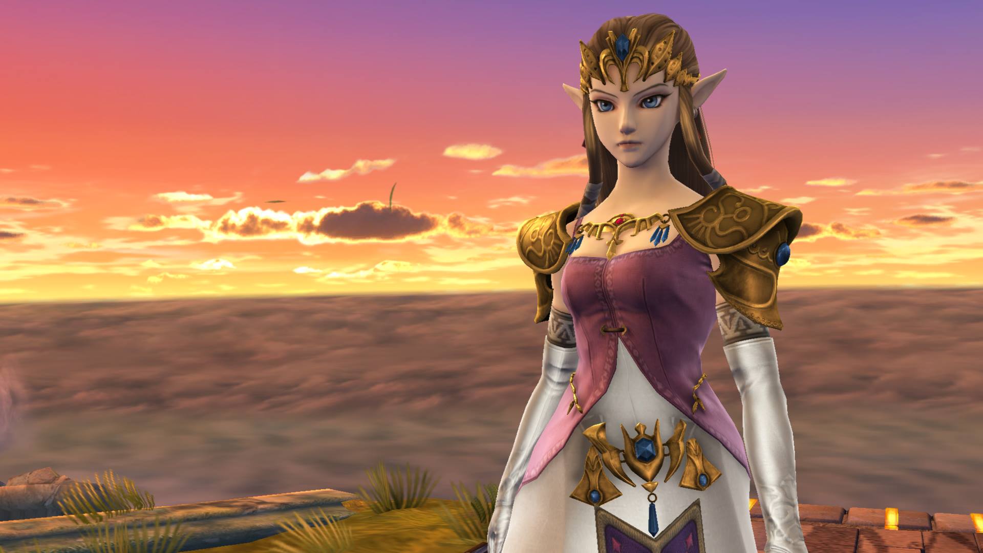
  • Certain characters got their looks very well fixed by certain features getting modified or removed (For example Zelda's face is very smooth and young now instead of having what I dub "the granny cheeks" she had in last game. Marth's hair is less smooth womanly wig-like thing and masculine posture has also been more reinforced by use of neck lines being more sharp and so on.)


Good stuff, really. I dig this game's art style direction - less serious than Brawl's, yet polishes more on each character and what makes them distinctive, as well as tribute to their best appearances.

Thanks also for fixing Marth's fabulousness to what it was intended in his series.
 
Last edited:

DaDavid

Just Another Sword User
Joined
Jan 22, 2014
Messages
2,206
Location
Probably at work.
NNID
DaDavidEffect
Switch FC
SW-7381-1262-2246
I never noticed the expressions changing to be more surprised and less in pain. Gives it a sillier sort of feel, but I guess I dig it.
 

ChikoLad

Purple Boi
Joined
Jan 11, 2014
Messages
23,084
So we've got 4 new vets to do, ay?

I'll do Zero Suit Samus myself at least, any excuse to look at her a bit more! :p
 

Katy Parry

The Only Zelda in Indiana
Joined
May 20, 2007
Messages
3,328
Location
Indianapolis, IN
NNID
justysuxx
Could you guys keep your ***** in your pants please? Thanks.

Could anyone do more for Zelda? She has barely any.
 

The Real Gamer

Smash Hero
Joined
May 7, 2008
Messages
9,166
Location
Atlanta, Georgia
3DS FC
3437-3797-6559
The sexy one herself is back!


Zamus got the best and biggest redesign by far. Some of the other vets don't look that far off from their Brawl counterparts. Zamus is literally night and day.

Her 3DS model is pretty "meh" though... It's not shiny like the WiiU counterpart. :F
 
Last edited:

mimgrim

Smash Hero
Joined
Jun 20, 2013
Messages
9,233
Location
Somewhere magical
Zamus got the best and biggest redesign by far. Some of the other vets don't look that far off from their Brawl counterparts. Zamus is literally night and day.

Her 3DS model is pretty "meh" though... It's not shiny like the WiiU counterpart. :F
You just prefer the bigger breasts. In which the 3DS version has smaller ones. Admit it. :L
 

Tornado_Man

Smash Lord
Joined
Jul 23, 2013
Messages
1,122
Location
Indiana
NNID
FireMegaBuster
Brawl vs SSB4 Sonic's down taunt comparison.
taunt.png

It can be seen just as the taunt begins.
 

Hippopotasauce

Smash Lord
Joined
Jul 3, 2013
Messages
1,659
NNID
Hippopotasauce
Personally I'm a fan of the blue lines and yellow highlights. Makes her seem like more than a regular person wearing latex.
 

BigHairyFart

Salty Supreme
Joined
Jan 10, 2013
Messages
866
Location
Kansas City, MO
NNID
JackAzzMcTittles
I've added Sheik. I wonder how different he'll feel to play as being separated from Zelda this time around.
 
Last edited:

DaDavid

Just Another Sword User
Joined
Jan 22, 2014
Messages
2,206
Location
Probably at work.
NNID
DaDavidEffect
Switch FC
SW-7381-1262-2246
Seeing him in the Direct I felt like he hadn't really noticeably changed at all.

I'll still say he is the least improved character so far in my opinion, but even something as simple as making his eyes dilate to show surprise and making his grin slightly wider goes a long way to making him feel more alive. Plus his claws don't look as nasty and yellow and junk.
 

BigHairyFart

Salty Supreme
Joined
Jan 10, 2013
Messages
866
Location
Kansas City, MO
NNID
JackAzzMcTittles
Really? I thought he changed quite a bit, despite his already basic appearance(like Kirby). One thing I noticed is that his wings actually seem smaller this time.
 

Priap0s

Smash Journeyman
Joined
Feb 18, 2013
Messages
280
Location
Malmö, Sweden
The pic on Charizard & Mario where Mario uses F.L.U.D.D... Is that a handle (like the ones you use in sunshine when "hoovering") we see on the back of the F.L.U.D.D? Was it there in Brawl too? Marios down-special could realy need some spicing up.


Please let Mario have F.L.U.D.D's hover thing, Please let Mario have F.L.U.D.D's hover thing, Please let Mario have F.L.U.D.D's hover thing, Please let Mario have F.L.U.D.D's hover thing, Please let Mario have F.L.U.D.D's hover thing, Please let Mario have F.L.U.D.D's hover thing, Please let Mario have the F.L.U.D.D's hover thing!!!
 
Last edited:

BigHairyFart

Salty Supreme
Joined
Jan 10, 2013
Messages
866
Location
Kansas City, MO
NNID
JackAzzMcTittles
Some of those comparasions use the wrong poses, especially Sheik, I think.

If only I had a computer I'd love to help with that.
Sorry about that. I admit, I never play most of the characters that aren't in my signature, so it was difficult to find the right animation. On top of that, a lot of the animations seem to have changed so that the character is always facing the camera. Also, I think Sheik was one of the better ones I didn't know.
 
Last edited:

Mypantisgone

Smash Lord
Joined
Feb 29, 2012
Messages
1,633
Location
Baguetteandwine Land
Sorry about that. I admit, I never play most of the characters that aren't in my signature, so it was difficult to find the right animation. On top of that, a lot of the animations seem to have changed so that the character is always facing the camera.
I did also notice the characters changing sides now, and some of the new animations like Sheik's Nair.
I do have a computer, but the conditions to use it are annoying (the screen is broken so we use the TV, I use my Wii U when I just want to go on the internet.) so I can't upload pictures whenever I want, again I'd love to help, but another time unfortunatly.

Leaving on a positive note, these comparisons are still very great, and you even go in details when you need to!
 

ChikoLad

Purple Boi
Joined
Jan 11, 2014
Messages
23,084
It's impossible to get a completely accurate comparison in the case of some pictures, especially ones involving multiple characters or split second timing. And yeah, the animations in some cases are noticeably different, even if the move is the same. If it's a case of them not facing the screen in Brawl though, when they are facing to the left, I simply take a picture of them facing right, and flip it in Photoshop, to make it look more like it is in Smash 4.

Also, while it's probably a bit early to be doing this, as we haven't got all of the characters out of the way:


Would it be possible for anyone to get a good screenshot of that same area of Skyloft within Skyward Sword? I want to compare original Skyloft to both the Project M version and the Smash 4 version. A first person screenshot would be preferable, assuming Skyward Sword has a first person look-around mode like most 3D Zelda games.

I'd do it myself, but Brawl is pretty much the only Wii game I can run well in Dolphin and is really the only one I'd ever want to run anyway. And I would take an photo with a camera from my Wii, as I do have Skyward Sword on my softmodded Wii, but I haven't played Skyward Sword myself yet and it'd probably take me a bit to find that place. Plus I don't have easy access to my Wii right now.
 
Last edited:

ChikoLad

Purple Boi
Joined
Jan 11, 2014
Messages
23,084
Aren't they all ported from Skyward Sword?
There could be a difference in lighting though, since Wii U is HD.
I believe so, but the Project M version SEVERELY reduces the polygon count and texture quality. So I want to see if they did the opposite in Smash 4.

Here's what that same area looks like in Project M:


Norm

Smash Lord
Joined
Oct 10, 2007
Messages
1,103
Location
Newfoundland, Canada
NNID
Sheldon86
I gotta say this is a pretty boss thread. It's nice seeing the comparison of all characters from brawl to the new Smash in one place. The wii U version is looking great awesome improvements all around.
 

ChikoLad

Purple Boi
Joined
Jan 11, 2014
Messages
23,084
Also, here's what both PM Skyloft and Smash 4 Skyloft look like from afar (left is PM, right is Smash 4):

 
Last edited:

BigHairyFart

Salty Supreme
Joined
Jan 10, 2013
Messages
866
Location
Kansas City, MO
NNID
JackAzzMcTittles
Would it be possible for anyone to get a good screenshot of that same area of Skyloft within Skyward Sword? I want to compare original Skyloft to both the Project M version and the Smash 4 version. A first person screenshot would be preferable, assuming Skyward Sword has a first person look-around mode like most 3D Zelda games..
I know that SS has a first person mode, and will try to get it later.
 

DraginHikari

Emerald Star Legacy
Joined
Sep 20, 2007
Messages
2,821
Location
Omaha, NE
NNID
Draginhikari
3DS FC
4940-5455-2427
Switch FC
SW-7120-1891-0342
Interesting how they've manage to give more expression to Charizard of all characters. They're more subtle changes but it works in its own way.
 

aBBYS

Smash Journeyman
Joined
Apr 17, 2014
Messages
247
The sexy one herself is back!


She looks sooooo much better in the new game than she did in Brawl. Her body plumped out a bit and that makes all the difference!

Although, technically, I see little difference in any of the characters apart from being rendered in higher resolution.
 

ChikoLad

Purple Boi
Joined
Jan 11, 2014
Messages
23,084
The characters that I see the most change in are:

-Samus and ZSS for obvious reasons that Sakurai himself mostly covered.

-Peach: Her dress is less overloaded with detail and the colour pops out more. The front of her face is also not so round anymore and is a bit more elegantly rounded, making her look less like a porcelain doll.

-All realistic humans (generally just look much more realistic, eyes are generally not as anime-ish as Brawl).

-Sonic: Has been updated to look more like the style that they have been using in Sonic games since Sonic Unleashed. This also means he now has his trademark side mouth, and his quills don't move like spaghetti.

-Yoshi (I should do him soon): Stands upright, and looks a lot more bubbly proportion wise. His eyes are more dilated too, making him look more adorable.

-Pikachu: He's dropped a few pounds. Really though, he know looks exactly how he does in the latest Pokémon games.

-King Dedede: Less cutesy, and his design is more based off of the Kirby anime now. Much more expressive too.

-Bowser: Stands upright, looks overall a bit sharper and more menacing despite the more colourful textures.
 
Top Bottom