BigHairyFart
Salty Supreme
Mario is up.
Welcome to Smashboards, the world's largest Super Smash Brothers community! Over 250,000 Smash Bros. fans from around the world have come to discuss these great games in over 19 million posts!
You are currently viewing our boards as a visitor. Click here to sign up right now and start on your path in the Smash community!
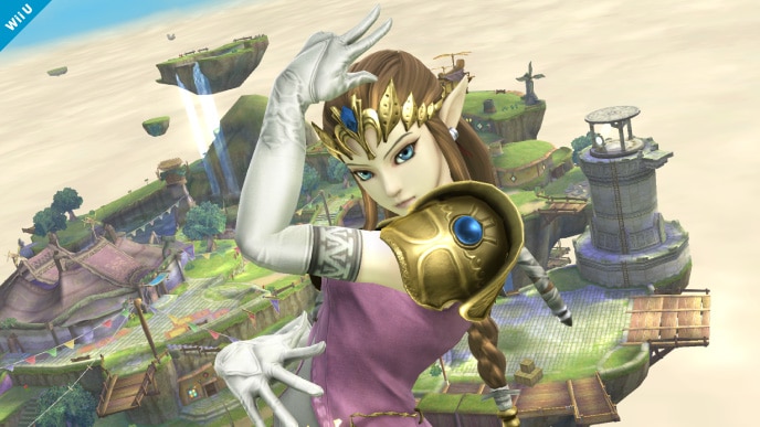
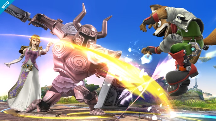
Yeah, she looks better. Her moves have been changed aesthetically too: F-tilt now has a red slash effect, N-air looks different, Din's Fire explosion looks different, and Farore's Wind is beautiful.That's why I'd like to see Zelda, and yeah, Bowser. They have the most notable changes to me. Other than Toon Link's super yellow hair, which looks perfect next to the WW HD release.
I absolutely loved the Brawl art direction, gritty done right. But these character models of Smash 4 are just astonishing, characters look much more lively now, the girls look sexier and cooler, Mario looks like Mario, Bowser actually looks like himself.I can't be the only person that prefers the art direction of Brawl, can I?
Texture detail goes a long way.
But most of all, I can't get over how odd the warmth of Donkey Kong feels. His skin is like playdough, and his fur is sooo fuzzy.
I see what you're saying, and I did like that Brawl had a lot of detail in it's textures, especially considering how old the hardware now is. However, I think that I like the new art direction better, it's more eye-popping and vibrant, making everything easier to see.I can't be the only person that prefers the art direction of Brawl, can I?
Texture detail goes a long way.
Exactly. It was just too much in Brawl, and honestly in general trying to make cartoony characters more gritty never tends to work out. Honestly it was a lame effort to make the game look more "HD" than Melee, OR (personal theory) it was to help Snake blend in better.Awesome that you're doing this! I love seeing clear comparisons that are as similar as possible.
I always felt like the textures in Brawl were a bit overkill. I prefer characters to look like themselves rather than a grittified rendition.
I didn't always feel that way about Brawl, but I'm one of the few who did before they even saw what Smash 4 looked like. I breathed a heavy sigh of relief when I saw what it looked like. This game so far is a dream come true for me.I always felt like the textures in Brawl were a bit overkill. I prefer characters to look like themselves rather than a grittified rendition.
I did. Lol.TOON LINK'S HAIR IS SO BLONDE NOW, HOW HAS NO ONE MENTIONED THIS YET?!
Because Zelda hasn't been reverted back to a blonde yet.TOON LINK'S HAIR IS SO BLONDE NOW, HOW HAS NO ONE MENTIONED THIS YET?!
Whoops! Scrolled too quickly it seems ^^;I did. Lol.
I loved Brawl's overall character design direction, and was hoping that would set the standard for the series from there on out. While the colors were far too dark and washed out for my tastes, the overall art direction was fantastic with its approach to taking all of these classic characters - some of whom had only been rendered in sprites in the past - and making them look as realistic as possible. I always liked how Brawl attempted to make every character fit into a unified art style by making them appear as if they all had entered the "real world". I think it worked well to a great extent, successfully bringing every character into the same universe. Characters like Dedede and the Trainer's Pokémon, never appearing in much detail before, looked extravagant in their official renders, and while SSB4's HD graphics and vibrant colors also look excellent, the fact that the characters look much more like cartoons limits the ability for the art direction to leave the sort of epic impact that Brawl's direction left me with.I can't be the only person that prefers the art direction of Brawl, can I?
Texture detail goes a long way.
But most of all, I can't get over how odd the warmth of Donkey Kong feels. His skin is like playdough, and his fur is sooo fuzzy.
Battlefield is absolutely gorgeous, I agree.I loved Brawl's overall character design direction, and was hoping that would set the standard for the series from there on out. While the colors were far too dark and washed out for my tastes, the overall art direction was fantastic with its approach to taking all of these classic characters - some of whom had only been rendered in sprites in the past - and making them look as realistic as possible. I always liked how Brawl attempted to make every character fit into a unified art style by making them appear as if they all had entered the "real world". I think it worked well to a great extent, successfully bringing every character into the same universe. Characters like Dedede and the Trainer's Pokémon, never appearing in much detail before, looked extravagant in their official renders, and while SSB4's HD graphics and vibrant colors also look excellent, the fact that the characters look much more like cartoons limits the ability for the art direction to leave the sort of epic impact that Brawl's direction left me with.
That being said, the colorful, smooth art direction taken in the Wii U game appeals to me just as much. There's a new sort of magic that it's introduced that Brawl didn't have, and vise-versa. The textures in this game leave a good deal to be desired, but the lighting and modeling is absolutely gorgeous, as are the base colors. Everything has an overall very soft and smooth look. Battlefield looks like a watercolor painting when viewed in profile, and it's simply fantastic.
I also agree that DK's model has a lot of problems. I honestly think he looks awful in this game, and he sticks out like a sore thumb amongst the rest of the cast, all of whom so far look so much better. Brawl's DK is highly unpopular, but it's actually my favorite design for him.

If your PC can handle it, you should be able to take screenshots (except print screens unless you increase your screen res over native too) at 1920x1080 if you increase your Dolphin resolution over what your monitor can display.@BigHairyFart : So I know you take requests, but would you accept donations too? I should have some free time this weekend, and I think I could at least do the Sonic pictures for you. I can run Brawl in Dolphin on my laptop, so the screenshots will be of a high resolution (1366x768, but I could go 1920x1080 if I use my brother's computer).
I'll do any others one that are there too. I have all Smash 4 media pictures and Daily Pics from E3 to the end of February (will have the March ones soon though, possibly today).
Feel free, it would definitely make it easier on me.@BigHairyFart : So I know you take requests, but would you accept donations too? I should have some free time this weekend, and I think I could at least do the Sonic pictures for you. I can run Brawl in Dolphin on my laptop, so the screenshots will be of a high resolution (1366x768, but I could go 1920x1080 if I use my brother's computer).
I'll do any others one that are there too. I have all Smash 4 media pictures and Daily Pics from E3 to the end of February (will have the March ones soon though, possibly today).
That's pretty much the feeling I think Sakurai was going for. If you remember, in the Developer Direct he mentions how the models look good even from a distance, where as in Brawl the "realistic" texture detail was it's way to look better than Melee.After taking a good look at your handy comparisons, I'm kind of getting the feeling that the models in Brawl were almost trying to be 'too real'. Though more vivid and cartoony, the SSB4 models still seem to have plenty of realistic detail.
This is probably due to Brawl's painted-on textures, which look "real" from a distance, but are a pretty cheap facade of detail when viewed from up-close. The Wii isn't much more powerful than the GameCube, so the faux-realistic textures, as @After taking a good look at your handy comparisons, I'm kind of getting the feeling that the models in Brawl were almost trying to be 'too real'. Though more vivid and cartoony, the SSB4 models still seem to have plenty of realistic detail.
Added Zelda, sort of... It was hard finding the right animations, so if you know which ones she's doing on her character page, please let me know.


After testing, I can confirm that the first pose is her transformation. Sadly, however, in Brawl, by the time she reaches anywhere near that frame, she's already turned completely white. The second pic does seem to resemble the down taunt, but not enough to get a good comparison shot.
Looks like the beginning of her transformation.

Pose reminds me of her down taunt. (same goes for the pose in the Peach x Link pic on her page)
That's all I got.
I've seen people compare it to her Assist Trophy summoning pose. Looks fairly similar to me.After testing, I can confirm that the first pose is her transformation. Sadly, however, in Brawl, by the time she reaches anywhere near that frame, she's already turned completely white. The second pic does seem to resemble the down taunt, but not enough to get a good comparison shot.
Dammit, Sakurai...
What about Melee? Brawl had a longer disappearance and loading time switching between her and Shiek because of its being dual-layered.After testing, I can confirm that the first pose is her transformation. Sadly, however, in Brawl, by the time she reaches anywhere near that frame, she's already turned completely white. The second pic does seem to resemble the down taunt, but not enough to get a good comparison shot.
Dammit, Sakurai...
Sheik confirmed?After testing, I can confirm that the first pose is her transformation. Sadly, however, in Brawl, by the time she reaches anywhere near that frame, she's already turned completely white. The second pic does seem to resemble the down taunt, but not enough to get a good comparison shot.
Dammit, Sakurai...
