• Welcome to Smashboards, the world's largest Super Smash Brothers community! Over 250,000 Smash Bros. fans from around the world have come to discuss these great games in over 19 million posts!

    You are currently viewing our boards as a visitor. Click here to sign up right now and start on your path in the Smash community!

Rate That Render! (Now Rating: #49 Little Mac)

nirvanafan

Smash Champion
Premium
Joined
Oct 14, 2016
Messages
2,749
:jigglypuff64:: 3/10
:jigglypuffmelee:: 3/10
:jigglypuffmelee: css: 6/10
:jigglypuff:: 3/10
:4jigglypuff:: 10/10
:ultjigglypuff:: 9/10
 
Last edited:

s07195

Smash Cadet
Joined
Jul 15, 2014
Messages
39
Switch FC
SW 4502 0980 9128
Jigglypuff:
64 - 3/10
Melee - 2/10
Brawl - 2/10
For - 7/10
Ultimate - 7/10
 

Mogisthelioma

Smash Master
Joined
Aug 24, 2018
Messages
3,596
Location
Ravnica
:jigglypuff64:: 3/10: She's just standing there.
:jigglypuffmelee:: 2/10: She's just standing there.........
:jigglypuff:: 1/10: SHE'S JUST STANDING THERE.......
:4jigglypuff:: 6/10: Look's weird, but OK.
:ultjigglypuff:: So puff is in rollout in this pose? And isn't standing there? 10/10.
 

MarioMeteor

Smash Hero
Joined
Nov 27, 2014
Messages
8,340
Location
New Orleans
NNID
BGenius23
3DS FC
0662-2900-1492
:jigglypuff64: 7/10 - I mean, it’s Jigglypuff. What more can you really ask from it? That said, the big, stare-into-your-soul eyes design for the pink balloon hasn’t aged well. I do like how she looks in the comic book-like art style of these renders, though.
:jigglypuffmelee: 6/10 - See above. It’s Jigglypuff, nothing more, nothing less. (But I like the CSS render a lot more because it looks like she’s photobombing.)
:jigglypuff: 6/10 - ⬆
:4jigglypuff: 10/10 - The smaller eyes and updated pose make for a render that can only be described as perfect. Can’t really get any better than this for Jigglypuff considering how simple her design is.
:ultjigglypuff: 9/10 - Don’t like the pose as much as Smash 4’s because it’s not quite as cute, but this is still a perfectly fine render for Jigglypuff.
 
Last edited:

VexTheHex

Smash Ace
Joined
Mar 30, 2018
Messages
567
:jigglypuff64: - 2.5/10 - I imagine Sakurai took Jigglypuff by her hands and announced to her she would be getting into a new game, much to her excitement. As they walked down the corridor for her sketch to be made, she envisioned the new pop singing game she would be starring in, her eyes sparkling at her dreams coming true. As she began to strike a pose, the artist asked her how she felt being the last of the 12 member cast to be joining Super Smash Bros. She dropped her pose and questioned what this "Smash Bros." meant as it sounded much different than "Puffball Diva Squad!" she was thinking of. The artist happily replied the cast will be fighting it out, punching and kicking each other's face in. In that moment, her eyes began dull and lifeless as her dreams died. This artwork was the capturing of that moment.

:jigglypuffmelee: - 6/10 - She didn't enjoy her treatment in Smash Bros in the slightest. She wasn't just meant to be beaten up, she was meant to be a joke fighter. But she heard news, the new installment would be losing cast members! Her eyes regained some light as she imagined herself escaping this hell and letting some other poor sucker get stomped, pummeled, and launched into the stars. It was deal, she'd suffer through one more game to escape the next.

:jigglypuff: - 6/10 - Almost frozen in time thanks to Sonic being late to the cast despite being known for his extreme speed. (she will never forgive him) She was almost out, she was almost out!!! But alas Sonic's late arrival meant Sakurai threw her back in with the wild dogs. She was in complete disbelief. Escape was right there, but that dumb blue hedgehog ruined it all.

:4jigglypuff: - 9/10 - She finally accepted her fate and with that came some happiness. She bonded with her fellow ladies and started to enjoy her time on the cast. I mean against all odds, she had managed to stay around with Nintendo's biggest names while lesser being like Roy, Pichu, and Wolf got dumpstered. She started feeling like the diva star she was meant to be.

:ultjigglypuff: - 7.5/10 - Everyone is here left a bitter taste in her mouth, she enjoyed making light of the ones who were cut in the past to help her feel better about being here. She almost fell back on how she was for three solid games. But her time in 4 had helped her find enough inner piece that allowed her to remain a little more positive and light spirited. She's hiding it, but she is full of emotion right now ranging from anger of being here to pride in being here.

I had to spruce up my rating to add excitement to her rather dull renders. Three of them are basically the same and Ultimate's is basically a floaty version of those. But I had fun imagining her 64 artwork being the soul crushing realization she was signed into a fighting game and not a singing/dance game.

:4jigglypuff: > :ultjigglypuff: > :jigglypuff: & :jigglypuffmelee: > > > > > :jigglypuff64:


Since this is the end of 64's renders. I looked back to see who scored the highest and lowest for my 64 rankings.

Highest - :falcon64: - 9/10 - Comic hero looks good on him!
Lowest - :fox64: - 2/10 - That creepy looking face and we're not talking about Andross.
 
Last edited:

NintendoKnight

Smash Lord
Joined
Oct 26, 2013
Messages
1,735
Location
Climbing the mountain I made from a molehill
NNID
Nin-Knight
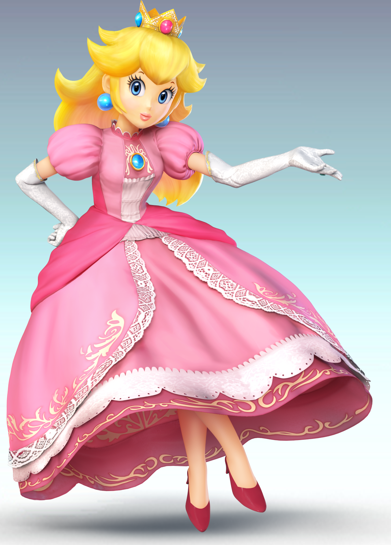
Reigning Monarch of the Mushroom Kingdom, Fair Maiden of Wishes, and the Princess who's ALWAYS in another castle: 13 Peach

Melee: :peachmelee:

Image Link

Our first Melee contender steps into the ring, and elegantly, I may add. With a tilt of the head and a hand rested on her brooch, Peach leaped in Smash with a spring in her step. But her render would betray that and only allow you to see the elegant ruler in a pose similar to how she would in her home series. Very much in line with her character, and looks great. Though, I wish more had been done with her eyes. (That probably applies to many Melee characters.)
8.2/10

Brawl: :peach:

HQ Image Link (Please use instead)

Reaching Brawl, Princess Toadstool's design matched more closely with her modern day appearances whereas her Melee design fell in line with her pre-N64 appearances. Now, I can't pinpoint it exactly, but this render of Peach has less... charm for lack of a better word. The pose is very much in line with her character and home series renders, but it's somehow less appealing than her prior render. Maybe because the positioning of her arms makes her look more pudgy?
7.4/10

Wii U/3DS: :4peach:

Image Link

Sm4sh was when many renders became more diverse, and Peach is no exception. Though I will say, her pose is much more dynamic, it lacks a certain "Peachiness" that her other 2 renders possessed. That doesn't detract from it too much though, as it still looks great. Something about the face bothers me, though.
8/10

Ultimate: :ultpeach:

Image Link

I LOVE this render for Peach! It shows a playfulness that none of her previous renders display, a whimsy that stays true to her character, while regaining that "Peachiness" that her Sm4sh render missed. Also, her parasol is here to play! The flow of the render, such as the movement of her hair and dress, is really well composed, and very easy on the eyes as well. The silhouette is phenomenal, though her prior renders had decent silhouettes, and her facial expression is perfect!
9.8/10

Greatest to Least: :ultpeach: > :peachmelee: > :4peach: > :peach:

What do you guys think? I'm not a big fan of Peach in the Smash series, hate fighting against or as her (and she's really obnoxious in Brawl and onward), but she has some pretty decent renders (of course her Ultimate one is really well done).
 

Mogisthelioma

Smash Master
Joined
Aug 24, 2018
Messages
3,596
Location
Ravnica
:peachmelee:: 5/10: I'm sorry, is she cross-eyed? Someone help her....
:peach:: 4/10: I'm equally disturbed by this one as I am by her Melee render. Except now she looks depressed too.
:4peach:: 6/10: I'm sorry, is she like, in the middle of a jump or something? I don't get this render. I also agree they messed up on her facial proportions.
:ultpeach:: 10/10: She looks so happy! And now they actually show her parasol/umbrella thingy!
 
Last edited:

Alternis

Ignore the user in front of you
Joined
May 28, 2018
Messages
1,304
Location
Tartarus
NNID
GeneralO
Switch FC
SW-1137-6792-9994
:peachmelee:: 7/10 - This render is decent for peach's personality, but the pose is nothing special.
:peach:: 6/10 - A decent pose, but it's essentially the same as before, and it seems a little bland to boot.
:4peach:: 8/10 - This pose is better, for sure. Even then, she's not exactly showing much emotion.
:ultpeach:: 10/10 - Peach's best render, bar none. Maintains her princess-like air, unlike the others. I like the addition of her parasol.
 

Luxent

Smash Journeyman
Joined
Oct 8, 2014
Messages
202
Location
Hiding with Mr. Saturn
NNID
Luxent
Switch FC
247632609328
I feel like everyone's renders are gonna be progressively better going from melee to ultimate.

The REAL tea tho is all of Peach's renders are stunning.

I love almost every render of hers except Melee.
 
Last edited:

VexTheHex

Smash Ace
Joined
Mar 30, 2018
Messages
567
My girl is up!!!

:peachmelee: - 6.5/10 - It's an alright pose with an air of playfulness. However, her face is a bit off and I like her dress fluffier honestly.
:peach: - 7.5/10 - Her dress got the fluff it needed, but the grim and dark take on her is awkward. It looks more like she is making a call for war instead of being the cheerful and loving lady she is known to be. There is also something odd going on with the pose making her look slouched as well.
:4peach: - 8.5/10 - This is the one where I think I realized what was bugging me a little with the previous ones, her face is very doll like and doesn't show any emotion. She is making a dynamic, interesting, and playful pose... yet her face reads nothing here. It was a pretty good one overall, but her face needs emotion.
:ultpeach: - 10/10 - One of my personal favorites, I have it with some other character's renders thrown around on my desktop background! It capture her perfectly, she looks playful, loving, and fun. This is the girl that I could see Bowser and Mario falling head over heels for. Her hair and dress adds nice flow to it while the parasol adds some unseen spice to it as well.

They seemed to go with a more doll like approach to her face for the first three, so it took Ultimate for Peach to come out with the loving and fun having aura in her render. And boy does it make it a lot better! I honestly wonder if it is my all time favorite render from everyone cause it's just that good to me.

:ultpeach: > :4peach: > :peach: > :peachmelee:
 
Last edited:

YoshiandToad

Smash Hero
Joined
Dec 24, 2001
Messages
7,123
Location
Still up Peach's dress.
Oh man, am I ever late to the party...

Okay Catch Up time:

:mario64:: 7.5/10, Of the Smash 64 renders, Mario has one of the less bizarre looking ones. His pose is simple and clean and showcases a healthy love of competition. The proportions comparitively to other fighters seem a little more accurate here. There's some detailing on the clenched hand missing that I'm not overly keen on and it would have been nice to see him with a big smile as he poses with his V for Victory, but overall pretty satisfied!

:mariomelee:: 7/10. He's jumping, which is VERY Mario but there's something not quite right with that arm that's not being thrust into the air which makes him look...honestly unsettling. The fact he's not looking at us the audience is also a little upsetting, I actually like it when the characters are posing for us.
The thing that saves this render is the beautiful detailing on his dungarees and hat which I remember being blown away by at the time and that it works very well in silhouette.

:mario2:: 5.5/10. Hoo boy. Okay, Mario's now ready for battle and that's neat but it's less a healthy love of competition and more like his Strikers "I'm gonna-a murder you all" looks. The pose is...fine, it's a battle ready stance but nothing about it screams Mario, just a standard basic pose for the most basic fighter...which I guess he is. Again, the detail on the denim is beautiful but it's the only thing worth talking about.

:4mario:: 9/10. Cooking with fire now. Literally. Mario's still got a case of the "I'mma kill ya"s but the fireball is at least an iconic Mario power up and his stance is solid. As an Amiibo this was one of the better choices, although it would have been fun to see him jumping AND fireballing since those are the two things he's known for. Also a smile or two wouldn't hurt Mario.

:ultmario:: 9.8/10. I wasn't sure on this one at first but he IS indeed doing something with a jump. It's dynamic, he's both battle ready and (possibly) smiling which brings him back up for me. The detailing on the denim is once again fantastic, but check out those shoes and gloves too! You can see the individual fabric strands and bits of leather.
Like NintendoKnight NintendoKnight said the only thing missing is his other fist being full of fireballs. Yum!
:dk64:: 4/10. He looks antagonistic like the Donkey Kong of old...I'm not sure why the renders of 64 insisted on making everyone's heads 3 times too large but I found it more offputting with DK than I did with Mario. The pose itself is pretty fine and seems to sum him up, even if he's a full on hunchback here. Grin is fun. Not the worst render from Smash 64, but no where near the best IMO.

:dkmelee:: 3/10. He's either swinging or stopping or running or...okay I have no clue what DK is doing in this one. Like Mario's Melee render he has taken his eyes off the audience which is pretty disappointing for me, and his face is a bit too expressionless for a character like DK.

:dk2:: 5/10. Same problem with looking away but his pose is more clear than it was in Melee. Again, expressionless and it bothers me greatly that the dark part around his eye is actually the same colour as the rest of his fur. Mouth is makes him look like a hideous fish, please change immedietely.

:4dk:: 7.5/10. MUCH BETTER. The fur is correctly coloured, he seems to be swinging forward. Pose seems pretty strong although DK is a character I associate with power and this one with him leaping around I feel fits more for a speedy character. I guess he's faster than Bowser. Open mouth is fine(and far far better than the previous two), but we want that big ol' goofy grin DK. Show us that winning smile!

:ultdk:: 10/10. Strong powerful pose, you can tell he's the BIG STRONG GUY(tm) and you can also see he's a bit of a dopey goofball thanks to that expressive face of his. Genuinely perfect. Couldn't have been better if they put a big old barrel in one hand and Pauline under his arm.
:link64:: 1/10. Sweet crap Link, what happened to you? You look malnourished and the bobble head look REALLY doesn't work on you with those skinny propotions. Also your nose is missing and the pose is the blandest of the bland. You look like a rejected Adventure Time character. Yeesh.

:linkmelee:: 8/10. Okay, I'm STILL not a fan of the looking away from the audience poses that Melee loved, but in Link's case it works. He looks like he's determined to stand up to the fight just over your shoulder, has picked up his blade and shield and is going to go save a Princess if you just move out his way. He doesn't have TIME to look at you here. He's a serious boy doing serious things.

:link2:: 2/10. Well...he's looking at us at least. The downside of Brawl was it was obsessed with all this grimey washed out realistic colours which honestly just makes him look a bit dull. Combine dull colours with a dull lifeless pose didn't do Link any favours.

:4link:: 6/10. Maybe I'm unsatisfiable, but Link's pose is pretty actiony...the problem for me is that it translated incredibly poorly into an amiibo and Link...doesn't really jump? So him jumping isn't exactly a plus...why couldn't they swap Mario and Link's poses around with Mario leaping and holding a fireball and Link standing strong with his shield and sword in a battle ready pose?

:ultlink:: 9/10. Okay, Ultimate's renders are pretty damn good. Link here is in the middle of combat and I guess hypocritically I like Link NOT looking at me, since unlike the previous two he should be more focused on the task at hand. Link's pose gives good movement IMO thanks to his tunic and hair and you can see he's preparing to strike back. Great stuff. A Breath of fresh air for Link renders.
:samus64:: 6/10. Samus with cartoon proportions is jarring although maybe not to the same extent Link's was since she's covered up. The pose is fine I suppose but it's nothing to write home about either.

:samusmelee:: 5/10. It's okay. I struggle with Samus' renders as a lot of the poses seem to be posing with the arm cannon. This one doesn't look particularly battle ready which is something I feel Samus should showcase.

:samus2:: 8.5/10. Pretty perfection IMO. Dynamic, YOU'RE the next target, and she's battle ready.

:4samus:: 2/10. Not sure what they were going for here...to make her seem godlike? Doesn't really work as a render. Functionally fine for the Amiibo and it's not awful thanks to the assymetry but it doesn't really give me a feel about Samus as a character or Metroid as a game. She looks positively peaceful here which is the opposite of what I think of when I think Metroid games.

:ultsamus:: 8.5/10. She looks like she's looking around for the next enemies sneak attack. Whilst I actually prefer Brawl's Samus render, this one does give me a subtle feeling of aloneness which sums up Metroid pretty well.
:yoshi64:: 5/10 Okay, I actually kind of miss Yoshi's more dinosaur-esque physique. The eyes here are creepy and again he's just...sort of standing there...giving you the bedroom eyes.

:yoshimelee:: 7/10. I don't know what it is, but I can't hate this render. Everyone always uses it to bash Yoshi but it's like "C'mon man, get on my back and we'll go on an adventure! I'll lead the way!" and again, those more dinosaur-esque propotions I really liked about retro Yoshi. Mario has always looked a bit odd riding on Yoshi's back when his proportions were similar to Mario's.

:yoshi2:: 6/10. His face is actually one of my preferred Yoshi renders, but damn do I dislike that pose. Not even sure what it's meant to be but Yoshi looks like a ridiculous penguin here. Please stop, you're the happy go lucky devouring machine.

:4yoshi:: 9/10. Something about the curvature of the body really appeals to me, and much like the Melee render he's saying "GET ON MY SADDLE BUD, LET'S GO ON A JOURNEY". Yoshi is the noble steed and it makes sense he wants you to come with him. Wish the face was a little happier, but what can you do? Overall I feel it was a good pose for the Amiibo too.

:ultyoshi:: 8/10. Slight regression for me. That clenched fist and happy hand wave feel too counter opposite for me. The positioning of his arm in comparsion to his head makes it a lesser pose for me personally. I'm really annoyed in five games we haven't had my main man Yoshi weilding an egg even once. Is that too much to ask?
:kirby64:, :kirbymelee:, :kirby2:: 5/10. Rating all three because they're equally eh to me. Kirby's simplistic design unfortunately leaves him a bit visually dull for poses in these renders...

:4kirby:: 1/10. But still better than this one! I'd have taken the happy arms up pose to this bizarre sitting down one for his amiibo any day. No energy. No excitement. Cuteness alone doesn't cut it with me, Kirb! I know you've got more star power than this. Strike a pose!

:ultkirby:: 9/10. YES. Now that's what I'm talking about! It's similar to the first three but more dynamic. The way he's kicking out his foot, the way his body curves slightly to an angle, that punch into the sky as if he's excited! YES. Well done Kirby. I wish this was your Amiibo.
:fox64:: 1/10. GOOD GOD FOX WHAT HAPPENED TO YOUR FACE?!? Also his pose doesn't strike me as confident but as a sassy femme fatale which doesn't really fit Fox McCloud at all.

:foxmelee:: 8/10 FAR BETTER. He's ready to stop his opponents, he's yelling at them, very 80s action pose.

:fox:: 8/10. For a static pose we can all agree Fox actually looks decent when he's not leaping around. He exudes confidence in his skills here.

:4fox:: 9/10. Star Fox's arwings have always been pretty angular. Perhaps that is why this pose works so well for Fox himself? It reminds me of his space craft, whilst at the same time showcasing his speed. No blaster, but I feel it works here. Again, a decent pose for an Amiibo.

:ultfox:: 8.5/10. I slightly prefer the Sm4sh one, but Fox has had mostly good poses throughout Smash history bar...that first one. Yeesh. This particular pose has Fox actually aiming a shot, showcasing his skill and more coolheaded personality compared to his fellow Starfox fighters.
:pikachu64:: 7.5/10. Pikachu here is adorable looking. Like most Smash 64 poses it's pretty static, but he's easily the best looking of the bunch with only Mario providing any competition. A more dynamic pose would be nice, but Pikachu...doesn't...do that.

:pikachumelee:: 4/10 oof. He looks like he's floating and with his tiny little limbs he looks like some sort of embryo monster. The face is cute, but it seems like in Melee Sakurai didn't know what to do with his models at all.

:pikachu2:: 4/10. A Pikachu as seen from slightly to the side. Again his body is doing weird movements. He looks like he's mid sneak for some reason and his legs positions just look ridiculously awkward,

:4pikachu::5/10. The most basic pose a Pikachu can do. At least he doesn't look deformed anymore, and that shade of yellow is very nice and bright. Dull Amiibo pose though.

:ultpikachu:: 7.5/10. He's trying his hardest bless him but thanks to the washed out yellow and the pose isn't quite as striking as it could be I don't really think much of this one either. The fold is cute, but the way the stomach doesn't bend around it perturbs me.

Okay, that took a while. I'll do the Secret four and Peach shortly. Phew.
 

pap64

Smash Apprentice
Joined
Aug 15, 2018
Messages
127
NNID
pappel64
Switch FC
2966 0225 9209
I'm sorry for coming in late to this party, but I think at this point we can all agree that the renders for Smash Ultimate are some of the best the series has ever seen, and it's all because of the pose design philosophy;
- Poses are clear and instantly readable
- They present proper physicality. Even when some characters have wild poses (hi there Bayonetta and Luigi), they feel like they have weight
- They are visually interesting
- They all convey character

I will admit I stole these from Dan's video about posing characters for animation based on the whole Overwatch Tracer controversy;

But everything he says applies so much to the Smash Ultimate renders it's like Sakurai and team watched that video or read Disney's "The Illusion of Life" book because the character presentation in this game is phenomenal. Here are some of my favorites:


Just look at this big ape. You can sense a lot of confidence in him without taking away that he is a comedic character, but one with strength to spare.


This just scream "dynamic" and "energetic". Not only is each Pokemon posing according to their personalities, the Pokemon trainer looks like she genuinely happy to battle and have fun.


You could have never touched a Bayonetta game before Smash and yet you would know exactly what kind of character Bayo is based on just this shot; sassy, confident, sensual, and a huge emphasis on her legs and butts. This pose does bend the rules because she is in a pose that most would never be able to pull off in real life, but like the video says, sometimes it's OK to stretch balance if it means it conveys characters well.
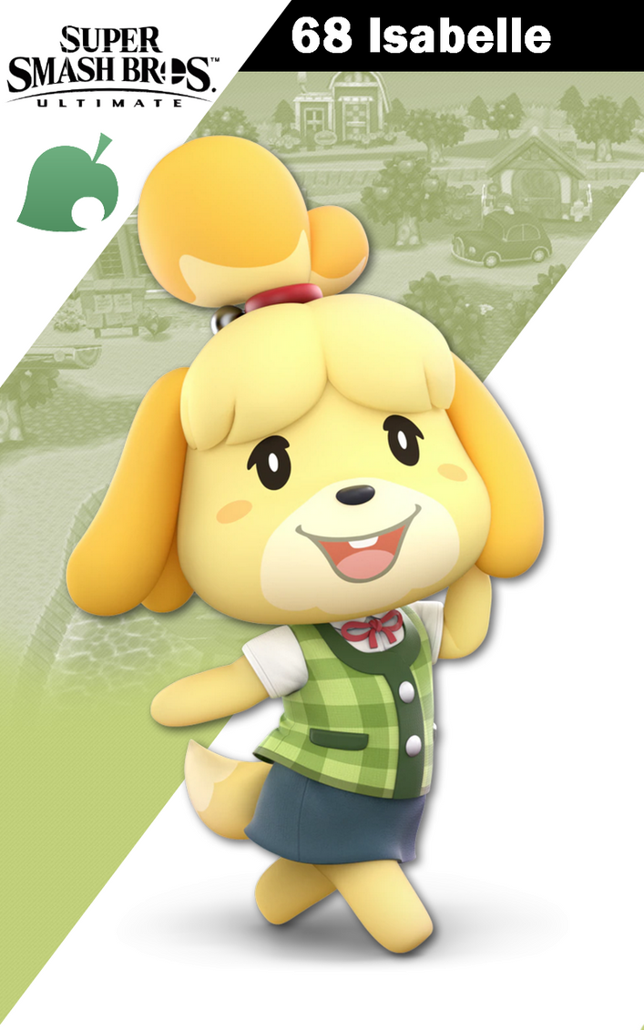


Now we have the exact opposite; she is cute, conservative, and brimming with charm. Her pose shows subtle sass but at the same time subtle elegance due to her being the mayor's assistant. She is the cartoon take on what an important secretary would be like in a world of cute animals. Again you could have not played New Leaf and yet you could see what kind of character Isabelle is.

I would buy the heck out of an "Art of Smash Ultimate" book because I feel artistically this game easily trumps the other Smash games, and I would love to learn more about it.
 

PF9

Smash Lord
Joined
Apr 13, 2010
Messages
1,068
Location
America
Oh man, am I ever late to the party...

Okay Catch Up time:

:mario64:: 7.5/10, Of the Smash 64 renders, Mario has one of the less bizarre looking ones. His pose is simple and clean and showcases a healthy love of competition. The proportions comparitively to other fighters seem a little more accurate here. There's some detailing on the clenched hand missing that I'm not overly keen on and it would have been nice to see him with a big smile as he poses with his V for Victory, but overall pretty satisfied!

:mariomelee:: 7/10. He's jumping, which is VERY Mario but there's something not quite right with that arm that's not being thrust into the air which makes him look...honestly unsettling. The fact he's not looking at us the audience is also a little upsetting, I actually like it when the characters are posing for us.
The thing that saves this render is the beautiful detailing on his dungarees and hat which I remember being blown away by at the time and that it works very well in silhouette.

:mario2:: 5.5/10. Hoo boy. Okay, Mario's now ready for battle and that's neat but it's less a healthy love of competition and more like his Strikers "I'm gonna-a murder you all" looks. The pose is...fine, it's a battle ready stance but nothing about it screams Mario, just a standard basic pose for the most basic fighter...which I guess he is. Again, the detail on the denim is beautiful but it's the only thing worth talking about.

:4mario:: 9/10. Cooking with fire now. Literally. Mario's still got a case of the "I'mma kill ya"s but the fireball is at least an iconic Mario power up and his stance is solid. As an Amiibo this was one of the better choices, although it would have been fun to see him jumping AND fireballing since those are the two things he's known for. Also a smile or two wouldn't hurt Mario.

:ultmario:: 9.8/10. I wasn't sure on this one at first but he IS indeed doing something with a jump. It's dynamic, he's both battle ready and (possibly) smiling which brings him back up for me. The detailing on the denim is once again fantastic, but check out those shoes and gloves too! You can see the individual fabric strands and bits of leather.
Like NintendoKnight NintendoKnight said the only thing missing is his other fist being full of fireballs. Yum!
:dk64:: 4/10. He looks antagonistic like the Donkey Kong of old...I'm not sure why the renders of 64 insisted on making everyone's heads 3 times too large but I found it more offputting with DK than I did with Mario. The pose itself is pretty fine and seems to sum him up, even if he's a full on hunchback here. Grin is fun. Not the worst render from Smash 64, but no where near the best IMO.

:dkmelee:: 3/10. He's either swinging or stopping or running or...okay I have no clue what DK is doing in this one. Like Mario's Melee render he has taken his eyes off the audience which is pretty disappointing for me, and his face is a bit too expressionless for a character like DK.

:dk2:: 5/10. Same problem with looking away but his pose is more clear than it was in Melee. Again, expressionless and it bothers me greatly that the dark part around his eye is actually the same colour as the rest of his fur. Mouth is makes him look like a hideous fish, please change immedietely.

:4dk:: 7.5/10. MUCH BETTER. The fur is correctly coloured, he seems to be swinging forward. Pose seems pretty strong although DK is a character I associate with power and this one with him leaping around I feel fits more for a speedy character. I guess he's faster than Bowser. Open mouth is fine(and far far better than the previous two), but we want that big ol' goofy grin DK. Show us that winning smile!

:ultdk:: 10/10. Strong powerful pose, you can tell he's the BIG STRONG GUY(tm) and you can also see he's a bit of a dopey goofball thanks to that expressive face of his. Genuinely perfect. Couldn't have been better if they put a big old barrel in one hand and Pauline under his arm.
:link64:: 1/10. Sweet crap Link, what happened to you? You look malnourished and the bobble head look REALLY doesn't work on you with those skinny propotions. Also your nose is missing and the pose is the blandest of the bland. You look like a rejected Adventure Time character. Yeesh.

:linkmelee:: 8/10. Okay, I'm STILL not a fan of the looking away from the audience poses that Melee loved, but in Link's case it works. He looks like he's determined to stand up to the fight just over your shoulder, has picked up his blade and shield and is going to go save a Princess if you just move out his way. He doesn't have TIME to look at you here. He's a serious boy doing serious things.

:link2:: 2/10. Well...he's looking at us at least. The downside of Brawl was it was obsessed with all this grimey washed out realistic colours which honestly just makes him look a bit dull. Combine dull colours with a dull lifeless pose didn't do Link any favours.

:4link:: 6/10. Maybe I'm unsatisfiable, but Link's pose is pretty actiony...the problem for me is that it translated incredibly poorly into an amiibo and Link...doesn't really jump? So him jumping isn't exactly a plus...why couldn't they swap Mario and Link's poses around with Mario leaping and holding a fireball and Link standing strong with his shield and sword in a battle ready pose?

:ultlink:: 9/10. Okay, Ultimate's renders are pretty damn good. Link here is in the middle of combat and I guess hypocritically I like Link NOT looking at me, since unlike the previous two he should be more focused on the task at hand. Link's pose gives good movement IMO thanks to his tunic and hair and you can see he's preparing to strike back. Great stuff. A Breath of fresh air for Link renders.
:samus64:: 6/10. Samus with cartoon proportions is jarring although maybe not to the same extent Link's was since she's covered up. The pose is fine I suppose but it's nothing to write home about either.

:samusmelee:: 5/10. It's okay. I struggle with Samus' renders as a lot of the poses seem to be posing with the arm cannon. This one doesn't look particularly battle ready which is something I feel Samus should showcase.

:samus2:: 8.5/10. Pretty perfection IMO. Dynamic, YOU'RE the next target, and she's battle ready.

:4samus:: 2/10. Not sure what they were going for here...to make her seem godlike? Doesn't really work as a render. Functionally fine for the Amiibo and it's not awful thanks to the assymetry but it doesn't really give me a feel about Samus as a character or Metroid as a game. She looks positively peaceful here which is the opposite of what I think of when I think Metroid games.

:ultsamus:: 8.5/10. She looks like she's looking around for the next enemies sneak attack. Whilst I actually prefer Brawl's Samus render, this one does give me a subtle feeling of aloneness which sums up Metroid pretty well.
:yoshi64:: 5/10 Okay, I actually kind of miss Yoshi's more dinosaur-esque physique. The eyes here are creepy and again he's just...sort of standing there...giving you the bedroom eyes.

:yoshimelee:: 7/10. I don't know what it is, but I can't hate this render. Everyone always uses it to bash Yoshi but it's like "C'mon man, get on my back and we'll go on an adventure! I'll lead the way!" and again, those more dinosaur-esque propotions I really liked about retro Yoshi. Mario has always looked a bit odd riding on Yoshi's back when his proportions were similar to Mario's.

:yoshi2:: 6/10. His face is actually one of my preferred Yoshi renders, but damn do I dislike that pose. Not even sure what it's meant to be but Yoshi looks like a ridiculous penguin here. Please stop, you're the happy go lucky devouring machine.

:4yoshi:: 9/10. Something about the curvature of the body really appeals to me, and much like the Melee render he's saying "GET ON MY SADDLE BUD, LET'S GO ON A JOURNEY". Yoshi is the noble steed and it makes sense he wants you to come with him. Wish the face was a little happier, but what can you do? Overall I feel it was a good pose for the Amiibo too.

:ultyoshi:: 8/10. Slight regression for me. That clenched fist and happy hand wave feel too counter opposite for me. The positioning of his arm in comparsion to his head makes it a lesser pose for me personally. I'm really annoyed in five games we haven't had my main man Yoshi weilding an egg even once. Is that too much to ask?
:kirby64:, :kirbymelee:, :kirby2:: 5/10. Rating all three because they're equally eh to me. Kirby's simplistic design unfortunately leaves him a bit visually dull for poses in these renders...

:4kirby:: 1/10. But still better than this one! I'd have taken the happy arms up pose to this bizarre sitting down one for his amiibo any day. No energy. No excitement. Cuteness alone doesn't cut it with me, Kirb! I know you've got more star power than this. Strike a pose!

:ultkirby:: 9/10. YES. Now that's what I'm talking about! It's similar to the first three but more dynamic. The way he's kicking out his foot, the way his body curves slightly to an angle, that punch into the sky as if he's excited! YES. Well done Kirby. I wish this was your Amiibo.
:fox64:: 1/10. GOOD GOD FOX WHAT HAPPENED TO YOUR FACE?!? Also his pose doesn't strike me as confident but as a sassy femme fatale which doesn't really fit Fox McCloud at all.

:foxmelee:: 8/10 FAR BETTER. He's ready to stop his opponents, he's yelling at them, very 80s action pose.

:fox:: 8/10. For a static pose we can all agree Fox actually looks decent when he's not leaping around. He exudes confidence in his skills here.

:4fox:: 9/10. Star Fox's arwings have always been pretty angular. Perhaps that is why this pose works so well for Fox himself? It reminds me of his space craft, whilst at the same time showcasing his speed. No blaster, but I feel it works here. Again, a decent pose for an Amiibo.

:ultfox:: 8.5/10. I slightly prefer the Sm4sh one, but Fox has had mostly good poses throughout Smash history bar...that first one. Yeesh. This particular pose has Fox actually aiming a shot, showcasing his skill and more coolheaded personality compared to his fellow Starfox fighters.
:pikachu64:: 7.5/10. Pikachu here is adorable looking. Like most Smash 64 poses it's pretty static, but he's easily the best looking of the bunch with only Mario providing any competition. A more dynamic pose would be nice, but Pikachu...doesn't...do that.

:pikachumelee:: 4/10 oof. He looks like he's floating and with his tiny little limbs he looks like some sort of embryo monster. The face is cute, but it seems like in Melee Sakurai didn't know what to do with his models at all.

:pikachu2:: 4/10. A Pikachu as seen from slightly to the side. Again his body is doing weird movements. He looks like he's mid sneak for some reason and his legs positions just look ridiculously awkward,

:4pikachu::5/10. The most basic pose a Pikachu can do. At least he doesn't look deformed anymore, and that shade of yellow is very nice and bright. Dull Amiibo pose though.

:ultpikachu:: 7.5/10. He's trying his hardest bless him but thanks to the washed out yellow and the pose isn't quite as striking as it could be I don't really think much of this one either. The fold is cute, but the way the stomach doesn't bend around it perturbs me.

Okay, that took a while. I'll do the Secret four and Peach shortly. Phew.
Since this was posted I'll do Pikachu

64: 7/10, was pretty basic for the era

Melee: 9/10. I could understand not using realistic fur here but...

Brawl: 5/10. This was one of the few non-realistic ones in Brawl

4: 5/10, missing out on a chance for realistic fur here and in...

Ultimate: 5/10, I mean if the Kongs and most of the canines can have realistic fur, why not Pikachu? Mice are mammals too.
 

IceeKnight

Smash Rookie
Joined
Feb 7, 2015
Messages
21
ITT: old renders bad new renders good based sakurai

also no one cares for anyone else's opinion but their own so why are people posting
 

NintendoKnight

Smash Lord
Joined
Oct 26, 2013
Messages
1,735
Location
Climbing the mountain I made from a molehill
NNID
Nin-Knight
I'm sorry for coming in late to this party, but I think at this point we can all agree that the renders for Smash Ultimate are some of the best the series has ever seen, and it's all because of the pose design philosophy;
- Poses are clear and instantly readable
- They present proper physicality. Even when some characters have wild poses (hi there Bayonetta and Luigi), they feel like they have weight
- They are visually interesting
- They all convey character

I will admit I stole these from Dan's video about posing characters for animation based on the whole Overwatch Tracer controversy;

But everything he says applies so much to the Smash Ultimate renders it's like Sakurai and team watched that video or read Disney's "The Illusion of Life" book because the character presentation in this game is phenomenal. Here are some of my favorites:


Just look at this big ape. You can sense a lot of confidence in him without taking away that he is a comedic character, but one with strength to spare.


This just scream "dynamic" and "energetic". Not only is each Pokemon posing according to their personalities, the Pokemon trainer looks like she genuinely happy to battle and have fun.


You could have never touched a Bayonetta game before Smash and yet you would know exactly what kind of character Bayo is based on just this shot; sassy, confident, sensual, and a huge emphasis on her legs and butts. This pose does bend the rules because she is in a pose that most would never be able to pull off in real life, but like the video says, sometimes it's OK to stretch balance if it means it conveys characters well.


Now we have the exact opposite; she is cute, conservative, and brimming with charm. Her pose shows subtle sass but at the same time subtle elegance due to her being the mayor's assistant. She is the cartoon take on what an important secretary would be like in a world of cute animals. Again you could have not played New Leaf and yet you could see what kind of character Isabelle is.

I would buy the heck out of an "Art of Smash Ultimate" book because I feel artistically this game easily trumps the other Smash games, and I would love to learn more about it.
Can I be real with you for a second?

That video you embedded is what inspired me to make my initial comparison of the Ganondorf renders (like i mentioned in the OP) which ultimately led me to making this thread. I thought about posting the video myself but decided not to so as to not overcomplicate a simple concept. Though I'm glad you posted it.

Edit: In order to avoid the double post, I have to edit my post here with the next of the render ratings.

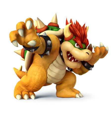
He's the King of the Koopas, the Kidnapper of Princess Peach, and Mario's archenemies; he's the Great and Terrible: #14 Bowser

Melee: :bowsermelee:

Image Link

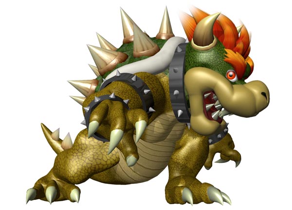
Starting off with another Melee vet, we have another Mario character, ol' King Koopa himself doing his best Godzilla impression. He's looking a lot like his Super Mario 64 self here, which is fine. He looks pretty monstrous, and he plays like it too. I do find it interesting how much his skin has the color of copper. Anyway, he's got this big lean going on while shooting us the evil eye. It's actually a pretty decent profile shot.
8/10

(Edit) Character Select Screen Portrait: CSSP
Image Link (Can't find a Smashboards supported link)

I can't believe I forgot the select screen portrait! With this image of Bowser on the select screen, he's basically using his in-game idle pose. Really boring, I gotta say. Fortunately, he's cut off at the part that really doesn't matter, so that worked well. Otherwise, it isn't very interesting.
5/10


Brawl: :bowser2:

Image Link

I really love this one despite it's lack of anything dynamic or visually interesting. Maybe it's because I love the expression he's wearing. It's like he's saying "I'm evil and i love it!" This render also brought Bowser up to more modern standards for his design, but not fully as he's still hunched over. I also dig his hand placement better than his Melee one.
8.2/10

Wii U/3DS: :4bowser:

HQ Image Link

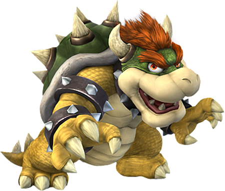
Almost like he's combined his Brawl and Melee renders, Bowser's rocking his evil pose and is proud of it. His claws are in more dynamic and interesting positions, and he's no longer hunched over from his shell. He's still managed to keep the lean that's he's head in each render, and he clearly favors the right side with each pose. He must love them profile shots.
8.7/10

Ultimate: :ultbowser:

Image Link

This is the most diverse and unique render Bowser's had for this series yet! Hilariously, with each installment, Bowes's render had his arms and hands slowly rise higher with every pose; culminating in his arm raised right over his head. He's now doing his "I'm a scary monster!" impression. He also retains the lean he's been working on in each render as well. With every new pose Bowser gets in Smash, he manages to take a little something from each pose and implement it into his new one. How does he do that?
8.9/10

Greatest to Least: :ultbowser: > :4bowser: > :bowser2: > :bowsermelee: > CSSP

What do you guys think of Bowser's renders?
 
Last edited:

DrPerplexion

Smash Cadet
Joined
Sep 26, 2018
Messages
64
Location
Planet Spaceball
DAILY DOUBLE
:jigglypuff64: neat 3/5 :peachmelee:good first impression 3/5
:jigglypuffmelee: deja vu 2.5/5 :peach:also good 3.5/5
:jigglypuff:deja vu 2/5 :4peach: looks PEACHY 4/5
:4jigglypuff:good 4/5 :ultpeach: NOW WE'RE TALKING 4.5/5
:ultjigglypuff: the puff is puffed 4.5/5
 

Mogisthelioma

Smash Master
Joined
Aug 24, 2018
Messages
3,596
Location
Ravnica
:bowsermelee:: 3/10: I'm sorry......no.
:bowser2:: 3/10: No again.
:4bowser:: 5/10: Look! Look! He's DABBING!
:ultbowser:: 10/10: He looks like a wild monster, and the amount of detail in this one is amazing!
 

RealPokeFan11

Smash Lord
Joined
Aug 24, 2018
Messages
1,243
Location
Center of the Zero Point
Switch FC
SW-0818-9732-6979
:bowsermelee:5/10 The rest of his body looks intimidating, but his face just screams "HERP DERP DERP!" He looks like a cranky tortoise that just woke up and needs his morning coffee.

:bowser2:7/10 They did it effectively and removed the derpiness, but the dark and gritty art style kinda ruins it a little. Also his pose seems too relaxed.

:4bowser:8.5/10 Looks much better than both Melee and Brawl, but I feel like he's missing something.

:ultbowser:10/10 Now THIS is how you do Bowser justice. His pose looks scary as hell, and it captures his personality and disposition perfectly.
Also the art style works so well.

Rankings: :ultbowser:>:4bowser:>>:bowser2:>>>:bowsermelee:
 
Last edited:

Admiral Pit

Smash Hero
Joined
Feb 20, 2008
Messages
8,722
Location
Skyworld
NNID
GoldAngelPit
3DS FC
0903-2895-3694
Finally a character I care about.

:bowsermelee: 4/10
He did seem kinda intimidating in a way, but that face isn't really right, I think. Well the eyes are kinda big, which probably why he's not as scary as he could be. Them spikes are also larger than I remember, but don't think it works.

:bowser2: 6/10
Bowser seems a tad scarier than his Melee version, but I don't think the dark style of Brawl did him too well, especially when he feels more um... elderly than he really is. At least it beats Melee.

:4bowser: 8/10
A brilliant pose that definitely gives off that frightening Bowser feel. He shows off them claws as if he's really gonna use him at his opponents and is a great fit for our modern Bowser. His body color is more fitting of the modern Bowser too.

:ultbowser: 10/10
You take a look at Smash 4's Bowser, and make him better. His mouth is more open which shows off his teeth better to make you think he's likely to bite or even roar, and that one arm in the air, showing that he's likely to swipe at you with those mighty claws of his. The colors are more clear and clean, and Bowser's intimidating factor is the best here outta all his Smash renders. The render captures his personality and ferocity really well, and to put it short, this is how you Bowser in this generation.
 

VexTheHex

Smash Ace
Joined
Mar 30, 2018
Messages
567
:bowsermelee: - 5/10 - Not as bad as i was expecting. However his right leg is a bit odd, his texturing seems a bit metallic, and his general face looks a tad off.
:bowser2: - 6.5/10 - He looks like he is up to no good but has a rather bland pose overall. It's an improvement for sure though.
:4bowser: - 8/10 - He looks sort of like a edgelord here with the pose (I think it's the left arm), but I like it overall. He looks a lot closer to what I think of when thinking of Bowser here than the previous two.
:ultbowser: - 8/10 - There's two things that bother me a little about this render. The first is the layout of his teeth make me think of the worms with teeth design you see in games, and it creeps me out a bit. The second is his hair doesn't quite match the rest of the render. Sometimes I look at it and think the hair meshes and other times I feel it stands out as over detailed compared to the rest of him. It's nice overall though!

Bowser is Nintendo's bad boy that has been with us for ages. I adore the guy, but I don't think any of his renders quite hit a home run for me. I don't really feel any of them were complete failures at least.

:ultbowser: & :4bowser: > :bowser2: > :bowsermelee:
 
Last edited:

Dukemon

Smash Apprentice
Joined
Sep 17, 2018
Messages
148
Peachs Smash 4 render reminds me of a Peachblossom. btw.

Only render I do not like is Smash 4 Luigis render.
 

Alternis

Ignore the user in front of you
Joined
May 28, 2018
Messages
1,304
Location
Tartarus
NNID
GeneralO
Switch FC
SW-1137-6792-9994
:bowsermelee:: 6/10 - The pose here is decent, and suits Bowser, but it feels bland.
:bowser2:: 6/10 - I could also the same about the Brawl render here, as it does fit an "evil" kind of vibe, but it's also uninteresting to look at.
:4bowser:: 7/10 - A more dynamic pose than the others, I'll admit. But there something odd in this render to me, though I can't discern what it is.
:ultbowser:: 9/10 - A really great pose right here. I keeps the same feel as the other renders, and it also makes it look like he's attacking, and he even looks a bit excited to be doing so. This captures the more villainous Bowser quite well.
 

NintendoKnight

Smash Lord
Joined
Oct 26, 2013
Messages
1,735
Location
Climbing the mountain I made from a molehill
NNID
Nin-Knight
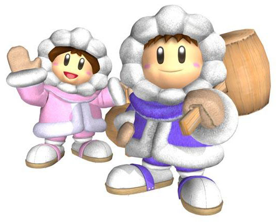
The Bone-Chilling duo, the conquerors of the infinite glacier, and the team who always reach the summit: #15 Ice Climbers

Melee: :icsmelee:

Image Link

The Ice Climbers kick into gear with their first pose. It's a very simple pose for the duo, though it's the first character to have a 2-in-1 gimmick. It's not bad, but it's not very interesting. They're just standing there, Nana's saying "hi". It's all very basic.
6/10

Brawl: :popo:

Image Link

Wow, look at the difference! They go from boring standing poses to this uniquely team-focused dynamic one. I like how this one shows off a stronger emphasis on the two of this as a team instead of just two people standing around. I also love how fuzzy their parkas are, ohmigosh.
8/10

Wii U/3DS: ...

Wait a minute, what happened here?! What do you mean there are no Ice Climbers in Wii U or 3DS?

Ultimate: :ulticeclimbers:

Image Link

OK, this is fantastic! Both climbers are fully visible in this one. The posing is dynamic as both characters are in different fighting poses. It's the little details that sell this one though. Fist, notice how the fuzz on the parka's is much more realistic looking. It's super plush, I love it. Next, pay attention to the bottom of Nana's boot (the pink climber) and the flat parts of their heads of their mallets; if you look, you'll see frost from their snowy travels on their hammer and cleats. It's a super nice touch that I absolutely love.
9/10

Greatest to Least: :ulticeclimbers: > :popo: > :icsmelee:

What do you guys think of the climbers' renders? I have to say, I almost forgot to do this because of Ultimate actually releasing and sucking up a good portion of my time today.
 

RealPokeFan11

Smash Lord
Joined
Aug 24, 2018
Messages
1,243
Location
Center of the Zero Point
Switch FC
SW-0818-9732-6979
:icsmelee: 6/10 Nana waving is cute, and that's about it. The pose is somewhat plain. (Also the stock icon looks like a screaming 6 year old playing Roblox)

:popo: 7/10 Slightly better pose, but their faces look somewhat bored.

??? 0/10 Why couldn't you just put them on the Wii U and leave them off the 3DS version? Not many people played it after the Wii U version was released anyway... (I only played 3DS for Smash Run.)

:ulticeclimbers: 9/10 Much better pose, and they look determined and ready for action. I also like the small details on their parkas, and their hammers and cleats. Great render for one of my new mains.
 
Last edited:

osby

Smash Obsessed
Joined
Apr 25, 2018
Messages
23,991
??? 0/10 Why couldn't you just put them on the Wii U and leave them off the 3DS version? Not many people played it after the Wii U version was released anyway... (I only played 3DS for Smash Run.)
3DS version's sales destroyed Wii U version. I think it was a smart call to keep them both in mind.
 

TheTrueBrawler

Smash Demon
Joined
Jul 16, 2018
Messages
816
Location
Mystery
I think WiiU was the superior version in terms of pretty much every difference that existed besides Smash Run versus Smash Tour. The reason why it didn't sell too well was because of its home console. The WiiU itself didn't sell well at all, so most were stuck with the 3DS version.
 

Necro'lic

Smash Ace
Joined
Aug 9, 2015
Messages
654
My precious children are back in Ultimate. <3

The Ultimate version is without a doubt superior. I love the details of frost on the mallets most of all. You can even see it in game if you look close enough. These two were my original main in Melee when I was a kid, because I loved the dynamic of two in one fighters. They feel nice in Ultimate too.

And besides all that, they are super cute! :ulticeclimbers::ulticeclimbers:
 
Last edited:
Top Bottom