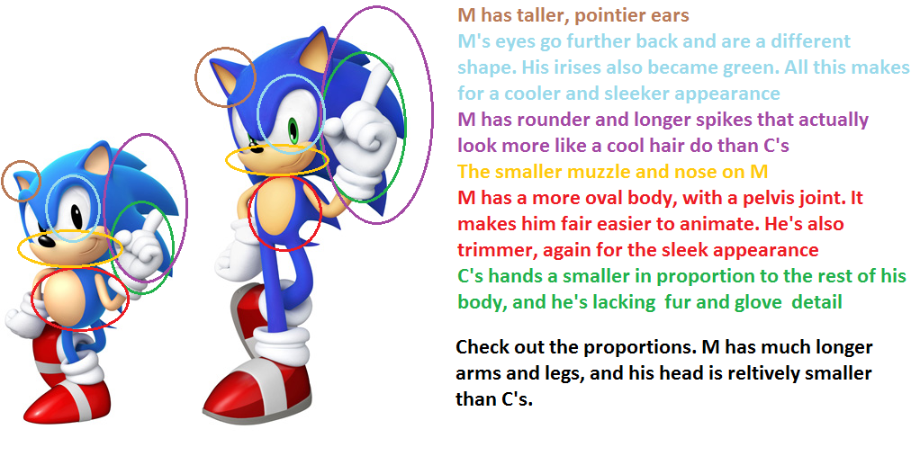
OVER ANALYSIS TIME:
I'm against it.
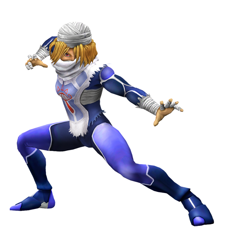
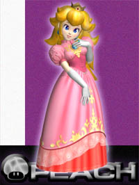
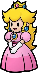
Firstly, the most obvious reason: The other classic designs may have similarities from their Melee counterparts, they're not based off of them: Ocarina of Time Link isn't based off of Melee, but Ocarina of Time. However, both Peach designs are based off of the same source material, Mario, consistently one art style, unlike Twilight Princess Link versus Ocarina of Time Link, making it hard for the Project M development team to take creative liberties with it. You have a valid point about Sheik, but she was designed to fit the Zelda Universe of choice to fit Brawl: Twilight Princess. Sort of a redesign akin to Pit's.
Now for the less obvious things: The colour issue. Both of them have the same primary and secondary colours, the only difference is that the Melee version is super saturated, which would never fit in the Brawl styling. If they desaturated the Melee design, it would look exactly the same.
WHY DO THEY STILL HAVE THOSE WARIO SWAPS. This introduces another problem: Visual direction. Everything you look at has a visual direction naturally drawing your eye to specific points. Both designs of Peach have the exact same visual direction, the only difference is that Melee Peach doesn't have the extra details, likely excluded due to size limitation. This leaves the only main difference in design, the cummerbund thingy, a small detail covered by her arms, not only all the time in-game, but also in the renders, a subtle but important detail,
emphasizing her character, her personality, all in movements. Which apparently means covering up her tum tum. I'm making this up.
Those are only the problems I saw during fifteen seconds. Someone more educated than myself could probably find even more.
The only way I could ever see it happening is if her Sunshine, nurse, or other short skirted design was used for the top, (where the Melee design is exactly the same as Brawl's 'cept that darling cummerbund thingy), while everything waste-down was the Melee design.
I don't like the turn my favourite thread is going down, it's been a bit hostile and full o' drama as of late it seems. Oh well!
Speaking of design comparisons, everybody seems to want PED Suit Samus for Samus' last swap. I, personally think that she should use the 0% design with the Hazard Protection accessory, which leaves Zero Suit. I think she should wear her uniform from the Galactic Federation in Other M. I know people hate that game, including myself, but that design is pretty cool and unique. Since both designs are of Galactic Federation origin, they would fit together well. If they went with a corrupted Zero Suit, it wouldn't fit the 0%, if they went with a different percentage, it would be super blue and be easily confused with her blue Dark Samus swap.






.png/revision/latest?cb=20121201200518)
