Hahaha, I was wondering the same thing... But he seldom comments, so I think (really hope) he's just catching up on all the other comments.
YOU CAN'T TELL ME WHAT I CAN TELL
YOU DON'T KNOW MY LIFE.
SHEESH, PEOPLE ALWAYS MAKE THESE ASSUMPTIONS, LIKE THEY KNOW WHAT MY OPINION IS, LIKE THEY HAVE MORE AUTHORITY OVER IT THAN I DO.
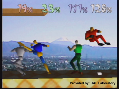
Hahaha, half extreme joke, half extreme pet peeve aside, I know, but I feel like things on paper can be so different, but in-game, look so similar. Chest piece, shoulder pauldrons, boots, hair, all the same colour. The only thing that's different colour-wise is the shirt, where Project M Roy has a tunic, and that Roy doesn't.
While detail-wise, it's
really cool, that's not as important as colour and the big picture. In-game, it's not particularly easy to pay attention to the smallest detail while three other characters are chasing after you. Having to pay attention to those details put you at a gameplay disadvantage.
Compare what they did with Power Suit Samus in comparison to the standard palette swap: Notice how her Power Suit has a yellow/tan colour, rather than an orange colour like the original concept art has. These kind of differences are very important, as it's very easy and obnoxious to accidentally think you're another character. If you have two costumes or palette swaps that are similar in both structure and colours, then it gets frustrating. That's why they changed so many of Lucario's and Sonic's palette swaps, and why I'm
so insistent on a few of Wario's palette changes.
I
waaay over-analyze aesthetics.


