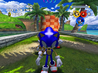
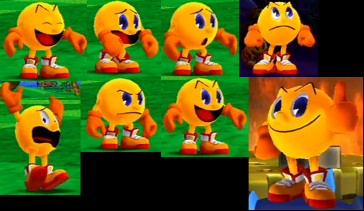
While they appear almost identical at face value, something that also made me ponder why I prefer one to the other so strongly, there are actually a few subtle differences that, as a whole, drastically contribute to why I prefer the Party design. The depressed eyes in the GA design are a little offputting on a round body, and the way that Pac is rendered overall makes him too shiny and dense, like a hard plastic figure or robot rather than an organic lifeform. The eyebrows are also a problem, as they're angled more acutely than in the Party design, making them shaped like "kitty ears". The Party design also has this "solid eyebrows" problem, but it's much more pronounced in GA. Add the mouth rim into the equation, and all of these attributes make it look like he's wearing some sort of shell over his body, which comes off as unnaturally inorganic. I think it's the same sort of problem that a lot of people had with the character models in
Sonic Heroes. The designs were unnecessarily shiny and rigid looking, making everyone look like plastic toys.

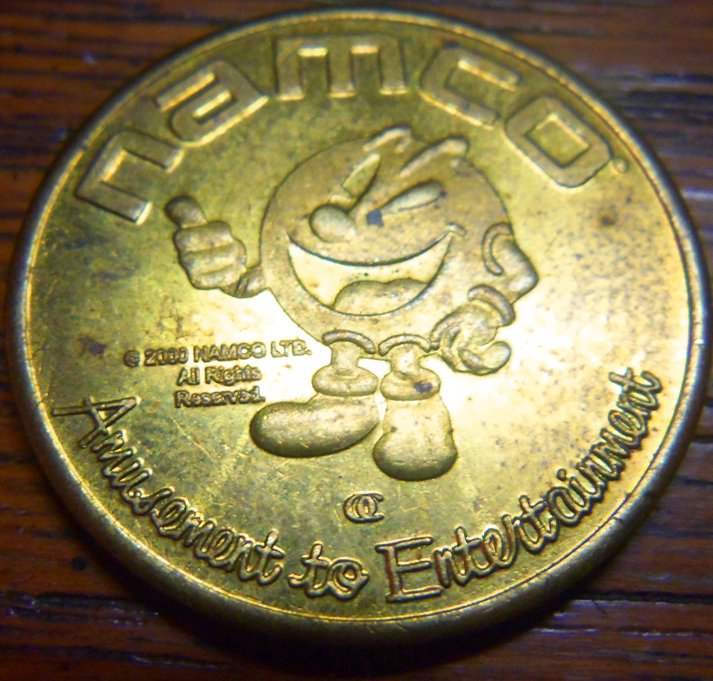
Everything else mentioned by greenluigiman2 is also pretty much spot-on in my point of view as well. I like the proportionality of the Party design more. The shorter limbs contribute to a more compact, "round" appearance overall, while the spindly arms of the GA design detract from that. The placement of the arms is notable as well. GA's Pac-Man has his arms directly in the middle of his body, while the Party design places them below the mouth, which I feel is a bit more natural, if you look at Pac-Man as more of a bodiless head and less like a headless body. I much prefer the gloved mittens to the fingered hands, the latter of which are the same size but are too large overall in proportion to the body thanks to the addition of digits. This isn't a dislike I have in solely the GA design. I dislike the fingered gloves in prior games' artwork as well. The teeth have never done it for me, and I think Pac-Man is just too abstract to have such a human-like set of teeth. It just looks really weird. Imagine if Kirby had teeth (he actually did, in older promotional material). It'd look awkward.
Finally, I prefer the coloring on the Party design. The shade of yellow used is more akin with how I tend to imagine the character, the deep orange gloves look better in contrast to his overall color scheme than the borderline red ones in the GA design, and his shoes are more vibrant and are a burnt orange sort of color, which clashes less with Pac-Man's palette than the straight red shoes in GA, which make him look like a McDonalds mascot.


 )
)