• Welcome to Smashboards, the world's largest Super Smash Brothers community! Over 250,000 Smash Bros. fans from around the world have come to discuss these great games in over 19 million posts!

    You are currently viewing our boards as a visitor. Click here to sign up right now and start on your path in the Smash community!

New Characters for Project M Discussion Thread (Voting Closed)

Status
Not open for further replies.

NisforSmash

Smash Journeyman
Joined
May 28, 2013
Messages
433
Then why did you upvote them in the first place?

It's because of things like this happening that Anti-Guy put in place the strict no-changing upvotes rule, which we are still upholding unless you provide "damn good" reasoning. Your previous post isn't a great example, I just don't see why we should drop your +1 for Isaac and Pichu.
Welp i tried. I guess just leave it on then.

The reason i upvoted them previously was because isaac was popular and looked like he fit in smash and because at the time i didn't see a reason not to add pichu. After reading some my opinion had changed on them.
 
Last edited:

JCOnyx

Smash Ace
Joined
Oct 10, 2013
Messages
610
Location
Granite Falls, WA
NNID
JCOnyx
On another note, I've been trying to create a standardized base for the character pics in the OP, to try and free up some space and make it look less cluttered. This is what I've made as a first attempt:


Needs some minor touch-ups, but it's a good start. What do you guys think?
 

Shin F.

Smash Master
Joined
Oct 10, 2013
Messages
3,314
Location
The internet, obviously.
On another note, I've been trying to create a standardized base for the character pics in the OP, to try and free up some space and make it look less cluttered. This is what I've made as a first attempt:


Needs some minor touch-ups, but it's a good start. What do you guys think?
Looks great. I'd experiment with making the text white to see if that looks better, but other than that I'd say it's just right. We can use these images and then spoiler the details below them to make it easy for people to browse characters in the OP.

And hey, if you need any help making them, I'd be glad to.
 

NisforSmash

Smash Journeyman
Joined
May 28, 2013
Messages
433
Looks great. I'd experiment with making the text white to see if that looks better, but other than that I'd say it's just right. We can use these images and then spoiler the details below them to make it easy for people to browse characters in the OP.

And hey, if you need any help making them, I'd be glad to.
Put a white border around the text and maybe lighten up the color on the gradient to match the color in the center of the M logo. Try that maybe? Otherwise it looks nice.
 
Last edited:

Shin F.

Smash Master
Joined
Oct 10, 2013
Messages
3,314
Location
The internet, obviously.
Put a white border around the text and maybe lighten up the color on the gradient to match the color in the center of the M logo.
Speaking as a pro graphic designer, borders are text are very, very bad. Literally anytime someone in my classes at design school tried that, they'd get chewed out for it. (admittedly, I did that a lot myself, though :p)

And while changing the M color to match is good in theory, the less saturated colors in the gradient help the more bright colors (like the logo and characters) to pop out from it.
 
Last edited:

NisforSmash

Smash Journeyman
Joined
May 28, 2013
Messages
433
Speaking as a pro graphic designer, borders are text are very, very bad. Literally anytime someone in my classes at design school tried that, they'd get chewed out for it. (admittedly, I did that a lot myself, though :p)

And while changing the M color to match is good in theory, the less saturated colors in the gradient help the more bright colors (like the logo and characters) to pop out from it.
Understood. I just meant a really really soft/subtle white around the edges to make the text coincide with that of the M in the logo and to make it stand out a bit off of the gradient. The second part i didn't actually think about but agree with.

For personal knowledge and insight why is a border on text generally bad / why wouldn't it work in this instance? (Might get into a little GD myself and one of the things I'm trying to work on is my typography skills.) I assume the point of interest on the character card in order of importance is the picture of the character, name of character/series, logo of series and PM logo. With how large the PM logo is I feel the text isn't being brought out as much as it could be and the pm logo seems to be slightly more important than maybe it should be when all character cards are shown together.

I'm not trying to challenge your knowledge here so i lay down my salt sword and flame shield. I'm just genuinely interested.
 
Last edited:

Shin F.

Smash Master
Joined
Oct 10, 2013
Messages
3,314
Location
The internet, obviously.
Understood. I just meant a really really soft/subtle white around the edges to make the text coincide with that of the M in the logo and to make it stand out a bit off of the gradient. The second part i didn't actually think about but agree with.

For personal knowledge and insight why is a border on text generally bad / why wouldn't it work in this instance? (Might get into a little GD myself and one of the things I'm trying to work on is my typography skills.) I assume the point of interest on the character card in order of importance is the picture of the character, name of character/series, logo of series and PM logo. With how large the PM logo is I feel the text isn't being brought out as much as it could be and the pm logo seems to be slightly more important than maybe it should be when all character cards are shown together.

I'm not trying to challenge your knowledge here so i lay down my salt sword and flame shield but I'm just genuinely interested.
In general, adding a border to text makes it harder to read. When you're looking closely at the type as you're designing, borders make it seem clearer, but that's only because you're very focused on it. Someone who is reading it casually or with a passing glance will have more eye strain when doing so. It's okay with a single letter like on the Project M logo, but in general it's not a good move.

You do have a point when you say the Project M logo is competing with the characters' name in the hierarchy of importance, and that's something I hadn't noticed. However, I believe that when looking at a group of these images (as they will, in all likelihood, be grouped together) will make the logo (which remains the same throughout each design) seem like more of a background element. That's what I'd hope for, at least.

No need for salt swords or flame shields :p We aren't cannibals here. *Chews on someone's leg* Mostly.
 
Last edited:

NisforSmash

Smash Journeyman
Joined
May 28, 2013
Messages
433
In general, adding a border to text makes it harder to read. When you're looking closely at the type as you're designing, borders make it seem clearer, but that's only because you're very focused on it. Someone who is reading it casually or with a passing glance will have more eye strain when doing so. It's okay with a single letter like on the Project M logo, but in general it's not a good move.

You do have a point when you say the Project M logo is competing with the characters' name in the hierarchy of importance, and that's something I hadn't noticed. However, I believe that when looking at a group of these images (as they will, in all likelihood, be grouped together) will make the logo (which remains the same throughout each design) seem like more of a background element. That's what I'd hope for, at least.

No need for salt swords or flame shields :p We aren't cannibals here. *Chews on someone's leg* Mostly.
Ah ok that makes sense to me.

Your probably right there as well but it probably wouldn't hurt to shrink it a tad.

....You were planning on sharing that leg right?
 

Anti Guy

Couch Tomato
BRoomer
Joined
Sep 27, 2001
Messages
2,072
Location
Wisconsin
NNID
CouchTomato87
On another note, I've been trying to create a standardized base for the character pics in the OP, to try and free up some space and make it look less cluttered. This is what I've made as a first attempt:


Needs some minor touch-ups, but it's a good start. What do you guys think?
Looks good for a start, though it's gonna be a tricky getting series icons for some characters (Sukapon especially)
 
Last edited:

EdgeTheLucas

Smash Lord
Joined
Oct 2, 2013
Messages
1,695
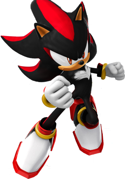
As a joke, though, let's keep Shadow with the lowest quality image to show how much we didn't like him over the course of five months :troll:
 

Sour Supreme

サイマグネット
Joined
Apr 9, 2014
Messages
2,704
Location
The Homebrew Channel

Sour Supreme

サイマグネット
Joined
Apr 9, 2014
Messages
2,704
Location
The Homebrew Channel
We're using the official icons for series that already have them, so Masked Man gets the standard Earthbound symbol.

I'm done with quite a few, but a couple that have been mentioned that I've done:
I figured you would. The Pig one just reminded me of Masked Man. Can't wait to see Ninten's.
 

EdgeTheLucas

Smash Lord
Joined
Oct 2, 2013
Messages
1,695
Am I the only one that likes the Black Shadow idea? :(

EDIT:
Just a little bit bigger.
And to back you up here, no, you are not the only one. But they were talking about Shadow as the hedgehog, not Black Shadow.
This. I love the idea, actually. Black Shadow / Ganondorf is one of my full votes.

Shadow the Hedgehog is in last place on the overall rankings, though, and it was him that I joked about.
 

MoRkY

Smash Rookie
Joined
May 10, 2014
Messages
12
Location
Portland, Oregon
+1 Skull Kid
+1 Ganondorf/Black Shadow
+1 Sukapon
+1 King K Rool
+1 Pokemon Trainer (example: down smash maybe a rattatta come outs and hyperfangs, or his up special could be riding a pidgy)
 

Halfhead

Smash Journeyman
Joined
Jul 16, 2013
Messages
361
+1 Bowser Jr. (Very different Squirtle clone; uses paintbrush)
+1 Porky (pretty different Wario clone)
+1 Vaati (kind of different Zelda clone)
+1 Isaac (idk, the way everyone else wants to do it)
+1 Tom Nook (I'm not sure, same as Isaac)
 
Last edited:

Winchester7314

Smash Journeyman
Joined
Apr 12, 2014
Messages
323
Location
Wesley Chapel, Florida
I'm newer here, and dont feel like reading through 350 pages of speculation, so I apologize if some of these have already been suggested a million times, but heres my thoughts.
'Clones'

Blaziken=Captain Falcon Clone
Changed SFX+Marios Final Smash

Shadow=Sonic Clone
Changed SFX+Sonics Final Smash(super shadow)

Raichu=Pikachu Clone
This one is debatable, as it could be used as just an alternate costume for pikachu. just depends on wetyher people feel having a raichu would just be bloating the roster.

'Costumes'
Charizard, *Blaziken*, Lucario

Mega Evolutions
I've been told megas will not be included as alternate costumes, but feel this should be reconsidered, they fit very well as costumes.

Mario, Luigi
Paper versions

Sonic, *Shadow*
Super Sonic, *Shadow*
Excalibur Sonic, *Shadow*

DeDeDe
Masked DeDeDe

Mewtwo
Melee Mewtwo
for those who rather the old look, or just want to battle nostalgicly. adding the colors would be a good option but might require atleast the grey tailed mewtwo to be removed(i considered gold armor to be removed, but it seems to be a tournament favorite, being use by people such as KDJ, and M2K)
 
Last edited:

NisforSmash

Smash Journeyman
Joined
May 28, 2013
Messages
433
Just read the OP again and i think it's worth mentioning that the descriptions of each character are pretty blatantly biased. Idk if you all had intentions of revamping them but i would recommend you to consider it. I'm sure you are planning on doing so anyway but just to be sure i wanted to say something.
 

EdgeTheLucas

Smash Lord
Joined
Oct 2, 2013
Messages
1,695
+1 Bowser Jr. (Very different Squirtle clone; uses paintbrush)
+1 Porky (pretty different Wario clone)
+1 Vaati (kind of different Zelda clone)
+1 Isaac (idk, the way everyone else wants to do it)
+1 Tom Nook (I'm not sure, same as Isaac)
Vaati isn't eligible. You'll have to pick someone else since Vaati isn't in Brawl in any way, shape, or form.
 

Solbliminal

Smash Champion
Joined
Oct 11, 2013
Messages
2,275
NNID
Solbliminal
that lucas costume is awesome
Why thank you. I used my master art skills in MS Paint to create this splendid outfit.

+1/2 Edge the Lucas
I thought your vote was hilarious until I realized I had to count it.

You haven't seen an Edgy Lucas until you've seen Lucas the Giygas.
I don't think you realize just how edgy Edge the Lucas is. He not only has Edge in his name, but his species is a Lucas. His Sonic character power is being the Edgiest of all Lucas' ever. That is why he looks a lot like Shadow.
 
Last edited:

ElGoombaswag

Hououin Kyoma
Joined
Jan 14, 2014
Messages
541
Location
none of your business...
NNID
cdoggfuentes
Why thank you. I used my master art skills in MS Paint to create this splendid outfit.


I thought your vote was hilarious until I realized I had to count it.


I don't think you realize just how edgy Edge the Lucas is. He not only has Edge in his name, but his species is a Lucas. His Sonic character power is being the Edgiest of all Lucas' ever. That is why he looks a lot like Shadow.
If only PMBR would accept the shadow idea.
 
Status
Not open for further replies.
Top Bottom