-
Welcome to Smashboards, the world's largest Super Smash Brothers community! Over 250,000 Smash Bros. fans from around the world have come to discuss these great games in over 19 million posts!
You are currently viewing our boards as a visitor. Click here to sign up right now and start on your path in the Smash community!
It appears that you are using ad block :'(
Hey, we get it. However this website is run by and for the community... and it needs ads in order to keep running.
Please disable your adblock on Smashboards, or go premium to hide all advertisements and this notice.
Alternatively, this ad may have just failed to load. Woops!
Please disable your adblock on Smashboards, or go premium to hide all advertisements and this notice.
Alternatively, this ad may have just failed to load. Woops!
Social Mother of the Cosmos: Rosalina [General/Social] Thread (Closed)
- Thread starter Claire Diviner
- Start date
- Status
- Not open for further replies.
KyroChao
Smash Journeyman
Quick, Elsa is here, light the fireplace
Tino
Smash Hero
- Joined
- Jul 31, 2014
- Messages
- 7,211
- Location
- Spartanburg, South Carolina
- NNID
- FaustinoRojo10
- 3DS FC
- 5284-1678-8857
- Switch FC
- SW-6232-2426-8037
Again with his Elsa ****? This is really getting old.
mario123007
HELLO, YOU HAVE ENTERED THE DUNK ZONE
- Joined
- Aug 1, 2014
- Messages
- 9,654
- Location
- Kaohsiung,Taiwan
- NNID
- mario123007
- 3DS FC
- 1521-3033-2948
- Switch FC
- SW-5739-4272-0700
Well... I mean "if"...I don't think anyone is going to take offense to that.
Yes she is...Yes, I was obviously joking, nobody needed to be the nice guy for that. I am the nice person usually.
And Elsa is god like tier.
Whoa, how did you post that Elsa icon?Elsa is love , Elsa is life...
Mario & Sonic Guy
Old rivalries live on!
Yeah I too find it very dumb to even be comparing Elsa to Rosalina, as they're nothing alike.Again with his Elsa ****? This is really getting old.
Swiftie_Muggle
Smash Lord
It's a joke. You know what they say ... ''if you can't stand the heat , get out of the kitchen''
Anyway , i tried porting Rosalina's model from MK7 to MKDS , and this is the result so far ...
I need to make it work , I'm figuring out , 1 step at a time...

Anyway , i tried porting Rosalina's model from MK7 to MKDS , and this is the result so far ...
I need to make it work , I'm figuring out , 1 step at a time...

Last edited:
mario123007
HELLO, YOU HAVE ENTERED THE DUNK ZONE
- Joined
- Aug 1, 2014
- Messages
- 9,654
- Location
- Kaohsiung,Taiwan
- NNID
- mario123007
- 3DS FC
- 1521-3033-2948
- Switch FC
- SW-5739-4272-0700
Just how did you get that Elsa icon? Is it in the Smashboards icon section?It's a joke. You know what they say ... ''if you can't stand the heat , get out of the kitchen''
Anyway , i tried porting Rosalina's model from MK7 to MKDS , and this is the result so far ...
I need to make it work , I'm figuring out , 1 step at a time...

Mario & Sonic Guy
Old rivalries live on!
It's not one of the SmashBoards icons. That icon actually came from DeviantArt.Just how did you get that Elsa icon? Is it in the Smashboards icon section?
mario123007
HELLO, YOU HAVE ENTERED THE DUNK ZONE
- Joined
- Aug 1, 2014
- Messages
- 9,654
- Location
- Kaohsiung,Taiwan
- NNID
- mario123007
- 3DS FC
- 1521-3033-2948
- Switch FC
- SW-5739-4272-0700
I think it's okay, afterall it is just a joke, but if course if you feel disturbing then as a moderator you can ask to stop if things gets a bit out of hand.Yeah I too find it very dumb to even be comparing Elsa to Rosalina, as they're nothing alike.
Oh, well... yeah, I got that...It's not one of the SmashBoards icons. That icon actually came from DeviantArt.
Tino
Smash Hero
- Joined
- Jul 31, 2014
- Messages
- 7,211
- Location
- Spartanburg, South Carolina
- NNID
- FaustinoRojo10
- 3DS FC
- 5284-1678-8857
- Switch FC
- SW-6232-2426-8037
Of course there's nothing alike between those two just by looking at them.Yeah I too find it very dumb to even be comparing Elsa to Rosalina, as they're nothing alike.
Swiftie_Muggle
Smash Lord
Purple Nails are so fetch.
Mario & Sonic Guy
Old rivalries live on!
You know, I feel like the pose below should've been Rosalina's 3rd place pose.


ChikoLad
Purple Boi
- Joined
- Jan 11, 2014
- Messages
- 23,084
That face kills me.You know, I feel like the pose below should've been Rosalina's 3rd place pose.

Honestly if it weren't for the schizophrenic voice clips, and the "IM SO SCARED OF BOWSER OMG" bull, I'd love Rosalina's portrayal in MK8 completely. Her animations are just the right balance of her signature elegance and beauty, and then that adorable factor Mario Party is known for, which is applied in a unique way to Rosalina (and then there is admittedly a bit of sexy in there too :>).
Mario & Sonic Guy
Old rivalries live on!
Even in the demo, it seemed very weird to see Rosalina have a shocked expression.
mario123007
HELLO, YOU HAVE ENTERED THE DUNK ZONE
- Joined
- Aug 1, 2014
- Messages
- 9,654
- Location
- Kaohsiung,Taiwan
- NNID
- mario123007
- 3DS FC
- 1521-3033-2948
- Switch FC
- SW-5739-4272-0700
Although she looks unhappy, but still cuteYou know, I feel like the pose below should've been Rosalina's 3rd place pose.

Mario & Sonic Guy
Old rivalries live on!
You could say that Rosalina is sad for not doing well in the minigame. This is especially true for the pose below.Although she looks unhappy, but still cute

mario123007
HELLO, YOU HAVE ENTERED THE DUNK ZONE
- Joined
- Aug 1, 2014
- Messages
- 9,654
- Location
- Kaohsiung,Taiwan
- NNID
- mario123007
- 3DS FC
- 1521-3033-2948
- Switch FC
- SW-5739-4272-0700
AdorableYou could say that Rosalina is sad for not doing well in the minigame. This is especially true for the pose below.

Tino
Smash Hero
- Joined
- Jul 31, 2014
- Messages
- 7,211
- Location
- Spartanburg, South Carolina
- NNID
- FaustinoRojo10
- 3DS FC
- 5284-1678-8857
- Switch FC
- SW-6232-2426-8037
She's got that "What did I do wrong here" look.You could say that Rosalina is sad for not doing well in the minigame. This is especially true for the pose below.

ChikoLad
Purple Boi
- Joined
- Jan 11, 2014
- Messages
- 23,084
HanAmes
Smash Ace
You know, I feel like the pose below should've been Rosalina's 3rd place pose.

It's nice to see Rosie being portrayed with different expressions; it really adds flavor to her personality.You could say that Rosalina is sad for not doing well in the minigame. This is especially true for the pose below.

I'll be getting Mario Party 10 this weekend, and can't wait to play it!
mario123007
HELLO, YOU HAVE ENTERED THE DUNK ZONE
- Joined
- Aug 1, 2014
- Messages
- 9,654
- Location
- Kaohsiung,Taiwan
- NNID
- mario123007
- 3DS FC
- 1521-3033-2948
- Switch FC
- SW-5739-4272-0700
She just looks awesome.It's nice to see Rosie being portrayed with different expressions; it really adds flavor to her personality.
I'll be getting Mario Party 10 this weekend, and can't wait to play it!
I... still don't have a Wii U....
Swiftie_Muggle
Smash Lord
This is going to be my new screen !


CatRaccoonBL
You can do it!
I think you guys scared @berserker01 off. :/
Anyway, forgot to talk about this. But remember when I said I was getting a nice frame for my Rosalina poster? Turns out, those costed a ridiculous amount being $721.43 dollars in total for all three posters. With that said, individually, they are about $240, so I decided to get a job during the summer and at least get one of them soon. The one being Rosalina, then next would be Villager, then finally Palutena.
There were these others sets if posters that together were about $120, and while I still couldn't have paid for that either way, I wanted to stick to getting the nicer looking frames, so I held off on those.
Well...my mom ended up buying those cheaper frames anyway. I am grateful that I have something to display my posters in...but my mom isn't exactly in the best financial spot, and I was content on getting enough money for the amazing frames, no matter how long. I don't know...
Anyway, I'll show you all how it looks once they are hanged up. : )
Xaltis
Smash Hero
*Steals Rosalina expression*
Bring me more of these! >:3
Bring me more of these! >:3
Shirma Akayaku
Smash Lord
- Joined
- Jun 20, 2014
- Messages
- 1,090
- Location
- A stray asteroid
- NNID
- Toadette75
- Switch FC
- SW-3818-9526-0298
Can there be a game where I don't see Rosalina's legs pass through her dress? (Besides Galaxy). They need to animate dresses better. -_-

This happens in 3D World, Mario Kart, Super Smash Bros., and now Mario Party. -_-

This happens in 3D World, Mario Kart, Super Smash Bros., and now Mario Party. -_-
Last edited:
Tino
Smash Hero
- Joined
- Jul 31, 2014
- Messages
- 7,211
- Location
- Spartanburg, South Carolina
- NNID
- FaustinoRojo10
- 3DS FC
- 5284-1678-8857
- Switch FC
- SW-6232-2426-8037
Meh, as much as I like Rosalina's animation poses and all that, I'm not really feeling the game itself. Just like the last three games in the series, Mario Party 10 is a complete disaster for me.
Only good thing about it, of course, is playing as Rosalina...even though I'm still not digging her portrayal and her irritating voice...
Only good thing about it, of course, is playing as Rosalina...even though I'm still not digging her portrayal and her irritating voice...
Xaltis
Smash Hero
lol Nintendo pls...
and Mario Party 10 is good so far. Of course nothing will compare to 1 and 3. But it's not doing bad right now.
and Mario Party 10 is good so far. Of course nothing will compare to 1 and 3. But it's not doing bad right now.
Last edited:
CatRaccoonBL
You can do it!
Well, how noticeable is it actually though? Like can you tell without pausing the screen?Can there be a game where I don't see Rosalina's legs pass through her dress? (Besides Galaxy). They need to animate dresses better. -_-

This happens in 3D World, Mario Kart, Super Smash Bros., and now Mario Party. -_-
On the topic of Mario parties, 6 is my favorite.
mario123007
HELLO, YOU HAVE ENTERED THE DUNK ZONE
- Joined
- Aug 1, 2014
- Messages
- 9,654
- Location
- Kaohsiung,Taiwan
- NNID
- mario123007
- 3DS FC
- 1521-3033-2948
- Switch FC
- SW-5739-4272-0700
Looking forward to see it!I think you guys scared @berserker01 off. :/
Anyway, forgot to talk about this. But remember when I said I was getting a nice frame for my Rosalina poster? Turns out, those costed a ridiculous amount being $721.43 dollars in total for all three posters. With that said, individually, they are about $240, so I decided to get a job during the summer and at least get one of them soon. The one being Rosalina, then next would be Villager, then finally Palutena.
There were these others sets if posters that together were about $120, and while I still couldn't have paid for that either way, I wanted to stick to getting the nicer looking frames, so I held off on those.
Well...my mom ended up buying those cheaper frames anyway. I am grateful that I have something to display my posters in...but my mom isn't exactly in the best financial spot, and I was content on getting enough money for the amazing frames, no matter how long. I don't know...
Anyway, I'll show you all how it looks once they are hanged up. : )
And your Rosalina avatar looks awesome!
A common glitch in Mario games for Rosalina...Can there be a game where I don't see Rosalina's legs pass through her dress? (Besides Galaxy). They need to animate dresses better. -_-

This happens in 3D World, Mario Kart, Super Smash Bros., and now Mario Party. -_-
ChikoLad
Purple Boi
- Joined
- Jan 11, 2014
- Messages
- 23,084
Just started toying around with my Rosalina sketch, but something keeps throwing me off:
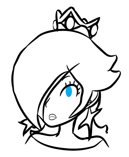
Are those lips OK? I feel like they're fine, but I also feel like something is weird about them.
Mind you, I am not trying replicate the official 2D Mario art style, merely take small pointers from it. I'm going for something that doesn't look quite as cutesy.


Are those lips OK? I feel like they're fine, but I also feel like something is weird about them.
Mind you, I am not trying replicate the official 2D Mario art style, merely take small pointers from it. I'm going for something that doesn't look quite as cutesy.

Swiftie_Muggle
Smash Lord
It's funny that some find her Mario Party 10 voice bad ... considering she doesn't really go horribly high and holds it back much like in 3D World , even her sounds when hitting and Jumping and from 3D World . I quite like it and it's easier to get used to unlike ... the horror ... ugh...
Also the lips can be better. The line you used is too thin , it has too match the rest of the artwork like the one you are looking into as a guide. Also the semi-circles that compose her lips shouldn't be touching each other and the position of the mouth as a whole should be closer to the nose and right under it so it doesn't look awkward.
Also the lips can be better. The line you used is too thin , it has too match the rest of the artwork like the one you are looking into as a guide. Also the semi-circles that compose her lips shouldn't be touching each other and the position of the mouth as a whole should be closer to the nose and right under it so it doesn't look awkward.
Shirma Akayaku
Smash Lord
- Joined
- Jun 20, 2014
- Messages
- 1,090
- Location
- A stray asteroid
- NNID
- Toadette75
- Switch FC
- SW-3818-9526-0298
It lasts for about half a second, enough to notice it. However, this is pretty minor compared to other games. The most jarring one is Super Smash Bros. on the 3DS. Due to the limitations of the 3DS, her legs pass through her dress constantly (the same goes for Peach, Zelda, and Palutena?).Well, how noticeable is it actually though? Like can you tell without pausing the screen?.
mario123007
HELLO, YOU HAVE ENTERED THE DUNK ZONE
- Joined
- Aug 1, 2014
- Messages
- 9,654
- Location
- Kaohsiung,Taiwan
- NNID
- mario123007
- 3DS FC
- 1521-3033-2948
- Switch FC
- SW-5739-4272-0700
I think the lips should be slightly bigger and close to her nose...Just started toying around with my Rosalina sketch, but something keeps throwing me off:

Are those lips OK? I feel like they're fine, but I also feel like something is weird about them.
Mind you, I am not trying replicate the official 2D Mario art style, merely take small pointers from it. I'm going for something that doesn't look quite as cutesy.

Shirma Akayaku
Smash Lord
- Joined
- Jun 20, 2014
- Messages
- 1,090
- Location
- A stray asteroid
- NNID
- Toadette75
- Switch FC
- SW-3818-9526-0298
Technically, the lines of the lips aren't too thin (well it is compared to the rest of the other lines), but it's probably the whole mouth that's too small. If it were made a tad bigger, and the semi-circles don't touch, it'd be fine. You're also right about the nose being closer to the mouth thing.Also the lips can be better. The line you used is too thin , it has too match the rest of the artwork like the one you are looking into as a guide. Also the semi-circles that compose her lips shouldn't be touching each other and the position of the mouth as a whole should be closer to the nose and right under it so it doesn't look awkward.
ChikoLad
Purple Boi
- Joined
- Jan 11, 2014
- Messages
- 23,084
Didn't get to properly continue (today has been a busy day), but I touched up the face.
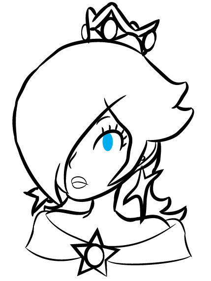
The lips look much better to me now, thanks for the help!
While there's definitely still blemishes here (the "ear-stars" and the hair in particular), I'll touch them up later since, they are finicky stuff. Her head and hair area are the most difficult parts, so I will come back to them and finish of the rest of her, which is comparatively simple.
Swiftie_Muggle
Smash Lord
I actually find Rosalina's hair and head really easy to draw considering that , while her facial features have to be really elegant and precise , there's not much to considering her lips aren't That big and that only one her eyes is visible.
Also you can have fun with the hair considering that Rosalina can have either pointy (spiky) ends (like Her artworks) or curvy ends in her hair (llike her in-game and 3d models) ; Personally i like the curvy ends because they are more like Luma's arms .
Also you can have fun with the hair considering that Rosalina can have either pointy (spiky) ends (like Her artworks) or curvy ends in her hair (llike her in-game and 3d models) ; Personally i like the curvy ends because they are more like Luma's arms .
ChikoLad
Purple Boi
- Joined
- Jan 11, 2014
- Messages
- 23,084
It's THE most difficult part though, since the rest of her is literally just breasts, arms, hands, and a big curve. In most cases, you won't even need to draw the legs and feet either.
I am taking some small liberties though, just to personalise her - you can see an example of that in how I have made her bang split in two at the very end. I think it looks cool on her.
I am taking some small liberties though, just to personalise her - you can see an example of that in how I have made her bang split in two at the very end. I think it looks cool on her.
mario123007
HELLO, YOU HAVE ENTERED THE DUNK ZONE
- Joined
- Aug 1, 2014
- Messages
- 9,654
- Location
- Kaohsiung,Taiwan
- NNID
- mario123007
- 3DS FC
- 1521-3033-2948
- Switch FC
- SW-5739-4272-0700
Looks better...Didn't get to properly continue (today has been a busy day), but I touched up the face.

The lips look much better to me now, thanks for the help!
While there's definitely still blemishes here (the "ear-stars" and the hair in particular), I'll touch them up later since, they are finicky stuff. Her head and hair area are the most difficult parts, so I will come back to them and finish of the rest of her, which is comparatively simple.
Um..now the oart I still think doesn't look right is her chin..., can't you make the point part right below her lips?
ChikoLad
Purple Boi
- Joined
- Jan 11, 2014
- Messages
- 23,084
Her chin looks more or less how it is supposed to. If I made her chin look any sharper, she wouldn't look like Rosalina, she'd look like Waluigi or something. :VLooks better...
Um..now the oart I still think doesn't look right is her chin..., can't you make the point part right below her lips?
- Status
- Not open for further replies.


