• Welcome to Smashboards, the world's largest Super Smash Brothers community! Over 250,000 Smash Bros. fans from around the world have come to discuss these great games in over 19 million posts!

    You are currently viewing our boards as a visitor. Click here to sign up right now and start on your path in the Smash community!

A fresh and sleek new HUD

trash?

witty/pretty
Premium
Joined
Jul 27, 2012
Messages
3,452
Location
vancouver bc
NNID
????
I'm the guy that made the kind-of-bad looking mock-up on the OP (this one). The idea for a parallelogram sounds nice, so I might mess around with it as a design. The main problem with it would be that the coolest ideas I have on hand could completely mess up in the instance where people start on stocks more than four, though, because I'd like to have a lil' bar behind the stocks, to make it look kind of like a health meter.

e: okay, here's the idea I was talking about:


Again, I'm pretty sure this would absolutely mess up on any stocks more than 4, but theoretically, it could work if you used the line under names for the "background" of the stocks.
 

fatman667

Smash Journeyman
Joined
May 30, 2011
Messages
364
Location
4S Ranch, San Diego, CA
I'm the guy that made the kind-of-bad looking mock-up on the OP (this one). The idea for a parallelogram sounds nice, so I might mess around with it as a design. The main problem with it would be that the coolest ideas I have on hand could completely mess up in the instance where people start on stocks more than four, though, because I'd like to have a lil' bar behind the stocks, to make it look kind of like a health meter.

e: okay, here's the idea I was talking about:


Again, I'm pretty sure this would absolutely mess up on any stocks more than 4, but theoretically, it could work if you used the line under names for the "background" of the stocks.
As far as I know, parallelograms would look really nice in the way you have them, but I don't think I have time to make it that way since I would have to modify the stock icon's location to make the parallelograms to be next to each other like that. The behind bars on the other hand may not be possible, but I could be wrong. I'll go test your theory tomorrow.

:phone:
 

Shun_one

Smash Ace
Joined
Jan 2, 2013
Messages
910
Location
Addison, IL
NNID
not_shun_one
Man. I'd love a HUD like the one in the OP.

But I cant use it with the full roster . ;_;
? ...But the full roster already has custom BP's for this HUD.

As for all the feed-back and ideas, keep 'em comin' guys.

@fatman & scarr - nice work guys!

I'm sure you guys have already noticed that the problem starts when we get to stocks larger than 5, because 5 kills most any neat design we could have.

As for a NES font with the pixels, I think someone through that together somewhere, I'd have to check. I personally wouldn't use it because I think it looks messy, but that's just me.

It's fun to experiment with all these stock shape ideas! "Smash logo's, M's, hearts, what else you got? Even if they end up being bad, it's good to see them.
 

GHNeko

Sega Stockholm Syndrome.
Joined
Aug 13, 2007
Messages
20,009
Location
テキサス、アメリカ
NNID
GHNeko
I'm talking about all the characters. Including the ones not present. So I can use it with the dev build.

Or maybe I'm tripping.
 

fatman667

Smash Journeyman
Joined
May 30, 2011
Messages
364
Location
4S Ranch, San Diego, CA
? ...But the full roster already has custom BP's for this HUD.

As for all the feed-back and ideas, keep 'em comin' guys.

@fatman & scarr - nice work guys!

I'm sure you guys have already noticed that the problem starts when we get to stocks larger than 5, because 5 kills most any neat design we could have.

As for a NES font with the pixels, I think someone through that together somewhere, I'd have to check. I personally wouldn't use it because I think it looks messy, but that's just me.

It's fun to experiment with all these stock shape ideas! "Smash logo's, M's, hearts, what else you got? Even if they end up being bad, it's good to see them.
Yea we all knew the 1-4 stock only problem from the start. Maybe I'll get around hearts, the M is a last experiment since it's a really complicated shape.

Priorities are hexagons, then pentagons, then investigating the possibility of the parallelogram, then the other shapes.

:phone:
 

Shun_one

Smash Ace
Joined
Jan 2, 2013
Messages
910
Location
Addison, IL
NNID
not_shun_one
Alright man. Go off and work on what you can, I'll handle things on my end.

@GHNeko - I made BP's for everyone in vBrawl. I don't know if there's any BR only textures for unreleased folks, but other than that, it should work fine.
 

uCooL

Smash Ace
Joined
Jan 2, 2013
Messages
747
Location
Manteca, California
NNID
SuperMurio

Shun_one

Smash Ace
Joined
Jan 2, 2013
Messages
910
Location
Addison, IL
NNID
not_shun_one
neato.

oh. do you have a tutorial for making those particular BPs?

There some stuff I want to try lol.
They aren't too hard to make.


That's the background template.

Basically, just re-size your image to fit within the borders, then erase everything outside of it and you're done.
 

GHNeko

Sega Stockholm Syndrome.
Joined
Aug 13, 2007
Messages
20,009
Location
テキサス、アメリカ
NNID
GHNeko
They aren't too hard to make.


That's the background template.

Basically, just re-size your image to fit within the borders, then erase everything outside of it and you're done.

ilu.

I'd make this within BBox right?

export the potraits and paste them over the template, and then cut it right? then replace the appropriate files and save the info.pac?
 

trash?

witty/pretty
Premium
Joined
Jul 27, 2012
Messages
3,452
Location
vancouver bc
NNID
????
There's actually quite a few good reasons people might not use the melee-ish HUD. For me, it's mostly because in the position where you'd have a fox/falco match, you don't immediately know which HUD position is for who. In actual melee, this was rectified from having the stock icons show the characters, but that isn't possible here, as far as I can tell.
 

GHNeko

Sega Stockholm Syndrome.
Joined
Aug 13, 2007
Messages
20,009
Location
テキサス、アメリカ
NNID
GHNeko
The franchise icons are colored based off their port though. So you can simply just look at which icon is your color as the match counts down.
 

Shun_one

Smash Ace
Joined
Jan 2, 2013
Messages
910
Location
Addison, IL
NNID
not_shun_one
ilu.

I'd make this within BBox right?

export the potraits and paste them over the template, and then cut it right? then replace the appropriate files and save the info.pac?
You'd need an image editor (MSPaint, gimp, Photoshop, etc.) to make the actual image edits, but all you have to do is replace the texture of the Battle portrait (InfFace### in info/portrite) that you want to change.

It's why this HUD is a bit of problem, since you have to remake every BP in the game to work with it.
--
As for Melee HUD, I call it BETA because of the whole "Who-is-who" thing. Yeah, you can tell by color, but it's bit of a sloppy solution, IMO. At least when compared to previous games.
 

Jdaster64

Smash Ace
Joined
Feb 29, 2012
Messages
668
Location
New Donk City
NNID
Jdaster64
3DS FC
4141-3026-8303
Switch FC
SW 7540 0069 7907
Not sure if this is worth the effort, but I've been working on figuring out how IA4 images work. At any rate, I think this is an improvement as far as anti-aliasing goes:

Compare that to the pic in the first post, especially at the corners of the "0". I wasn't paying much attention to the size of the original, either; this was a five-minute test.
 

Mr.Jackpot

Smash Lord
Joined
Mar 30, 2011
Messages
1,727
Location
WA
Not sure if this is worth the effort, but I've been working on figuring out how IA4 images work. At any rate, I think this is an improvement as far as anti-aliasing goes:

Compare that to the pic in the first post, especially at the corners of the "0". I wasn't paying much attention to the size of the original, either; this was a five-minute test.
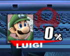
Does this mean we can get rounder circles too? They look at bit flat on the top and bottom right now.
 

Jdaster64

Smash Ace
Joined
Feb 29, 2012
Messages
668
Location
New Donk City
NNID
Jdaster64
3DS FC
4141-3026-8303
Switch FC
SW 7540 0069 7907
Woo! Just made making clean borders on IA4 images a billion times easier! It turns out that IA4 just swaps the brightness and alpha values, so I wrote a little Java program to swap those values in a grayscale (or nearly-so) bitmap with alpha. Ergo, I can take a PNG file like this:


and turn it into the proper IA4 file to make it look like this in-game! Hooray for one semester of Java!
 

Jdaster64

Smash Ace
Joined
Feb 29, 2012
Messages
668
Location
New Donk City
NNID
Jdaster64
3DS FC
4141-3026-8303
Switch FC
SW 7540 0069 7907
Here's something I whipped up with that new method; ignore the rest of the HUD and palette. Excluding the % sign, this is probably the closest to Melee's font I can get it (give or take a bit of anti-aliasing):


I based 1-9 on this sheet on Spriters' Resource, and found a font that had a similar 0 to Melee's.
 

Comeback Kid

Smash Champion
Joined
Dec 25, 2009
Messages
2,431
Location
Parts Unknown
Here's something I whipped up with that new method; ignore the rest of the HUD and palette. Excluding the % sign, this is probably the closest to Melee's font I can get it (give or take a bit of anti-aliasing):


I based 1-9 on this sheet on Spriters' Resource, and found a font that had a similar 0 to Melee's.
If you and Shun could cooperate on this, I see an awesome update to the beta Melee Replica Hud in our near future. :bee:
 

Jdaster64

Smash Ace
Joined
Feb 29, 2012
Messages
668
Location
New Donk City
NNID
Jdaster64
3DS FC
4141-3026-8303
Switch FC
SW 7540 0069 7907
I'd be glad to post the info.pac with those numbers in it if anyone wants them; the vBrawl % probably looks all right with those. I'll probably make a SSB64 font as well at some point, as I know the font for that is Bauhaus-Thin, which I already have.

EDIT:
[collapse="Melee HUD Font Download"]

Brawl Vault Link - Direct Link (Dropbox)[/collapse]All over the vBrawl info.pac.
 

\Apples

Smash Journeyman
Joined
Jan 3, 2013
Messages
488
Location
Kirkland, Washington
So, here's a mock-up I spent loads of time on and depending on what Shun, Hamsauce and I can cook up, it might end up looking a little different from what's here at the moment. But I'd like to get some community feedback before we go ahead and start actually developing this one.


You'll notice that we've removed names. At first, this may seem a little off-putting, but we felt that names were the only extraneous information on the traditional HUD, so we cut it. As for what's being done with them? BP's are 56x48, i.e. not a square. There's a possibility we'll use the name image to complete the rest of the BP without losing quality through scaling. I'm designing this primarily with a focus on the pixel portraits that Abyss Wolf made years ago, which Shun and I have modularized and re-colored to more accurately match vBrawl and Project M's default textures, as well as custom textures. (That project isn't complete at the moment, but it's near finished.)

The only issue with using two images for the BP's is that it'll be much more tedious to set them up for your custom portraits, and if anything at all, that'll be the only factor that would make this HUD's final appearance turn out something more along one of these lines, to fill in the grid space neatly:


@jdaster - That HUD is so super simple, I like simple. It's really easy to understand the information presented there.

EDIT: Here's another solution that just came to mind a moment ago, pretty experimental, not sure how I feel about it.
 

uCooL

Smash Ace
Joined
Jan 2, 2013
Messages
747
Location
Manteca, California
NNID
SuperMurio
So, here's a mock-up I spent loads of time on and depending on what Shun, Hamsauce and I can cook up, it might end up looking a little different from what's here at the moment. But I'd like to get some community feedback before we go ahead and start actually developing this one.


You'll notice that we've removed names. At first, this may seem a little off-putting, but we felt that names were the only extraneous information on the traditional HUD, so we cut it. As for what's being done with them? BP's are 56x48, i.e. not a square. There's a possibility we'll use the name image to complete the rest of the BP without losing quality through scaling. I'm designing this primarily with a focus on the pixel portraits that Abyss Wolf made years ago, which Shun and I have modularized and re-colored to more accurately match vBrawl and Project M's default textures, as well as custom textures. (That project isn't complete at the moment, but it's near finished.)

The only issue with using two images for the BP's is that it'll be much more tedious to set them up for your custom portraits, and if anything at all, that'll be the only factor that would make this HUD's final appearance turn out something more along one of these lines, to fill in the grid space neatly:


@jdaster - That HUD is so super simple, I like simple. It's really easy to understand the information presented there.

EDIT: Here's another solution that just came to mind a moment ago, pretty experimental, not sure how I feel about it.
this is beautiful
 

Jdaster64

Smash Ace
Joined
Feb 29, 2012
Messages
668
Location
New Donk City
NNID
Jdaster64
3DS FC
4141-3026-8303
Switch FC
SW 7540 0069 7907
Not sure I like the numbers there; not sure how that'd be doable in-game, and it seems like it'd be pretty hard to read as well. I'm not against monospace, hard-edge fonts if that is doable, but that particular one seems really distracting. The rest of that HUD mockup looks amazing.

Also, I just figured out I can put shading on the numbers in the HUD as well, but I'm probably not going to do it for the Melee HUD, as for one, it'd take a long time to redo, and for another, it's not true to original Melee's anyway. Something to consider in the future, though.
 

Comeback Kid

Smash Champion
Joined
Dec 25, 2009
Messages
2,431
Location
Parts Unknown
I dig this, best use of pixel portraits I have seen.

I think that making the series icon as transparent as possible would be a good thing, since it just distracts from the beautiful NES damage font.

Maybe making smaller the / in the 0 a little bit, especially the bigger part that takes up more space at the edges, would make it more readable for people, though I like it.
 

GamerGuy09

Smash Master
Joined
Apr 4, 2012
Messages
3,090
Location
Iowa
Switch FC
SW-3742-4712-6319
EDIT: Here's another solution that just came to mind a moment ago, pretty experimental, not sure how I feel about it.
I like this design the most. Just work more on the numbers, give them more shading and it would be perfect!
 

Shun_one

Smash Ace
Joined
Jan 2, 2013
Messages
910
Location
Addison, IL
NNID
not_shun_one
JD, excellent work with the numbers. Using those will help make everything look much crisper.

Apples, the vertical stocks look nice. Only problem is a solution for when more than 6 stocks appear.
 

\Apples

Smash Journeyman
Joined
Jan 3, 2013
Messages
488
Location
Kirkland, Washington
Here's a little update.


Also, the reason I'm keeping the franchise icon translucent rather than transparent is because when a player has no more stocks, there is also no damage counter displayed, so the right side would look pretty barren. Compare:

It's not terrible, the mini-grid breaks it up a little bit, but I will probably be releasing it when it's done with the franchise icons visible. Each user that feels that they'd prefer that space empty can simply replace each franchise icon with a pure black image of the same size, that should only take about 40 seconds tops.

Then, I'm not sure if the latter is possible, but it's what I'd prefer. What does everyone else think?

EDIT: Kind of prefer the former now, actually.
 

trash?

witty/pretty
Premium
Joined
Jul 27, 2012
Messages
3,452
Location
vancouver bc
NNID
????
Daaaaamn that looks nice. Though it has a similar problem to the first mock-up I had with the height of the font vs. the width. What if it filled depending on the digits involved? It would look nice for the single- to double-digits, while still not wasting much space.
 

Comeback Kid

Smash Champion
Joined
Dec 25, 2009
Messages
2,431
Location
Parts Unknown
Here's a little update.


Also, the reason I'm keeping the franchise icon translucent rather than transparent is because when a player has no more stocks, there is also no damage counter displayed, so the right side would look pretty barren. Compare:
I gotta be honest: The damage percent being so vertical makes the pixel artstyle lose much of it's charm. :(

I much prefered the horizontal stocks with the smaller damage percent.

Also, I'm not sure about the comparison without the series icon. When I said more transparent I didn't mean invisible, which is what it looks like in that second pic.
 

#HBC | Joker

Space Marine
Joined
Feb 2, 2012
Messages
3,864
Location
St. Clair Shores, Michigan
NNID
HBCJoker
3DS FC
1864-9780-3232
The only complaint I have about that is that the %numbers look like they're being stretched to take up all the space in that box. Cut 'em down a bit so they look more natural, or maybe just cut the whole hud down to take up less space vertically. I actually really like how Shun's hud takes up less screenspace, and I think yours would look extremely sleek if it was chopped down just a tad.

I think the premise of the design, overall, is fantastic. It just needs some tweeks to look less awkward.
 

fatman667

Smash Journeyman
Joined
May 30, 2011
Messages
364
Location
4S Ranch, San Diego, CA
Here's something I whipped up with that new method; ignore the rest of the HUD and palette. Excluding the % sign, this is probably the closest to Melee's font I can get it (give or take a bit of anti-aliasing):


I based 1-9 on this sheet on Spriters' Resource, and found a font that had a similar 0 to Melee's.
Hohoho Merry very late Christmas, here are the fonts ripped with transparency. I know you don't really need it, but it makes it even more accurate.

EDIT: Come to think of it you only needed the percent huh?
EDIT 2: Actually compared some of the fonts, yea some could change a bit.
 

Jdaster64

Smash Ace
Joined
Feb 29, 2012
Messages
668
Location
New Donk City
NNID
Jdaster64
3DS FC
4141-3026-8303
Switch FC
SW 7540 0069 7907
Very nice. As for the inconsistencies, I was mainly trying to counter the skewed angle of Brawl, and that introduced a few stray anti-aliasing mishaps. And as you can see, I didn't get the angle just right either. I'll see if I can't get a better version up based on those rips above, as well as a SSB64-inspired font, later this week.
 

fatman667

Smash Journeyman
Joined
May 30, 2011
Messages
364
Location
4S Ranch, San Diego, CA
Very nice. As for the inconsistencies, I was mainly trying to counter the skewed angle of Brawl, and that introduced a few stray anti-aliasing mishaps. And as you can see, I didn't get the angle just right either. I'll see if I can't get a better version up based on those rips above, as well as a SSB64-inspired font, later this week.
I'll try ripping the N64 version's textures tomorrow. And yea I know what you mean, I'll try working with Brawlbox and learning more this weekend. So I can make hacks and stages.

:phone:
 
Top Bottom