• Welcome to Smashboards, the world's largest Super Smash Brothers community! Over 250,000 Smash Bros. fans from around the world have come to discuss these great games in over 19 million posts!

    You are currently viewing our boards as a visitor. Click here to sign up right now and start on your path in the Smash community!

A fresh and sleek new HUD

\Apples

Smash Journeyman
Joined
Jan 3, 2013
Messages
488
Location
Kirkland, Washington
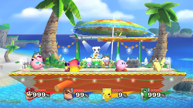
Daaaaamn that looks nice. Though it has a similar problem to the first mock-up I had with the height of the font vs. the width. What if it filled depending on the digits involved? It would look nice for the single- to double-digits, while still not wasting much space.
I highly doubt this is possible.

I gotta be honest: The damage percent being so vertical makes the pixel artstyle lose much of it's charm. :(

I much prefered the horizontal stocks with the smaller damage percent.

Also, I'm not sure about the comparison without the series icon. When I said more transparent I didn't mean invisible, which is what it looks like in that second pic.
You said as transparent as possible, so I figured you meant transparent since we can make them transparent. I also dislike the franchise icon. Decreasing their opacity is a favorable option for me.

I'm really surprised at all the damage font hate, I think it looks excellent, and should be that big. The problem with using horizontal stocks here is that using a cubic frame, the BP makes some real ugly empty space that the vertical stocks fill in quite nicely. I've really grown to like them that way as well.

The only complaint I have about that is that the %numbers look like they're being stretched to take up all the space in that box. Cut 'em down a bit so they look more natural, or maybe just cut the whole hud down to take up less space vertically. I actually really like how Shun's hud takes up less screenspace, and I think yours would look extremely sleek if it was chopped down just a tad.

I think the premise of the design, overall, is fantastic. It just needs some tweeks to look less awkward.
Duly noted. The numbers are being stretched, but they're not losing quality as they increase in size. I'm really surprised everyone thinks they look stretched, because I don't at all.

I do like your suggestion of cutting the whole HUD down to take up less space. What would have to be done is use BP's that only use 48px of the texture's vertical space. That way, we'd have 48x48 BP's and a 48x96 HUD + the fading mini-grid lines.
 

splat

Smash Lord
Joined
Oct 28, 2006
Messages
1,169
Location
The Netherlands
Hey, does anyone have a clean version of the brawl logo 'swipe'?

I too would like to create a mock-up of a HUD, but I can't find an image that's clean enough to work with, and I'm too lazy to recreate the thing myself.
 

\Apples

Smash Journeyman
Joined
Jan 3, 2013
Messages
488
Location
Kirkland, Washington
I do not, sorry. :/

Shrunk it down. 48x48 portrait.


There's an extra pixel on either side of the stock icons, and it bugs the crap out of me. If I have a border of 1px and 5 icons, and a width of 48px for all icons fit within, that gives me:
( 48px - 6px ) % 5 which equals 2. 2 Extra pixels with each icon at 8x8px. It's so ugly to me, even though most people probably won't notice it, it makes me want to go down to 46x46 BP's just so everything is flush and uniform.
 

Comeback Kid

Smash Champion
Joined
Dec 25, 2009
Messages
2,431
Location
Parts Unknown
I do not, sorry. :/

Shrunk it down. 48x48 portrait.


There's an extra pixel on either side of the stock icons, and it bugs the crap out of me. If I have a border of 1px and 5 icons, and a width of 48px for all icons fit within, that gives me:
( 48px - 6px ) % 5 which equals 2. 2 Extra pixels with each icon at 8x8px. It's so ugly to me, even though most people probably won't notice it, it makes me want to go down to 46x46 BP's just so everything is flush and uniform.
I would like to reassure you that this looks great, and I don't notice it even when you point it out. Making it any smaller wouldn't do your work justice, an artist needs a big enough canvass after all.

And remember this is a hud for a non-hd game with plenty of jaggies in it. A pixel or two that no one will see ain't a big deal in comparison. :reverse:
 

Jdaster64

Smash Ace
Joined
Feb 29, 2012
Messages
668
Location
New Donk City
NNID
Jdaster64
3DS FC
4141-3026-8303
Switch FC
SW 7540 0069 7907
[collapse="Melee HUD, Version 2"]

Brawl Vault - Direct (Dropbox)[/collapse]Wait, completely vertical fonts? What madness! Now with 99% fewer jaggies and about 5% less size, mandated by the extra slant. In case anyone's wondering, you can make the numbers stand straight up by using the "Shear" tool in GIMP, and giving it a value of 1/10 of the size of the image (e.g. shear of 40 for 400x400px image).

EDIT: Also, I still would like to see what that pixel HUD would look like with numbers that don't quite reach the square stocks (maybe four or so pixels shorter). Either way, the rest looks great.
 

splat

Smash Lord
Joined
Oct 28, 2006
Messages
1,169
Location
The Netherlands
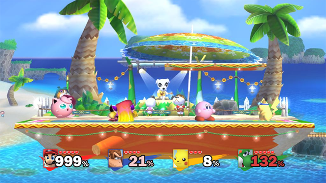
I found the Brawl swipe (on spriters-resource, doh) and made a quick mock-up, too:

[collapse=My mock-up]
[/collapse]

- I attempted to get rid of some information that wasn't really helpful and only cluttered the screen (name, game series) to keep only valuable data.
- The character images should be fairly small compared to Brawl's, thus taking up less screen vertically.
- The percentage meter is pretty big compared to the rest of the interface, and because of the thick border it 'pops' out more. It's supposed to draw in your focus, rather than the player looking at the image of the character first. They could possibly be even bigger, might look better.
- Stock icons are all heart-shaped and red, not only because that's pretty much Nintendo's standard, but also because red is a color most people easily recognize - thus making it more legible at all sizes, so I could make the stock icons a bit smaller because of it. They need a bit more spacing to keep it from one red line, though.
- The Brawl swipe I put in because Project M is filled with nods to 64 and Melee, so why not a nod to Brawl, too?

EDIT:
[collapse=Fixed the number size and spaced the stock icons]
[/collapse]
 

Led-Zeppelin

Smash Apprentice
Joined
Feb 21, 2012
Messages
98
I found the Brawl swipe (on spriters-resource, doh) and made a quick mock-up, too:

[collapse=My mock-up]
[/collapse]

- I attempted to get rid of some information that wasn't really helpful and only cluttered the screen (name, game series) to keep only valuable data.
- The character images should be fairly small compared to Brawl's, thus taking up less screen vertically.
- The percentage meter is pretty big compared to the rest of the interface, and because of the thick border it 'pops' out more. It's supposed to draw in your focus, rather than the player looking at the image of the character first. They could possibly be even bigger, might look better.
- Stock icons are all heart-shaped and red, not only because that's pretty much Nintendo's standard, but also because red is a color most people easily recognize - thus making it more legible at all sizes, so I could make the stock icons a bit smaller because of it. They need a bit more spacing to keep it from one red line, though.
- The Brawl swipe I put in because Project M is filled with nods to 64 and Melee, so why not a nod to Brawl, too?
That looks... perfect :love:
 

fatman667

Smash Journeyman
Joined
May 30, 2011
Messages
364
Location
4S Ranch, San Diego, CA
[collapse="Melee HUD, Version 2"]

Brawl Vault - Direct (Dropbox)[/collapse]Wait, completely vertical fonts? What madness! Now with 99% fewer jaggies and about 5% less size, mandated by the extra slant. In case anyone's wondering, you can make the numbers stand straight up by using the "Shear" tool in GIMP, and giving it a value of 1/10 of the size of the image (e.g. shear of 40 for 400x400px image).

EDIT: Also, I still would like to see what that pixel HUD would look like with numbers that don't quite reach the square stocks (maybe four or so pixels shorter). Either way, the rest looks great.
Nice job on the font, I'll be using this font from now on.

:phone:
 

Shun_one

Smash Ace
Joined
Jan 2, 2013
Messages
910
Location
Addison, IL
NNID
not_shun_one
I like the idea of making all the stocks a universal color and your usage of the Brawl swipe.

I think we really get somewhere with that mock-up with some more tweaks and edits. Nice work man
 

Jdaster64

Smash Ace
Joined
Feb 29, 2012
Messages
668
Location
New Donk City
NNID
Jdaster64
3DS FC
4141-3026-8303
Switch FC
SW 7540 0069 7907
Wow, that looks pretty incredible. Making all the stocks the same color might be nice as an alternative, but at the same time, I'd probably use it just as it is. The spacing of everything is pretty great, although I might have to redo the Melee numbers again to get them a tad closer together. I probably still have another pixel or two to work with.
 

\Apples

Smash Journeyman
Joined
Jan 3, 2013
Messages
488
Location
Kirkland, Washington
That looks great, I love using hearts and having them all red, regardless of port. Great use of the swipe to denote the slot in lieu of the stock icons.
 

Mithost

Smash Ace
Joined
Apr 22, 2011
Messages
690
Location
Locked in a safe floating in the Atlantic Ocean.
Regarding the "Who's who" problem with the Melee Battle portraits, I had a bit of an idea. I don't have photoshop to make an example, but here it goes.

Remove the series logo, and replace it with a similarly styled silhouette of the character's face or something. The pallet for each BP would be only one color and transparency. The only issue I can find with this is player colours. We can't have separate BPs for each controller port, but we CAN have separate colours for each costume. This means if you have say... a falco ditto, you have both falco faces, both being a different shade based on their costume instead of their controller port. It looks like melee, keeps colours consistent, solves the who's who problem, and "gets rid of" the BP entirely.

discuss?
 

Comeback Kid

Smash Champion
Joined
Dec 25, 2009
Messages
2,431
Location
Parts Unknown
Shun, Hamyojo, and Associates: Any way one of you would consider incorporating the new font Jdaster made into the Melee Hud?

It would be greatly appreciated and make the process of downloading much simpler.
 

AnOkayDM

Smash Champion
Joined
Mar 10, 2010
Messages
2,235
Location
Shoreline, WA
NNID
EvanescentHero
Regarding the "Who's who" problem with the Melee Battle portraits, I had a bit of an idea. I don't have photoshop to make an example, but here it goes.

Remove the series logo, and replace it with a similarly styled silhouette of the character's face or something. The pallet for each BP would be only one color and transparency. The only issue I can find with this is player colours. We can't have separate BPs for each controller port, but we CAN have separate colours for each costume. This means if you have say... a falco ditto, you have both falco faces, both being a different shade based on their costume instead of their controller port. It looks like melee, keeps colours consistent, solves the who's who problem, and "gets rid of" the BP entirely.

discuss?
Does each character have their own series logo, or do, say, all the Zelda characters draw from a single location for the Triforce logo?
 

Vashimus

Smash Master
Joined
Jan 1, 2013
Messages
3,308
Location
Newark, NJ
I do not, sorry. :/

Shrunk it down. 48x48 portrait.


There's an extra pixel on either side of the stock icons, and it bugs the crap out of me. If I have a border of 1px and 5 icons, and a width of 48px for all icons fit within, that gives me:
( 48px - 6px ) % 5 which equals 2. 2 Extra pixels with each icon at 8x8px. It's so ugly to me, even though most people probably won't notice it, it makes me want to go down to 46x46 BP's just so everything is flush and uniform.
This looks a thousand times better. Not only are the numbers smaller, but the stocks are displayed horizontally instead of vertically, just like we've been used to for all 3 Smash games.

I found the Brawl swipe (on spriters-resource, doh) and made a quick mock-up, too:

[collapse=My mock-up]
[/collapse]

- I attempted to get rid of some information that wasn't really helpful and only cluttered the screen (name, game series) to keep only valuable data.
- The character images should be fairly small compared to Brawl's, thus taking up less screen vertically.
- The percentage meter is pretty big compared to the rest of the interface, and because of the thick border it 'pops' out more. It's supposed to draw in your focus, rather than the player looking at the image of the character first. They could possibly be even bigger, might look better.
- Stock icons are all heart-shaped and red, not only because that's pretty much Nintendo's standard, but also because red is a color most people easily recognize - thus making it more legible at all sizes, so I could make the stock icons a bit smaller because of it. They need a bit more spacing to keep it from one red line, though.
- The Brawl swipe I put in because Project M is filled with nods to 64 and Melee, so why not a nod to Brawl, too?

EDIT:
[collapse=Fixed the number size and spaced the stock icons]
[/collapse]
Now that's how I always visualized the HUD. It's easy to associate hearts with lives, and that looks much better. I understand the lack of series symbols though.
 

Shun_one

Smash Ace
Joined
Jan 2, 2013
Messages
910
Location
Addison, IL
NNID
not_shun_one
@comeback kid: Fatman has you covered. And JD works with us too, so the next updates will include his contributions.

:phone:
 

uCooL

Smash Ace
Joined
Jan 2, 2013
Messages
747
Location
Manteca, California
NNID
SuperMurio
I found the Brawl swipe (on spriters-resource, doh) and made a quick mock-up, too:

[collapse=My mock-up]
[/collapse]

- I attempted to get rid of some information that wasn't really helpful and only cluttered the screen (name, game series) to keep only valuable data.
- The character images should be fairly small compared to Brawl's, thus taking up less screen vertically.
- The percentage meter is pretty big compared to the rest of the interface, and because of the thick border it 'pops' out more. It's supposed to draw in your focus, rather than the player looking at the image of the character first. They could possibly be even bigger, might look better.
- Stock icons are all heart-shaped and red, not only because that's pretty much Nintendo's standard, but also because red is a color most people easily recognize - thus making it more legible at all sizes, so I could make the stock icons a bit smaller because of it. They need a bit more spacing to keep it from one red line, though.
- The Brawl swipe I put in because Project M is filled with nods to 64 and Melee, so why not a nod to Brawl, too?

EDIT:
[collapse=Fixed the number size and spaced the stock icons]
[/collapse]
Best HUD i have ever seen, i cant wait for the download
 

hamyojo

Smash Ace
Joined
Mar 13, 2012
Messages
551
Location
DFW
I found the Brawl swipe (on spriters-resource, doh) and made a quick mock-up, too:

[collapse=My mock-up]
[/collapse]

- I attempted to get rid of some information that wasn't really helpful and only cluttered the screen (name, game series) to keep only valuable data.
- The character images should be fairly small compared to Brawl's, thus taking up less screen vertically.
- The percentage meter is pretty big compared to the rest of the interface, and because of the thick border it 'pops' out more. It's supposed to draw in your focus, rather than the player looking at the image of the character first. They could possibly be even bigger, might look better.
- Stock icons are all heart-shaped and red, not only because that's pretty much Nintendo's standard, but also because red is a color most people easily recognize - thus making it more legible at all sizes, so I could make the stock icons a bit smaller because of it. They need a bit more spacing to keep it from one red line, though.
- The Brawl swipe I put in because Project M is filled with nods to 64 and Melee, so why not a nod to Brawl, too?

EDIT:
[collapse=Fixed the number size and spaced the stock icons]
[/collapse]
Does the Brawl check-mark come in P:M M?
I understand nods to Brawl, but at a quick glance it's already hard enough to see if you're playing P:M or Brawl, especially if you're just watching.

Although for Brawl that fits absolutely beautifully <3
 

fatman667

Smash Journeyman
Joined
May 30, 2011
Messages
364
Location
4S Ranch, San Diego, CA
updatin' OP with this a few other things in a moment


http://www.youtube.com/watch?v=DSa2_KAqkRU&
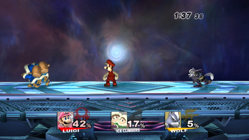
Here's the latest Melee HUD in action
Dang it, you beat me to it. :(
Oh well it is nice to see it further improved, let's see if we can reposition the percentage and stocks to make it look even more like Melee.

EDIT: BTW really like the combo video with the Mute City SNES theme, F-ZERO needs more love.
 

Vashimus

Smash Master
Joined
Jan 1, 2013
Messages
3,308
Location
Newark, NJ
Does the Brawl check-mark come in P:M M?
I understand nods to Brawl, but at a quick glance it's already hard enough to see if you're playing P:M or Brawl, especially if you're just watching.

Although for Brawl that fits absolutely beautifully <3
Looks like heart shaped stocks can be done, AND still look good hammy. ;)
 

crabsmack

Smash Cadet
Joined
Jan 2, 2013
Messages
32
I found the Brawl swipe (on spriters-resource, doh) and made a quick mock-up, too:
I just want to say that this looks absolutely amazing, the more I look at it the more I like it. I honestly think this would be what I'd keep forever, and outdoes any Smash UI I've seen: including the ones from the actual games.

Seriously, it's fantastic. Cannot wait for it to be made.
 

Translucent

Smash Journeyman
Joined
May 20, 2012
Messages
354
I just got this, and it looks pretty good. I really like what it has turned out to be so far.
 

uCooL

Smash Ace
Joined
Jan 2, 2013
Messages
747
Location
Manteca, California
NNID
SuperMurio
I see all of these amazing mock ups and font improvement concepts, when will the OP be updated with them? Or is it because the links scattered through the thread and im just not seeing em?

(my eyes get fuzzy after staring at the screen for a while)
 

hamyojo

Smash Ace
Joined
Mar 13, 2012
Messages
551
Location
DFW

Pwnz0rz Man

Smash Lord
Joined
Mar 30, 2008
Messages
1,862
Location
Nowhere, Kansas
3DS FC
1950-9089-5761
Of course. After the startup screens, right after the big white screen with the project M address on it, the screen transfers to a permanently black screen without showing the "Now Loading" at the bottom right. I'm trying a bunch of little things to try and fix it for myself, but I'm running out of ideas. The Melee Hub looks amazing, and is exactly what I want to see when I play against my friends. If there's anything else you think I could do to address the issue. I'm up for suggestions.
 

Comeback Kid

Smash Champion
Joined
Dec 25, 2009
Messages
2,431
Location
Parts Unknown
I'm weary of getting malware from that mediafire link myself, since it seems to want to install SweetIM crap on my computer.
 

Mithost

Smash Ace
Joined
Apr 22, 2011
Messages
690
Location
Locked in a safe floating in the Atlantic Ocean.
I'm weary of getting malware from that mediafire link myself, since it seems to want to install SweetIM crap on my computer.
You sure that is not a virus that is already on your computer? From my experience viruses tend to wait a while and then trigger after something else gets changed. It's a trick to keep the real source from getting noticed. It doesn't always happen, but it's possible.
 

Shun_one

Smash Ace
Joined
Jan 2, 2013
Messages
910
Location
Addison, IL
NNID
not_shun_one
Of course. After the startup screens, right after the big white screen with the project M address on it, the screen transfers to a permanently black screen without showing the "Now Loading" at the bottom right. I'm trying a bunch of little things to try and fix it for myself, but I'm running out of ideas. The Melee Hub looks amazing, and is exactly what I want to see when I play against my friends. If there's anything else you think I could do to address the issue. I'm up for suggestions.
I am assuming you tried to use the latest one? If so, I'll take a look at it. Sounds like it went over the file-size limit and is preventing your game from loading.
 

Comeback Kid

Smash Champion
Joined
Dec 25, 2009
Messages
2,431
Location
Parts Unknown
You sure that is not a virus that is already on your computer? From my experience viruses tend to wait a while and then trigger after something else gets changed. It's a trick to keep the real source from getting noticed. It doesn't always happen, but it's possible.
That might have been the case, either way I cleaned up my computer and downloaded the Melee pac.

And to be absolutely clear before I do anything else, I can manually delete both info and info 2 folders and just have one info.pac folder as a replacement?

I don't have a program to open the download if that matters.
 

Shun_one

Smash Ace
Joined
Jan 2, 2013
Messages
910
Location
Addison, IL
NNID
not_shun_one
That might have been the case, either way I cleaned up my computer and downloaded the Melee pac.

And to be absolutely clear before I do anything else, I can manually delete both info and info 2 folders and just have one info.pac folder as a replacement?

I don't have a program to open the download if that matters.
If you're using the Melee HUD, sure, the info folder matters not. It only contains edited BPs which Melee HUD does away with.

As for your freezing problem.
Updated Melee HUD
That should fix it. The previous one went over the file-size limit. Let me know if this one works.
 

hamyojo

Smash Ace
Joined
Mar 13, 2012
Messages
551
Location
DFW
If you're using the Melee HUD, sure, the info folder matters not. It only contains edited BPs which Melee HUD does away with.

As for your freezing problem.
Updated Melee HUD
That should fix it. The previous one went over the file-size limit. Let me know if this one works.
Updated the OP~
 
Top Bottom