• Welcome to Smashboards, the world's largest Super Smash Brothers community! Over 250,000 Smash Bros. fans from around the world have come to discuss these great games in over 19 million posts!

    You are currently viewing our boards as a visitor. Click here to sign up right now and start on your path in the Smash community!

A fresh and sleek new HUD

Pwnz0rz Man

Smash Lord
Joined
Mar 30, 2008
Messages
1,862
Location
Nowhere, Kansas
3DS FC
1950-9089-5761
The updated version works, and I managed to get my custom song titles in without forcing it over the limit. Thanks a lot Shun.
 

uCooL

Smash Ace
Joined
Jan 2, 2013
Messages
747
Location
Manteca, California
NNID
SuperMurio

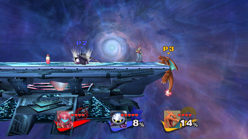
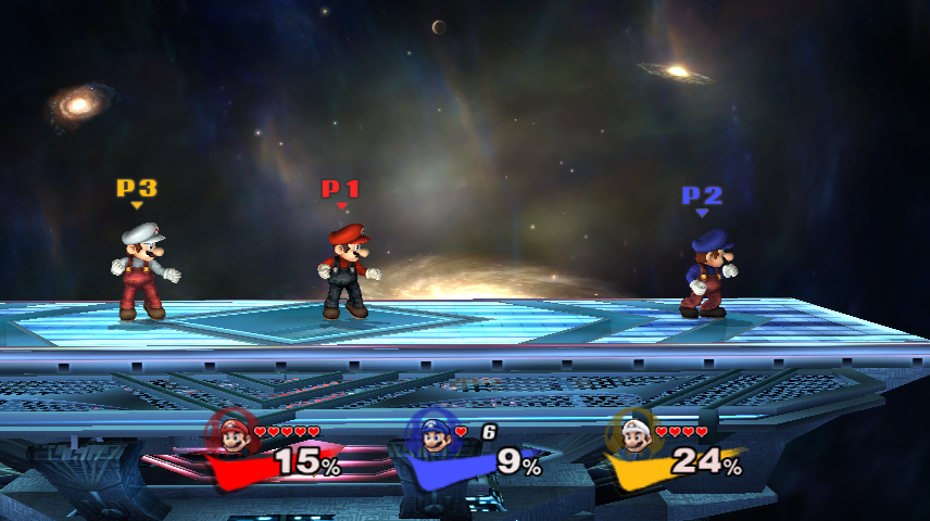
How's this looking?
I think this would be absolutely beautiful if the BPs were completely removed. (also maybe make the drop shadows not as hard. cut how much the shadows stick out in half and maybe drop the shadows opacity by 50% as well? )
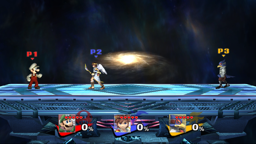
The vibrant color check mark is a clear indicator of which character has which stocks.
 

crabsmack

Smash Cadet
Joined
Jan 2, 2013
Messages
32
How's this looking?
Comparing this to Splat's mock-up, here are my thoughts.

  • Would it be possible to move the heart stock icons over to the right? They look better when next to the portrait, not overlapping it.
  • Could the portraits be shrunk a bit? Also, I think making them slightly more vertically narrow would look better
  • The franchise icons are pretty unnecessary, given the colored Brawl swipes
  • I think the font size might benefit from being upped a bit
  • I think it would look considerably better with the shadows on the Brawl swipes removed

Very nice work, I just wanted to get my input out there while the HUD's still in the oven. With some of these adjustments it could look great.
 

yogurtgun1245

Smash Apprentice
Joined
Dec 13, 2009
Messages
183
Location
Delaware
I like the way it looks with both the large swipe and series icon. However I think it might look better slightly more opaque.
 

Jdaster64

Smash Ace
Joined
Feb 29, 2012
Messages
668
Location
New Donk City
NNID
Jdaster64
3DS FC
4141-3026-8303
Switch FC
SW 7540 0069 7907
Addressing just about everything,

- I really don't want to mess with the BPs, as that's not even handled by the same file; furthermore, that slight change would require editing hundreds of extra files. Not worth it, in my opinion, and not having the BP there at all makes it look pretty bare. I guess I might release an entirely BP-less version if I can move the franchise icon considerably to the left.

- I will reduce the opacity of the swipe's shadow; I think it looks good with a shadow of some sort, but pure black is a bit of overkill.

- I'll put up versions with and without franchise icons. I like them, personally; they don't really take up much additional space.

- The font size is pretty much at a maximum at the moment, as I had to use an extra 3 pixels or so to get them to stand upright. I could manage at most one more pixel without cutoff, but that would make the borders a bit uneven, and come on, it's only one pixel. I've played with it in-game, and the space doesn't look noticeable (unless you were to have 111% or something).

- I will move the hearts over to the right a bit; it is a bit distracting having that much overlap (although no one uses 5 stocks anyway).
 

Jdaster64

Smash Ace
Joined
Feb 29, 2012
Messages
668
Location
New Donk City
NNID
Jdaster64
3DS FC
4141-3026-8303
Switch FC
SW 7540 0069 7907
Meh, I guess I'll see how that looks as well; wasn't thinking about them. At any rate, I won't have time to work on them until at least tomorrow afternoon.
 

Jdaster64

Smash Ace
Joined
Feb 29, 2012
Messages
668
Location
New Donk City
NNID
Jdaster64
3DS FC
4141-3026-8303
Switch FC
SW 7540 0069 7907
The issue I'm going to have with Shun's is that he actually put the grey into the portraits, rather than changing the background, so it's going to be hell trying to get the swipe to neatly fit around it. The swipe is actually on the top layer (save for the damage font and non-existent names), so I had to cut a hole in it to make it look right. I'll work on a BP-less version for those that want it, but it's either going to be all or nothing.

EDIT: New version of the BP one. Keep in mind that unless you play with five stocks, there's only going to be a tiny amount of overlap.


EDIT again: Does anyone know how or if one can move the series icons?
 

Shun_one

Smash Ace
Joined
Jan 2, 2013
Messages
910
Location
Addison, IL
NNID
not_shun_one
JD, you can move the position of the BP's by moving the names Bone. I was going to try moving it myself for the next general HUD update, but looks like you could use it more.

You can move the series icons by editing the InfMark bone.
 

Jdaster64

Smash Ace
Joined
Feb 29, 2012
Messages
668
Location
New Donk City
NNID
Jdaster64
3DS FC
4141-3026-8303
Switch FC
SW 7540 0069 7907
I tried that and it didn't work, but vertex-editing moved it just fine:
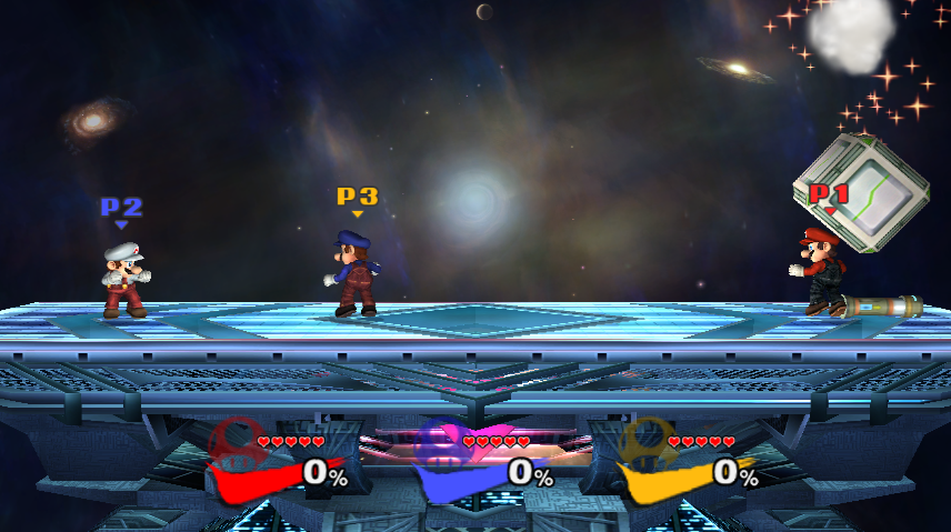

I can clean up the linework on the swipe, but are there any changes that need to be made or other arrangement suggestions?

EDIT: Heck, I might just release this one after it's finished and nothing else. BP's are a pain to work with anyway.
 

Jdaster64

Smash Ace
Joined
Feb 29, 2012
Messages
668
Location
New Donk City
NNID
Jdaster64
3DS FC
4141-3026-8303
Switch FC
SW 7540 0069 7907
I thought about that, actually. I don't really know that that's necessary, though; series icons and player color should really be identification enough. I'll see what it looks like, but it'll likely be optional at best.

:phone:
 

crabsmack

Smash Cadet
Joined
Jan 2, 2013
Messages
32
My thoughts on your most recent build:

  • I personally think it looks better with the vBrawl BPs than with totally empty space. It looks very empty without them, and while the colored Brawl stripes do work for identification, I'd argue it takes longer to identify who is who.
  • I still think it might look better without the franchise icons, but I'd much rather have BP + icon than just icon.
  • Font size is fine if it's a pain to change, not a huge issue.
  • Hearts look much better after you moved them over.
  • I think the minimal shadow you have in your latest picture is the best so far.
  • Brawl swipes look pretty jagged, but it seems you're aware of this.
 

uCooL

Smash Ace
Joined
Jan 2, 2013
Messages
747
Location
Manteca, California
NNID
SuperMurio
I tried that and it didn't work, but vertex-editing moved it just fine:


I can clean up the linework on the swipe, but are there any changes that need to be made or other arrangement suggestions?

EDIT: Heck, I might just release this one after it's finished and nothing else. BP's are a pain to work with anyway.
this is absolutely the best HUD I have seen anywhere. If the jaggies were fixed on the checks it would be perfect. I dont see how people are getting confused on whos stocks are who's.

There's the identifying player color on the CSS, which is the same color as the players shield and its also the same color as their check mark and icon logo. Not to mention the player tags. (If you use those)
 

GamerGuy09

Smash Master
Joined
Apr 4, 2012
Messages
3,090
Location
Iowa
Switch FC
SW-3742-4712-6319
I tried that and it didn't work, but vertex-editing moved it just fine:


I can clean up the linework on the swipe, but are there any changes that need to be made or other arrangement suggestions?

EDIT: Heck, I might just release this one after it's finished and nothing else. BP's are a pain to work with anyway.
Please keep the portraits. :(
 

Kati

Smash Lord
Joined
Mar 22, 2010
Messages
1,471
It's already perfect. What more can they do to it? Melee styled numbers are available on brawlvault I believe.
 

NightTide

Smash Rookie
Joined
Jan 11, 2013
Messages
8
Location
California
Tried out the Melee HUD and it's simply awesome. It took me a moment to realize that the real difference is that the stock icons are now shapes instead of mini character heads. But it only takes moment to determine who is who in a match anyways, so I wouldn't think it's an issue...
 

Shun_one

Smash Ace
Joined
Jan 2, 2013
Messages
910
Location
Addison, IL
NNID
not_shun_one
Melee HUD was recently updated with Melee numbers.

As for the player recognition thing, it really bugs me that there's nothing aside from player color, but I suppose it'll do...for now.
 

B.W.

Smash Champion
Joined
Apr 27, 2006
Messages
2,141
Location
Darien, IL
Any progress on the stock icon? I still think moving the stocks over a little so 5 stocks can fit next to a portrait would be fine. You guys stated you were worried about the face icon looking too much like it was part of the stock list. If you're really worried about that why use some tricks?

Put the left most stock underneath the face icon so it would look like you have 3 bubbles then a face. I honestly don't think it would look bad just having the stock icon and the stocks though.

Also, for the Melee HUD, the emblem should be lower so that the numbers are over it.
 

Jdaster64

Smash Ace
Joined
Feb 29, 2012
Messages
668
Location
New Donk City
NNID
Jdaster64
3DS FC
4141-3026-8303
Switch FC
SW 7540 0069 7907
The thing I really hate about the version of my HUD with the BPs is that the swipe doesn't fade to trasnparent when someone gets too low on the screen like the portrait does, so you can see a massive hole there. Vertex editing doesn't move the BP to the front either. I'll try a couple more things to move them to the front, but if it doesn't work, I'll have to leave it like that when I release it, which looks really ugly. If I can move them to the front, though, then the HUD should be compatible with just about any set of BPs, and I'll just release one version that everyone's free to add their own BPs to (They're in a different folder anyway).
 

B.W.

Smash Champion
Joined
Apr 27, 2006
Messages
2,141
Location
Darien, IL
I like that HUD, though I'm still not a fan of the checkmark.

I'd love to see that HUD but with the series logo under the damage numbers and player colored hearts. I actually very much like the hearts.
 

Shun_one

Smash Ace
Joined
Jan 2, 2013
Messages
910
Location
Addison, IL
NNID
not_shun_one
I like that HUD, though I'm still not a fan of the checkmark.

I'd love to see that HUD but with the series logo under the damage numbers and player colored hearts. I actually very much like the hearts.
Which is the current plan. Though, I won't label it as a "Melee HUD" since it's a cheap solution for the moment, I do think it'll suffice.

But before I get to work on that, I must upload a version of the HUD with names for those who are asking for it.
 

B.W.

Smash Champion
Joined
Apr 27, 2006
Messages
2,141
Location
Darien, IL
I took Jdaster's HUD, swapped the all red hearts for team colored hearts and took out the checkmark.

I dunno how to move the series logo, but I very much enjoy it without the checkmark. Hearts are awesome stock counters.

My heart coloring job is awful though so I'd love if someone else did it lol.
 
Top Bottom