• Welcome to Smashboards, the world's largest Super Smash Brothers community! Over 250,000 Smash Bros. fans from around the world have come to discuss these great games in over 19 million posts!

    You are currently viewing our boards as a visitor. Click here to sign up right now and start on your path in the Smash community!

Polygons and whatnot (mostly polygons)

PsychoIncarnate

The Eternal Will of the Swarm
Joined
Jul 4, 2007
Messages
50,642
Location
Char
NNID
PsychoIncarnate
3DS FC
4554-0155-5885
I'm not exactly sure what you mean by that.

We are basically given some models and told to animate them.

I kinda differentiated from what we were suppose to do. But the teacher expects that
 

Geist

Smash Master
Joined
Sep 26, 2007
Messages
4,893
Location
Menswear section
my bad, should have said "rig"
derp
can't spell

aka did it come with pre-set handles for your animation or did you do all that yourself? Models don't come standard with deformers and armature/skeletons.
Unless you did all the animation by manually deforming the mesh itself >_>
<_<
I hope that's not the case
 

PsychoIncarnate

The Eternal Will of the Swarm
Joined
Jul 4, 2007
Messages
50,642
Location
Char
NNID
PsychoIncarnate
3DS FC
4554-0155-5885
I actually haven't learned to make bones and stuff like that yet. It was just the first lesson and we were just using modifiers in the animation.

I'm getting the impression that is a faux pas or something?
 

Geist

Smash Master
Joined
Sep 26, 2007
Messages
4,893
Location
Menswear section
nah no worries, if it was your first lesson, you don't need to know how to be rigging.
Using basic modifiers for something super simple is fine on a first experience basis too.

If you were physically selecting each vert/face and pulling them manually, that would be a problem lmao
 

PsychoIncarnate

The Eternal Will of the Swarm
Joined
Jul 4, 2007
Messages
50,642
Location
Char
NNID
PsychoIncarnate
3DS FC
4554-0155-5885
I've been teaching myself box modelling recently.

I just have a couple of questions about it.

Is it better to start with a box for making a person or a circle?

Also, when making a model, do you make it ALL from one shape, or multiple shapes and connect them?

We aren't going to get into that in 3D class for a bit
 

Geist

Smash Master
Joined
Sep 26, 2007
Messages
4,893
Location
Menswear section
When I model characters I use a variation of ribbon modelling to do it. I feel really uncomfortable with box modeling organic things because there's more of a need for a precise edgeflow.
Ribbon modeling, or at least the way I do it, is like building a net in the shape of the model, starting with a few key edge loops (the eyes and the mouth) and working outwards using extrusions to follow key paths along the body. I continue like that, creating a grid-like frame for the model, until everything I feel that's needed is there, and then I fill up all the holes.

That's my process in maya at least. If I want to start a model in zbrush I either use dynamesh or I import a very basic cube-like model from maya.

and as for 3dsMax...
I don't like modeling in Max lol


Definitely start different limbs as different objects and connect them afterwards, I usually find it easier to work with separate pieces whenever I can, so a clothed character would essentially be a whole bunch of disconnected pieces, like disembodied arms poking out of a shirt and stuff. Don't model what you can't see unless it's part of an assignment or your character is like... stripping naked I guess.
I have the head, torso, arms and legs all as different objects when I first start the model, usually mirrored down the middle so you don't have to do double the work.

If working in zbrush, it's best to subdivide as you go along from a single mesh, and import meshes and zspheres when you need them (like belts and accessories)
I won't get too much into that because I'm pretty sure you're not using zbrush. And if you are, you shouldn't be.
 

PsychoIncarnate

The Eternal Will of the Swarm
Joined
Jul 4, 2007
Messages
50,642
Location
Char
NNID
PsychoIncarnate
3DS FC
4554-0155-5885
Well, all I know at the moment is box modeling, so I'm just going to go with that for now.

Here is my current personal project. The first real box model attempt I've made


It's going to be a dinosaur in the end.

The second leg is just for show, it's just a mirrored copy of the first. Don't actually work on legs separately
 

BioDG

Smash Ace
Joined
Jan 20, 2009
Messages
609
Thanks man
didn't you say you were going to post something earlier? :0
Yeah, I kind of forgot. I'm having trouble getting into a life drawing class, but I managed to get in a 3-week seminar (once a week, so...3 rounds and that was it :( ). It's too bad I'm too busy and too far away from existing classes right now to jump in a full one. Here are some worth showing:


They're a bit better than my old class drawings, though I can't find those.

I'm starting face studies now, though (back views in both pictures were just coincidence). A system I thought might work is doing a hundred-something sketches from one perspective. 25 two-minute drawings with a picture for a subject and for looking at every now and then between drawings to assess things. After each drawing, I've been putting a mirror next to each drawing to expose mistakes, then on to the next. I'll change the reference every 25 drawings for sake of gender, racial, and facial variety. Then I'll do all of this again with a different perspective of the face. I've started and it's enjoyable enough.

Might be a good way of tiding me over until I can find the time for life drawing again.
 

Geist

Smash Master
Joined
Sep 26, 2007
Messages
4,893
Location
Menswear section
Yeah, I kind of forgot. I'm having trouble getting into a life drawing class, but I managed to get in a 3-week seminar (once a week, so...3 rounds and that was it :( ). It's too bad I'm too busy and too far away from existing classes right now to jump in a full one. Here are some worth showing:


They're a bit better than my old class drawings, though I can't find those.
ooo very nice

Good stuff, nice tonal contrast. It looks like it was done in conté?
If you're looking for critiques, I can give you some. It might be a bit tricky, since it's usually a lot easier to get good results out of back view, due to less musculature definition and just less information in general being present, especially from female models lol

Post more btw


I'm starting face studies now, though (back views in both pictures were just coincidence). A system I thought might work is doing a hundred-something sketches from one perspective. 25 two-minute drawings with a picture for a subject and for looking at every now and then between drawings to assess things. After each drawing, I've been putting a mirror next to each drawing to expose mistakes, then on to the next. I'll change the reference every 25 drawings for sake of gender, racial, and facial variety. Then I'll do all of this again with a different perspective of the face. I've started and it's enjoyable enough.

Might be a good way of tiding me over until I can find the time for life drawing again.
Yeah that sounds like what I put myself through before I started school...
it's great if you have the time but it'll leave you braindead after a few hours for sure.

It might be better to try drawing the same general face from lots of different directions, using minimal reference. It's a more creative exercise if you are creating your own information, and it'll force you to study your subject more in-depth, rather than just copy what's in front of you.
I enjoy finding a front and side view of someone and then drawing them in a 3/4's view.

Switching to different faces/races/genders every so often is good though. It's more important to practice and study angular structure in facial anatomy than it is to study specific faces, and different races have different bone/muscle structures in specific areas.

I just feel I have to say this because repetition is commonly considered an objectively good thing for learning, when in reality, repetition can often cause bad habits. And I can tell you from experience that it's harder to unlearn bad habits than it is to start from scratch.
 

BioDG

Smash Ace
Joined
Jan 20, 2009
Messages
609
Yeah, the back is easier now that I think about it. It was graphite/charcoal, by the way. And thanks for your thoughts.

I'll try to post more, but I gotta have more stuff to show lol. I'll see if these exercises will get me into something worth posting.

And yeah, I only meant having a real face somewhere as a mental guide to check on occasion when I'm not drawing and possibly steer me back if habits pushed me towards deforming a particular part of the face. I wouldn't want to have it as a means of direct observation. Also, by "general face" do you mean a real face? And it sounds like you prefer that I switch perspectives before switching faces?

It also sounds like you consider repetition counter-intuitive if not kept in check. In this case, do you consider the "check" as switching things often (faces and perspectives)?
 

Geist

Smash Master
Joined
Sep 26, 2007
Messages
4,893
Location
Menswear section
Your overall goal should be to be able to draw a believable face without reference. It gets difficult to reach that goal if your reference is of the same thing you're drawing repeatedly, because it only serves you to be able to draw that specific thing.
Even using face reference as a mental reminder could result in you studying the wrong things. When I said general face I actually mean 'generic', I don't know why I typed general. Either a plain looking model or one of those generic sketching heads is good, because you'll be able to study your reference as more of a 3-dimensional form rather than a 2-dimensional one if you're not simply transferring what you see onto paper.

And yes, repetition can be a bane if you're not careful. I find the more variation in your exercise, the better. I usually just make crap up and try to force myself to either see things in a different way or use a different drawing process.

The nice thing about life drawing is that you're taking a 3 dimensional figure and sort of 'sculpting' them onto paper. It's easier to study from life because you have to compensate for that extra dimension, whereas study from a 2 dimensional image is more akin to projecting a flat image onto another flat image. A lot of information is lost.
That's why I like to draw people in different perspectives than my reference, because I'm studying shapes and volume rather than tones and lines.
 

neous

Smash Journeyman
Joined
Mar 10, 2009
Messages
374
Location
Rutgers / Apex area
//psycho i look forward to seeing what your characters will look like in 3d.

---

I'm making some banners [finally fixing my sites], and im having trouble with readability, +design overall...


If its one thing i'm good at, its eye cancer.

On a more positive note, look at my cute pixelturtle stickers :3


also, shouts to you guys who lurk + never post.​

EDIT: I made a gif out of the files accumulated during edits


Chronodiver Lokii

Chaotic Stupid
BRoomer
Joined
Aug 11, 2009
Messages
5,846
Location
NEOH
dfsdjafklsajd d'awwwww

yeah lurkers! post! we dont bite <3 we wub people

Also, art school thread updated! really great video added :3
 

Geoberos

Alicorn or not, my mane mare, my unicorn, Twilight
Joined
May 18, 2007
Messages
3,243
Location
San Antonio, TX
NNID
Geoberos
dead turtles D:
and then turtles :D

in the swing of drawing in between classes again now that spring semester has started.
nothing original tho :/
 

Morrigan

/!\<br>\¡/
Joined
Mar 10, 2006
Messages
18,681
neous
I can see where you're going with the readability stuff. The only thing that threw me off a little bit was the i
 

neous

Smash Journeyman
Joined
Mar 10, 2009
Messages
374
Location
Rutgers / Apex area
yeah, i tend to stylize my i's into +s which is bad for readability/ communication. its like, im one of people that insists on perpetuating certain elements of their poorer tastes. :D

random:
 

BioDG

Smash Ace
Joined
Jan 20, 2009
Messages
609
Nice image-type piece. As for me, the horizontal line in the M also made it difficult for me to read. It made me see a T before an M. The lowercase i made me read a lowercase t instead. So, I saw Tntus before the real word.

It's GREAT to take creative liberties in text, though, so I dig it anyway. Sometimes it's nice to have the reader try to figure it out a bit as it makes it more charming when the message is found. But be careful. I accidentally saw the other comment on the lowercase i before seeing the picture, cheating me into reading it faster, so I don't know if it was readable enough on its own. But I think this one was probably okay on the communication side.

Cool portrait with the swirls, as well. As for the last one, I think I've seen many frontals like this from you from lurking in here randomly.
 

Geoberos

Alicorn or not, my mane mare, my unicorn, Twilight
Joined
May 18, 2007
Messages
3,243
Location
San Antonio, TX
NNID
Geoberos
At first glance yesterday, I didn't even realize it was a word. Took until today going back to it that I saw each letter right away. All lowercase though so the fringe on the m and u seems justified. The i isn't that bad when it still has it's dot, unless you make it out to be a colon. With that in mind, obviously that's the name of the window as well on the bottom left. The face kinda just... stares deep. Creeeeeep.


Last night a friend was asking for assistance in drawing "semi-realistic hair" and sent me this as an example.
[COLLAPSE="Her Expectations"]
[/COLLAPSE]
I don't really have that much experience into going into that much detail, but I tried to give my thoughts and personal way of attempting it through livestreaming my desktop. -- We both use Easy Paint Tool Sai -_-
She sent me a piece on what she was working on.
[COLLAPSE="Her WiP"]
[/COLLAPSE]
I opened up her file and then on stream I tried to explain by babbling on light sources, drawing indention in the hair like it was a realistic wrinkly shirt, using very low density pen to create thin hairlines and then add shading. She told me the hair was meant to be albino white and at the end of the stream, I gave her the unfinished example to use as reference for her to practice with.
[COLLAPSE="My Rendition"]
[/COLLAPSE]
If anything I said didn't sound anywhere near coherent, I'd be grateful for any tips in the right direction in this sort of endeavor.
 

BioDG

Smash Ace
Joined
Jan 20, 2009
Messages
609
Geoboros, that should put her on the right track; you have a pretty good grasp on hair. Keep up the good work! Not sure if you were looking for critique but it seems successful enough to help your friend.
 

Geist

Smash Master
Joined
Sep 26, 2007
Messages
4,893
Location
Menswear section
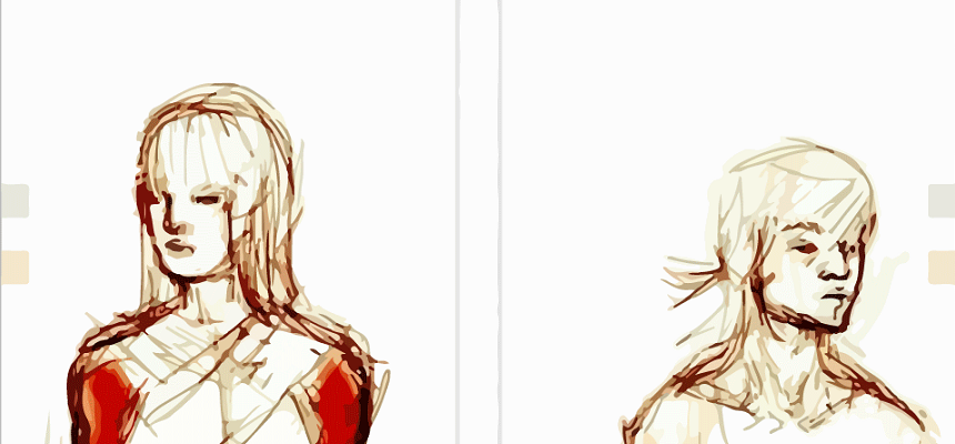
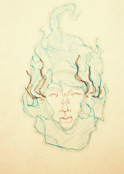
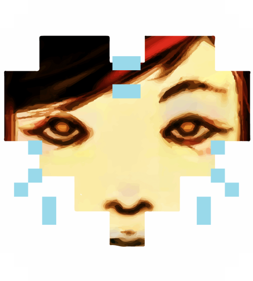
Here's two different painting styles of hair I've done before:
realistic
pseudo-realistic/stylized

So since I've tortured myself in the past by rendering hair follicle by hair follicle, I feel like I have a decent understanding on how to get decent results. The way I do it isn't the only way, obviously, but through trial and error, it's what I've found to be easiest for me.

Firstly, I don't know how far you plan to emulate the style of that hair you showed in your example geo, but if you want to get the best result, get rid of all your lines. Specific styles, like the one you're going for, are sometimes meticulously built to have a certain overall aesthetic. Linework, commonly associated with a more comic book style, would look goofy with rendered, painterly hair, just as a detailed oil painting would look silly if all the hair had an inked comic book look.

You always want to start with a base, something that's just a flat color (hopefully on a separate layer). This base color should be a midtone of your desired hair color. It doesn't have to be a super precise midtone, because there's a lot of tweaking involved anyways. So in your example, geo, even white hair would have a base color that's an off-white (I'd personally use slightly colored grays, it'll give more life and less sterility to white haired characters than a completely unsaturated gray.)
Then with very large, single strokes, with a 40-50%ish transparent brush, determine the flow of the hair using alternating layers of lights over darks. Sometimes I love using a bit of burn and dodge. This can end up making your colors look flat if you overuse it, but for establishing lights and darks, it's just fine.
Don't alternate these layers too many times, just like 3 - 4 layers is fine. End with the highlights on top, because that's how life works, and keep the flow of the hair consistent, but following different lines. This part doesn't actually have to be that accurate, so just focus on highlights and darks as well as general flow direction. Don't detail yet.
Once this is done, break out the smudge tool on a mid/high opacity and go nuts. This is the detailing stage,and the smudge too does a great job of making smooth gradients and borrowing colors in a nice organic way. Start with a large brush, and gradually make it smaller and smaller until you get the desired amount of detail.

*EDIT* I recommend finding hair reference and studying how hair follicles tend to clump together and flow in long shapes, as well as how single strands of hair branch out from those flowing shapes. It's very easy to get a good result with hair if you get this part down well, even just using solid strands of color/shades properly can give you hair that looks really accurate. /EDIT

After you're satisfied with your smudging, add the last definitions with a brush to give sharper details.
photoreal hair and less detailed, more painted hair start at the exact same stage, it's all about how far into detail you decide to go with it with that smudge brush and the finishing details. The hair on my first example started similarly to my second example, but it took about 10 hours longer to do. So detail at your own discretion.

Again, this is how I do it, not how it HAS to be done. I know lokii is also good with hair and has a completely different technique.
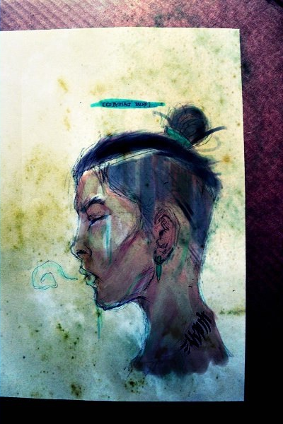
 

Chronodiver Lokii

Chaotic Stupid
BRoomer
Joined
Aug 11, 2009
Messages
5,846
Location
NEOH
I tried demo-ing how I paint hair sometimes because I loooooooove hair painting

....video was corrupted :C

I can send you the file though : o I use a bajillion layers so its easy to piece apart shade by shade in the hair

:phone:
 

Chronodiver Lokii

Chaotic Stupid
BRoomer
Joined
Aug 11, 2009
Messages
5,846
Location
NEOH
Nope :I I'm a queen of clutter
I don't even name layers
Really inefficient
But I know where everything is

I'll name layers for assignments or commissions tho

Hair layers are what takes up most of my stuff though
Or skin
Usually hair though

:phone:
 

BioDG

Smash Ace
Joined
Jan 20, 2009
Messages
609
Grouping is a must for me, but if I don't name my layers, my working files become puzzle games when I go back to them later.

As for hair, I don't like using lines, either...but then again multiple approaches can work.
 

Chronodiver Lokii

Chaotic Stupid
BRoomer
Joined
Aug 11, 2009
Messages
5,846
Location
NEOH
Mhm
Drawing in every hair is inefficient
Draw a few for style

BUT
EVERY
STRAND

DOOOOOONT.
STAHP
TAKES TOO LONG

Oh, Bren. Can I get an opinion on a picture later? I don't want to start painting on something that might be BROKED xD

:phone:
 

BioDG

Smash Ace
Joined
Jan 20, 2009
Messages
609
Dude give me your skype, bro bro!

Mine is bio.dg or bio dg (I always forget)
 

Geoberos

Alicorn or not, my mane mare, my unicorn, Twilight
Joined
May 18, 2007
Messages
3,243
Location
San Antonio, TX
NNID
Geoberos
I see. It is something of an idea I think I can grasp and test, trial, and experiment with, but now I understood why the original drawing had a gray base to start with. The general feel from what I haven't tried yet was the few layering of light and dark over each other. Thanks again, y'all.
 

Geist

Smash Master
Joined
Sep 26, 2007
Messages
4,893
Location
Menswear section
Dude give me your skype, bro bro!

Mine is bio.dg or bio dg (I always forget)
done

I see. It is something of an idea I think I can grasp and test, trial, and experiment with, but now I understood why the original drawing had a gray base to start with. The general feel from what I haven't tried yet was the few layering of light and dark over each other. Thanks again, y'all.
no problem
thankfully hair is one of those things that seems daunting at first but it's actually really fast once you get a process down.
 

neous

Smash Journeyman
Joined
Mar 10, 2009
Messages
374
Location
Rutgers / Apex area
Obnoxiously sized post:

Thanks for the readability input guys, it’ll help me fix my mess.

...It's GREAT to take creative liberties in text, though, so I dig it anyway. Sometimes it's nice to have the reader try to figure it out a bit as it makes it more charming when the message is found. But be careful...
Man, i love doing hyper-stylized text. it's half of my work/play to be honest.

*Text to go along with my gif from earlier:


Lack of readability is definitely a specialty.

...I think I've seen many frontals like this from you from lurking in here randomly.
Yeah, I REALLY like doing the simple thangs like experimenting with front views of faces. I don’t feel comfortable uploading faces i've drawn from other angles [aside from profiles] just yet though, they suck.

[Here's some none straight up frontal ones.]


Also, I find hair hard too. Hair or lack of drawing hair and replacing with clouds or something:


Attempt at side shaved + puffy top:


You guys should post more things. Seems i post more stuff than everyone combined. A show and tell thing going on would be nice.


There was this deal to make photo book with like 60% off. So I'm gonna do that. I made a cover:


BioDG

Smash Ace
Joined
Jan 20, 2009
Messages
609
Nicely rendered concept, Lokii. :]

Neous, might as well keep your text visible unless it has to do with a collapsed image.

Anyway, I love your style man. It's very graphic-oriented, which is probably why you like working with typography so much. You also got some influences of graffiti and your stuff with the stylized front view drawings (the ones that are more detailed and just have eyes/nose/mouth) have a tribal feel to some of them. Really cool stuff.

Don't worry too much about posting horrible stuff. We're here to help! Your other perspectives of the head aren't nearly as refined, sure, but you have a pretty good understanding. I have a book based solely on the head, so don't get too discouraged about it; it's a really complex form with so many variations.

You guys should post more things. Seems i post more stuff than everyone combined. A show and tell thing going on would be nice.
Sure, I'll dump some stuff for you. Here's some stuff I did for the smash community:


World Hobo 4 (Whobo 4) was a national Smash Bros. Brawl tournament that was Metaknight banned (indicated by the distorted Metaknight mugshot). I was going for something felt very much like a Mario-esque Nintendo logo. This logo never got used for the tourney, unfortunately.


This one is used, however. Ascension is a fairly new tournament series that has completed its 4th tournament. I was going for an optimistic feel because of the name so I automatically thought of mountains. I think that inspired my blues whereas the orange was to bring it back to a vibrant video game color scheme.

ZSS - http://img35.imageshack.us/img35/9692/biozss.jpg
Initially, this was an exercise at creating a new coloring style for myself (which I'm currently trying to use), which was mostly successful. But since zss was also my main, I ended up using it for a profile image back when I played Brawl competitively. I am proud to say I retired as a top 5 zss, so this is one actually has some sentimental value.

Link - http://img827.imageshack.us/img827/9683/linkfinalaib.jpg
Another coloring exercise. Originally, I was just going to make a bust of Link to be in an avatar for a smash buddy, but I went ahead and did an entire rendering to continue working with the coloring approach.


Other old works:
1 - http://imageshack.us/a/img9/2096/clichet.jpg -
"The Early Bird Gets the Worm". Illustration of a cliche phrase. I looked at some baby blue jay photos to figure out what it looked like, then created my own composition.

2 - http://imageshack.us/a/img9/1456/dspecss1.jpg
3 - http://imageshack.us/a/img213/3030/dspecss2.jpg
4 - http://imageshack.us/a/img545/5467/dspecss3.jpg
A three-part exercise of fusing graphic elements with basic character drawings.

5 - http://imageshack.us/a/img163/4339/lastlessons2portfolio.jpg
For a Pilates magazine. "Last Lessons" is a page that has a quote accompanied by an illustration of the message. It's intended to illustrate the kind of inner spirit focus one should have in order to perform a Pilates pose properly. "LifeVirus" was my old pen name I gave myself before "BiO".

6 - http://imageshack.us/a/img820/8256/icejengapm.jpg
Woodblock print. Jenga blocks melting in the light.

7 - http://imageshack.us/a/img703/3197/losingfocus2.jpg
I was on the chararcter-graphic fusion kick again.

8 - http://imageshack.us/a/img39/2791/illusions3.jpg
College project to make an imaginary cover illustration. I just made something that reminded me of those trippy CD covers. I wanted to convey some sense of moral duality within a person; the entire composition forms a face.


Many more where that came from, but that's enough. Right now my goal is to improve my grasp of the human form, so from here on out, all I will be drawing/posting are sketches and life drawings. At the moment, I'm waiting for the life drawing seminar to start back up. I think my technical skiils are there now, but my knowledge of human anatomy is lacking.
 
Top Bottom