
Crainy
Smash Apprentice
- Joined
- Aug 23, 2014
- Messages
- 143
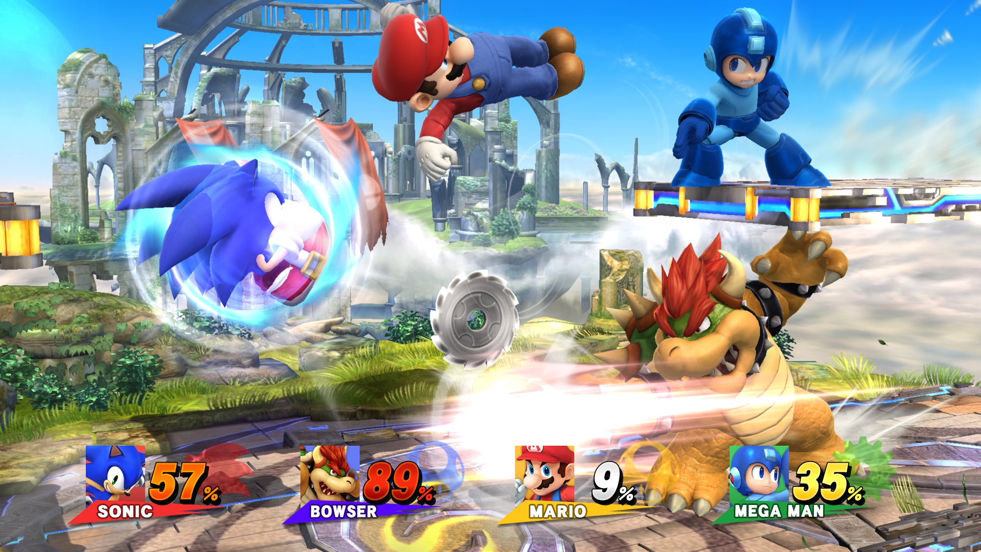
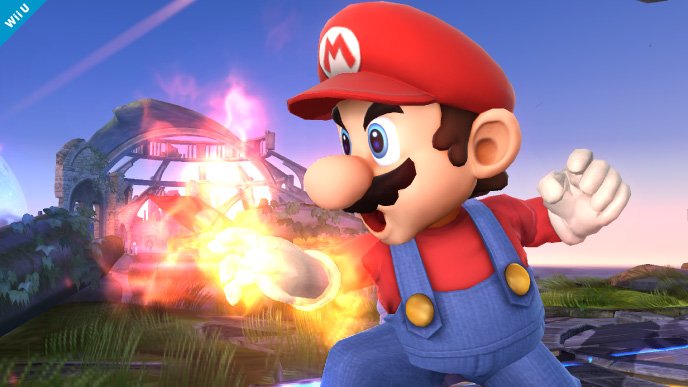
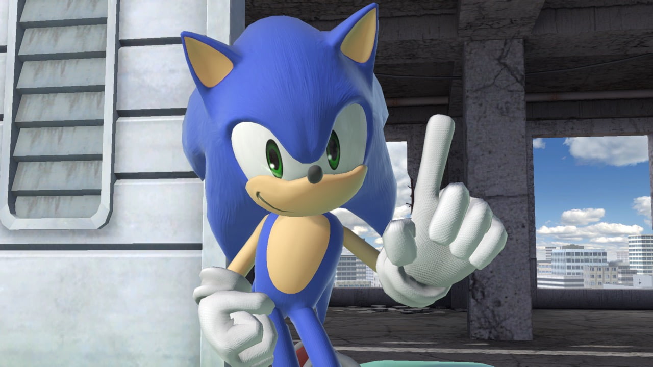
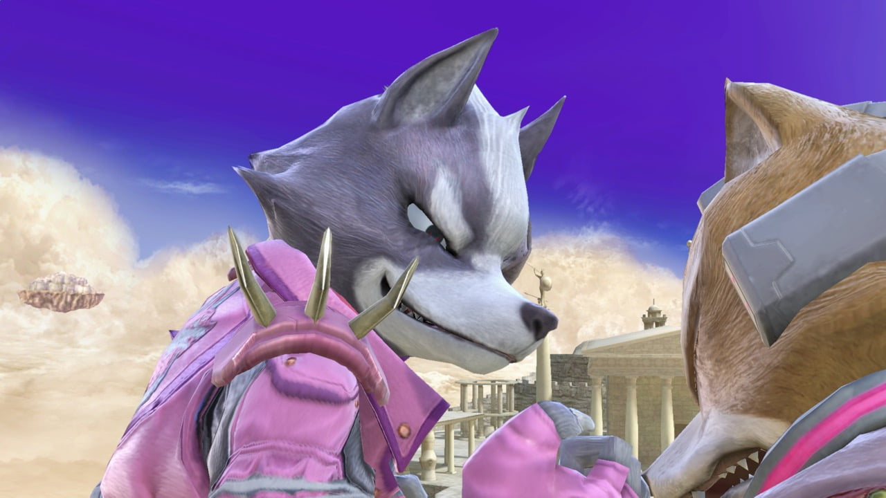
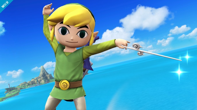
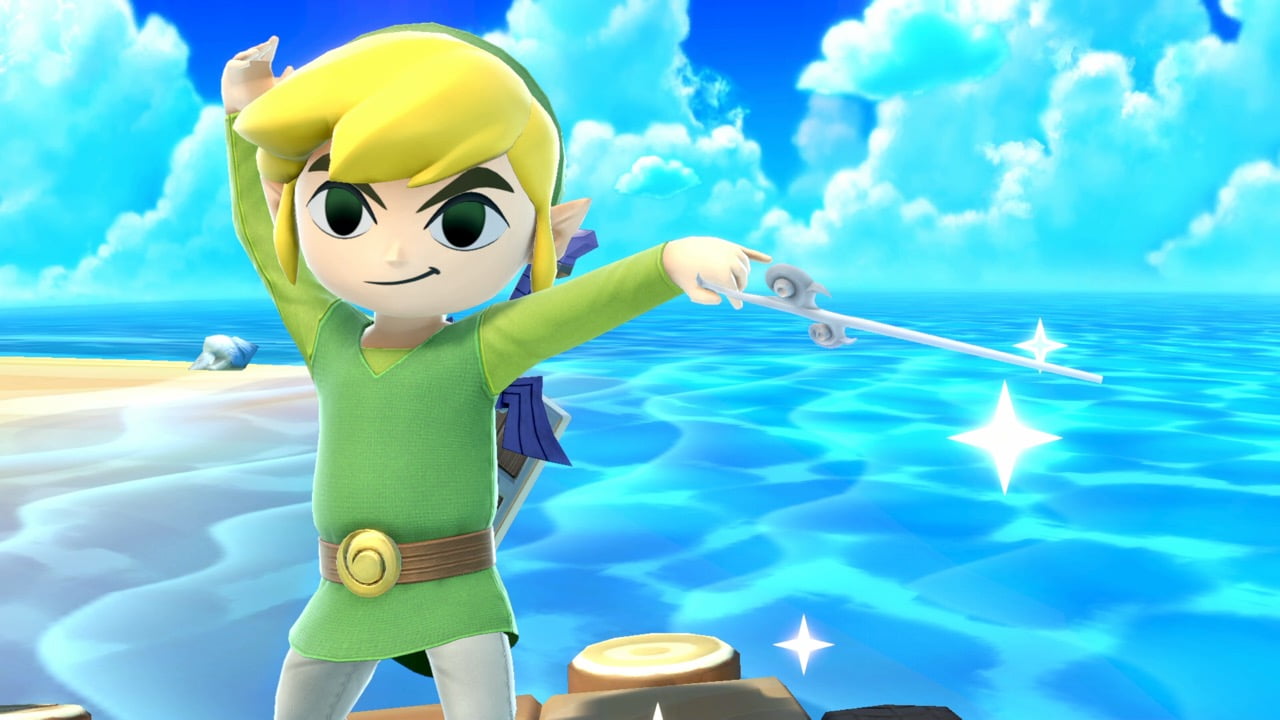
Many of you have noticed that the art style of Ultimate is quite different to Smash 4. I almost feel like its a mix between Smash 4´s and Brawls art style.
Personally, Im still on the fence about it, but I also thought Smash 4 was a remarkably good looking game in terms of art style. Either way, I really like how it looks, Im just not sure if I like it more or less than Smash 4 atm.
Some comparison images, what do you think?
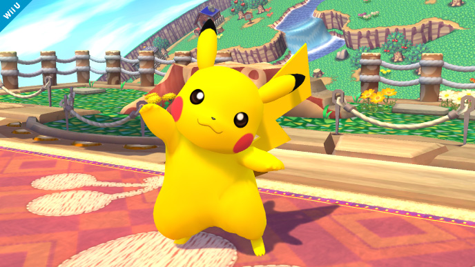
Smash 4:
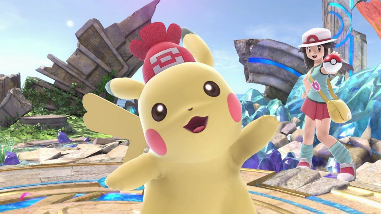
Ultimate:

Smash 4:
Ultimate:
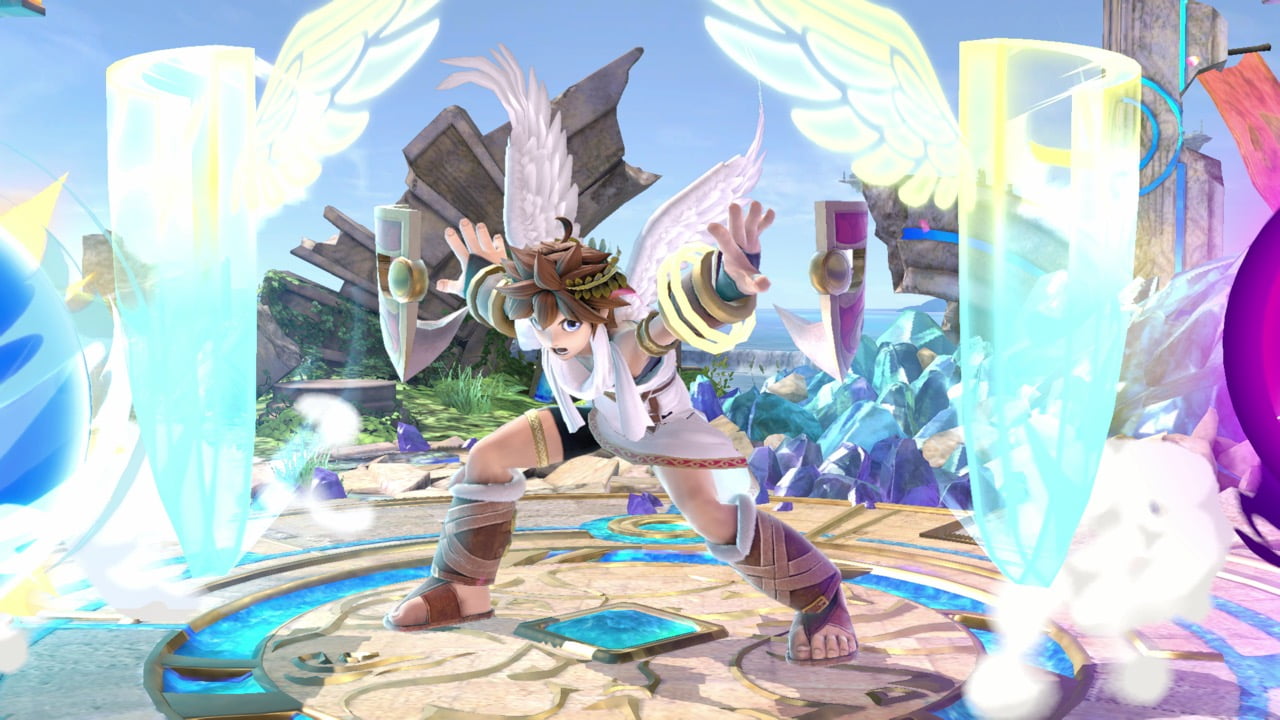
I really love the colors in the Smash 4, though I do have to say, in some instances Ultimate almost looks like CGI, its that good:
Personally, Im still on the fence about it, but I also thought Smash 4 was a remarkably good looking game in terms of art style. Either way, I really like how it looks, Im just not sure if I like it more or less than Smash 4 atm.
Some comparison images, what do you think?
Smash 4:
Ultimate:
Smash 4:
Ultimate:
I really love the colors in the Smash 4, though I do have to say, in some instances Ultimate almost looks like CGI, its that good:
Last edited:


")