finalark
SNORLAX
Link to original post: [drupal=1827]Video Game Box Art Comparisons [/drupal]
Ever notice how box art is changed when games are localized? Well, I got bored of Price of Persia today and I was thinking about this. With nothing to do, I decided to write a blog about it.
Shadow of The Colossus/Wanderer to Kyozo (JPN title)

The above is the US box art, which depicts the Wanderer mounted on Aro facing a massive colossus with what appears to be the temple off to the side. The US box art kind of gives you a glimpse at what the game's about, while keeping the air of mystery that's in the story.

In the Japanese box art we see the Wanderer charging at a smaller Colossus in a canyon. This box art really doesn't feel like it gives you the same sense of mystery that the US one does, but I'm really not sure which box art is more menacing. In the US box art the Colossus is huge, and takes almost the entire box. However, in the Japanese version the Colossus is hidden in shadow, keeping his identity a secret making it feel like you're facing the unknown. So I guess the Japanese box art does convey that mysterious feeling of the story.
Paper Mario: The Thousand Year Door/Paper Mario RPG (JPN title)

In the US box art we have Mario himself reading a map with various characters, both friendly and otherwise, in one big jumble behind him. In the background we have what looks like a section of the in-game world map blown up to be big enough to fit the box. The US box art kind of gives you an adventurous feel, along with cartoony fun.

Sorry for the quality, but that's the best I could find. Anyway, while the US box art has a calm and tame feel to it, the Japanese box art is piratically exploding in your face with a verity of characters and the tilted stage that you fight on in the background. Rather than looking exploratory adventurous like the US box art did, it looks more fantastic and mischievous.
Ratchet and Clank: Up Your Arsenal/Ratchet and Clank 3 (JPN title)
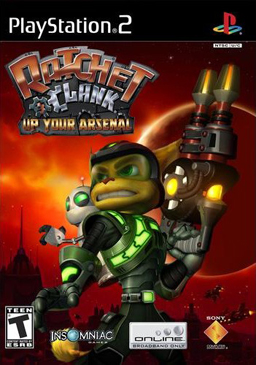
The US box art holds a really serious tone to it with all of the red in the background, along with the silhouette of a city, some kind of big-*** planet and a bunch of star ships. Even the heroes themselves look dead serious and ready for some intense action.

Well, here's two box arts that are like day and night. The Japanese box art throws all of the seriousness out the window and the main characters sky diving out of an aircraft with a few bots in the distance. Both the heroes have big, goofy exaggerated grins on their face and the Japanese box art is just so colorful and cartoony that you'd think they'd be two completely different games.
Well, that was entertaining. Perhaps I'll write a sequel in the future.
Ever notice how box art is changed when games are localized? Well, I got bored of Price of Persia today and I was thinking about this. With nothing to do, I decided to write a blog about it.
Shadow of The Colossus/Wanderer to Kyozo (JPN title)
The above is the US box art, which depicts the Wanderer mounted on Aro facing a massive colossus with what appears to be the temple off to the side. The US box art kind of gives you a glimpse at what the game's about, while keeping the air of mystery that's in the story.
In the Japanese box art we see the Wanderer charging at a smaller Colossus in a canyon. This box art really doesn't feel like it gives you the same sense of mystery that the US one does, but I'm really not sure which box art is more menacing. In the US box art the Colossus is huge, and takes almost the entire box. However, in the Japanese version the Colossus is hidden in shadow, keeping his identity a secret making it feel like you're facing the unknown. So I guess the Japanese box art does convey that mysterious feeling of the story.
Paper Mario: The Thousand Year Door/Paper Mario RPG (JPN title)
In the US box art we have Mario himself reading a map with various characters, both friendly and otherwise, in one big jumble behind him. In the background we have what looks like a section of the in-game world map blown up to be big enough to fit the box. The US box art kind of gives you an adventurous feel, along with cartoony fun.
Sorry for the quality, but that's the best I could find. Anyway, while the US box art has a calm and tame feel to it, the Japanese box art is piratically exploding in your face with a verity of characters and the tilted stage that you fight on in the background. Rather than looking exploratory adventurous like the US box art did, it looks more fantastic and mischievous.
Ratchet and Clank: Up Your Arsenal/Ratchet and Clank 3 (JPN title)
The US box art holds a really serious tone to it with all of the red in the background, along with the silhouette of a city, some kind of big-*** planet and a bunch of star ships. Even the heroes themselves look dead serious and ready for some intense action.
Well, here's two box arts that are like day and night. The Japanese box art throws all of the seriousness out the window and the main characters sky diving out of an aircraft with a few bots in the distance. Both the heroes have big, goofy exaggerated grins on their face and the Japanese box art is just so colorful and cartoony that you'd think they'd be two completely different games.
Well, that was entertaining. Perhaps I'll write a sequel in the future.