-
Welcome to Smashboards, the world's largest Super Smash Brothers community! Over 250,000 Smash Bros. fans from around the world have come to discuss these great games in over 19 million posts!
You are currently viewing our boards as a visitor. Click here to sign up right now and start on your path in the Smash community!
It appears that you are using ad block :'(
Hey, we get it. However this website is run by and for the community... and it needs ads in order to keep running.
Please disable your adblock on Smashboards, or go premium to hide all advertisements and this notice.
Alternatively, this ad may have just failed to load. Woops!
Please disable your adblock on Smashboards, or go premium to hide all advertisements and this notice.
Alternatively, this ad may have just failed to load. Woops!
The Super Smash Bros. Roster Maker (Version 11.0 available)
- Thread starter Jakor
- Start date
Skjoett96
Smash Rookie
- Joined
- Nov 16, 2015
- Messages
- 23
Thanks, I will probably use that Sora and Falco :-)
MeleeMario64
Smash Ace
I know that feel...
Now is not the time for "Oh Yeah"...
Now is the time for "Oh No"...
Planet Cool
Smash Ace
Does anyone have the Hyrule Warriors version of Skull Kid and Tingle?
EDIT: Can I get Sceptile from Pokken Tournament too?

(Couldn't find a solo render.)
Much appreciated!
EDIT: Can I get Sceptile from Pokken Tournament too?

(Couldn't find a solo render.)
Much appreciated!
Last edited:
The_Naraotor
Smash Ace
Can't find the Mewtow Icon made with the official Smash Bros Render and I search in all this topic 

TikiFan
Smash Journeyman
- Joined
- Jul 31, 2015
- Messages
- 437
I want an icon of Ridley in this render!
Attachments
-
661.1 KB Views: 255
-
658.6 KB Views: 231
AccordionChick
Smash Rookie
Can we please get these as Dojo icons, please?
Warzenschwein
Smash Journeyman
- Joined
- Mar 23, 2014
- Messages
- 331
BluePikmin11
Akko is my dear daughter!
Has there been a Cloud dojo icon yet, it's been a month, and looking through the pages, I haven't found it yet.
The_Naraotor
Smash Ace
Someone can reupload Mewtwo please I can't find it
SmashMaster1001
Smash Cadet
Icon Request:
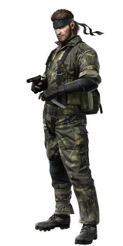
Snake
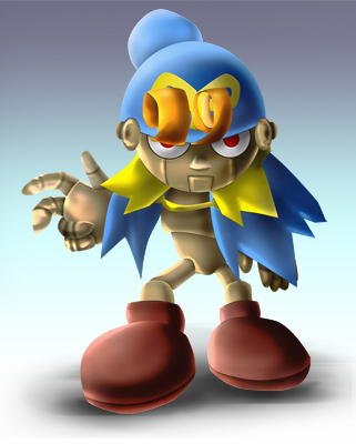
Geno
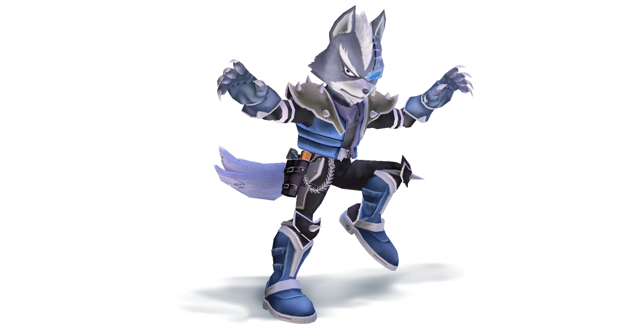
Wolf

Snake

Geno

Wolf
EdgeTheLucas
Smash Lord
- Joined
- Oct 2, 2013
- Messages
- 1,695
Reposting my request since it's a new page:
You know how the thread OP has links to blue and white templates for CSS icons?


Well, I saw some icons that looked cool with the name bar at double height.
credit to
Proceleon
Would anyone mind posting the templates for them like the blue and white templates, but with the names at double height? I'd love to redesign my own rosters with this sweet smexy roster design
Should someone do so I think it should be linked to the OP, I think it would go over well
Silvera
Jammin' Jammies
- Joined
- Feb 10, 2014
- Messages
- 4,745
- Location
- Silver's Era
- 3DS FC
- 4914-7114-2601
- Switch FC
- SW-2130-5650-7930
Punch-Out
Smash Cadet
- Joined
- Nov 28, 2014
- Messages
- 55
Punch-Out
Smash Cadet
- Joined
- Nov 28, 2014
- Messages
- 55
Has anyone done Squirtle and Ivysaur Icons based on these ? If not, Icons would be much appreciated.


I don't remember who made it
Last edited:
liamt4
Smash Rookie
- Joined
- Dec 17, 2015
- Messages
- 14
Thanks
The_Naraotor
Smash Ace
Yes Perfect thx manThe_Naraotor View attachment 87960 is this what you're looking for?
SmashMaster1001 View attachment 87961 someone made this a while ago, but I forgot who
Proceleon
Smash Journeyman
- Joined
- Oct 22, 2015
- Messages
- 463
- Location
- Yoshi's Island
- NNID
- Proceleon
- 3DS FC
- 2423-2553-2839
- Switch FC
- SW-6226-7752-8603
I noticed that the default way of organising characters, especially in the standard view, is a little confusing. If I want the regular Bowser Jr., for example, he's in the B section; however Paper Bowser Jr. would be down in P, so I changed it round.
![]() By adding specifications in parenthesis, the different versions of the characters appear next to each other. Samus and Zero Suit Samus appear next to each other if "Zero Suit Samus" instead reads "Samus (Zero Suit)" and so on. Here's an example with Charizard.
By adding specifications in parenthesis, the different versions of the characters appear next to each other. Samus and Zero Suit Samus appear next to each other if "Zero Suit Samus" instead reads "Samus (Zero Suit)" and so on. Here's an example with Charizard.
![]() The "Charizard (Pokken)" icon still says Charizard on it, but it's done so that a certain glitch doesn't happen. (When two versions of the same character icon, e.g. two Marios with SSBB and SSB4 artwork, are put in the same roster, they change to all be the same version when exported.)
The "Charizard (Pokken)" icon still says Charizard on it, but it's done so that a certain glitch doesn't happen. (When two versions of the same character icon, e.g. two Marios with SSBB and SSB4 artwork, are put in the same roster, they change to all be the same version when exported.)
![]() And here's one extra detailing Claus (Yes, I know I used Lucas' Alt render.) Just to get it across, Claus and Masked Man are the same person - we don't need to treat them as separate characters. Also, the "Claus & Masked Man" icon? Really?
And here's one extra detailing Claus (Yes, I know I used Lucas' Alt render.) Just to get it across, Claus and Masked Man are the same person - we don't need to treat them as separate characters. Also, the "Claus & Masked Man" icon? Really?
Again, not saying it's necessary, just sharing what changes I made to improve my overall interface.
E EdgeTheLucas I'm glad you like the icon design. I'm trying to remake every icon, minus stages and items, in this format. I just need a way to store them.
 Here's the template I'm using. I added some extra characters for those who use Greek letters (E-102) or gender symbols (Nidoran).


Again, not saying it's necessary, just sharing what changes I made to improve my overall interface.
E EdgeTheLucas I'm glad you like the icon design. I'm trying to remake every icon, minus stages and items, in this format. I just need a way to store them.

Last edited:
Nabbit The Rabbit '02
Smash Rookie
- Joined
- Dec 13, 2015
- Messages
- 7
- NNID
- bubsyinclaws
still no Bubsy icon?
EdgeTheLucas
Smash Lord
- Joined
- Oct 2, 2013
- Messages
- 1,695
Ah, that's great news. I'd love to see every icon recreated this way, so good luck on that massive undertaking.E EdgeTheLucas I'm glad you like the icon design. I'm trying to remake every icon, minus stages and items, in this format. I just need a way to store them.
Here's the template I'm using. I added some extra characters for those who use Greek letters (E-102) or gender symbols (Nidoran).
Also thanks for that template, I'm gonna remake my own icons too.
Geno Boost
Smash Master
This Geno please.
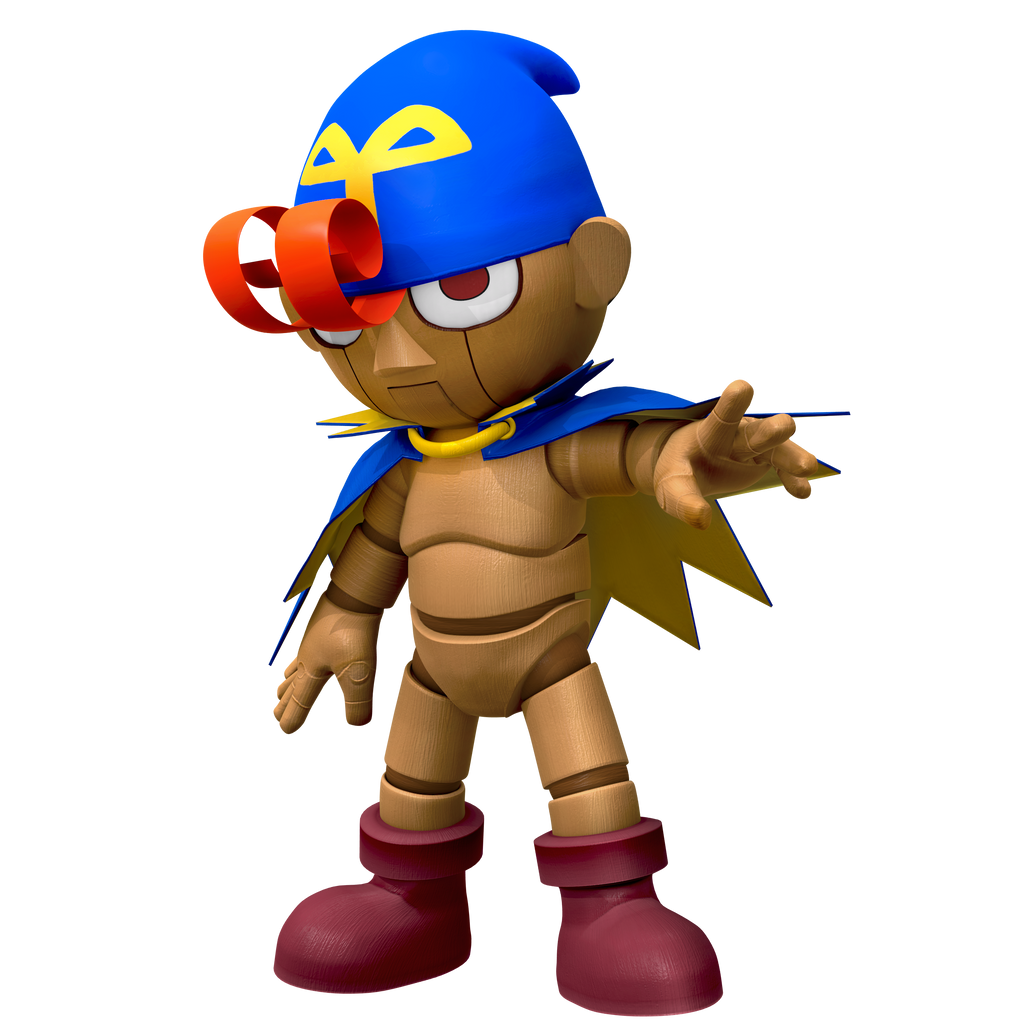

Last edited:
Chazman2000
Smash Journeyman
This Geno please.


Darkusdude327
Smash Rookie
- Joined
- Jun 26, 2015
- Messages
- 16
Last edited:
Pacack
Super Pac-Fan
- Joined
- Jun 7, 2013
- Messages
- 8,066
- Location
- US (Mountain Time, -7 Hours)
- NNID
- Pacack
- 3DS FC
- 0688-5284-6845
Also...

Silvera
Jammin' Jammies
- Joined
- Feb 10, 2014
- Messages
- 4,745
- Location
- Silver's Era
- 3DS FC
- 4914-7114-2601
- Switch FC
- SW-2130-5650-7930
Just post the link to the image. Also, no double posting.Ok how come every time I insert a picture's link it never shows up correctly?!
Dedede Fan!!!
Smash Cadet
I'll do it!Ok so I have quite the request friends. I can't figure out how the roster maker program works completely (adding new icons and such), so I figured I could ask a kind fellow here to be so friendly to do the work of making my roster v2. for me (believe me I tried myself). Here is a roster I made with the icons already in the program, but as you know many of these icons just sticks out and looks out of place, so I would love if any of you would help "fixing" the roster for me. After the picture of my original version below, there are a few instructions on how exactly I would like this to be done.
![]()
Instructions:
Well that was all my friends. Yes a very long request, and it would be easier if I wasn't such a tard with this program, but oh well. I understand if noone of you are up for the task, but if someone can make this for me I would be forever grateful.
- Every character icon needs to be exactly where they are now, in the same row and order.
- I would prefer if all the characters that have "Smashified" renders have those, and those who don't have one could then just get another good 3d render of them (I assume though that you can't find icons of most/all of the characters here somewhere on this thread).
- Wario's icon should be in his classic outfit (the yellow), instead of the biker outfit.
- Characters such as Roy and Ryu who are in the Sm4sh now, should just have their icons as they appear in Sm4sh.
- See the 2 "random" icons? One of them is just a placeholder for a "search" icon (an idea of mine), where it's basically like you can put your cursor there and then a search bar will pop up and then you can find every character (included alternative costumes). Obviously it's not supposed to say "Random" then, so if you could just insert a picture of a cartoony-ish magnifying glass (something that fits in with the style and doesn't stick out) and a text saying "SEARCH" underneath in the text bar, that would be neat. The "Random" icon besides the Mii fighters is just the regular random icon as it is, but if you could replace it with the random icon as it appears in Smash 4 that would be great.
- The background color of each icon needs to be the blue-ish it already is on most of them.
- You don't have to make your version of the roster with colored borders, but if you want to or even would make a version both with color borders and one without, it would be great (if so then exactly the same colors as in the above picture).
EDIT: Woops! I didn't see that someone did it already!
Double Edit: Here it is anyway:
Last edited:
Proceleon
Smash Journeyman
- Joined
- Oct 22, 2015
- Messages
- 463
- Location
- Yoshi's Island
- NNID
- Proceleon
- 3DS FC
- 2423-2553-2839
- Switch FC
- SW-6226-7752-8603
Would I be allowed to save my icon archive on this thread like Cobalsh did? It just seems like the most appropriate place.
Darkusdude327
Smash Rookie
- Joined
- Jun 26, 2015
- Messages
- 16
Thanks! That was fast!


&h=300&w=300&tbnid=qGaDTy52SExMEM:&docid=BwwlwJkdrPgWKM&ei=z7VwVv3HF4jVjgT05ILADg&tbm=isch&ved=0ahUKEwi9686Rld_JAhWIqoMKHXSyAOgQMwgxKAAwAA)


&h=512&w=562&tbnid=l6BafjhPIf3VbM:&docid=XUCI_ElKtmgrnM&ei=ZrlwVuv7JeuNjgT7zIKwDA&tbm=isch&ved=0ahUKEwjrxvjHmN_JAhXrhoMKHXumAMYQMwgdKAEwAQ)


