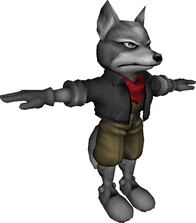
I'm sorry my friend, but he doesn't fit the standards. Here are some comparisons that should be helpful for anyone here making content for Smash 3C.
Here is the original texture for Nanobuds' Shadow the Hedgehog on BrawlVault.
The model and textures were from Sonic Generations, just like Smash 3's Sonic. However, the texture isn't straight from that game.
This is the original texture from Sonic Generations. Note the lack of heavy detailing here. Nanobuds edited this so that the textures were more on par with Brawl's detailing. The detailing in Sonic Generations didn't have to be applied to the texture because those effects came from secondary lighting textures that wouldn't be in Brawl. However, you can still see the curve in Shadow's body and how color is applied. There is still shading here, with different parts being slightly darker than others. Sega knew what they were doing here.
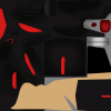
This is your work, @
 ProjectBrawl7
.
Now, when I look at this, I don't see the detailed shading that was on the previous textures, nor the clean separation between the black fur and his red stripes. The center of his muzzle is lighter than the rest of it. Otherwise everything here is too intense and saturated. While you may have worked hard, I feel that this is not close to the standards set by the Smash 3 Project.
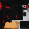
As a comparison, here are the textures from their own recolor of Sonic with black fur, a subtle reference to Shadow.
Look at how drastically different this is from your attempt, ignoring the textures for his beige arms and belly (Shadow's arms and chest are furred). Unlike your texture, it's not just one color! You can see the shaded regions. The color tone here is nice, and not too saturated. This is true quality, and while it may be daunting, this is something we'd be going for.
You may argue that this comparison isn't fair, because Shadow and Sonic don't have the exact same textures. However, a good friend of mine - @
 Aghanim
- actually did attempt to work on Shadow awhile ago before being preoccupied with other projects. Here is his work.
Note how you can see the shading here. The lighting on the muzzle is evenly distributed, without one light bright part. It's not terribly saturated, or at least not as much as your texture. It's not perfect, for Aghanim was unable to continue work on Shadow, but even now his quality is much closer to Smash 3 than your work was.


