Zodiak-Lucien
Smash Lord
http://usuarios.lycos.es/cardgallery/cards_blue.htm
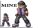
just look at all those, and at such high quality too. There is a good number of nintendo characters there also. This guy's sprite work is some of the best I have ever seen. His deviantart can be seen here, though none of the excellant cards are there. http://abysswolf.deviantart.com/
just look at all those, and at such high quality too. There is a good number of nintendo characters there also. This guy's sprite work is some of the best I have ever seen. His deviantart can be seen here, though none of the excellant cards are there. http://abysswolf.deviantart.com/
 its still pretty **** awsome