• Welcome to Smashboards, the world's largest Super Smash Brothers community! Over 250,000 Smash Bros. fans from around the world have come to discuss these great games in over 19 million posts!

    You are currently viewing our boards as a visitor. Click here to sign up right now and start on your path in the Smash community!

Stages by splat

splat

Smash Lord
Joined
Oct 28, 2006
Messages
1,169
Location
The Netherlands
Hi.

Again, I'm trying to pick up stagebuilding (this time it's the Roy HYPE that's got me going again). I've decided to pick re-attempt the following:

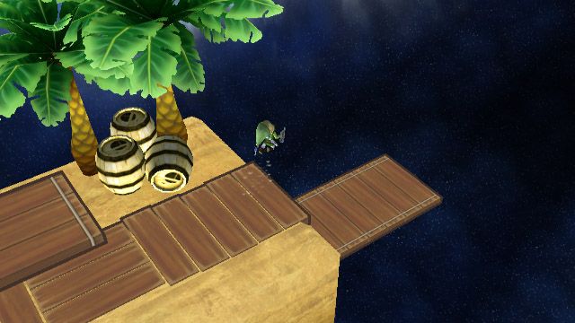
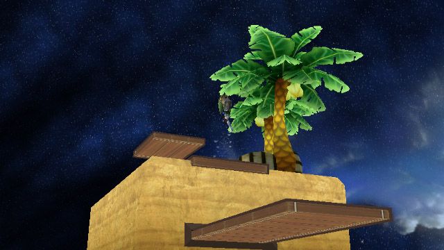
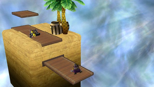
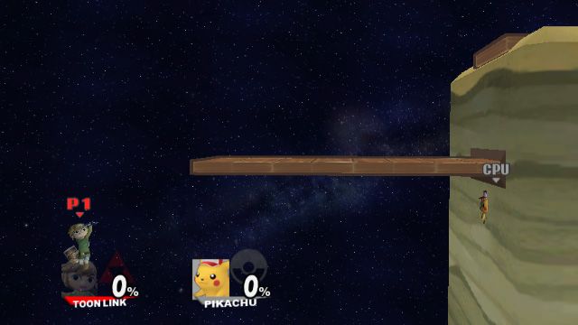
It's supposed to be Rice Beach, a proper Wario Land stage, referencing how Project M's Wario is more in tune with Wario Land than with WarioWare. The back part (where I envision a couple of Barrels, like in the original Rice Beach) is still a bit wonky, I'm struggling a bit to make the elevated part seen natural.
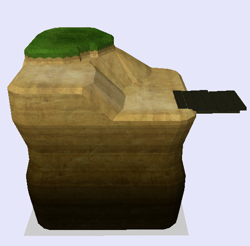
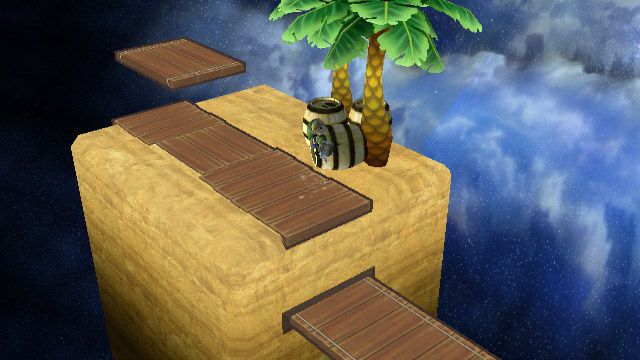
This time around, though, I decided to do something completely different. Instead of going for some sort of high definition version of a normally pixelled environiment, I'm opting for something simpler, more cartoony and true to the WarioLand series. The main stage is pretty much a square, like the platforms in the original Rice Beach stages, which are covered by wooden boardwalks that are accentuated by a thick, active border (which is a nod to both the WarioLand games and the upcoming Smash 3DS game).

Now, design-wise, I am a tad stuck - so I've decided to give you guys a first peek at what I've been doing. Pardon the textures, they are not done (nowhere near). The background and lightning are also still FD's, no water at the bottom, the lower platform isn't moving, boundaries and camera aren't set yet.. There's still a heap to be done, let's keep it at that.


Yes, the above three images are the same moment, different angles. As you can see, the borders of the parts you battle on move along with the camera, so I'm pretty happy with that.
What I'm not so happy with, though, is the empty parts in the back of the main stage, behind the platform.

Any thoughts on what I could add there to make it look less empty? Ideas would be nice.
Also: this is a picture I just took that I couldn't not share.


Sluigi123

R64/Brawl- Dev; AI Coder; Balancer
Joined
Jan 18, 2011
Messages
365
Location
Bowling Green, Ohio, USA
NNID
Sluigi123
How about a hill to make it look like the floating platform is attached to the background, and maybe add a tree, and maybe a crate or two on top of the hill.
 

Nausicaa

Smash Lord
Joined
Mar 7, 2013
Messages
1,485
Location
Here

This would be my suggestion.
The EASY way of doing this, would be making 2 more SQUARES. 1st angled 45 degrees, and a 2nd attached to it.
Move the RIGHT JUTTING OUT PLATFORM graphic to fit into the side of the 2nd platform.
On the ANGLED platform, either use the BOARDWALK graphic of the far RIGHT, or far LEFT, from the MAIN platform.

This will add a lot to the game-play flow, as right now it wouldn't be very smooth, and it would give it more dynamics.
This would add some ascetic flavor with the angles, along with another 'main' platform square (2) to texture uniquely.

I was happy you went with a Platform layout on Bowser's Castle that I suggested, so you're smart enough to understand these things, and cooperative with the community at that. Good combo, so I figured I'd suggest something for this too. This is the best thing I can think of, so hope it helps/you can take some ideas from it and make another awesome stage work!

Good to have you back.

PAINT!


Edit: The 2nd flat MAIN platform can jut-out to the back (the new one on the far right), to give it some depth visually too.
With a couple trees and a little pond added... would be super pretty, yet simple.

Keeping in non-symmetrical is ideal too. (lower than the MAIN platform [because the platform is lower on the right side] + ending earlier on the left than the main platform [behind the stage, so tree-tops or something can only be seen over it, or a little hut or something])

TOP VIEW PAINT!!!
 

splat

Smash Lord
Joined
Oct 28, 2006
Messages
1,169
Location
The Netherlands
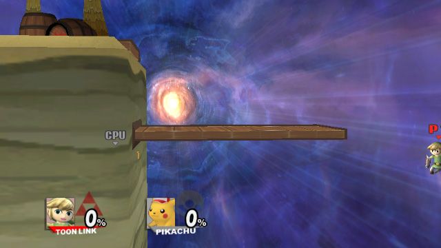
Thanks for the input guys - Nausicaa especially, you seem to have been putting quite some thought in your post, on how to counter a infinite wall combo. I did so too when planning the layout; the bottom platform is supposed to move through the stage, moving from right to left and back. Like so (the images display a crummy error in the collisions, though (also, Pikachu is in the main stage because I haven't changed spawning points yet)):
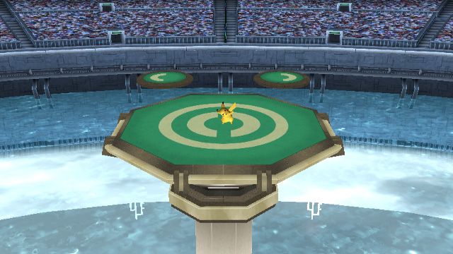
I liked the idea of platforms moving in from the wall in a constant motion - combined with the asymmetrical single platform it'd take some thinking about positioning during battle, I figured. I can still change this if too many people feel it wouldn't work, but I personally think it's pretty nice.
 

B.W.

Smash Champion
Joined
Apr 27, 2006
Messages
2,141
Location
Darien, IL
Like the platform from the Mario Bros. stage in SSB64.

I thought that's what it was supposed to do to begin with. I like it.
 

Raccoon Chuck

Smash Lord
Joined
Feb 2, 2013
Messages
1,194
Location
Chico, California
3DS FC
3437-3568-6776
You know, I think it would be pretty sweet to see a proper tourney legal Fire Emblem stage. I know you're probably busy, but do you think it's something you'd be up for?
It could be based on the Colosseum battles, Arena Ferox, yada yada. Just to name a few good settings.
Edit: Plus, although I'm relatively new to the series, those games have more than their fare share of cool non arena like settings. I'd even go for the Midmire just so I can have an excuse to flashback and put "Don't mock my sisters words!", over it.
 

Nausicaa

Smash Lord
Joined
Mar 7, 2013
Messages
1,485
Location
Here
(also, Pikachu is in the main stage because I haven't changed spawning points yet)):

I'm not sure if it's been fixed for 2.6, but even after pointing it out in 2.1, I could get in multiple stages with Pikachu in 2.5. The easiest was YS:Melee.
So fun. Up-B is messed up. Spawn-points being weird just skips that step. haha

Good stuff with the platform moving, though if that's the case, you still might want to slope it down to that height anyway. It's not so much the wall infinite thing that should be of concern (they made most things regarding that impossible to abuse in PM anyway), but rather the actual game-flow that separate degrees in height on main platforms interrupts. Like the ledge in Hyrule: 64, there's an entire phase of camping/odd position based meta-game that develops around something like that, and an experiential nuance like that adds a lot, but takes a lot away from the actual game-play, turning it into more of a silly trait than anything. Basically, things that interrupt play too directly (hazards/platforms that are way off stage/stage size {Picto/YS64 Clouds/Temple: M}, go from 'Cool dynamics in the stage' to 'Gimmicks. 2 layers to a stage is REALLY difficult to make NOT gimmicky. The height difference, timing of how long it lasts (in this stages case), area coverage both on the upper and lower floors.
tl;dr, make it sloped downwards on BOTH sides to reach the moving platform, and it shouldn't interrupt game-flow in a way that hinders game-play. Even sharp jagged slopes so they cover as little room as possible. (Example: Removing DD/WD game from edge-game, is not going to fly with any competition-worthy meta-game)
 

splat

Smash Lord
Joined
Oct 28, 2006
Messages
1,169
Location
The Netherlands

Pikachu, where have you gone to this time?​
Oh, you cheeky little mouse. You aren't even allowed to go there!​
WIP, obviously.​
 

uCooL

Smash Ace
Joined
Jan 2, 2013
Messages
747
Location
Manteca, California
NNID
SuperMurio

Pikachu, where have you gone to this time?​
Oh, you cheeky little mouse. You aren't even allowed to go there!​
WIP, obviously.​
Keep the stage small! its something different that we don't really have right now. (tiny stage battles)
 

splat

Smash Lord
Joined
Oct 28, 2006
Messages
1,169
Location
The Netherlands
I cant wait for the two latest preview stages you just posted!
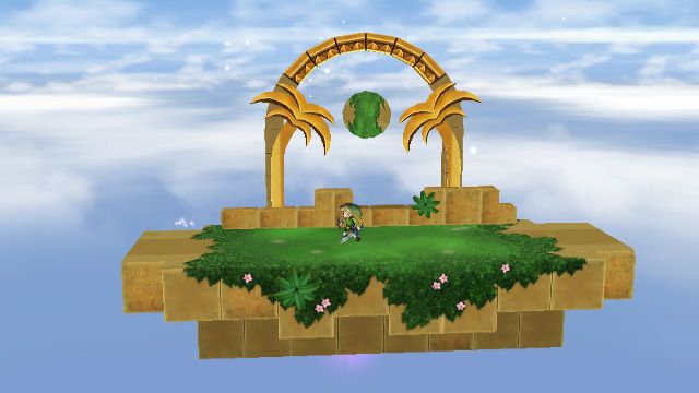
Good to hear, I hope I can release them in due time. The Rice Beach stage, though, will receive a bunch of changes. I've been speaking with Nausicaa, who explained why the current layout wouldn't work in the P:M environment.

But if you enjoyed the latest two previews, you might also the following screenshot:


I know I should've made a screen with Donkey & Diddy as opposed to Toon Link, but I can't resist making shots of my custom (also unfinished) Toon Link.

Now, it may look like it's fairly far along, there's still a heap to be done before I can release it:
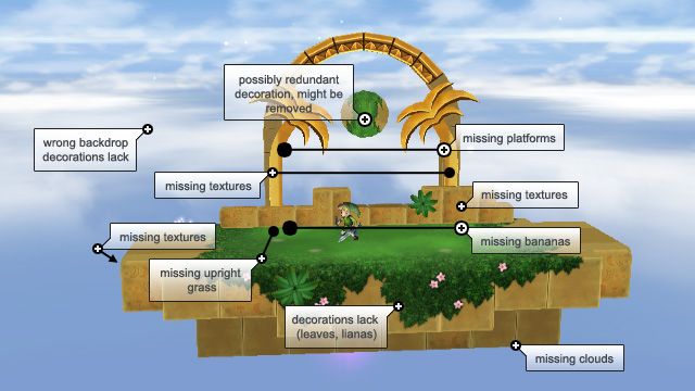

And then there's the usual camera, lights and shadows to be done.​


Keep the stage small! its something different that we don't really have right now. (tiny stage battles)
The stage will not get any bit bigger. If any, it'll shrink in size a bit, but I think it's a pretty decent size now.
It's called Pokémon Stadium: Little Cup, so a small size is pretty necessary from a concept point-of-view.
 

uCooL

Smash Ace
Joined
Jan 2, 2013
Messages
747
Location
Manteca, California
NNID
SuperMurio
Good to hear, I hope I can release them in due time. The Rice Beach stage, though, will receive a bunch of changes. I've been speaking with Nausicaa, who explained why the current layout wouldn't work in the P:M environment.

But if you enjoyed the latest two previews, you might also the following screenshot:


I know I should've made a screen with Donkey & Diddy as opposed to Toon Link, but I can't resist making shots of my custom (also unfinished) Toon Link.

Now, it may look like it's fairly far along, there's still a heap to be done before I can release it:


And then there's the usual camera, lights and shadows to be done.​


The stage will not get any bit bigger. If any, it'll shrink in size a bit, but I think it's a pretty decent size now.
It's called Pokémon Stadium: Little Cup, so a small size is pretty necessary from a concept point-of-view.
Yes make lil cup even a lil smaller! and dude that preview u just posted is sick as well! stop teasing everyone with these!
 

splat

Smash Lord
Joined
Oct 28, 2006
Messages
1,169
Location
The Netherlands
Yes make lil cup even a lil smaller! and dude that preview u just posted is sick as well! stop teasing everyone with these!

I don't think I'll make it any smaller. As it stands, I think it's even a tad smaller than Metal Cavern, which can feel pretty cramped already.

Also, thanks!
As for the teasers: I'd rather show people what I'm doing every now and then, so they can give me feedback; it's easier to change things early on than having to change them when you think you've got everything done.
 

uCooL

Smash Ace
Joined
Jan 2, 2013
Messages
747
Location
Manteca, California
NNID
SuperMurio
I don't think I'll make it any smaller. As it stands, I think it's even a tad smaller than Metal Cavern, which can feel pretty cramped already.

Also, thanks!
As for the teasers: I'd rather show people what I'm doing every now and then, so they can give me feedback; it's easier to change things early on than having to change them when you think you've got everything done.
Good point about the smallness, and ya i was just kidding around about the teasing stuff. Those stages all look great man i cant wait to play them.

EDIT: if you ever need a tester...i am here.
 

Tuvillo

Smash Apprentice
Joined
Oct 2, 2008
Messages
120
Location
Netherlands
My game froze on Bowser's Castle 1.0 (The one currently in the opening post)

It was my Wolf vs level 9 Lucario, both the unedited PM original colors. No idea what caused it, as it happened after we had both lost several Stock already.
 

uCooL

Smash Ace
Joined
Jan 2, 2013
Messages
747
Location
Manteca, California
NNID
SuperMurio
My game froze on Bowser's Castle 1.0 (The one currently in the opening post)

It was my Wolf vs level 9 Lucario, both the unedited PM original colors. No idea what caused it, as it happened after we had both lost several Stock already.
You mentally willed the Wii to freeze up because you were about to lose.
 

splat

Smash Lord
Joined
Oct 28, 2006
Messages
1,169
Location
The Netherlands
My game froze on Bowser's Castle 1.0 (The one currently in the opening post)

It was my Wolf vs level 9 Lucario, both the unedited PM original colors. No idea what caused it, as it happened after we had both lost several Stock already.
I have no idea what causes your game to freeze - it's the first time I've heard of something like it.

Bowser's Castle has a lot of issues though, and I'm not sure on how to fix them. There may be a more stable version of the stage posted in this thread somewhere - but honestly, I lost track of it a bit.


So you're still going to put in the platform that moves up and down on both ends and travels horizontally above the median like you said previously right?
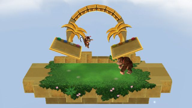
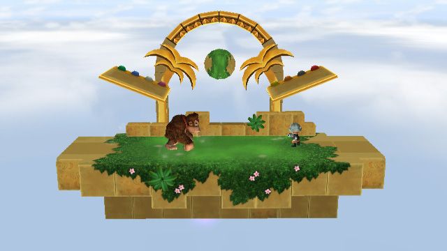
I don't think I ever said I'd do that particular layout, as far as I'm aware it was a suggestion by hotdogturtle that many people liked.
As I'm still learning on animating collisions (which is the reason my attention swapped away from RB and PSLC at the moment), that particular platform setup is out of my reach for now. By suggestion of Nausicaa (or my interpretation thereof) I'm currently testing a layout with two platforms with an inward slant:


It's a bit iffy right now, I think; there's very little room to breathe. Again, pay no attention to the textures - many of them are missing still.

EDIT: Do note that I too liked the suggestion hotdogturtle made - and once I really understand animations I'll try to deliver a stage that uses said suggestion.
 

Nausicaa

Smash Lord
Joined
Mar 7, 2013
Messages
1,485
Location
Here
Raise the platforms to be snug against the bottom of the palm trees, and it should be fine.
If that's too ascetically unappealing, move the platforms up and away from each other at the angle they already are (no change in position/angle, just moved away at that angle and they'll naturally rise a bit to give room).
In other words, make the lowest part of the platforms where they're touching the tree stumps, that should give them more height without changing their design/playfulness.

For PSLL, MC slopes which is its saving grace, as the slope gives more room to play naturally. If this is already pushing smallness, it may be best to make each of the platforms a little larger. Stretch them to the middle of the stage. This will make tech-chasing and platform use a lot more dynamic/less mindless (a platform that isn't even a 'Roll' length is already pretty limiting in function, and given it's a small stage, the platforms are a major part, so having them too small is about as harmful a thing that could happen for the stage). It would be good if there was a smaller gap between them than their own size, by the looks of it. Basically have them cover around 2/3rds of the stage if combined, with a 1/2 size gap between them, using the same distance from the ledge as they are in the picture as an outside edge.

Just some more thoughts. Sexy platforms in Golden Temple btw. Those are hawt like Strawberries. haha
 

Shun_one

Smash Ace
Joined
Jan 2, 2013
Messages
910
Location
Addison, IL
NNID
not_shun_one
Glad to see this stage is still progressing.

If you're looking for breathing room, perhaps moving the plat-forms further apart?
 

splat

Smash Lord
Joined
Oct 28, 2006
Messages
1,169
Location
The Netherlands
How's this for the platforms, guys? I moved both platforms outwards by 10, eh.. whatever unit BrawlBox uses, and up by 5 (also back by 2 - so that the characters are standing in the middle of the rock part, instead of almost touching the Rare Orbs - but that's not really relevant). Moving them up more so they're at the palm top height just didn't look right to me. What do you think?


Nausicaa

Smash Lord
Joined
Mar 7, 2013
Messages
1,485
Location
Here
Looks great, can't wait to play it! :D

It also looks like you did what we were talking about, whether you meant to or not. lol
Raise the platforms to be snug against the bottom of the palm trees, and it should be fine.
If that's too ascetically unappealing, move the platforms up and away from each other at the angle they already are (no change in position/angle, just moved away at that angle and they'll naturally rise a bit to give room).
In other words, make the lowest part of the platforms where they're touching the tree stumps, that should give them more height without changing their design/playfulness.
 

Tuvillo

Smash Apprentice
Joined
Oct 2, 2008
Messages
120
Location
Netherlands
That stage looks quite fun and original, both concept and layout.

Also, I froze on Bowser Castle again and I have no idea why. It froze exactly when I died... Maybe I'll just re-download and see if it happens again.
 

uCooL

Smash Ace
Joined
Jan 2, 2013
Messages
747
Location
Manteca, California
NNID
SuperMurio
How's this for the platforms, guys? I moved both platforms outwards by 10, eh.. whatever unit BrawlBox uses, and up by 5 (also back by 2 - so that the characters are standing in the middle of the rock part, instead of almost touching the Rare Orbs - but that's not really relevant). Moving them up more so they're at the palm top height just didn't look right to me. What do you think?

Looks really good man, this made me splat my pants.
 

Fortress

Smash Master
Joined
Oct 2, 2013
Messages
3,097
Location
Kalispell, MT
How's this for the platforms, guys? I moved both platforms outwards by 10, eh.. whatever unit BrawlBox uses, and up by 5 (also back by 2 - so that the characters are standing in the middle of the rock part, instead of almost touching the Rare Orbs - but that's not really relevant). Moving them up more so they're at the palm top height just didn't look right to me. What do you think?

Looks super-duper slick, to me. How close were the side blast lines, again? The stage struck me as one that would have blast lines slightly closer than Battlefield's for some reason.
 

Sluigi123

R64/Brawl- Dev; AI Coder; Balancer
Joined
Jan 18, 2011
Messages
365
Location
Bowling Green, Ohio, USA
NNID
Sluigi123
I'd say lower the platforms from where they're at right now by 2.5 Brawl Units, cause it looks like most characters need to double jump up to the lower side of the platforms, IMO.
 

Nausicaa

Smash Lord
Joined
Mar 7, 2013
Messages
1,485
Location
Here
He's alive and kicking, just not kicking much because he needs hype to do anything...
^educated assumptions ;)

GET YOUR STUFF DONE SPLAT, or you fave character will be released by surprise and you won't have time even when you're hyped. :D
 

splat

Smash Lord
Joined
Oct 28, 2006
Messages
1,169
Location
The Netherlands
so splat are u still alive?
Yes, I am. Just been playing the hell out of Pokemon X, so I haven't had that much time to work on stages.

GET YOUR STUFF DONE SPLAT, or you fave character will be released by surprise and you won't have time even when you're hyped. :D
You make it sound like you know something we don't. Are they really working on Professor E. Gadd? Pianta? Vigoroth? Masked Man?
 

uCooL

Smash Ace
Joined
Jan 2, 2013
Messages
747
Location
Manteca, California
NNID
SuperMurio
Yes, I am. Just been playing the hell out of Pokemon X, so I haven't had that much time to work on stages.


You make it sound like you know something we don't. Are they really working on Professor E. Gadd? Pianta? Vigoroth? Masked Man?
I heard you can't get bidoofs mega evolution unless you finish your stages though, uh oh huh?
 
Top Bottom