reothepenguin
Smash Journeyman
Zink...............................Your calculations seem to be...................incorrect.

Welcome to Smashboards, the world's largest Super Smash Brothers community! Over 250,000 Smash Bros. fans from around the world have come to discuss these great games in over 19 million posts!
You are currently viewing our boards as a visitor. Click here to sign up right now and start on your path in the Smash community!
wow this is the most monotonous opinion ever, please use commas...wow, this is the worst ike clan ever
brawl fc is different from Wii fc, anyway.im gonna get my friend to join this guild and how do you find out what your friend code is.
( Got the wii today)
it was said about 5 pages back, as well as in the front page of the blood for blood clan's updatesOkay thanks, and when are we gonna own RoK's clan, and I heard it is a team battle.
Yes, yes I must. It is my job to gib anyone who "tAwk lYke diS"Must you always correct everyone enshoku?
Not to mention real-life now = =Yes, yes I must. It is my job to gib anyone who "tAwk lYke diS"
Besides, I'm not trying to be mean when doing it, just trying to stop the internet's language from degenerating through the hells of the myspace, youtube, and AIM speak...
...mmm I might be able to make something like that. I just have way too much freetime on my hands right now that I can make what sig Zink is suggesting out of boredom.Zink:
Zar, we need an official clan sig. I have an idea, but I'm no good at making them...
here's the idea: white/gray background. on the right, the same picture you have of Ike's head, but resized so the whole face fits. Then on the leftd:
Guns don't kill people...
IKE kills people.
Deus de Animus
only with some better fonts.
this is why myspace either needs an intarweb literacy test to join, or an age requirement... thank satan I'm home schooled...Not to mention real-life now = =


Awesome!!!I don't mean to tread on anybody's turf- I just got bored.
Keep your sig reo, its awesome! ^_^Wait, so are we all supposed to use that sig?
Hey, man, that's Epic. What program do you use?GREAT AETHER!
Wow, Torchick did those? Didn't know that.Okay good, cause torchik did a great job with this sig and I didn't want to change it. Those are cool though. ^_^
I may try my hand at one tomorrow. Photoshop though.Ehehe, awwww, thanks you guys! ^_^' I like the new banner also! It's gonna be weird seeing everyone have it...I like my unique sig, hehe...
sexy, although both the leftmost pattern, and bottom right corner of the signature appear unevenly blended. The font is clear, and would be perfect if bordered in a dark color to draw attention to it. I also think the right pattern intrudes a bit on the look of the image by partially covering Ike's face. 7.5/10I don't mean to tread on anybody's turf- I just got bored.
the "Ike kills people" font is great, but the other two look a bit plain. The render looks amazing and precisely cut, as does it's back drop. The background is sexy, and does it's job without attracting too much attention. Moving the render to the left 10-20 pixels wouldn't hurt either... 8.9/10GREAT AETHER!
Wow, Torchick did those? Didn't know that.

What do you mean, unevenly blended? As in, the pattern is too visible on one side and not on the other? or that there is more pattern on the left than the right?both the leftmost pattern, and bottom right corner of the signature appear unevenly blended.
Man, I wish I had you around on projects that mattered. I can never get people to be brash about my art. I think I'll fix these things and re-submit this one, but I think I'll do another I'll put more time into.The font is clear, and would be perfect if bordered in a dark color to draw attention to it. I also think the right pattern intrudes a bit on the look of the image by partially covering Ike's face.
Nice. CS2 here. Really nice changes, btw. As soon as I saw yours, I wished I had spent more time on mine, lol.To Idfection:
I'm using Photoshop CS3
Nah, I just don't have a life sometimes lolNice. CS2 here. Really nice changes, btw. As soon as I saw yours, I wished I had spent more time on mine, lol.
yes, that is godly-esque. There is still something about the text but I can't put my finger on it, it's very sexy nonethelessTo Idfection:
I'm using Photoshop CS3
To Enshoku:
I took your advice and did some modifying.

it's my job to be brash about things, just like it's torchik's job to tell me to stop being so critical.What do you mean, unevenly blended? As in, the pattern is too visible on one side and not on the other? or that there is more pattern on the left than the right?
Man, I wish I had you around on projects that mattered. I can never get people to be brash about my art. I think I'll fix these things and re-submit this one, but I think I'll do another I'll put more time into.
Anyone got any more ideas? I don't feel like drawing Chuck, sorry Zink, lol.
Nice. CS2 here. Really nice changes, btw. As soon as I saw yours, I wished I had spent more time on mine, lol.
By blended I meant that the two aforementioned parts are noticeably blurred, compare Ike left eye to his right...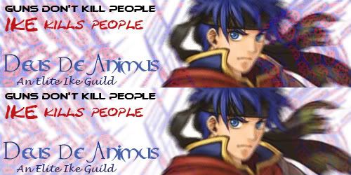
That wasn't nit-picking, saying that sentences don't start with AND is nit-picking... now all of you GET OUT OF MY GUILD THREAD RIGHT NOW!And Shoki, I WOULD tell you to stop nit-picking on their sigs, but you gave them credit, so I'll let ya go. This time... >_>