• Welcome to Smashboards, the world's largest Super Smash Brothers community! Over 250,000 Smash Bros. fans from around the world have come to discuss these great games in over 19 million posts!

    You are currently viewing our boards as a visitor. Click here to sign up right now and start on your path in the Smash community!

Gfx Ranking Thread

Status
Not open for further replies.

Gflare

Smash Journeyman
Joined
Jul 6, 2008
Messages
433
Current Rankers:
Gflare, Black Waltz and Sgt. Wikez.


I bet most of the designers here wonder what rank they´re currently in. That´s what we´re supposed to do in this thread, you give us 5-7 of your best pieces and we will rank you in one of 6 ranks along with a detailed description of what you should work on/what you have accomplished. There can also be variations such as low or high. Since some people don´t really know about this ranking system, I´ll explain it now.

Ya see, the popular way to rank people based on their skill in gfx boards nowadays is placing them in the following "tiers"(of course, there´s a description of each one):

Beginner
Lowest tier, but then again, you´re not necessarily bad. The rise from beginner to novice shouldn´t take TOO long, as following a few tutorials should teach you basic composition and effects. Most early beginner work is very vague, messy and/or missing most of the basic design components.

Novice
Tis getting there, but still missing some of the design components(Flow, composition, depth, etc.) and doesn´t show that "oomph" you usually get with higher level tags. Possibly some silly mistakes keep you here. Trust me, the leap from novice to moderate is a very hard, annoying one.

Moderate
Looking good, you got most key components down. Your work is impressive, and most tags moderate or above are to be congratulated. Hard to achieve and appealing. Still, you don´t completely have that awesome "oomph" or wow factor to get to inter. Also, your concepts might not be as creative as inter designers. Probably doesn´t have colors and color depth, and along with transitions of colors, for those help to decipher key composition elements of inter tags.

Intermediate
Very skilled. If you´re here, you´re pretty ****ing good. You have most everything down, just missing some of that wow factor or awesome concepts to move up. Not much you don´t have other than that, so congrats.

Semi-Professional
You´re awesome, you got mostly everything down. Your work will wow most who look at it, and your design is one of those jewels that people will keep coming back to you to see. You should be proud, and know that you are excellent and have achieved alot. Still not the best of them all though, which brings me to the next rank...

Professional
This is it. Your concepts are revolutionary, you can do anything you want on the canvas. Your pieces are breath taking, and you most likely have what it takes to even earn a living through graphic design. You´re part the elite of graphic design, and you should be very proud.

This is it for ranks. Our ranking is opinion, even though we will follow the criteria used on most graphic sites, so don´t come whining about how "mah mumma tuld meh im pro so u cant tell me otherwise", because we can. And we will.

Follow this template order to recieve a ranking:

5-7 pieces of your best work:

How long have you been designing:
(Not really important, but it´s a nice curiosity)


Current Ranked Artists

Grandeza: Low Novice

AlmightyJeebus: High Beginner

Plural: Novice

cmpr94x: Low-Mid Beginner

Majin Lee: High Novice

Hentekorino: High Novice

AzSvFez: Beginner

Conker315: Novice

PiSToLZ: High Beginner

HabiT: Beginner

doom dragon 105: Low-Mid Novice

Btw, please stay on topic and avoid trolling for senseless offtopic reasons.

Thanks, this is all.
 

Black Waltz

Smash Champion
Joined
Jan 27, 2007
Messages
2,243
Low-Mid Novice.

EDIT: Your color combinations still need some work. Your newer vectors are very random and look messy. Overall, you need to work on placing your effects where it doesn't disrupt the focal and flow too much. In 4, you added some noise and other effects on the guitar, which doesn't look attractive. Text needs work; it's a very difficult concept to place text in a manner that doesn't detract from the focal but is also noticeable.
IMO, 1 is your best. There's a reasonable amount of depth and the colors are very warm and inviting. A few more effects could have been added though.
 

Gflare

Smash Journeyman
Joined
Jul 6, 2008
Messages
433
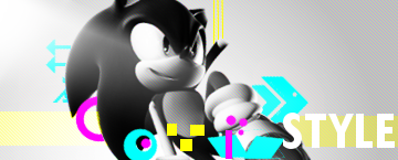
Low novice imo. I see where you´re going, but you need more. You seem to know bits of effects (number 4), but they´re very messy and don´t create much flow. Otherwise you didn´t present much effect-wise, mostly vector attempts. 2 and 6 are the worst of the batch imo. 2 has potential with the concept, but it´s undernourished. Also, the vector brushing looks blurry and forced. On 6, everything is just overly simple, and it´s not as vibrant as a vector tag of the higher levels should be. 5 looks better than 2, whereas the strong point here should be the color scheme. 1 shows nice eye for colors, as you picked a nice, warm atmosphere with warm colors. Then again, too simple of a tag overall to get even solid novice imo. Sonic one has vibrant colors, but badly composed with some weird and sharp shapes. Work on mostly everything, namely composition. Overall KIU, I hope you make the leap in no time.

EDIT:
Waltz, be descriptive or ima go kung-fu panda on your ***!
 

Gflare

Smash Journeyman
Joined
Jul 6, 2008
Messages
433
KIU = Keep it up. Get reclassed whenever you want, just make sure you don´t use the exact same batch of tags, bcause then it´s pointless. xD
 

plural

Smash Journeyman
Joined
Mar 23, 2008
Messages
394
but you guys are novice/mod...i know bw is novice, i saw thread on gsa.
 

Gflare

Smash Journeyman
Joined
Jul 6, 2008
Messages
433


Ima guess somewhere in the beginner very low novice range :)
High beginner.
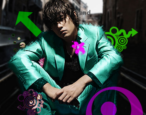
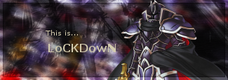
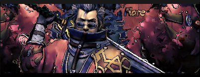
The textures you use on most of your sigs don´t look good, and this hinders them. Also, most of it looks like plain brushing, which is never a good thing. Color schemes are poor, as are some of the render placements. 4 flows a little, take that as an influence. Also, you need to start working on getting depth and overall composition, because right now it´s all very simple. Also, the renders you pick are generally LQ, hindering overall potential of your tags. Also, stop brushing with this ugly set of brushes to make a BG, it´s just not appealing overall. Text looks pretty weird overall, and hardly readable on some of them. Try to blend your renders and create foreground effects to make depth. Try using some c4ds to have more options for effects. Your borders are also pretty ugly atm, try just black or none at all.
Plural, you´re next...
 

Gflare

Smash Journeyman
Joined
Jul 6, 2008
Messages
433


how long: over a month now

what i think: low novice?
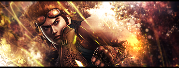
Solid novice.
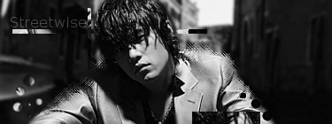
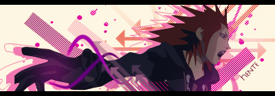
You seem to know your effects nicely, but first and last bring you down. First one just screams novice, composition isn´t near as good as your standard. Colors are also weird for a vectory attempt. Last one is oversaturated and weird, I just don´t like it overall. On the other hand, I´d say 2 is your best. Awesome effects, nicely composed. Greens to the left look sorta weird though. Clipping masks look great, and the whole thing has decent depth and flow. I´d say pretty high novice on that particular one. Joker one is just alright. Seems to be lacking. Next one is nicely composed and shows potential, but the terrible coloring just ruins it utterly. Black and white one is a little to simple, but aight as well. Overall you´d be high novice if you removed first and last and placed in a more up to par one.
 

cmpr94x

Smash Lord
Joined
Jul 1, 2008
Messages
1,099
Location
Georgia
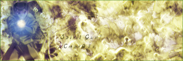
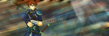
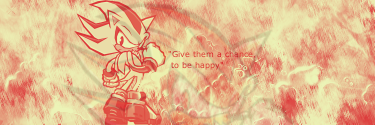
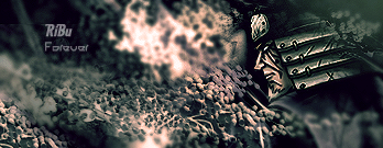
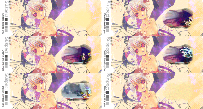
Im gonna post my sigs here I guess...
Tell me how i am :-) I started last week so yeah.

1.


2.


3.


4.


5.


6.
 

Black Waltz

Smash Champion
Joined
Jan 27, 2007
Messages
2,243
@jeebus: high beginner. like what flare said, your textures aren't very good. you still to learn lots of the basics: blending, lighting, flow.

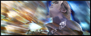
@plural: mid novice. your color coordination still needs work. but as i recall, you are colorblind (or were you just kidding?), so i cant really blame you. your work has decent flow. it's enough to make sure that your eyes stay on the focal. work on creating more contrast with depth.

@cmpr: low-mid beginner. you still need a lot of work on basic blending, composition and flow. read more tutorials and self-critique.
 

plural

Smash Journeyman
Joined
Mar 23, 2008
Messages
394
^well yeah...its just...I can't tell what color im putting down...or...what color I'm looking at...unless its extremely obvious, like pure red/blue/yellow etc.

doctor said i see in gray only..i dunno about that though

edit: wikez is here?!
 

Gflare

Smash Journeyman
Joined
Jul 6, 2008
Messages
433
Im gonna post my sigs here I guess...
Tell me how i am :-) I started last week so yeah.

1.


2.


3.


4.


5.


6.
Overall low-solid beginner. You lack most theory, but number 2 is going the right way imo. More foreground, depth, composition, flow, better text... I´d say you need to check over the list I posted on your shop and follow at least half of those tuts. You need to learn Gimp´s interface, and for that you need tutorials. Also, try experimenting with smudging.
 

cmpr94x

Smash Lord
Joined
Jul 1, 2008
Messages
1,099
Location
Georgia
Gflare... it isnt my shop lolz yeah I have not been able to replicate number 2s awesomeness. 2, 3, and 5 were all done with the same tut with no avail :-( Back to researching.:laugh:
 

Gflare

Smash Journeyman
Joined
Jul 6, 2008
Messages
433


I've been doing this since 07, but kind of stopped for a long time
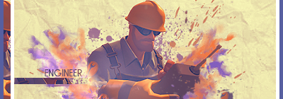
I´m gonna have to say high novice. Last one is very low moderate, 4th one is like low-mid novice. I see were you were going there, but I just don´t like it. First tag is hindered by bad color scheme, I see potential on it. I like how you made the effects fit the drawing style. 3 has a nice feel to it, but effects and compo aren´t complex or well thought enough to warrant moderate. 2 and 5 just look sorta cheesy with the starry smudgy stuff set to lighten only. Has mood, but it´s easy to replicate. IMO you didn´t pick your absolute best works for this ranking.
 

Gflare

Smash Journeyman
Joined
Jul 6, 2008
Messages
433


How long have you been designing: 4 Months, around there.

What rank you think you currently are at: Low novice.
I was torn between low moderate and extremely high novice, and I think I´m going with extremely high novice.
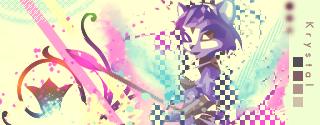
Your colors are very nice, you have a good eye for tones. 3 and 4 are my faves on that batch, 4 is just wonderfully vectored, and 3´s HQ render along with very nice mood, flow, and effects just deserves low moderate. The vector with Krystal is also pretty nice, once again, great colors. Second one´s video is just extremely pointless, so I´ll just ignore it. Looks very LQ, probably because of the video, and it just looks weird to stick a video on a potentially nice tag. Tones are just ok, but then again, with the low quality, I wouldn´t know... 1 just looks to common, everyone does this dark themed tag with a lightsource thing, so if you don´t make it exceptional, it´s probably gonna seem bland. And bland it is... Washed out colors on the last one don´t hit me, I´d rather not have them. Nice colors once again. KIU, you´ll be mod in no time.
 

Gflare

Smash Journeyman
Joined
Jul 6, 2008
Messages
433
Alright heres mine.
I've been doing this for a month or so.


Solid-High beginner.
I don´t care, I know I don´t have a great description here. Just a coupe of words: Composition, colors, flow, blending, foreground, depth. Oh, also, one last, very important word.
****ING MESSY
Read more and more tuts.
 

AzSvFeZ

Smash Lord
Joined
May 18, 2008
Messages
1,022
Location
Sierra Vista, AZ.
I know, I'm starting to use that tut list on the all stars shop


Hey hey hey, the **** word is unnecissary to use.

Just playin.
 

Gflare

Smash Journeyman
Joined
Jul 6, 2008
Messages
433
heres some of mine


Solid Novice.
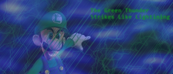
Last two are high novice. The naruto one is very cheesy, blur-lighten only generally only looks good if subtle. White right side is just uber weird. 2´s render just looks veeeeeeeeery strange/LQ, making the whole piece look weird. Weirdness is def a problem, 1 looks weird as well with the brushy stuff all over. Here´s a weird tag I did a while ago, you DON´T want to get similar to it, it´s terrible:

See how it´s just weird? Weird ain´t appealing, mystical stuff is. But that´s another discussion. 4 looks pretty nice with the fiery stuff, but the pen tool looks absolutely terrible. What were you thinking there, seriously? Last one could be a little less on the dull side, but the basic compo looks nice.

@Cmpr: Erh, I usually post my work on the critique thread. My photobucket isn´t to be followed, because there´s some very ugly stuff on there which I like to keep secret.
 

cmpr94x

Smash Lord
Joined
Jul 1, 2008
Messages
1,099
Location
Georgia
Conker I will come at you like a spider monkey if you dont give me the link to his photobucket. Anyways someone get on aim! No one is there :-( I am alone. Also, Conker you should have put up your Mega man instead of Naruto and simply added your Majora's mask one to the mix. I really like the Majora's mask one he he.
 

HabiT

Smash Apprentice
Joined
Jul 13, 2008
Messages
83
Location
Dayton, TN
1.


2. (first vector sig)


3.


4. (first sprite sig)


5.


6.


7. (first tech sig)


Been doing sigs for 6 days. Probably just low novice or high beginner.
 

cmpr94x

Smash Lord
Joined
Jul 1, 2008
Messages
1,099
Location
Georgia
Oh my, you have been doing this less than me and you are better IMO. Specially #1 Just a tip.... make the text smaller.
 

plural

Smash Journeyman
Joined
Mar 23, 2008
Messages
394
fixed it, but i crossed it out, if you click it, its your conscience in invading gflares privacy....or something like that.
 
Status
Not open for further replies.
Top Bottom