• Welcome to Smashboards, the world's largest Super Smash Brothers community! Over 250,000 Smash Bros. fans from around the world have come to discuss these great games in over 19 million posts!

    You are currently viewing our boards as a visitor. Click here to sign up right now and start on your path in the Smash community!

Are the Renders well made?

RedFly

Smash Lord
Joined
Sep 27, 2013
Messages
1,237
NNID
RedFlyNinja
3DS FC
0018-1836-2825
While looking at characters like Kirby or Sonic, Lots of the renders just look boring and not very unique in my own opinion. While Brawl's renders were really memorable and stuck along just as much as the music did.

But what's your opinion, Are these Renders handled well like Brawl or Melee?
 

Xermo

Smash Champion
Joined
Feb 19, 2013
Messages
2,811
Location
afk
NNID
SSBFC-Xerom
3DS FC
4425-1998-0670
Brawl's renders were ****, what are you talking about.
 

RedFly

Smash Lord
Joined
Sep 27, 2013
Messages
1,237
NNID
RedFlyNinja
3DS FC
0018-1836-2825
I thought they were great... This game's renders look very pretty and shiny but to me they get old so fast...
 

Ryuutakeshi

Smash Lord
Joined
Feb 20, 2008
Messages
1,553
Location
Fireguard
How does one make a walking pink sphere look interesting compared to the fire breathing turtle?

They're fine.
 

mygamecube

Smash Lord
Joined
Jul 31, 2013
Messages
1,115
Location
Detroit, MI
NNID
mygamecube
3DS FC
4596-9526-5701
Smash 4 renders absolutely trump Brawl's. Like by a lot.

Definitely more emotion and a lot less bland. I love the renders for this game.

I'd go as far to say Melee's renders were better than Brawl's as well.
 

Impmacaque

Smash Journeyman
Joined
Jul 1, 2003
Messages
349
Location
Bronx, New York
The characters in Sm4sh look really, really good. It's one of the game's strongest points by far. All the characters pop out at you and have a really clean look.
 

ScottyWK

Smash Lord
Joined
Apr 8, 2014
Messages
1,116
Location
Dallas, TX
NNID
ScottyWK
3DS FC
3239-4428-9575
Palutena is the only one that seems underwhelming. Her model seems incredibly stiff (especially her hair).
 

Super Writer

Smash Apprentice
Joined
Jun 20, 2014
Messages
162
I like the Smash 4 renders, though it annoys me more than it should that Mario's includes that fireball. I don't know if everyone got some sort of effect like that, I wouldn't care, but alone with him it kind of stands out a little. It was worse for me when the Amiibo figures were being shown, and only one have some crazy special effect added to it.

The only ones that I don't care for are Kirby's and Pikachu's, neither of them are really that interesting or capture a part of their respective characters.
 

The Real Gamer

Smash Hero
Joined
May 7, 2008
Messages
9,166
Location
Atlanta, Georgia
3DS FC
3437-3797-6559
Palutena is the only one that seems underwhelming. Her model seems incredibly stiff (especially her hair).
Huh... I assumed I was the only person who thought this.

Something about her face throws me off as well. Not that it's ugly I was just expecting something a bit more expressive. This comparison does a better job of showing what I mean:


Something about the new model's face just seems so... lifeless in comparison. IDK maybe I'm just being nitpicky.
 

Impmacaque

Smash Journeyman
Joined
Jul 1, 2003
Messages
349
Location
Bronx, New York
I think it's her eyes. They look pretty vacant and absent in the in-game screenshot. It gives her entire face a blank, thoughtless expression.
 

Nintendotard

Smash Lord
Joined
Jul 26, 2013
Messages
1,712
NNID
Mariotard
The only ones I find boring so far are Palutena and Pikachu. Bowser I think has the best render by far! His pose is so sinister, and now that he doesn't look like a dried up lizard, I am very happy with that!

Just look at Zelda's too, she looks so mystique. Villager's has ended up making him look like a killer, Dedede just shows how well his expressions are put into the game, and a majority of the other renders really capture the character's personalities
 

Xavier :D

Smash Ace
Joined
Jan 3, 2014
Messages
517
Location
Rainbow Road
NNID
legend_of_xav
I love the renders.....they are all very creative and they definitely stick in my head. And people should cool their jets about Palutena...It is just pre-game after all, it could change. If I remember correctly, wasn't Mega Man's face during his final smash at the demo very dull, but in the direct it wasn't?
 

Nintendotard

Smash Lord
Joined
Jul 26, 2013
Messages
1,712
NNID
Mariotard
I love the renders.....they are all very creative and they definitely stick in my head. And people should cool their jets about Palutena...It is just pre-game after all, it could change. If I remember correctly, wasn't Mega Man's face during his final smash at the demo very dull, but in the direct it wasn't?
Well the demo is a previous version of the game, but who knows at this point lol
 

StupendousMike

Smash Ace
Joined
Oct 15, 2007
Messages
624
Location
Los Angeles, California
Everyone is so colorful and expressive. I LOVE they way everyone looks so far. I agree Palutena is looking a tad dry by comparison, but that could change. I love that Sonic has his little side smirk back, I love Dedede's expressions, I love all of it.

I love the renders.....they are all very creative and they definitely stick in my head. And people should cool their jets about Palutena...It is just pre-game after all, it could change. If I remember correctly, wasn't Mega Man's face during his final smash at the demo very dull, but in the direct it wasn't?
I could be mistaken, but Mega Man seemed much more expressive in the Direct and the demo than he did in his reveal trailer.
 

MasterOfKnees

Space Pirate
Joined
Jan 4, 2010
Messages
8,579
Location
Denmark
NNID
KneeMaster
Switch FC
SW-6310-1174-0352
Brawl's looked very stiff honestly, a few of them like Samus and Meta Knight's were good, but then you had guys like Mario, Link and Pit that just look dead in their eyes.

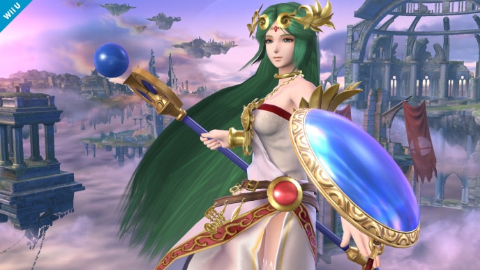
The Smash 4 renders are much better, they're much more lively. I will say that I don't particularly like the Palutena, Pac-Man, Kirby, Diddy Kong and Samus renders though. Palutena is just the same as the KI:U artwork, likewise with Pac-Man it's just the same old boring pose, with Kirby it's just odd to have a character sit down like that on the select screen, something looks off with Diddy Kong's mouth, and Samus' is way too static compared to her Brawl render. I also think Charizard's looks weird, what the hell is he even doing? It looks like he's about to fall over or something.

In general they're still much better than the Brawl renders though. I mean, just look at Ike, he looked like one of those action figures with bendable limbs, now he's ready to kick some serious ass.

I love the renders.....they are all very creative and they definitely stick in my head. And people should cool their jets about Palutena...It is just pre-game after all, it could change. If I remember correctly, wasn't Mega Man's face during his final smash at the demo very dull, but in the direct it wasn't?
In-game animations and renders are two very different things. Renders are used promotionally and have to be finished much earlier to fit the CSS, stock icons, and so forth. It's not changing this late. The only time we've seen a render change mid-development was with Pit's Brawl render on the 2006 Brawl site, it was changed when his page went up on the official Dojo in 2007, and that was still only his face.
 
Last edited:

Jellyfish4102

Smash Journeyman
Joined
Nov 27, 2013
Messages
338
NNID
jellyfish
I think the Wii U version's look great. The 3DS version's look kind of fat to me. Maybe it's the outlines.
 

FalKoopa

Rainbow Waifu
BRoomer
Joined
Dec 16, 2012
Messages
32,231
Location
India/भारत
3DS FC
1650-3685-3998
Switch FC
SW-5545-7990-4793
I'll echo the general sentiment here. Smash 4's renders are far better than either Melee's or Brawl's. Other than the fact the colours really pop, they are very, very detailed. Just look at Bowser or DK. You can almost count the strands of fur/hair. The textures for shoes, gloves, clothes etc also look quite realistic while maintaining the bright look.
 

RedFly

Smash Lord
Joined
Sep 27, 2013
Messages
1,237
NNID
RedFlyNinja
3DS FC
0018-1836-2825
I guess i thought they were forgettable is that i have been staring at the site too long.
 

Hong

The Strongest
Joined
Jul 6, 2004
Messages
23,550
In my opinion, the Brawl characters have always looked really washed. Like fabrics that have been washed with the wrong colours for too long. The stark, primary colours they used in Smash 4 look anything but realistic, but not only does it look less dull but it also vastly improves the visual flow of information to the retinas. I approve.
Huh... I assumed I was the only person who thought this.

Something about her face throws me off as well. Not that it's ugly I was just expecting something a bit more expressive. This comparison does a better job of showing what I mean:
Something about the new model's face just seems so... lifeless in comparison. IDK maybe I'm just being nitpicky.
Nah, you're not being picky. I have been wanting Palutena since the Brawl hype days and now that we finally have her I must say her appearance is rather underwhelming. Not sure if it's just her face, or if she just does not translate well to HD as I had hoped.
 

NintendoKnight

Smash Lord
Joined
Oct 26, 2013
Messages
1,735
Location
Climbing the mountain I made from a molehill
NNID
Nin-Knight
The only time we've seen a render change mid-development was with Pit's Brawl render on the 2006 Brawl site, it was changed when his page went up on the official Dojo in 2007, and that was still only his face.
Just wanted to point out this, and this.

Also, Samus' render resembles Ezio from the Assassin's Creed 2 artwork.
 

MasterOfKnees

Space Pirate
Joined
Jan 4, 2010
Messages
8,579
Location
Denmark
NNID
KneeMaster
Switch FC
SW-6310-1174-0352
Just wanted to point out this, and this.

Also, Samus' render resembles Ezio from the Assassin's Creed 2 artwork.
Huh, didn't know about Snake, or at least I didn't notice it back then. It seems his texture was generally changed to be a bit more colorful, so it makes sense. It was still in early development though, Palutena's render is 3 months before JP release.
 
Last edited:
D

Deleted member

Guest
Im glad with the direction they went. I wasn't a fan of Brawl's dull realistic look. Also, I like how the models arent as lifeless, especially Dedede.
 
Last edited by a moderator:

PixelPasta

Smash Lord
Joined
Jul 27, 2013
Messages
1,147
These renders are great!
I love how Bowser, Dedede, Charizard, Zelda, Toon Link, and Marth look.
 
Last edited:

Norm

Smash Lord
Joined
Oct 10, 2007
Messages
1,103
Location
Newfoundland, Canada
NNID
Sheldon86


With brawl there was a lot more texture details in the models because there had to be. All the stitching in Mario's overalls was very visible they looked like real denim overalls but it's all just a flat texture. Where as in the Wii U version they're more pastel in colour. However much of the tiny details like stitching in Smash Bro's Wii U are fully modeled now and not left to texturing and bump mapping like they were in Brawl. They may not stand out as much as they did in Brawl. That is because the little details look more natural and a part of the overall character model. The models look far better everything has smoother lines. The faces are far more expressive.

You can see what I'm taking about here the chain mail on Link in brawl is just a flat texture as is the cross stitch at the top of his shirt. Where as in Smash Bro's Wii U the chain mail is a separate piece you can see the shadow it casts on Link's shirt. You can also see the cross stitch standing out as well because it's actually modeled. Admittedly with Mario his model design in Smash Bro's Wii U is very simplistic which is why some might say the Brawl one stands out more. More texture detail darker shadows. That darker, grittier colour scheme of Brawl may appeal more to some. Personally I love the look of Smash Bro's Wii U everything looks very polished and I like the brighter colour scheme it suites the characters more.
 

Superyoshiom

Smash Master
Joined
Jul 15, 2013
Messages
4,337
Location
The Basement
NNID
Superyoshiom
Some of them are kinda lazy, like Palutena's and Pac Man's, because there was official art of them in that pose. For the others, I think they look great. One tiny nitpick though, Peach's render looks nothing like she does in-game.
 
D

Deleted member

Guest
I like Pac-man's render. It gave us this: :4pacman: which is almost an equivalent to the troll face.
 

Superyoshiom

Smash Master
Joined
Jul 15, 2013
Messages
4,337
Location
The Basement
NNID
Superyoshiom
In my opinion, the Brawl characters have always looked really washed. Like fabrics that have been washed with the wrong colours for too long. The stark, primary colours they used in Smash 4 look anything but realistic, but not only does it look less dull but it also vastly improves the visual flow of information to the retinas. I approve.Nah, you're not being picky. I have been wanting Palutena since the Brawl hype days and now that we finally have her I must say her appearance is rather underwhelming. Not sure if it's just her face, or if she just does not translate well to HD as I had hoped.
Palutena was based of her appearance in Uprising, in which she had an anime-styled design. It's hard to translate anime characters into 3D without it looking goofy.
 

Hong

The Strongest
Joined
Jul 6, 2004
Messages
23,550
Palutena was based of her appearance in Uprising, in which she had an anime-styled design. It's hard to translate anime characters into 3D without it looking goofy.
This is true. Ike looked really bad in Brawl IMO compared to how he looks in the Path of Radiance cutscenes.

That said, I am less forgiving now, only because Marth and Pit both look simply gorgeous... the latter of which is equally as anime as Palutena.
 

TheDMonroeShow

Smash Apprentice
Joined
May 5, 2014
Messages
189
Location
New Jersey, U.S.A
3DS FC
3695-0037-2189
Palutena is the only one that seems underwhelming. Her model seems incredibly stiff (especially her hair).
Didn't other character get more emotion added to their animations as time went on? Maybe it could be the same case for palutena as I think the problem is in her expressiveness not her hair.
 

Mypantisgone

Smash Lord
Joined
Feb 29, 2012
Messages
1,633
Location
Baguetteandwine Land
I love the renders, I think they're the best we've ever had.

Maybe some of them have slightly uninspired poses compared to how they could pose, but I'll forget about that.
 

ScottyWK

Smash Lord
Joined
Apr 8, 2014
Messages
1,116
Location
Dallas, TX
NNID
ScottyWK
3DS FC
3239-4428-9575
Didn't other character get more emotion added to their animations as time went on? Maybe it could be the same case for palutena as I think the problem is in her expressiveness not her hair.
In Palutena's trailer, around 1:38 on, you can see her hair moves like a cape...like one huge entity.
http://www.youtube.com/watch?v=vsl3bNO1O0w

In, let's take, Zero Suit Samus's, you see her hair performing like hair (whipping around, shifting, etc)
http://www.youtube.com/watch?v=bJ5UItb-Zec

It's picky, and really specific, but when you have a character with hair like Palutena's, it just looks stiff when it looks and acts like a cape. I mean...it's flat.

Facial expressions are weird too, you're right, but I was just using that as an example to show how Palutena doesn't seem right.
 

D-idara

Banned via Administration
Joined
Jul 8, 2012
Messages
3,240
Location
Venezuela
NNID
D-idara
3DS FC
4511-0670-4622

Enough said.
God, Melee Bowser was really cringe-worthy, I find it funny that even though Brawl used grittier color schemes, Bowser looks a little more like Bowser in Brawl. I mainly think he looks cringey because of the enormous pupils that make him look like some weird alien thing.

And I don't really know what's about Palutena's model, but, god, her cutscene model in Uprising was expressive and full of life! Why doesn't this one look as good?
 

AncientArk

Smash Apprentice
Joined
Jul 11, 2012
Messages
184
Location
London
I think the renders are pretty good to be honest.
I really like Sonic and Marths.

What's up with Mario losing the fireball though?
On the character page for the website he's missing it, but you go into his screenshot page he has it.
 
Top Bottom