
-
Welcome to Smashboards, the world's largest Super Smash Brothers community! Over 250,000 Smash Bros. fans from around the world have come to discuss these great games in over 19 million posts!
You are currently viewing our boards as a visitor. Click here to sign up right now and start on your path in the Smash community!
It appears that you are using ad block :'(
Hey, we get it. However this website is run by and for the community... and it needs ads in order to keep running.
Please disable your adblock on Smashboards, or go premium to hide all advertisements and this notice.
Alternatively, this ad may have just failed to load. Woops!
Please disable your adblock on Smashboards, or go premium to hide all advertisements and this notice.
Alternatively, this ad may have just failed to load. Woops!
Are the Renders well made?
- Thread starter RedFly
- Start date
ScottyWK
Smash Lord
They are a little flat and lack as much depth as the others, but I think they fit her well. Brings more focus to the color of her eyes and the feminine aspects of them.They're all pretty fantastic, except for Palutena on reasons mentioned above. And is it just me, or does Peach's face look a little... off? Something about the eyes...

BridgesWithTurtles
Smash Champion
I like to look at it the same way I look at Sugimori's Pokémon art.
Over time, the character art has become more colorful and vibrant, with overall cleaner definition. Pokémon are drawn to more closely match their anime depictions than in the past, just as Smash 4's character renders more closely resemble each fighter's mainstream design. Everything looks objectively much cleaner and more professional.
However, some people will always prefer the older artwork for whatever reason, whether that be for its rougher, grittier, and less sterile qualities (like the polygonal N64 renders or choppy Melee renders); the more unique art style and characterization (akin to Brawl's "dark" art style); or its more dynamic poses (which some people in this thread have expressed dislike about regarding Smash 4's renders).
The only difference is that I like the older Sugimori art more, while I think Smash 4's renders beat everything before it, with a few exceptions. For example, I like Brawl's Samus and Sonic renders more than the newer ones.
RODO
Smash Ace
Smash 4 looks sooo good in person
LoboRundas
Smash Apprentice
- Joined
- Apr 29, 2014
- Messages
- 176
- Location
- Canary Islands, Spain
- NNID
- LoboRundas
- 3DS FC
- 4098-3496-0921
- Switch FC
- SW 6696 1795 2392
I like all of the renders, but Pit's one I don't really like. His face seems weird, as does Palutena both in render and ingame.
Mark Helsing
Smash Rookie
Certain poses in the official artwork feel a little off for me. How exactly is Zero Suit Samus going to be made into an amiibo with a pose like that?
ChikoLad
Purple Boi
- Joined
- Jan 11, 2014
- Messages
- 23,084
They're all really wonderful.
And you really need to see the 5000x5000 renders to fully appreciate them. The detail is insane.
Did you know that Kirby actually has a marshmellowy texture?
Click the Download button on the page below to download the uncompressed 5000x5000 render of him. Then zoom in on the area between his mouth and eyes. Your mind will be blown.
You can still see it a bit even just by zooming in on the preview.
https://www.dropbox.com/s/35ginszl903dfir/SuperSmashBros_char_04.png
Last edited:
alex6309
Smash Ace
They'll just just have something support them. Like a pole.Certain poses in the official artwork feel a little off for me. How exactly is Zero Suit Samus going to be made into an amiibo with a pose like that?
Pyra
Aegis vs Goddess
- Joined
- Jul 7, 2012
- Messages
- 18,560
- Location
- where ToasterBrains is
- NNID
- ToasterBrains
- Switch FC
- SW 8322 4207 9908
Woah! Good eye.They're all really wonderful.
And you really need to see the 5000x5000 renders to fully appreciate them. The detail is insane.
Did you know that Kirby actually has a marshmellowy texture?
Click the Download button on the page below to download the uncompressed 5000x5000 render of him. Then zoom in on the area between his mouth and eyes. Your mind will be blown.
You can still see it a bit even just by zooming in on the preview.
https://www.dropbox.com/s/35ginszl903dfir/SuperSmashBros_char_04.png
Mark Helsing
Smash Rookie
I know about the poles they use, Peach's has one under her dress. I just think that with ZSS her pose looks a little too awkward and top heavy that she'll have some really ugly pole placements.They'll just just have something support them. Like a pole.
D-idara
Banned via Administration
I personally like ZSS' pose much better here, she looks much more 'battle-ready' than the Brawl render, and her face looks much more expressive, not Other M-expressive, but real expression. I do like angry Samus better than deadpan Samus.
Last edited:
ChikoLad
Purple Boi
- Joined
- Jan 11, 2014
- Messages
- 23,084
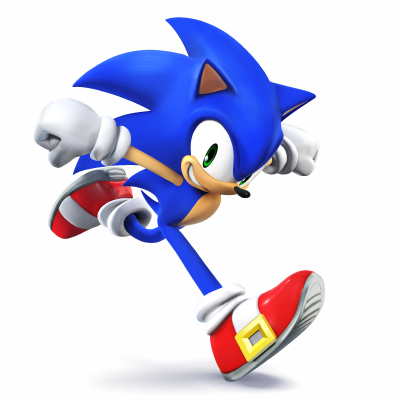
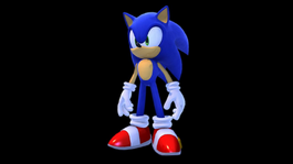
The current model for Sonic in his own games, which started in 2008 with Sonic Unleashed (same year as Brawl's western release), has much more similarities to the Smash 4 render than the Brawl render. His shoes are much brighter and shinier, his overall model is much smoother in the Smash 4 render, compared to the Brawl render (look at the cuffs on his gloves), his quills are bigger and swoop downward more, his chest is a bit more buff, where as Brawl Sonic's chest is really flat (which it shouldn't be, Modern Sonic has had that more defined chest since the Sonic Adventure promo art), and his expression in the Brawl render looks lifeless (it's really the eyes). Even in the Sonic Unleashed model here, where he has a neutral expression instead of a grin, he looks more alive than the Brawl render. Sonic's mouth in the Brawl render also looks odd, it's really not curving, nor does it look like he's using any muscles to move his mouth.
That's just one example, but yeah, I think the Smash 4 renders capture these characters much better than the Brawl ones.
The Brawl ones were never terrible honestly, they're just dated.
D-idara
Banned via Administration
If I had to think about characters that were better captured with the Brawl renders, probably Diddy Kong, he looks odd here, while the Brawl render perfectly captured him. Samus too, and no, I do like the Other M design, but the Brawl pose for Samus was much more dynamic and looked ready to Brawl, I don't get where this Samus-Ezio pose comes from...lemme see, Snake's Brawl render was pretty kickass, but if he makes the cut, maybe his Smash 4 render will be even better.
Now, I hadn't noticed before how much of an improvement Peach's render is! She looked so lifeless back then, and now she's adorable, frilly and full of life! :D Her face also looks miles better, although she still doesn't really look like the Mario games (At least her render, her In-Game model seems much closer to the actual Mario series).
One thing I don't like is that Palutena and Greninja pretty much have the exact same poses as their respective games' concept art.
JabbatheHutt
The Kingpin of the Outer Rim
Dunno if im the only one thinking how amazing Wario's will be.
Tollhouse
Smash Journeyman
Aside from melee Bowser which is hideous.I agree with this.