Roller
Smash Legend
Here is not the place to discuss such things.Rollerking, when shall I join your shop?

Welcome to Smashboards, the world's largest Super Smash Brothers community! Over 250,000 Smash Bros. fans from around the world have come to discuss these great games in over 19 million posts!
You are currently viewing our boards as a visitor. Click here to sign up right now and start on your path in the Smash community!
Here is not the place to discuss such things.Rollerking, when shall I join your shop?
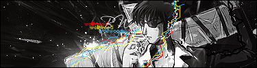
I was skipped?I have one tht i would like critiquing on
it is my first sprite sig so yea...

Did my CnC not count or something?I was skipped?
SgtWikez-
comon, most girls at my school have more skin showing than that. and that's a **** good thing too.I have one question. How come your latest sigs are practically porn...?
Does that make it any better? Lolz, there are ten year olds on smashboards, not me not me but srsly. Less pron more cowbell. I have a fever.comon, most girls at my school have more skin showing than that. and that's a **** good thing too.
and isn't Frate supposed to be doing all the CnC'ing for this topic?
Yes.and isn't Frate supposed to be doing all the CnC'ing for this topic?
It won't, PiSToLZ. We already have a stickied topic for general critiquing. This is a one on one thing.if it gets stickied
before you doubt mefrate your CnC isnt that great you should elaborate more
And I still think those "short" messages are better than the average in critique board. If something isn't clear enough, just tell me and I'll try to elaborate, rather do that than elaborate at the unnecessary and obvious things (so I don't blather out 30 lines of which you know, so you can ask precisely what you want to know instead)Another shortcut since I didn't leave yet even though I should D:
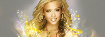
* http://planetrenders.net/renders/displayimage.php?pos=-12371Another one from my Coldplay collection:

If you have seen any high quality Coldplay or Dave Matthews Band stocks/renders, let me know. I've been cutting them myself so far.
* Color wheel. Gray, pink and brown don't have that fuzzy feeling together.pl0x:


* The text is okay. It does not hurt too much, but it doesn't help either. I guess it makes the tag a bit more interesting but it bugs me slightly.
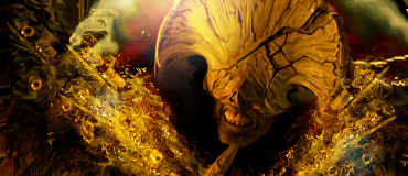
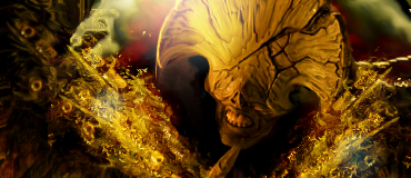
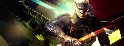
Trying a new lighting method. :|


I'm not too sure how I incorporate the texture to look like lighting. What kind of texture are you thinking of?Frate said:* In case his shoulder was already black, try adding a texture or something on a low opacity (textures can be found at http://resurgere.deviantart.com) over it, then use the burn + dodge tool to make it look like the lightning slightly overlaps his shoulder so it isn't completely black.
oh lordy lord weed is back lolNice going Frate, maybe people will be more encouraged to try more advanced sig making with better critique available")