PseudoTypical
Smash Lord
He's kidding. He just hasn't been around in a while. Howdy, @210stunaYes, this is Brawl. The textures of characters are changed to look like Smash 4.

Welcome to Smashboards, the world's largest Super Smash Brothers community! Over 250,000 Smash Bros. fans from around the world have come to discuss these great games in over 19 million posts!
You are currently viewing our boards as a visitor. Click here to sign up right now and start on your path in the Smash community!
He's kidding. He just hasn't been around in a while. Howdy, @210stunaYes, this is Brawl. The textures of characters are changed to look like Smash 4.
Yeah, probably should've figured that out when his profile says, "Smash Lord" among other things...He's kidding. He just hasn't been around in a while. Howdy, @210stuna
Smash 3 Team, there's only one request that I want to make. Since you're doing Doctor Mario, you might as well use this for his Red Team outfit:
![]()

If that spoiler's so huge that you need to have multiple spoiler alerts, I don't think it should be here to begin with...
I don't know how to interpret this... so...
GET BACK ON SFM RIGHT NOW OR I WILL FIND YOU YOUNG MANIm glad nothing is changed with you guys.
*MEGA FACEPALM*If that spoiler's so huge that you need to have multiple spoiler alerts, I don't think it should be here to begin with...
Maybe he learned a thing or two from Silver... (But lord please prevent sonic from having that "ITS NO USE!" quote)Ah, his inability to hold the chaos emerald, how you will always be remembered.

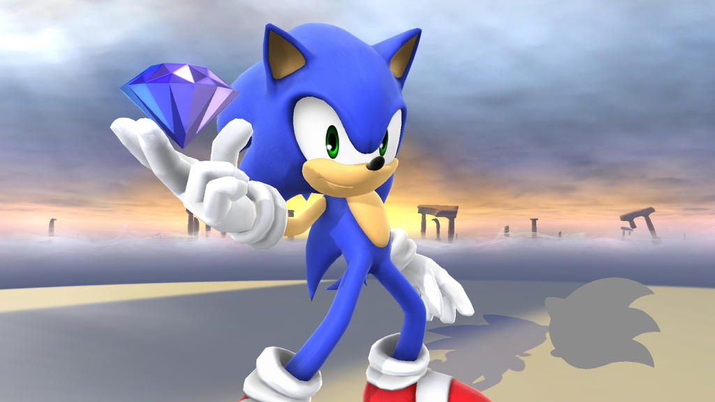
wow, where is that render from? looks like a remaster of Brawl Sonic![]() Sonic Boom ST
Sonic Boom ST
His design isn't that good but I like how the shoes look in that game. Specifically the soles. The shoes that he wears when using the Gems would have been a great shoe type to use for recolors too.Sonic 06 looks terrible. I have no idea why people like his appearance in that game. His arms and hands are massive.
I suppose it's a matter of opinion. When I see Sonic in Smash 4 I am reminded of Sonic Unleashed, Sonic Colors, Sonic Generations, and Sonic Lost World. I love how he cockily smirks during his animations and the crisp, vibrant blueness of his fur. The way his quills are animated remind me of those high-quality cinematics from the latest Sonic games...Sonic is meant to look...awesome, not boring.
View attachment 71002

It's literally one person who likes it.Sonic 06 looks terrible. I have no idea why people like his appearance in that game. His arms and hands are massive.


The way that some of the images are stretched vertically makes it look bad. Especially the random button.To boost up morale, look how far we've come in just doing the original 12 in the new style (with help from Smash 3C).
![]()
and for the heck of it, here's the Smash 64 roster w/h some of the cut characters(Bowser, Dedede, & Mewtwo) and Ganondorf:
![]()
Out of the Original 12, we only have 5 more characters left to do in the new style!
Actually, it's not what you think (except for the random button, I was also doing a little design concept if Smash 64 had modern menu design, thus having a central random button was key and stretching on that part was unavoidable). You may think the character icons are stretched, but the original images are actually square (those are downsized from the normal 80x56 shape). It's the frame I used (nicknamed the Etika Special) that gives the illusion of stretching. If you want more mind-bending, check this out below:The way that some of the images are stretched vertically makes it look bad. Especially the random button.


You can't just gloss over that without some sort of explanation.(nicknamed the Etika Special)
Actually, it's not what you think (except for the random button, I was also doing a little design concept if Smash 64 had modern menu design, thus having a central random button was key and stretching on that part was unavoidable). You may think the character icons are stretched, but the original images are actually square (those are downsized from the normal 80x56 shape). It's the frame I used (nicknamed the Etika Special) that gives the illusion of stretching. If you want more mind-bending, check this out below:
![]()
(^Tabuu's Render was done by Shin F. Renders not currently released yet, but will be out soon.)
Still think the images are stretched? Compare these two and be blown away:
![]() [/spoiler
[/spoiler![]()
The border looks like Etika's Logo.You can't just gloss over that without some sort of explanation.
Just for a different aesthetic, I'm quite bored of the normal rectangular shape of the CSS Icons, so I wanted to do something different. When I first tinkered with the parallelogram shape, I noticed that for each row I could "mirror" the border for a nice effect (like an optical Illusion). Plus after browsing Reddit, I came across a post that suggested a better layout for the CSS that was more organized. While I do not yet know how to rearrange the css Icons without the CSS manager (doesn't work with Ondo's Out Of the Box CSS), I wanted to at least make it easier for people to find their main.i think the portraits don't look right, is there a reason you're squeezing them?
")


that's not what i meant lol, but as for why you're flattening the characters' portraits from the sides, or stretching them vertically, whatever (jiggs and kirby should look like a circle, but they now look like an oval, for example)The border looks like Etika's Logo.
Just for a different aesthetic, I'm quite bored of the normal rectangular shape of the CSS Icons, so I wanted to do something different. When I first tinkered with the parallelogram shape, I noticed that for each row I could "mirror" the border for a nice effect (like an optical Illusion). Plus after browsing Reddit, I came across a post that suggested a better layout for the CSS that was more organized. While I do not yet know how to rearrange the css Icons without the CSS manager (doesn't work with Ondo's Out Of the Box CSS), I wanted to at least make it easier for people to find their main.
Edit: @Juken I made the random icon better!
![]()
![]()
Looks better doesn't it?
The kicker is, from your perspective, you're both right AND wrong at the same time. Your eyes assume that Jiggs and Kirby looked deformed in the "Etika" borders, but original images are in-fact square 46x46 portraits centered in a 64x64 transparent canvas. And having the rows alternate in border orientation (slant to the right, slant to the left, repeat) makes it easier to distinguish characters located in that row compared to the rows above/below them. Not to mention when you have an ensemble of alternating icons, you have another optical illusion being formed; just look at my post on this page that's below Juken and look in the spoiler if you're ready to be spoiled.that's not what i meant lol, but as for why you're flattening the characters' portraits from the sides, or stretching them vertically, whatever (jiggs and kirby should look like a circle, but they now look like an oval, for example)
Yeah, sorry for derailing the thread for a bit...Man, I never realized how important CSP talk was for Smash3.
Especially considering we have nothing to do with it.

Why yes. Yes they did.so did you guys end up finding people to help you?
And I was gonna go serenade @Why yes. Yes they did.
I feel like a Hexagon would be a good idea for a shape tooThe border looks like Etika's Logo.
Just for a different aesthetic, I'm quite bored of the normal rectangular shape of the CSS Icons, so I wanted to do something different. When I first tinkered with the parallelogram shape, I noticed that for each row I could "mirror" the border for a nice effect (like an optical Illusion). Plus after browsing Reddit, I came across a post that suggested a better layout for the CSS that was more organized. While I do not yet know how to rearrange the css Icons without the CSS manager (doesn't work with Ondo's Out Of the Box CSS), I wanted to at least make it easier for people to find their main.
Edit: @
![]()
![]()
Looks better doesn't it?
who was itWhy yes. Yes they did.
Oh come on. The answer is literally there.who was it